Jordan Peterson on why zebras look the way they do

Today, I was thinking, what with it being Friday: What can I put here about cats or other creatures that would be of interest? But instead of looking for something along those lines, I was listening to a video conversation between Jordan Peterson and Camille Paglia, about the sorry state of the humanities departments of American universities. I can’t remember why or how, but I was. And twenty four and a half minutes into this, I listened in astonishment as Peterson suddenly started talking, fascinatingly, about zebras.

Why do zebras look the way they do, so very black and and so very white, and so very stripey?

This has long puzzled me. The arch enemy of the zebra is the lion, and the lions are impeccably camouflaged. Their coats are the same colour as the veldt, or whatever it is that the zebras roam about on and that the lions hunt the zebras on, and so the zebras don’t see the lions coming. But the zebras, with their garish black and white plumage, are nothing at all like the colour of the land they live on. What gives? Why the lurid and fantastically visible stripes?

Today I learned the answer to this question.

The answer is: When lions hunt zebras, they do this by deciding on just the one zebra that they are going to hunt, and they concentrate entirely on that one zebra. Eventually, the chosen zebra is exhausted, and the lions catch it and kill it.

And how do zebras respond, evolutionarily speaking? Answer: By becoming extremely hard to distinguish from each other. Their very stripey stripes do exactly this. The result of that is that although the lions try to hunt just the one zebra, thereby exhausting it and killing it, they instead keep getting confused about exactly which zebra is the one they are trying to hunt. And the result of that is that instead of hunting one zebra to its death, they hunt half a dozen zebras, not to any of their deaths, and go home without their dinner.

Some scientists who were studying zebra plumage did what turned out to be a rather cruel experiment which proved this. They squirted some colour onto one of the zebras in a zebra herd. The lions, confident now that they would not be confused about which zebra they were hunting, proceeded to hunt that one marked zebra to its inevitable death. Without such marking out, they couldn’t tell which zebra was which. With such marking, hunting success followed, every time. Every time, they chose the marked and hence easily distinguishable zebra.

I did not know this.

Peterson’s point was that American humanities professors are like this. They all have totally crazy, yet totally similar, opinions. That way, their enemies can’t fixate on one of them and destroy him. Or something. In this version of the zebra stripes story, Peterson is saying that people in general are like zebras. But I really didn’t care about that. It was the zebras and their stripes that interested me.

I love the internet.

Originally posted at Brian Micklethwait’s Old Blog

David Hockney likes having servants!

To quote my own earlier words about David Hockney:

What I particularly like about him is that he doesn’t indulge in the usual artistic sport of epater-ing the bourgeoisie. He is content to be bourgeoisie.

And as if to prove me right, in the same book I was referring to, I later encounter (pp. 105-106) this amazingly honest Hockney outburst:

The best form of living I’ve ever seen is Monet’s – a modest house at Giverny, but very good kitchen, two cooks, gardeners, a marvellous studio. What a life! All he did was look at his lily pond and his garden. That’s fantastic. He was there for forty-three years. …

Two cooks! Gardeners! How rare it is to encounter such full-throated pleasure being taken in the idea of having servants to look after you!

You can feel the people who try to decide these things going off Hockney, and I’m guessing that this has been going on for some time. I’m not saying that Adrian Searle, for instance, doesn’t mean the things he says in this Guardian piece about Hockney’s pictures over the years. And I actually rather share some of Searle’s preferences as to which Hockney pictures are nice and which are not so nice. Searle says they’ve got worse, basically.

However, I suspect that Hockney’s real crime is that he started out looking like a radical homosexualist, but then when homosexuality settled back into being just part of the scenery of modern affluent, successful, happy life, Hockney was revealed as being not angry about modern, affluent, successful, happy life. He just wanted that sort of life for himself, and for many decades now, he has had it. He would have been angry only if denied such a life by anti-homosexualists. But he wasn’t. As soon as the world started happily tolerating Hockney’s not-so-private life and made his picture-making life affluent and successful, Hockney was content happily to tolerate the world and to revel in its visual pleasures, natural and electronic. The Grand Canyon! iPhones! Bridlington!

Capitalism? Commerce? Hockney’s not angry about it. He’s part of it. He produces it, he consumes it, he applies it to his work, he knows this, and he loves it. And he has long surrounded himself with a small and happy team of assistants and cooks and bottle-washers of all the sorts that he needs, to enable him, Monet-style, to concentrate on his picture-making. Hockney is the living embodiment of the glories of the division of labour. Aka: social inequality.

I surmise that this is what really makes Searle’s readers (i.e. Guardian readers) angry about Hockney, not the claim that his pictures have got worse. They’re angry about modern life, and they’re angry that David Hockney isn’t angry about modern life.

And I suspect that Hockney is, in the eyes of Those Who Try To Decide These Things, helping to take the Impressionists down with him.

Originally posted at Brian Micklethwait’s Old Blog

Solving the puzzle of pictures

Martin Gayford’s book A Bigger Message: Conversations With David Hockney, seems very promising.

Hockney is an interesting and likeable man, I think, although I imagine he turns a bit nasty if you in any way get between him and his work. What I particularly like about him is that he doesn’t indulge in the usual artistic sport of epater-ing the bourgeoisie. He is content to be bourgeoisie.

Here’s an early nugget from this book (from the Introduction, on page 10):

The savants of the eighteenth century were much exercised by the question of what a person blind from birth, whose sight was suddenly restored, would make of the visible world. Amazingly, the experiment was actually performed. In the 1720s, William Cheselden, a London surgeon, removed the cataracts from the eyes of a thirteen-year-old boy. The latter gradually came to associate the objects he had known only through touch with what he now saw. One of the last puzzles he solved was that of pictures. It took two months, ‘to that time he consider’d them only as Party-coloured Planes, or surfaces diversified with Variety of paint’. And that of course is exactly what pictures are, but they fascinate us and help us understand and enjoy what we see.

When I’m done reading that book, I will be moving on to Gayford and Hockney’s more recent magnum opus, entitled A History of Pictures: From the Cave to the Computer Screen.

I have always been fascinated by the complex relationship between photography and painting. As has Hockney, it would seem. The very fact that this title talks about “pictures” rather than merely “art” or “painting” is, to me, highly promising.

Originally posted at Brian Micklethwait’s Old Blog

Thumbnails

Click on the thumbnail on the right to see why I’m presenting this photo to you, as a thumbnail.

Photo taken outside (as you can probably work out) Westminster Abbey in December 2015.

Originally posted at Brian Micklethwait’s Old Blog

An interruption ends

Today I finally got to the end of The Judgement of Paris. I have now started making a list of some short bits of it that I hope to reproducing here.

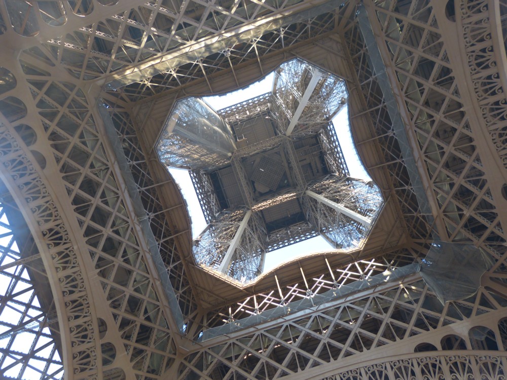
Meanwhile, by way of a small celebration, here is a Parisian photo I took, in Paris, way back in February 2012:

It’s the Tour Eiffel, of course, photoed from under it. Tour Eiffel is pronounced “Tour F L”, rather that “Tour I Fell”. Which reassures me that I know how to pronounce the leading historical character, Ernest Meissonier, in the above book. “May sonni eh” rather than “My sonni eh”.

Anyway, a big and very interesting interruption has stopped interrupting me and my life, and I’m very glad about that.

Originally posted at Brian Micklethwait’s Old Blog

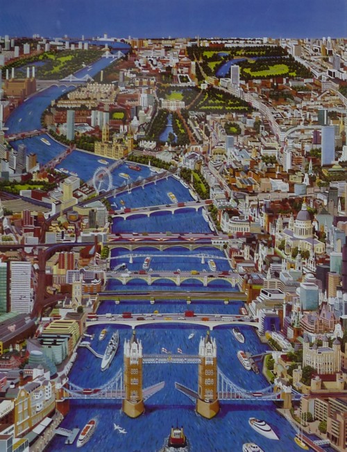
Photo by me of seventeen London bridges

I am very proud of the photo of London bridges that I took from the top of the Hotel ME, which featured seven bridges.

But today, while trawling through my photo archives on another errand entirely, I encountered a London bridges photo that I took, back in 2015 which clearly shows no less than fifteen London bridges:

And not so clearly, it shows, I reckon, two more bridges, in the very far distance, beyond the second pointy one, which I reckon must be Albert Bridge.

Originally posted at Brian Micklethwait’s Old Blog

XYZprinting’s full-colour 3D printer ‘paints’ your builds as it makes them

Here.

I still don’t know what the domestic 3D printing killer app is going to be, and nor does anyone else. But, this feels like it brings it closer.

Originally posted at Brian Micklethwait’s Old Blog

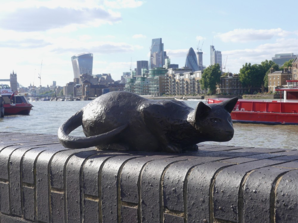
Dr Salter’s imaginary cat statue

Indeed:

I took all these statue photos yesterday, in a walk with GodDaughter 2 that I have already referred to, which started at the Shard (see below), Tower Bridge, and nearby places, and ended … well, quite a way downstream.

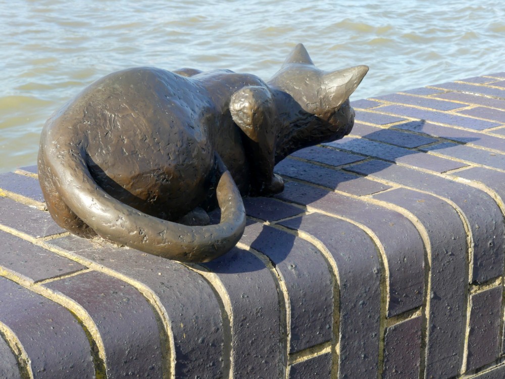
As often happens, my favourite photo of this subject was the first one I took. But I also liked this next one, which neglects what seems to be the usual Big Things of The City background and adds only wall and water:

The explanation of the rather odd title of this posting is that what we have here is not so much a group of statues as a drama acted out by a group of statues. Dr Salter (see below) is looking on at his small daughter, and at her cat. But it is all taking place in his imagination, because the small daughter died tragically young. It is all very well explained, with more pictures, here. Follow that link, and you’ll even find a map of exactly where this all is.

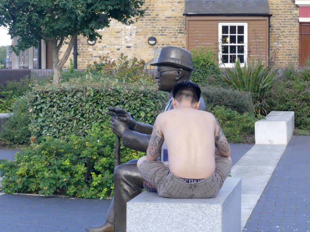
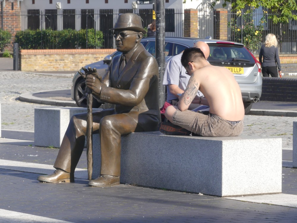
The drama gets an extra layer of drama, because the original statue of Dr Salter was stolen, for its value as scrap metal. I think I preferred the stolen one, but here is the replacement, with the addition of a young man with tattoos:

The tattoos on the front of that guy were remarkable, and I regret now not asking him to let me photo them. I know, I know, creepy. But if he had said yes, I would have been delighted, and if he had said no that’s creepy, I’d have got over it.

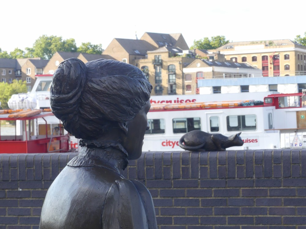
Mrs (Ada) Salter also looks on, and these two headshots of her came out quite well too:

While taking these photos, or maybe it was a bit later, I found myself musing aloud to GD2 (with her agreeing) that people seem greatly to prefer statues that are very clearly statues, made out of some sort of monochrome material such as stone or metal, rather than something more realistically coloured, a fact which has, from time to time, puzzled me. Were the latter procedure to be followed, people wouldn’t be able to tell the difference between statues and actual people, and this would freak them out.

A “realistic” painting or photo of a person is actually not realistic at all. People are complicated in shape. Paintings and photos are flat. So, if you encounter a photo or a painting of a person, even if it’s life size, there is no possibility that you will be duped into introducing yourself to it or asking it for directions. But if you encounter a genuinely realistic 3D statue of a person, only its deeply unnatural stillness would eventually tell you that this is not a real person. And this would be awkward to be dealing with on a regular basis.

A giant statue of someone, realistically coloured, might be okay. After all, miniature statues (go into any toy shop or gift shop to see what I mean) already are okay. Just as with a tiny but realistically coloured person statue, you could tell at once that a giant realistically coloured person statue was only a statue rather than a real person.

A giant cat statue, on the other hand, probably wouldn’t be a good idea. People might think: Woooaaarrrrgggghhh!!! A giant cat!!! Get me out of here now!

Originally posted at Brian Micklethwait’s Old Blog

X lights the spot

Earlier this month I was in the Hackney Wick area. My object was to check out that particular stretch of water known as the Hertford Union Canal, which is the straight line of water that connects what describes itself on maps as “River Lee Navigation”, at the bit of that next to the Olympic Park, to the Regency Canal, at the bit of that at the south west end of Victoria Park. The Hertford Union Canal marks the southern edge of Victoria Park.

And I duly checked it out. As I said in that earlier posting, there’s a lot of graffiti in that part of London, and the Hertford Union Canal is also thus decorated. Or violated, if that’s how you feel about graffiti.

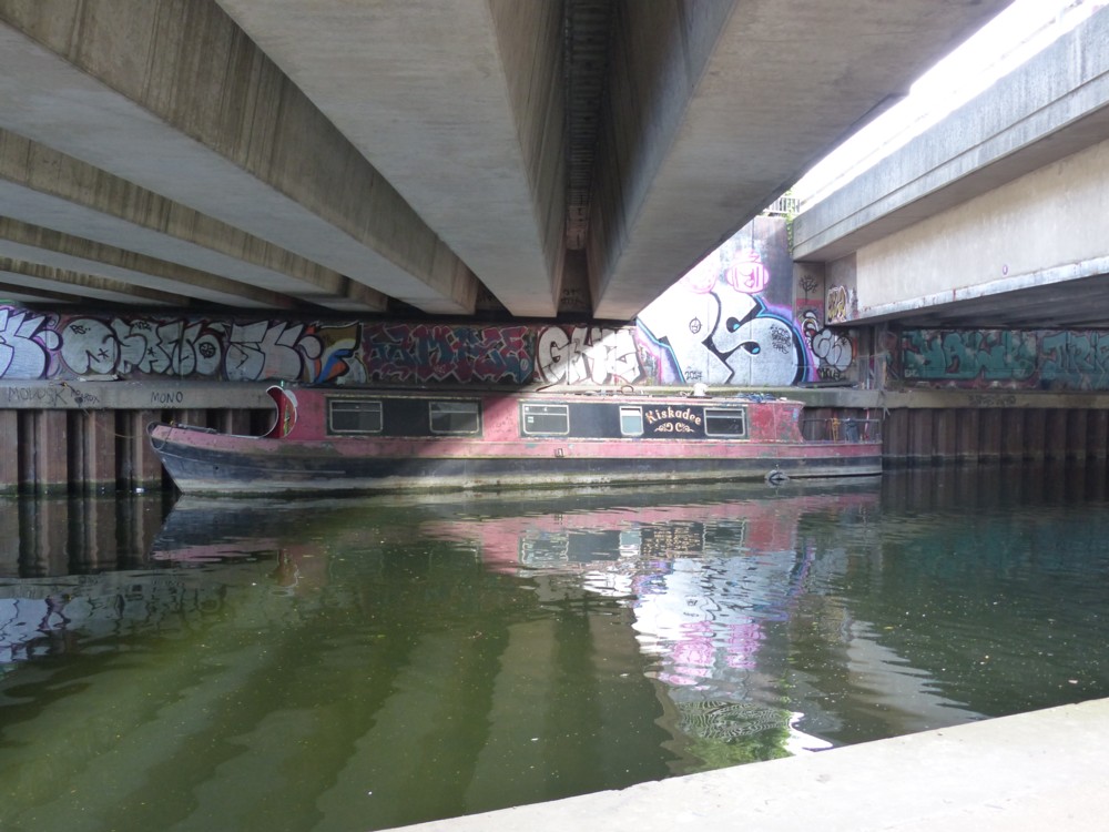
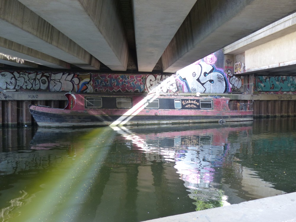
Here is an example of the graffiti to be seen, this time under some bridges which take the A12 and a local road alongside it across the canal:

However, by the time I took that photo the ubiquitous graffiti had ceased any longer to register. What I was interested in was the light. Photography is light.

And look what the light did next:

A mere splurge of light has been sharpened, presumably by the sunlight no longer being diffused by a cloud, and it is then being sliced into two distinct sheets of light by some kind of roadside fence or barrier (which you can dimly see in the top picture above).

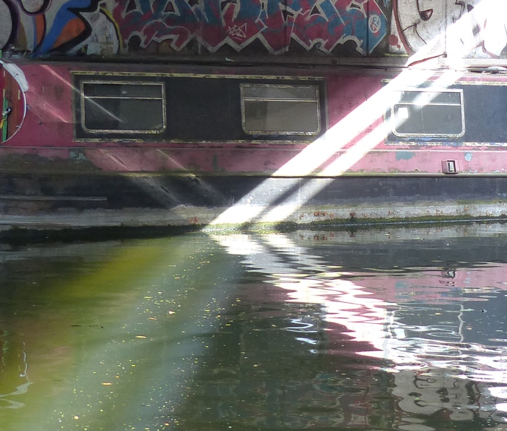
Let’s take a closer look at that light, and what happens to it when it hits the canal:

Okay, let’s itemise what’s happening there. We have here an X, with four arms.

Top right arm: the light slices between the bridges and hits the wall on the far side of the canal, and the boat parked on the far side of the canal.

Bottom right: what happens top right is bounced off the water on its way to me, rather than bouncing directly to me off the far wall and directly off the boat.

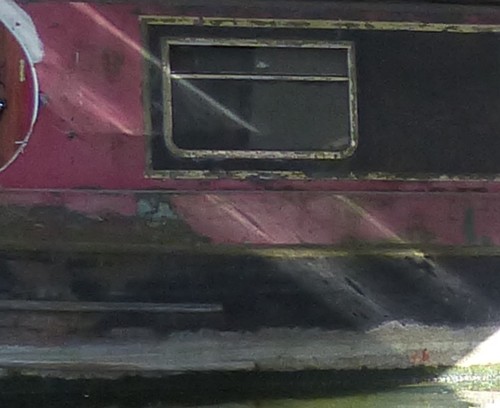
Top left, and now it starts getting a bit confusing:

I think what we see there is the light bouncing off the water into the boat.

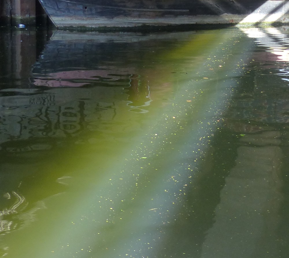
And bottom left? Now I’m becoming even more confused:

What I think we see there is the light directly striking the surface of the water, lighting up all the particles floating on it, and also penetrating the water and turning it green.

If someone painted a picture looking like all that, we’d say: you’re taking the piss. Nothing looks like that. But, it did.

Originally posted at Brian Micklethwait’s Old Blog

Meanwhile in East London …

Indeed:

Click on that sliver of horizontality to see the building in question.

No doubt this has already received much www attention. And now, I attend to it. Photos taken by me, outside Hampton Wick Overground Station, yesterday.

The graffiti in the Hampton Hackney Wick and surrounding areas is dispiritingly ubiquitous. I prefer the way my part of town handles graffiti, which is for it all to happen in a tunnel.

Originally posted at Brian Micklethwait’s Old Blog