Photoed by me in Leake Street, a week ago:
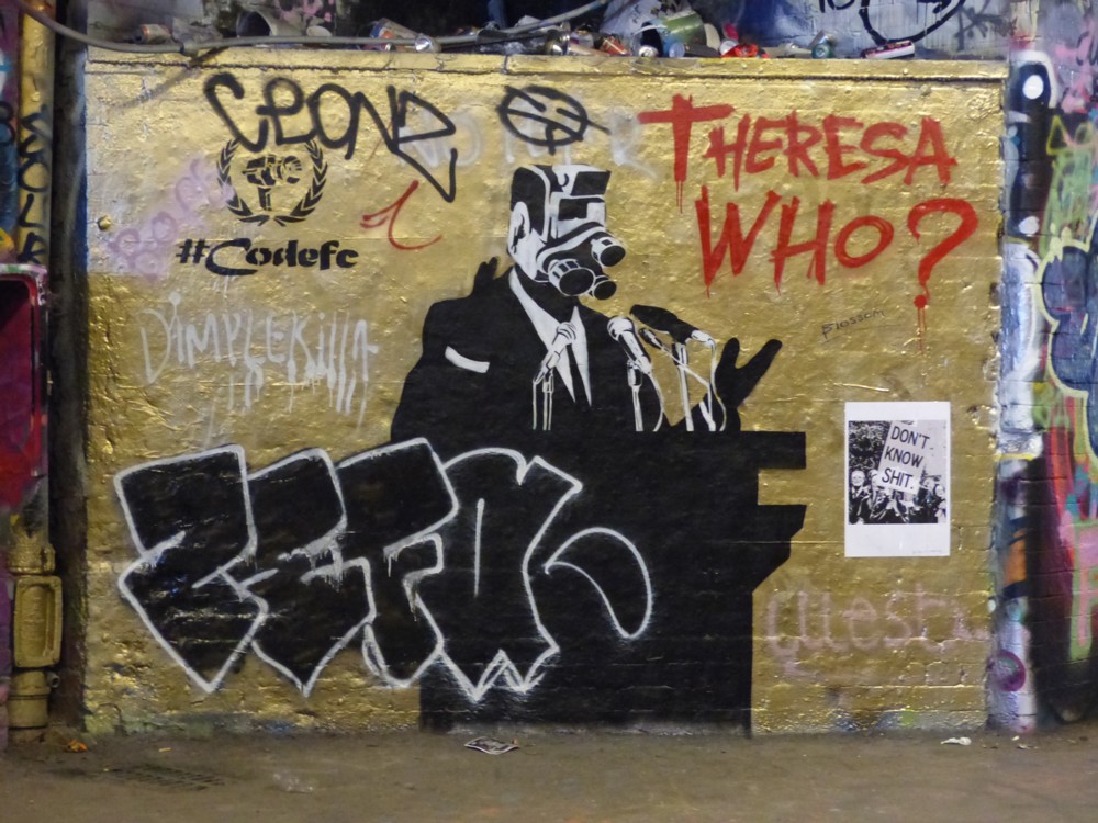
I have no idea what most of the stuff in this photo is about, but the Theresa Who? That certainly looks like happening pretty soon.

Photoed by me in Leake Street, a week ago:
I have no idea what most of the stuff in this photo is about, but the Theresa Who? That certainly looks like happening pretty soon.
Today I journeyed to Waterloo, and then walked from Waterloo to the City, there to inspect the latest batch of City Big Things that they are busy erecting. My inspecting done, I made my weary way to Monument Tube Station, which I reached just as it was starting to rain.
And Monument Tube Station was shut. No District Line. The City is like a morgue at the weekend, that being why I chose the weekend to be there. I wanted to see buildings, not people. The City being the City, there were no buses to anywhere, or not that I could detect. So I trudged, in the rain, as it got heavier, across the river, intending to get to Southwark Tube if all else failed. I did have my umbrella with me, thank goodness, but rain with an umbrella is still far worse than no rain. But then a bus showed up on its way to Waterloo, and at Waterloo I quickly found another bus back home, near enough. So there I was, home, damp, knackered. It could have been far, far worse, but I was still in no state to be doing anything fancy here.
So, here is just one photo that I took today, in Leake Street, right at the beginning of my wanderings. Leake Street is the graffiti tunnel under Waterloo:

Photoers, surprise surprise. But, I like it.
I took a lot of other photos that I like. Later, maybe, although I promise nothing.
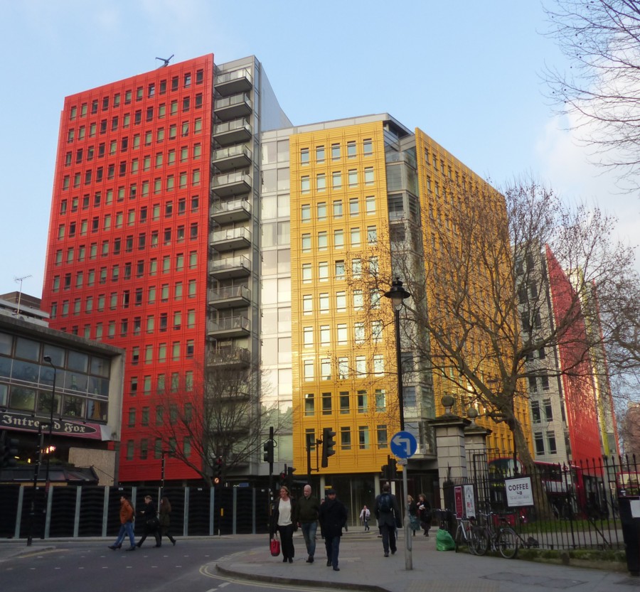
Here is a piece I did here about how Modernism got associated with whiteness. And for most would-be Modernists, Modernism still is white. But, here is another piece I did about coloured Modernism, in the form of Renzo Piano’s very colourful buildings near Centre Point. (Renzo Piano also designed the Shard.)
Here is another photo I took of these, I think, delightful edifices:
And here is a faked-up picture I came across not long ago, which suggests that Piano’s colourfulness may have struck a chord with other architects:
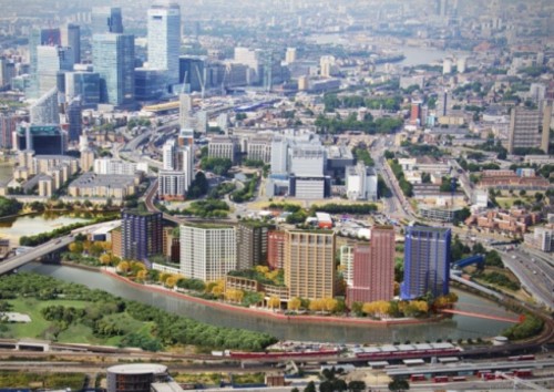
That picture adorns a report about the footbridge that you can see on the right of the picture, the very same one that I saw being installed last August. But I think you will agree that the towers on the Island there are a definite echo of that Pianistic colour.
The great thing about coloured architecture is that you can build the most severely functional lumps, and only worry about brightening them up afterwards. Form can colour function, and then colour can cover up the form and make it fun.
But it need not stop at just having one plain colour. Soon the artists will join in, and there will be giant murals.
If I had to place a bet about how different London will look from now in thirty year’s time, this would be the change I would bet on. Both new buildings and dull old ones will be much more brightly coloured.
I’m guessing that outdoor paint is a technology that has had a lot of work done on it in recent years, and that such work continues.
I will be interested to see if those Piano office blocks become faded, or if the colour stays bright for a decent time.
Interestingly Le Corbusier was a great one for colour being slapped on Modern buildings, but the notion never really caught on. Or rather, it is only now catching on.
As is illustrated in this posting at Material Girls. Where the point is also made that another huge influence on the monochrome association with Modernism was early and black-and-white photography. Even colourfully painted buildings didn’t look coloured in the photos. (One might add that newspapers and magazines only burst into colour after WW2, in the case of newspapers only in the 1960s. Until then, all newspaper and magazine photos were printed in black and white. So even if Modernism was done in colour, its influence spread in black and white.)
Now, colourful buildings tend to look colourful, both for real, and in the photos.
I have already quoted a couple of interesting bits from Bill Bryson’s excellent book, At Home. I have now finished reading this, but just before I did, I encountered some interesting stuff about paint (pp. 453-5):
When paints became popular, people wanted them to be as vivid as they could possibly be made. The restrained colours that we associate with the Georgian period in Britain, or Colonial period in America, are a consequence of fading, not decorative restraint. In 1979, when Mount Vernon began a programme of repainting the interiors in faithful colours, ‘people came and just yelled at us’, Dennis Pogue, the curator, told me with a grin when I visited. ‘They told us we were making Mount Vernon garish. They were right – we were. But that’s just because that’s the way it was. It was hard for a lot of people to accept that what we were doing was faithful restoration.
‘Even now paint charts for Colonial-style paints virtually always show the colours from the period as muted. In fact, colours were actually nearly always quite deep and sometimes even startling. The richer a colour you could get, the more you tended to be admired. For one thing, rich colours generally denoted expense, since you needed a lot of pigment to make them. Also, you need to remember that often these colours were seen by candlelight, so they needed to be more forceful to have any kind of impact in muted light.’
The effect is now repeated at Monticello, where several of the rooms are of the most vivid yellows and greens. Suddenly George Washington and Thomas Jefferson come across as having the decorative instincts of hippies. In fact, however, compared with what followed they were exceedingly restrained.
When the first ready-mixed paints came on to the market in the second half of the nineteenth century, people slapped them on with something like wild abandon. It became fashionable not just to have powerfully bright colours in the home, but to have as many as seven or eight colours in a single room.
If we looked closely, however, we would be surprised to note that two very basic colours didn’t exist at all in Mr Marsham’s day: a good white and a good black. The brightest white available was a rather dull off-white, and although whites improved through the nineteenth century, it wasn’t until the 1940s, with the addition of titanium dioxide to paints, that really strong, lasting whites became available. The absence of a good white paint would have been doubly noticeable in early New England, for the Puritans not only had no white paint but didn’t believe in painting anyway. (They thought it was showy.) So all those gleaming white churches we associate with New England towns are in fact a comparatively recent phenomenon.
Also missing from the painter’s palette was a strong black. Permanent black paint, distilled from tar and pitch, wasn’t popularly available until the late nineteenth century. So all the glossy black front doors, railings, gates, lampposts, gutters, downpipes and other fittings that are such an elemental feature of London’s streets today are actually quite recent. If we were to be thrust back in time to Dickens’s London, one of the most startling differences to greet us would be the absence of black painted surfaces. In the time of Dickens, almost all ironwork was green, light blue or dull grey.
Famously, the rise of the Modern Movement in Architecture was triggered by, among many other things, a revulsion against the excesses of Victorian-era decoration, especially architectural decoration. Decoration became mechanised, and thus both much more common and much less meaningful. What did all this mechanised decoration prove, what did it mean, when you could thrash it out with no more difficulty than you could erect a plain wall?
What the above Bryson quote strongly suggests, at any rate to me, is that something rather similar happened with colour.
Why is the overwhelming atmosphere of Modernist architecture and architectural propaganda so very monochrome, still. Part of the answer is that it was only recently learned how to do monochrome. Monochrome looked modern, from about 1900-ish onwards, because it was modern. Monochrome was the latest thing. Colour, meanwhile, had become much cheaper and had been used with garish nouveau riche excess, and there was a reaction to that also, just as there was to excessive decoration.