Roof clutter viewed through an RCM window

Yesterday I attended a Master Class at the Royal College of Music, in which five singing students, GodDaughter 2 among them, were publicly instructed by distinguished tenor and vocal teacher Dennis O’Neil. It was fascinating. He spent most of the time focussing on the art that conceals art, which meant that I couldn’t really understand what he was saying. The minutiae of sounds and syllables, and of where the sound comes from, in the head or in the body. All like a foreign language to me, but it was fascinating to expand the range of my ignorance, so to speak. I am now ignorant about a whole lot more than I was.

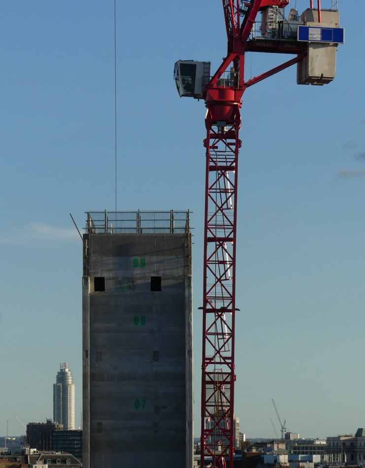
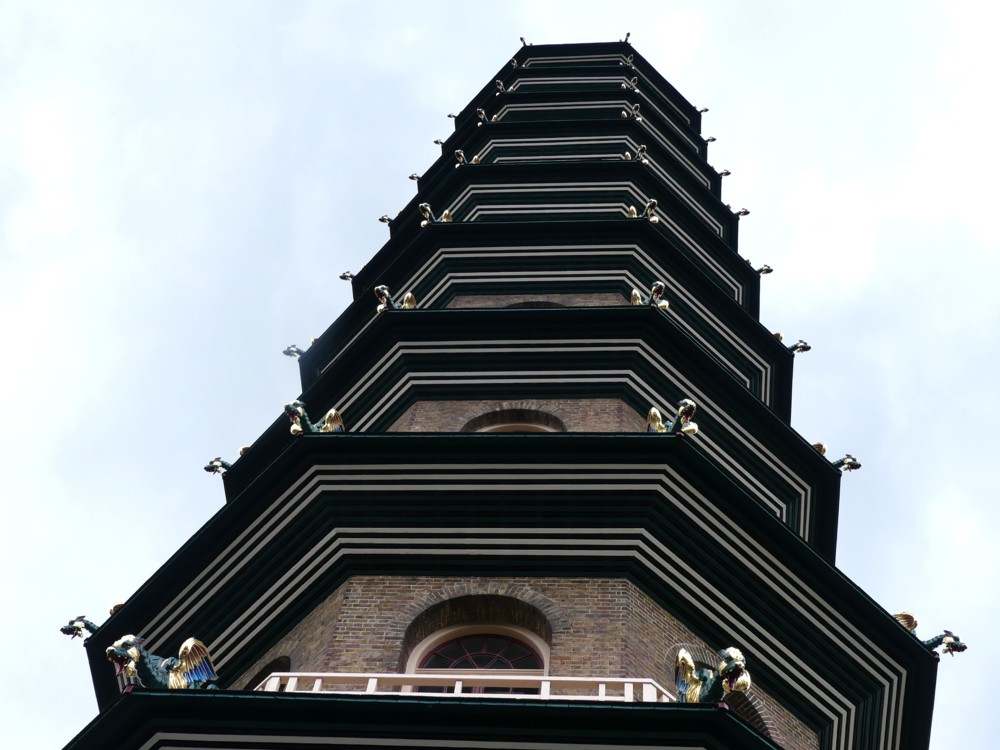
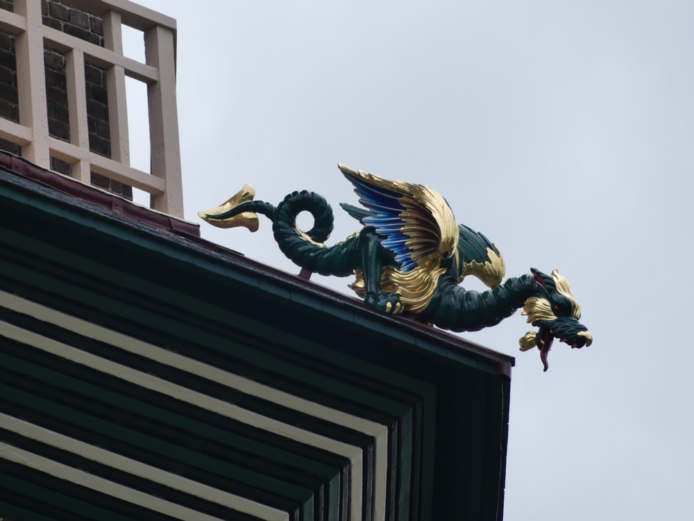
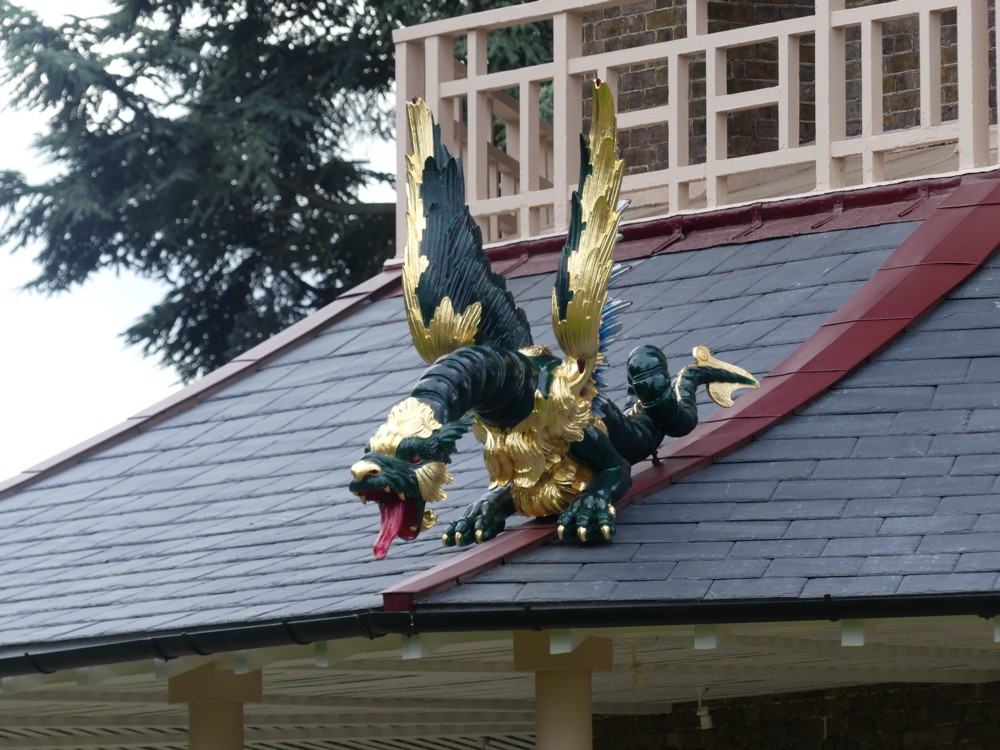
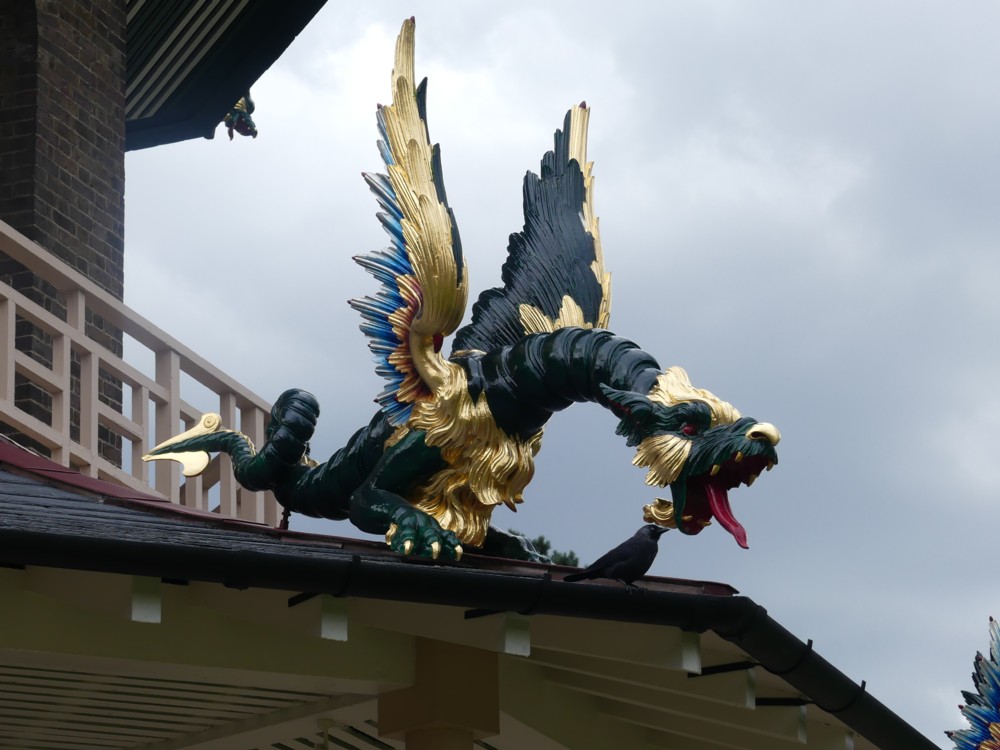
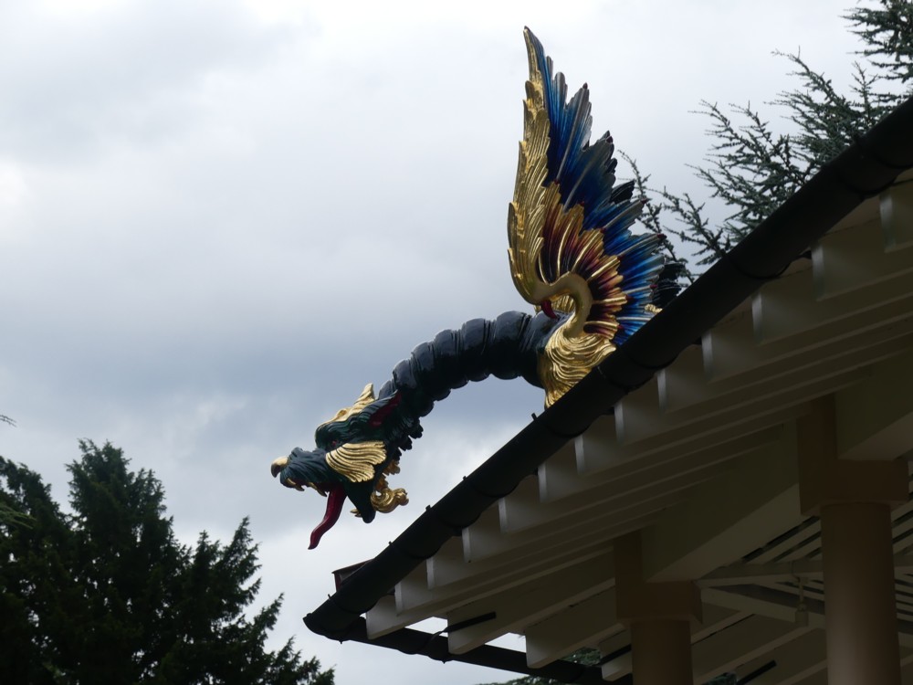
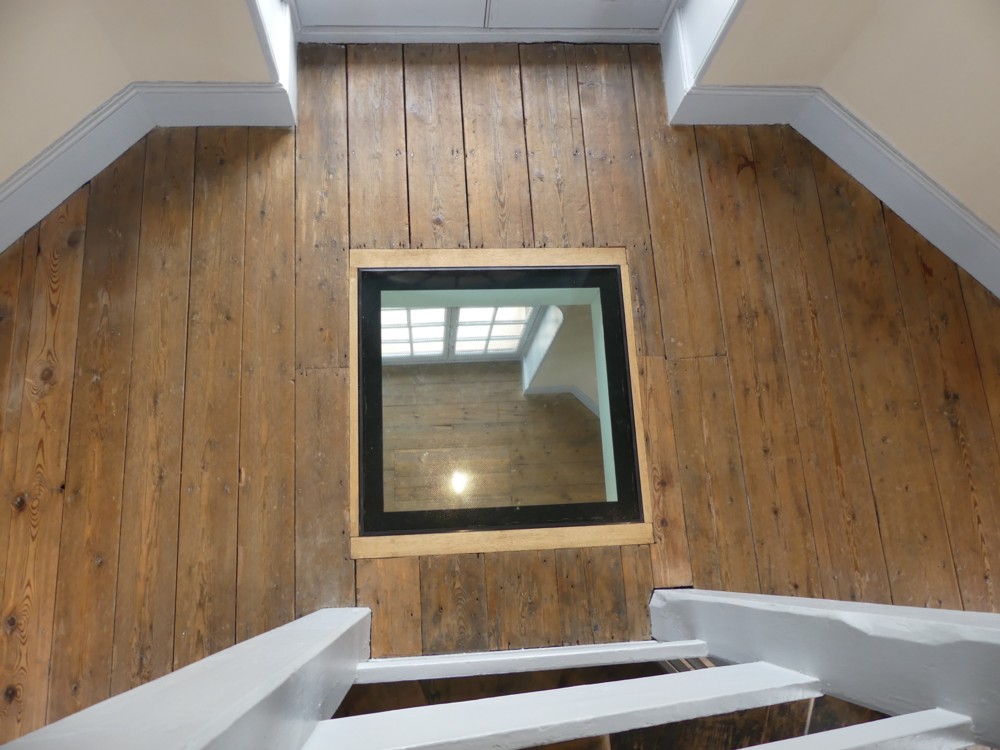
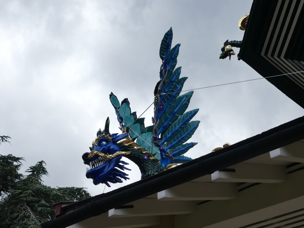
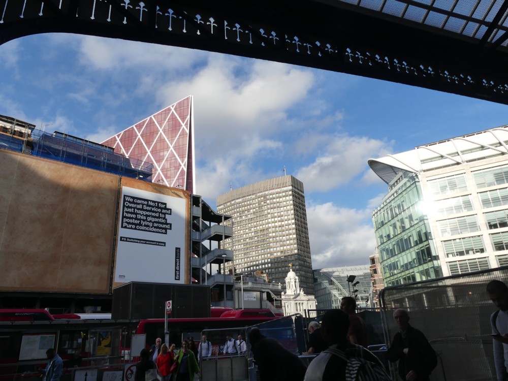
This all happened way down at the bottom of the RCM, in the Britten Theatre (which you go down to get into but the theatre itself stretches up to the top again), On the way back up the numerous stairs to the street level entrance, I saw, through a very grubby window, and photoed, this:

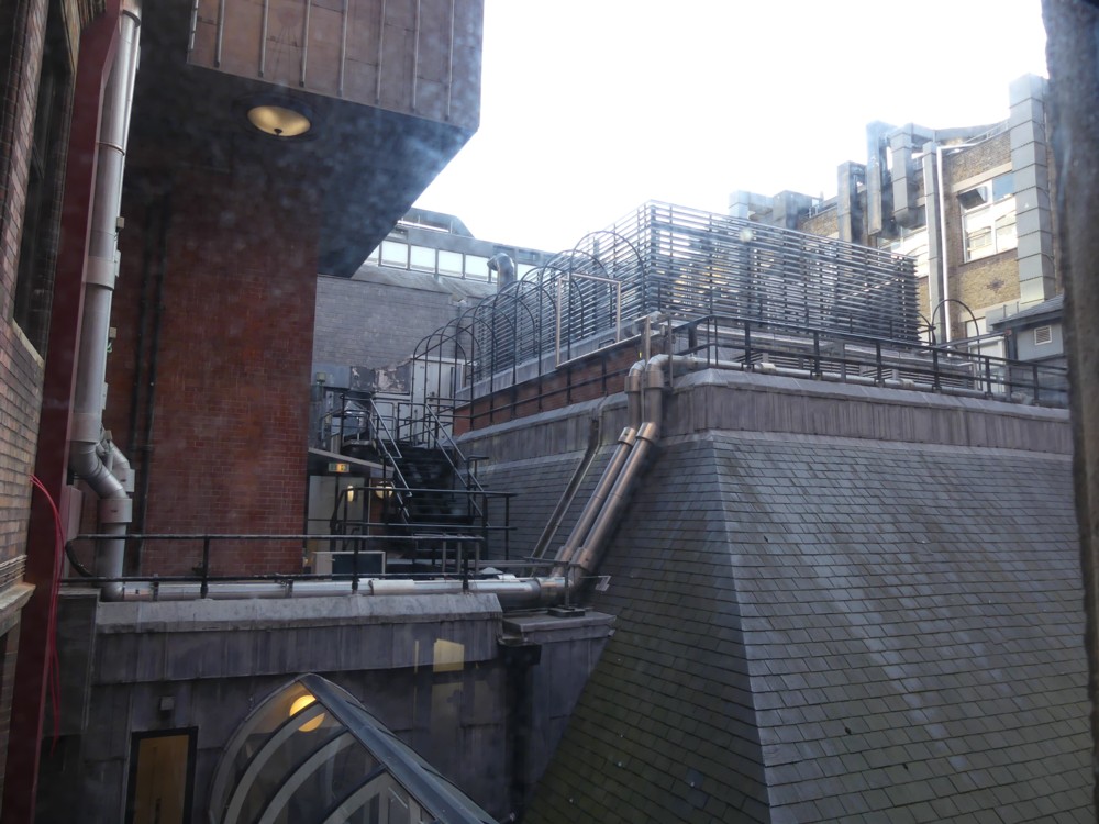
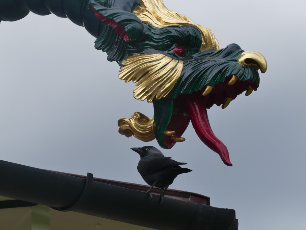
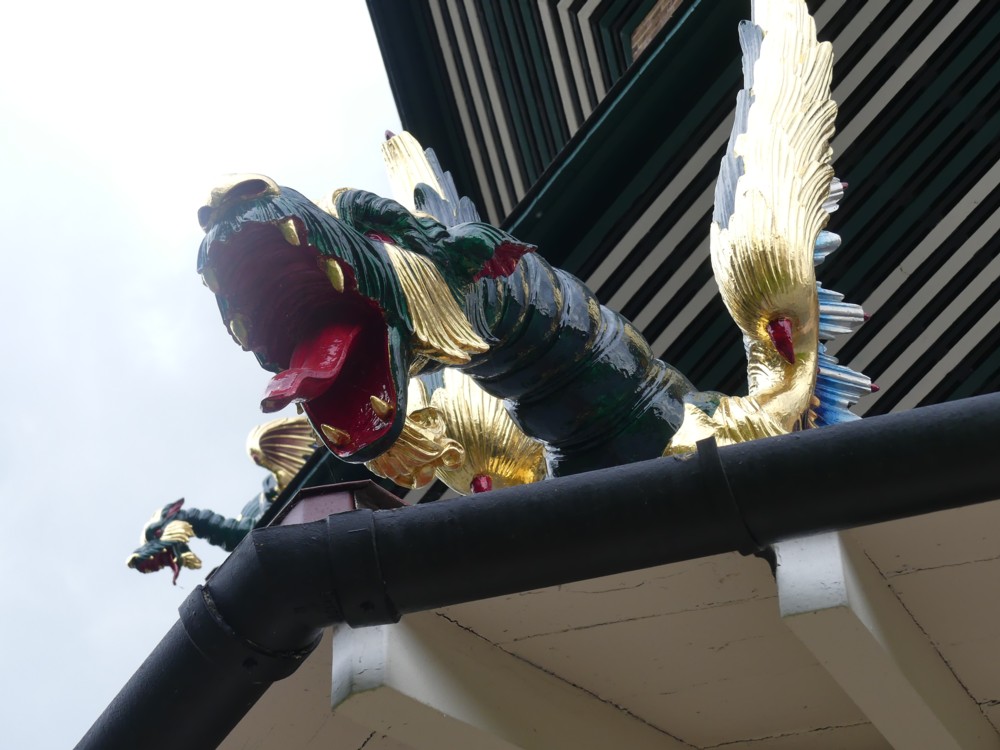
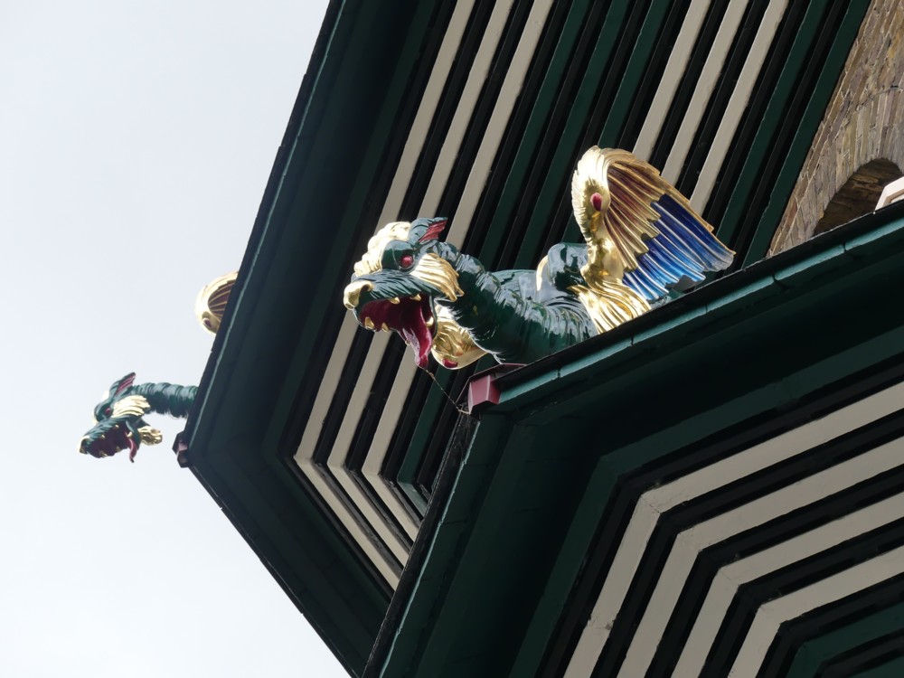
Okay the window is indeed very grubby, but, you know, how about that? All that roof clutter, buried in the middle of the College. Although, I think that this particular clutter is part of Imperial College, which is next door.

Backstage architecture, you might say.

The Royal College of Music is as amazing an accumulation of architectural chaos as I have ever experienced. It must take about half of your first year to learn where everything is, and years later you are probably still getting surprises. I never knew this was here! Etc.

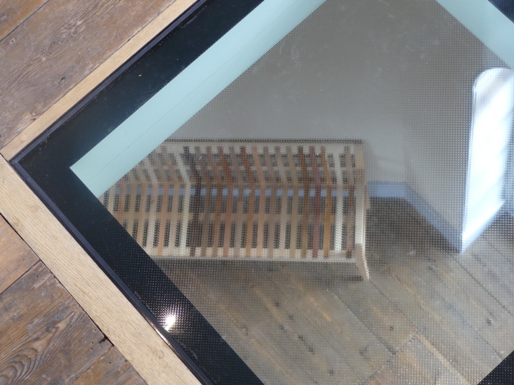
That corridor made of windows, bottom left, with the light in it, is something I have several times walked along, to a canteen or a bar or some such thing, I think. By which I mean that I think I have walked along it, but that this could be quite wrong. Like I say: architectural chaos. I took a look at the place in Google Maps 3D, but I still have only the dimmest Idea of where I was on the map.

The night before, I was at the Barbican Centre, also for some music, and that’s almost as architecturally chaotic as the inside of the RCM. But there, they don’t have the excuse that the architectural chaos accumulated over about a century of continuous improvisation. At the Barbican, the chaos was all designed and built in one go.

Originally posted at Brian Micklethwait’s Old Blog

150 great things about the Underground: Number 122

This:

Photoed by me last night. And explained here. The Metropolitan Line came up with this logo just after the regular London Underground logo was devised. Now this version of it survives, but only on platforms at Moorgate that are no longer used.

Weird.

In the twentieth century, weird is all it would have been. Then forgotten. Just another of life’s little mysteries. But, in the age of the internet, there are no little mysteries.

Originally posted at Brian Micklethwait’s Old Blog

What electrified track looks like when they really turn up the electricity

Photoed by me last night, at Blackwall DLR station:

It’s not really that of course. It’s just that I have learned that one of the best ways to photo a sunset is to photo railway tracks that are disappearing into it.

Originally posted at Brian Micklethwait’s Old Blog

TIL about TIL

TIL that TIL stands for “Today I learned”.

First word in this, which is about piles. IL more about piles here and here.

Originally posted at Brian Micklethwait’s Old Blog

67 & 541 – 477/8d & 134/9

For the last four days I have been following Surrey v Essex at the Oval, on Cricinfo mostly. The scores alone were remarkable, hence my title above. Those who do not know cricket should know that, to those who do know cricket, the mere numbers above are truly astounding.

Famed Surrey commentator Churchy couldn’t take his eyes off it:

That’s him on the left. Don’t know who the other bloke is. Kevin Howells? See also this (about the effect on the face of photoing someone from really close-up). And the second of these two guys (both saying: well done Surrey) is another in-your-face face.

Given how good the weather forecasts were (and given how good weather forecasts are) I thought about going there. But I still suspect that, had I done so, a cascade of butterfly effects would have been set in motion, and Surrey would have lost by an innings and about three hundred early on day three, instead of by a mere one wicket on the afternoon of day four, having looked, towards the end, well capable of snatching a win.

Anyone who thinks that only winning matters in sport should ponder how much happier a Surrey fan like me is about this game as it finally turned out, compared to how grumpy I would have been if it really had ended early on day three. Still an Essex win. Same number of Championship points to both sides. Surrey still win the Championship anyway. But what an abject anti-climax that would have been. And what a great actual-climax to the season it actually was.

Had the County Championship still been at stake, and had it depended on this result, I could not have endured it. But, if the Championship had been at stake, it would, I think, have been an entirely different game. Intrinsic to the amazing Surrey recovery was that this was … only a game. Thus did it end up being a great game, because only a game.

I really want to remember this one, hence this posting.

Originally posted at Brian Micklethwait’s Old Blog

Another leaning crane

This phenomenon continues to trouble me. Intellectually, I know that the people supervising these circumstances have them all under control. If ever there was a trade in Britain that knows what it is doing, it is the big city building trade. Things get done on time, all according to plan, and the results work as intended. And cranes do not fall over. (The financing can go all over the shop, which means that plans can change dramatically, but that’s a different story.)

But it still feels to me as if this crane might fall over. It still feels to me that, at any moment, something near the ground, on the left as we look, just might … SNAP!!!!:

So, another for the collection. Photoed by me the day before yesterday, from the Rooftop of John Lewis.

I don’t generally do Photoshop(clone)ing, but some rotation was necessary with this one. In my original, the crane was completely vertical. And everything else: not.

Originally posted at Brian Micklethwait’s Old Blog

Art and information

Maybe “art” is putting it a bit strongly, but nevertheless, I do really like this photo …:

… which I took in the summer of 2015, somewhere in the City of London. The directory I found this in is called “Looking4BroadgateTower”, so that tells you roughly where I was.

BMdotcom-wise, this photo has so many boxes ticked.

– First things first: cranes. In this case, crane towers. BMmmmmm.

– Reinforcing rods, sticking out the top of the lump like vegetation. Reinforcement: insufficiently sung heroism of modernity.

– A crane tower shadow, on …

– … that material they shove over …

– … scaffolding.

– That monochrome thing that happens during sunsets. And – who can say? – maybe even during sunrises.

– The way that sunlight hits crane towers and just lights them up, which I so often try to get and so seldom manage to get.

– Lots of horizontals and verticals, made possible not by Photoshop(clone)ing but by the excellent zoom lens on my nearly-but-actually-not-SLR camera, with its one brilliant super-zoomy lens.

So, lots to like there. But what and where was this? This is the kind of thing I like to know.

Luckily, I took informational photos, as well as arty photos like that above. Always, when out taking photos like the above, take lots of photos which are not for art, but for information about that art. I need to keep telling myself, because often I fail to do this.

I fail, that is to say, to take photos like this …:

… which scores about zero for artistic impression, but which tells me what all that art in the first photo above actually was.

In the above (information) photo we see the same crane towers and the same lump, but viewed side on. It’s definitely the same stuff.

There’s even a name and a website to be seen, if you crop it, and then expand it to be 500 pixels across, like this:

So, there we have it. It’s the earlier stages of this. Once you have the words to describe what you want to learn about, the internet suddenly starts to work.

This being this:

My best guess is that the lump of art in the first photo in this posting is somewhere in the middle of the more complicated computerised Thing on the right.

Originally posted at Brian Micklethwait’s Old Blog

The Great Pagoda of Kew Gardens – and its dragons

The high point, literally, of the expedition that GodDaughter2 and I made to Kew Gardens back in August was our exploration of the Great Pagoda.

From the top of the Great Pagoda, you can see the Big Things of Central London. But what the Great Pagoda itself looks like is also worth examining.

Here is an early view we had of it:

And here is how it looked when we got closer:

The Daily Mail describes the Great Pagoda as Britain’s First Skyscraper.

Now look how it looked when we got closer still:

So, what are those sticky-outy things on the corners of each sticky-outy roof?

That’s right, dragons. And we’re not talking merely inflated dragons. These are solid looking and scary. You couldn’t kill these dragons with a mere pin prick, and you wouldn’t dare to try.

Most of the Great Pagoda dragons look like this:

We discovered when we got there that the recent restoration of this Great Pagoda had, only a few weeks before our visit, been completed. We got very lucky with that.

Read more about these dragons, and about the Pagoda that they now guard, in this Guardian report.

This Great Pagoda, London’s very first Big Thing, was built by Sir William Chambers in 1762. The dragons were a feature of the original Pagoda, but in 1784 they were removed. Being made of wood, and following a burst of wet weather, they had started to rot.

Wikipedia says that Kew Gardens was adopted as a national botanical garden in 1840. Would that be when the Pagoda was opened to the general public? Whenever exactly that was, Kew Gardens and the Great Pagoda have been what we now call visitor attractions for quite a while now.

During World War 2, the Great Pagoda was used to test bombs. You can still see one of the holes they made in all the floors, to allow the bombs to fall. Keeping that for everyone to see now is a nice touch, I think.

Kew Gardens contains lots of greenery, and green stuff on sticks. What do they call those things? Trees. Kew Gardens has lots and lots of trees, of many different brands.

So, on the left here, the hole in the floor. On the right there, the seat made from many trees:

And in the middle, the seat, seen through the hole.

But back to those dragons. The old rotting dragons have now been almost entirely replaced by 3D printed dragons, which look solid but which are actually far lighter than the old-time originals.

On the lowest roof, right near the ground, there was a different sort of dragon, which looked like this:

I wonder what the story was of that one, for there did indeed seem to be only one such blue dragon. Had the original plan been to make all the dragons like that one? But did its structural weakness cause them to abandon that plan, and go with the other darker green dragon with its scary red tongue, and with its rather more solid wings? Don’t know, but whatever the story is, the winning dragon design is pretty good also.

Everything about how the Great Pagoda looks, inside as well as its exterior, says: class. This is a visitor attraction that I warmly recommend. There is no lift, not originally of course, and not now, but the steps, although quite numerous, are at a comfortably mild angle – rather than, say, like the ones in the Monument. Even better, each flight of steps you go up causes you to reach another actual floor, of the sort you can stand on, with windows looking outwards. So, oldies like me can go up two floors, say, and then have a comfortable breather, without blocking anyone else on the stairs. If we are on the right floor, we can even use that multi-treed seat (see above).

The weather on the day that GD2 and I visited Kew Gardens was not perfect. The dragons look rather dark and menacing in my photos. But that look works, I think. And as days out go, this day out was pretty much perfect.

Originally posted at Brian Micklethwait’s Old Blog

Pavlova in front of “Portland House”

Yesterday I was in Victoria Station, and as I emerged from it into … that mess of activity outside the front entrance, I noticed that the light seemed particularly appealing. At first what got my attention was the combined effect of the mess in the foreground, in the dark, and the assorted Medium Sized Things in the background, totally mismatched and just jambed down together in the London style, all illuminated. (See photos 1.1 and 1.2 below.)

But then, I found myself zeroing in, yet again, on Pavlova. What got me noticing her was that, finally, I seemed to have found the right moment to photo her with that big concrete lump that calls itself “Portland House” behind her. I have done this a lot, but it has never worked until now. This time, there was a shadow behind Pavlova, while Pavlova herself, and the dwarfed-by-modernity theatre on the top of which Pavlova dances, were both picked out by the light, a combination of circumstances I have never before encountered, or if I did I didn’t notice.

I took many photos of this effect. Partly because I can’t decide which one I like best, and partly because I think these photos look good when small, here are 3×3=9 of them:

Maybe the Wikipedia entry for Portland House does say who originally designed this unlovely edifice, but if it does, I couldn’t find that. Wikipedia does note, however, that Portland House is a miniature rip-off of the Pan Am Building in New York, now called something else.

Further googling got me to a piece by Mike Higginbottom entitled Pan-Am’s London sibling. He rather likes it. Plus, he name checks the now pretty much forgotten architect of said sibling: Howard Fairbairn & Partners. Modern Movement hulks by big name modernists sometimes have a certain in-your-face impact and memorability about them. But this hulk has always seemed to me to epitomise Modern Movementism at its dreariest. It’s not even “brutal”, just big, bland and boring. I greatly prefer Nova, the red diagonalised Medium Sized Thing nearby, which is also to be seen in photos 1.1 and 1.2 above.

Originally posted at Brian Micklethwait’s Old Blog

A lorry brings reinforcements

And no, I don’t mean reinforcements for an army. I mean the kind of reinforcements that end up buried in concrete.

Like these ones:

All six of these photos also feature one of the more impressive scaffolding arrays near me just now. The art of scaffolding and the art of creating reinforcements for structural concrete have much in common. Both involve putting together lots of bits of metal. Both need to result in a structure that stays put and does not collapse. Both look pretty to people like me.

But there are also big differences. Scaffolding is very visible, and it remains visible for the duration of its working existence. Scaffolding thus proclaims itself to the world, by its very existence. That we live in a golden age of scaffolding is obvious to all of us, whether we like this fact or hate it.

Also, scaffolding rather quickly punishes those who erect it, if they don’t do it right. While creating scaffolding, scaffolders make use of the scaffolding they have just been constructing, and they are their own first users. They thus have a literally inbuilt incentive to do their work well. And if they don’t, it is not that hard for others to spot this. Bad scaffolding wobbles. Such are my surmises about scaffolding.

Reinforcements for concrete are something else again. By the time they go to work, doing the job they were built for, everyone concerned had better be damn sure that they have done their work well. But, if they haven’t, the disastrous consequences of that bad work may take years to happen, and even then to be controversial. Who is to say exactly what caused a building to collapse? And if the building collapses rather catastrophically, it is liable to destroy a lot of the evidence of what exactly happened, and why. Investigating such catastrophes being a whole separate job in itself. So, getting these reinforcements right, with an inbuilt regime of testing and inspection and supervision, all managed by morally upright people whose declarations of confidence in what they have been inspecting can be relied upon, is a whole distinct industry.

But, this is an industry whose products, by their nature, end up being invisible. We all rely on such work being done correctly, not just “structurally” but also in a morally correct manner. Yet, we mostly never see this work, only its indirect results.

So, I hereby I celebrate the work, morally as well as merely technically good, that goes into the making of reinforcements for concrete. I salute the good men and true who make these (I think) beautiful objects, and who ensure that they perform faithfully. Their moral as well as technical excellence is all part of why I consider such reinforcements to be things of beauty.

I did some googling to try to determine exactly what reinforcements like those in my photos are used for. The lorry says R. SWAIN AND SONS on it. But they are hauliers, not makers of concrete reinforcements. The nearest I got to an answer was this photo, of objects just like those on my lorry, with this verbiage attached: “Prefabricated Piling Cages Made of Reinforced Bars On Site”. Prefabricated Piling cages. Piling sounds to me like foundations. (Yes.) The reinforcing has to be shoved down a hole in one go. It can’t be constructed bit by bit, in the hole. It either gets assembled beforehand on site, or, it gets assembled in a factory and taken to the site by lorry, as above.

The reinforcing that a structure needs when it is above ground, on the other hand, can be assembled on site, and I’m guessing that this is what usually happens.

Just guessing, you understand. My first guess actually was: for an above ground structure, until I came upon the photo I just linked to, and not foundations. But, what do I know?

Originally posted at Brian Micklethwait’s Old Blog