Dame Edna and Borats in Piccadilly Circus!

So today (yesterday by the clock but this is only the small hours and not really tomorrow yet) I was in Piccadilly Circus, London, and I spotted and snapped a celebrity:

Yes it was Dame Edna:

I know, the sunlight all behind her. But what could I do? Move the sun round to behind me? Run round to the other side of the car? Not strong enough or clever enough, and no time. But at least the traffic forced her to stop right next to where I was. Had this happened during the early days of the Congestion Charge, she’d have been there and gone in a blur.

Could this personal appearance in full war paint be something to do with this? She was evidently being filmed as she travelled on her stately way. I’m pretty sure that that definitely-not-Billion-Monkey-type camera was attached to her car, although you can’t be sure just from my shot of the arrangement.

I was only passing through Piccadilly, having other business to attend to. But when that was done, I came back for more, hope that lightning might strike twice. And it did, in the form of these peculiar circumstances:

Those bottoms are advertising the Borat DVD, in which Borat himself dressed like this. Or I presume he did. Maybe that was only for the promotional stuff. The Borats were cavorting and yelling in Boratese outside what used to be Tower Records in Piccadilly, and is now (I think) another Virgin mega-emporium. I of course photoed the photo-ers as well as the bottoms, that snap being the best of a (by then) rather dimly lit lot.

Originally posted at Brian Micklethwait’s Old Blog

Dirty vapour trail over London

A few days ago, I was out and about snapping, as is my wont, and I saw something rather unfamiliar in the sky over London, a dirty-looking vapour trail.

Vapour trails usually look white, as the older vapour trail that makes an X with this new one is. Something about the way vapour trails are usually lit makes them look white, against a blue sky. Mechanical clouds, you might say. And what could possibly be wrong with that? Vapour trails are just nice, clean steam.

But that one looks a whole lot dirtier, doesn’t it? And there’s the remnants of another, across the X, horizontally.

This was snapped just before it got dark, and I presume that has something to do with it. For some reason, this particular vapour trail was not lit. High clouds blocking the sun from it, but not blocking the sun from lighting us down on the ground? Or the older vapour trail, the one that’s white? I don’t know.

What I do know is that if vapour trails always looked this dark and dirty, there would surely have been a lot more talk about restricting air travel even than there is. Air travel would long ago have become more expensive.

Now, you could say that clouds are often this dark too, presumably for similar reasons. But clouds look natural. This vapour trail looks like mechanised evil spewing into the sky. It looks, in other words, just what the environmentalists have finally persuaded a lot of people that it is, despite usual appearances to the contrary.

Originally posted at Brian Micklethwait’s Old Blog

Shadow on the Shell Building

These pictures, taken about ten days ago, began life as a simple Billion Monkeys shot, of a guy using his mobile phone to take pictures of the wheel. But what he never saw, and what I didn’t see at first, was that the real story was behind him.

Usually I hate the Shell Building, which has now barged its way into undeserved picture postcard prominence through its proximity to the wondrous Wheel. But the evening sun does cast a lovely shadow on it, does it not?

I couldn’t decide which of these snaps showed the effect better, so here are both of them.

At first, these little pictures were going to be clickable on, to get them bigger. But I now think that the effect is clearer in a small picture than in a big one (rather in the way that blurry photos can look quite sharp on the small screens of Billion Monkey cameras), so small is all I show. And I now think, because the shadow is smaller, than the one on the left shows the effect better, but mucking about with this now would be further effort, and I want to go to bed.

Originally posted at Brian Micklethwait’s Old Blog

Blurry squirrel

When is a photo a bad photo? When it’s all blurry?

Well maybe so, but I rather like that blur. I’ve been rootling through my hard disc choosing pictures to print out for Christmas fun, and came across this squirrel cavorting about in St James’s Park. Click to get it a bit bigger, but no less blurry.

Originally posted at Brian Micklethwait’s Old Blog

Rolls Royces

Is there anyone in the world who reads this blog but not this one? Perhaps, but it seems improbable. On that off chance, this demographic should be sure not to miss this analysis of an epic car chase in one of those Confessions Of movies starring Robin Askwith.

That’s a seventies Rolls Royce going through a brick wall. It seems that Mark Holland also takes pictures off of his telly.

This is not a move I would care to try unless I owned a lot of Rolls Royces, and as it happens I don’t own even one. Frankly I think the wall would, in real life, have given a better account of itself.

But, I reckon the new German Panzer Roller would probably have done exactly that to it. For months I have been watching out for one of these in the streets of London, moving slowly enough for me to photo it. Nothing. Well, one, moving far too quickly. And then a few weeks ago I finally encountered one. It was parked outside the magnificently red bricked Westminster Cathedral (the Roman Catholic one in Victoria Street), ready to take away the Nigerian bride and groom from their magnificent Nigerian wedding. It was the best looking wedding I have ever chanced upon. Great hats. Ascot, forget it. It was as if the entire occasion had been organised for my entire benefit.

I may stick up more photos of that event anon, with hats, but I promise nothing. Sadly the light was not great, which is what has put me off doing this earlier.

I was expecting to find the new Roller overbearing and ugly. But I like it.

Originally posted at Brian Micklethwait’s Old Blog

Sunset in Hampstead

A week ago I was in Hampstead for a supper date with Jackie D and Antoine, and was somewhat delayed in my journey, by a sunset. All had seemed normal and grey and dreary when I set out on my journey from the heart of civilisation to the outer edge of 0207 land. But when I emerged from West Hampstead tube station, I encountered some extraordinary sunlight crashing in across the railway bridge. There was a break in the clouds right where the evening sun was. Out came the Canon S1 IS!

Trouble is, cheap digital cameras, at any rate in my hands, are not necessarily at their peak of performance in conditions like these. The drama in what you see is in the spectacular contrasts between the bright bits and the dark bits, between where the sun is and where the clouds are, or between the bright orange buildings lit up by the sun, and the dark clouds behind them. I’m sure there are ways of dealing with all that, knobs I could twiddle, but I don’t know about them properly.

Here is a photo which illustrates the problem.

Basically I just stuck my camera over the parapet and hoped for the best, and because of all the rails, regularly polished by trains, I got some nice effects. But look at that sunset! Just a blaze of pure white. It was more interesting than that, believe me.

The purple splodge is some kind of camera thingy effect, or so Bruce the Real Photographer told me when he dropped by. A more devoted Photoshopper than I, such as Bruce the Real Photographer, could remove it, but I am a puritan about Photoshop. I think Photoshop is for sizing, cropping, brightness, contrast, and nothing else. Cutting things out is Stalinism. It is also too much like hard work.

However, there were some photographable sunset effects to be observed, which I snapped away at more in hope than expecation, but which did come out quite well.

Click to get any of those bigger.

The light here is coming in under the high clouds and lighting up the interesting low clouds. I know, I know, you’ve already seen pretty sunsets. But for me, this was a little victory, and this blog is all about me and my needs.

Originally posted at Brian Micklethwait’s Old Blog

Lady photographer doing it in the road

Blatant quota posting, in the form of an intriguing little photography scene right near where I live, in Vincent Square, this afternoon, as I was walking home. Many is the time I have taken photos through those railings, often of things like the sun on the Wheel, or of Big Ben which can be seen above and beyond the cricket pavilion (which you can just see on the top left here) on the far side of the square.

I like how the Vincent Square sign is included. This is the exact picture I took, no cropping, even though I don’t remember giving any thought to that sign. I think it was just luck.

Click to get it bigger.

I like the shoes that the ladies are each wearing.

More opportunist photography from me here. I took that picture only minutes before taking this one.

Originally posted at Brian Micklethwait’s Old Blog

Benjamin Nabarro and the Belmont Ensemble

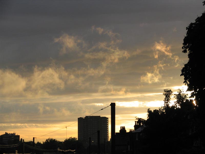
Last night I and some friends attended a concert given by the Belmont Ensemble of London, in St Martin-in-the-Fields, which is the splendid and beautifully decorated early eighteenth century church at the top right corner of Trafalgar Square.

It was one of those concerts of baroque and not long after string orchestra favourites, of the sort that only the public has much fondness for. Bach Brandenburg 3, Mozart Divertimento K137, Pachelbel Canon, Mozart Adagio and Fugue, Bach Double Violin Concerto, and in the second half Handel Arrival of Queen of Sheba, and finally Vivaldi’s Four Seasons.

The first half was excellent. Sometimes the accoustics at classical concerts make it sound as if someone has turned up the treble knob, which is the opposite of what I do at home. But in St Martin’s, the accoustic is very echo-y and forgiving, and provided you play in tune, which these young string players all did with only very rare deviations, you will sound pretty good. Also, the conductor, Peter Gilbert-Dyson, clearly knows what he is about. He chose good tempi, and kept things bowling along well. His orchestra is not called the Belmont Ensemble for nothing.

In part one, it was the Adagio of the Mozart Adagio and Fugue which had the most impact for me, partly because it is an amazing piece of music, and partly because of all the pieces played in the concert, it was one I knew least well. What weird harmonies. I will now dig out whatever CDs I have of this extraordinary piece and will definitely be listening to this piece again very soon.

Nevertheless, part one had a strange feel to it. It had me thinking that posh music-making has finally come full circle and we are back to the age when classical musicians are domestic servants. The Great Recordings of all this music have all been made. The Great Conductors who presided over these recordings have come and gone. The Belmont Ensemble either cuts its own CDs and sells them for a fiver in the foyer to friends, to relatives, and to CD-maniacs like me, or they don’t. Those are their recording choices. Otherwise serving up classical hits, for tourists who clap after first movements, and for the aging Classic FM listening middle classes, is about all there is. Being the best of their generation is no longer enough, because there have now been too many generations.

Actually they were charging a tenner for their CDs, which is twice as much as the LSO charges for theirs and a quid more than what the LSO charges for its SACDs. Which might explain why they have only made three CDs so far and why the last one they made was recorded in the mid-nineties. A tenner is too much. No doubt there are all manner of complicated reasons, involving the phrase “business model”, why they can’t charge only a fiver, but I repeat: a tenner is twice too much.

So in other words, part one of this concert, although expertly played, got me thinking about the History of Music. My mind wandered somewhat. These people were the hired help. They were good at being the hired help, and performed their duties with an expertise that was beyond criticism, certainly from the likes of me. But, it was all ever so slightly routine.

This air of expert routineness was only reinforced by the Bach Double Violin Concerto, the last piece played in part one. One of my friends grumbled about some poor tuning from the lady leader of the orchestra, Anna Bradley, who stepped up to play the second violin part in this, but she sounded fine to me. Having fallen in love in my teens with the Oistrakh DGG recording of this I was ready to be severely unimpressed, but I enjoyed this performance a lot. It is extraordinary music and Ms. Bradley, joined by first violinist Benjamin Nabarro, played it very well. Good speeds. Well conducted. No bum notes that I could spot. None of that authentic crap, where you overdo the first note in each bar, swallow the rest, and play everything too fast. Lovely.

The first violinist, Benjamin Nabarro, wearing a dark shirt with no tie and with the top button undone, played excellently, but I kept thinking how he might have looked dressed as an eighteenth century servant, scraping away for a humble living in the service of the Elector of Somewhereburg. He is a short fattish bloke with a beard, who looked more like one of these people who come to mend your computer or your sink than any sort of virtuoso violinist. A Hobbit. Twenty years ago, such a chap would have made a decent living in an orchestra, maybe even a decent career as a soloist. Fifty years ago, he might have been a household name. As it is, history has passed him by. Life is unfair, and playing the fiddle this cleverly counts for extremely little nowadays. In ten years Benjamin Nabarro will be exactly what he is now, Benjamin Who? That’s how it seemed to me.

Until, Vivaldi’s Four Seasons got under way. With that, everything changed.

The Four Seasons is one of those pieces that is often underrated by the experts, because it is so popular. I agree with the public that it is by far Vivaldi’s best set of pieces. Something about the challenge of depicting the unpredictabilities of the weather, instead of just writing a bunch of concertos, seemed to stir Vivaldi’s creative juices. Unlike that Bach concerto, the Four Seasons features many abrupt changes of tempo and mood, and numerous oppportunities for both the soloist and the orchestra to create different moods and atmospheres. It’s like film music, and it greatly benefits from having show-off musicians playing it, who exphasise its numerous special effects.

This was one of the best performances of this group of concertos that I have ever heard. Or maybe it was just the contrast with all that had gone before, and it merely sounded like it at the time. Whatever. I really, really enjoyed it, and forgot about the History of Music for the duration. The slow movements were especially well done, with beautiful, still, almost vibrato-less playing the like of which I have seldom heard. It was the kind of performance where I stopped saying to myself, oh he did that bit wrong and not the way I prefer it, and said to myself instead, ah that’s how he did that bit, how wonderful.

Benjamin Nabarro, this time out at the front on his own as the soloist, was a man transformed, from a dutiful servant into the master both of his instrument and of all he surveyed, with his conductor matching his every move. Despite being dressed in the same nondescript clothing, he even looked different, not like a Hobbit at all. He looked like a star violinist. And whereas earlier I had felt sorry for him for missing out on the Great Recording Project, I now believe that he might yet be a part of whatever remains of this project, and become a household name even now. By the time I got home and googled him, I was not a bit surprised to learn how distinguished he seems to be, and with what a variety of ensembles and orchestras he has played, and what a variety of concertos he has performed.

Looking back on it, my guess is that the Vivaldi was the thing they all really practised. The other pieces, they practised enough to be sure they would not make fools of themselves, but the Four Seasons they practised enough for it (them) to really sparkle. Which it did.

Thinking about the History of Music some more, I still think that these deserving and worthy young people are destined for oblivion, having been born at one of the worst possible times for “classical” music-making ever, after the Great Recording Project (more about that by me and many commenters in this Samizdata posting), but before the Great Recovery from the Great Recording Project (concerning which more anon) gets seriously under way. But for as long as they were playing the Four Seasons, I forgot about that.

Originally posted at Brian Micklethwait’s Old Blog

An east London photo on the right

More housekeeping, this time to sort out how to have a picture on the right, and text next to it on the left.

First I will just have a picture which isn’t clickable, but if I can, I’ll make it so you can click and get the original and wider version.

For those not familiar with London, and I have to face the fact that I do share a planet with millions of such people, the towers in the distance are the towers of Docklands, and the chair in the foreground is a chair in the foreground.

That part of London is one of my favourite places in the world. The magic of it for me is in the constant contrasts you get between the mundane foreground – industrial estates, chain link fencing, weeds, parked cars, security guard signs, joggers, families on bicycles, pubs, giant rusting machinery like in the last scene of Get Carter (by the sea), and new apartment blocks beyond counting – and the vastness of the distant towers or the distant Dome, which is a wonderful structure even if they have yet to think of anything meaningful to put in it. Because both the towers and the Dome were put there by politicians, rather than being straight commercial bets, there is this constant mismatch between the relatively low key foreground, and the high tech background. These are not objects that thrust up from the seething surface of a city – a city with nowhere else to go except up. They are more like parked spacecraft.

Is that going to be enough chitchat, I wonder? I don’t like it when the picture goes further down than the text.

Well, that is enough text but the problem remains of the gap between the text and the photo. I hoped it would be 10 pixels minimum, but that doesn’t seem to be registering. Until that is sorted, forget about clicking for a bigger picture. A call has gone to my technical staff to get them to put their heads together and sort this out.

Plus, re my liking for that bit of London, I realise I ought to prefer the atmosphere of libertarian type edifices to that of mixed economy edifices like these ones. What next? Preferring Brazilia to Rio de Janeiro? But there you go, that’s how I feel it. At least these towers are a capitalist muddle rather than an identical national socialist matching set, like in Brazilia.

More on the margin thing. In case anyone suggests this as an alternative, I don’t want to stick a margin all around the picture, first because I just don’t, but second, because I also want to be able to put a photo on the left and have text next to it on the right, with the left hand edge of the photo aligning vertically with the main text. I knew you’d be excited.

DONE! It turned out that the answer was to replace “10” with “10px”. As simple as that. As I always say, everything involving computers is easy when you know, and f***ing impossible and f***ing infuriating when you don’t.

By the way, my team of web developers and software engineers have said that they would like to be thanked in person, as well as being paid all the fees I am paying them. They are: Patrick Crozier.

Originally posted at Brian Micklethwait’s Old Blog

Photo!

So. Let me see whether I can contrive to upload a photo.

It seems to have worked.

And I surely cannot be accused of misusing this lady’s likeness, stealing her soul, or suchlike.

However, more work is needed making it smaller, so the box doesn’t get bigger than it should.

Which has now been done. If anything the picture is now too narrow. But too narrow is better than too wide.

Slumps back in chair exhausted.

Originally posted at Brian Micklethwait’s Old Blog