Jeppe Hein’s red seat sculptures outside the Royal Festival Hall

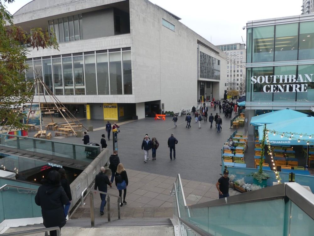
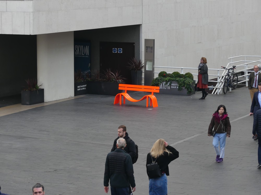
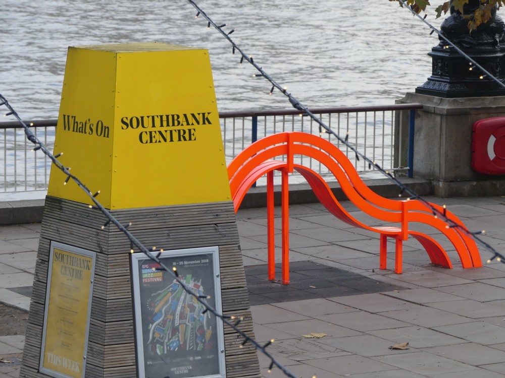
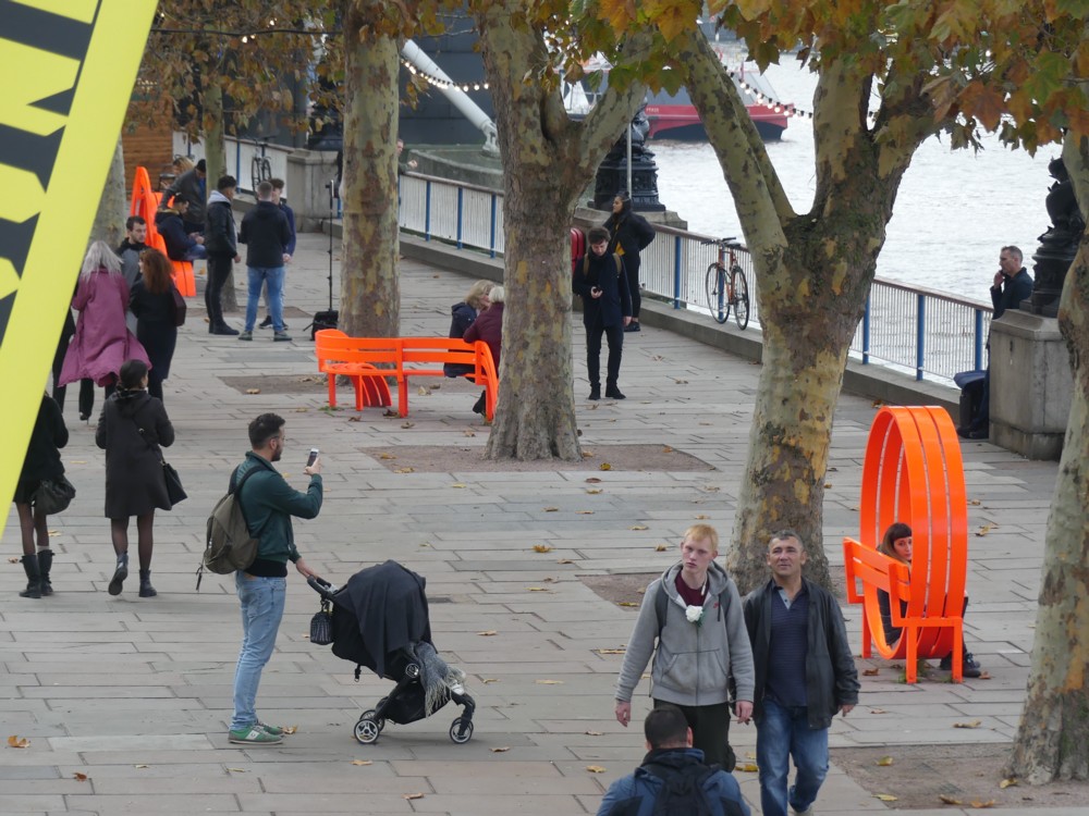
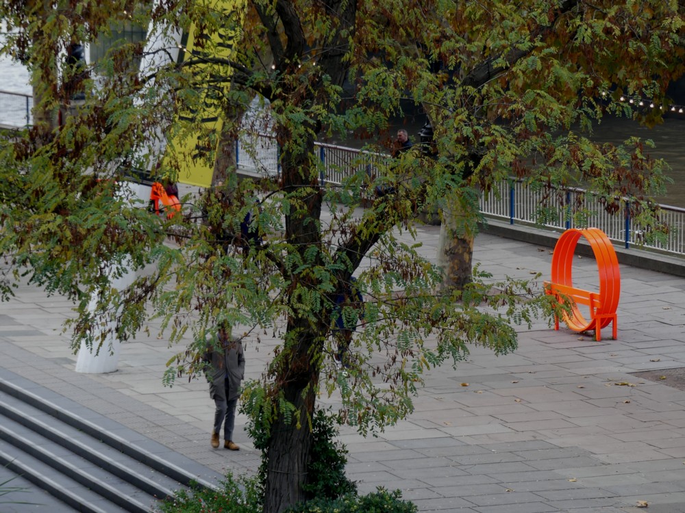
There are seven of them, and they are bright red. Here are fourteen photos (two of each) that I photoed in November 2018. The weather was grim, making everything else look decidedly monochrome by comparison:

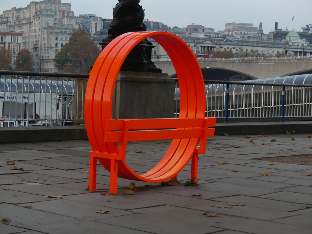
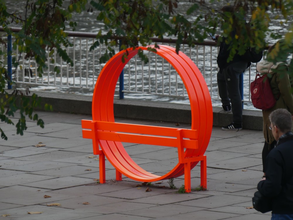
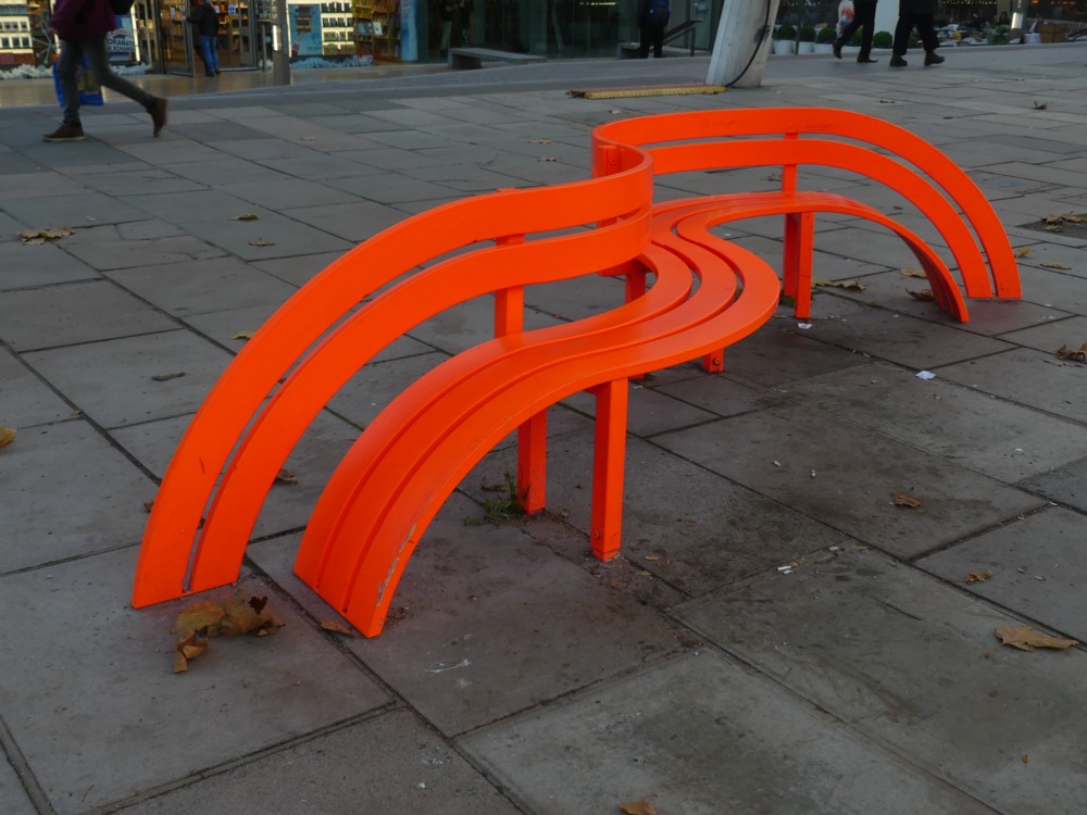
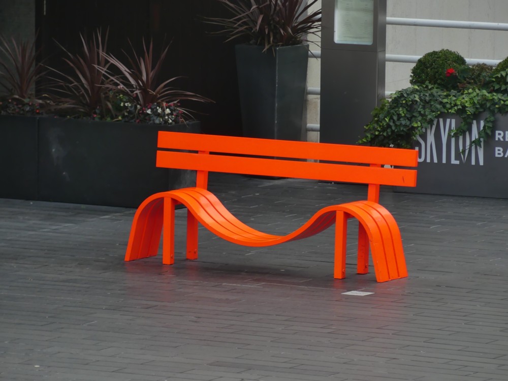
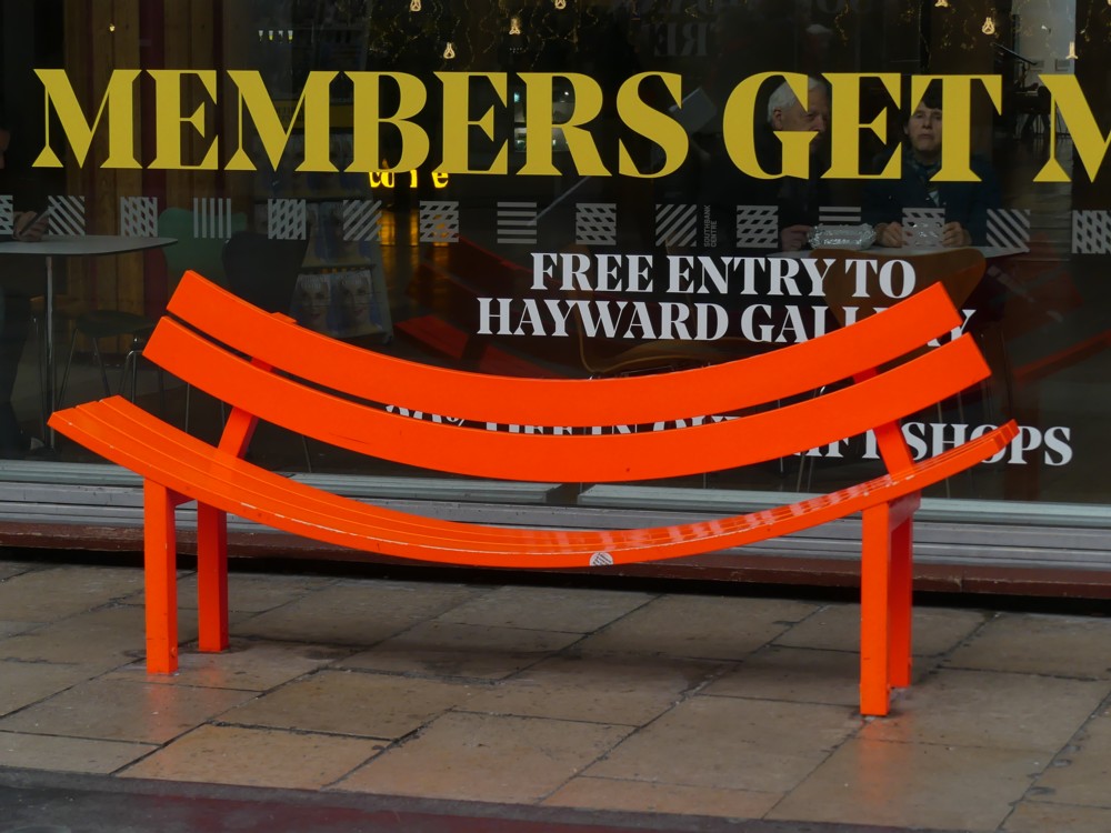
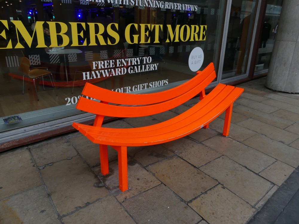
Which I think worked rather well to show how these bright red objects brighten up a part of London still ruled by orthodox Modernists and their monochromatic prejudice against “imposed ornament”. They prefer imposed boredom. This is called “structural honesty”. And honestly, this can get very boring.

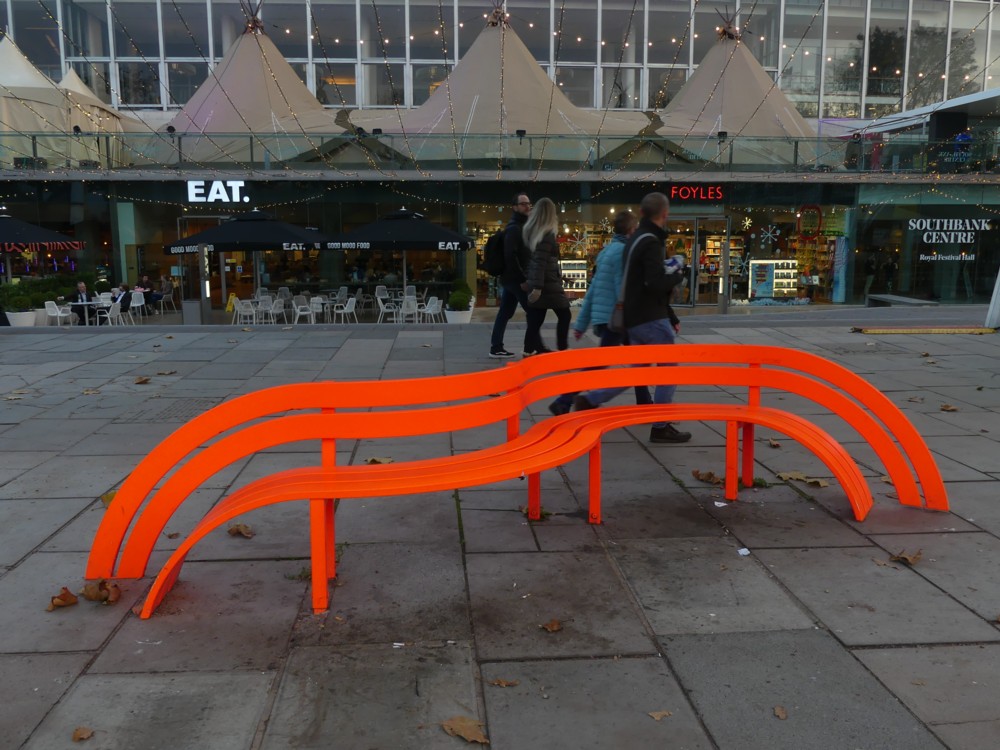
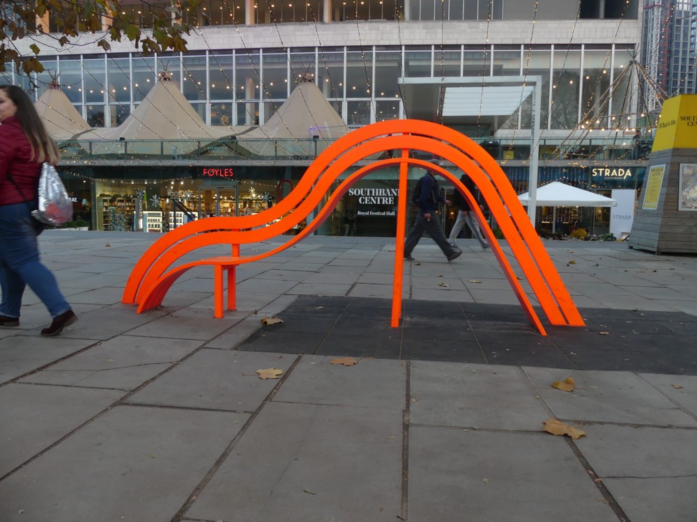
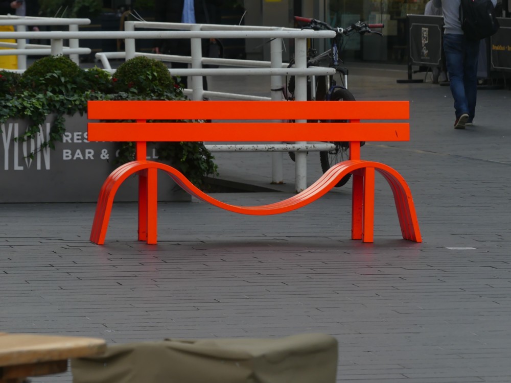
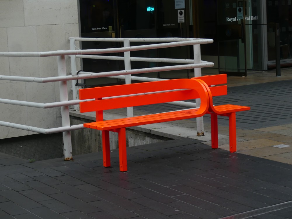
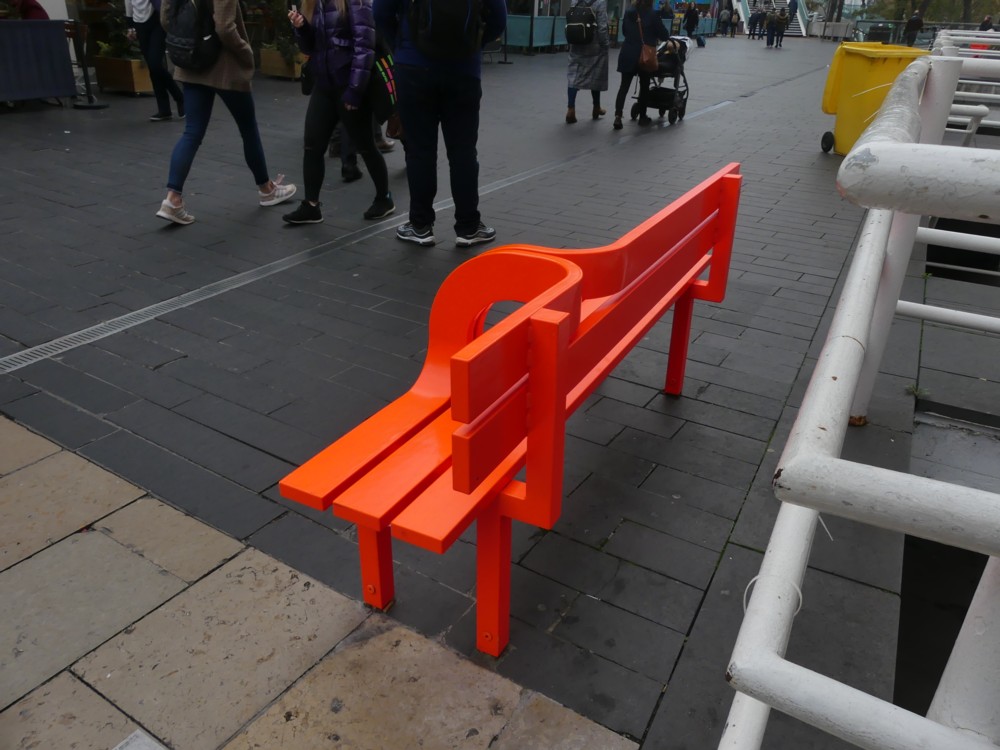
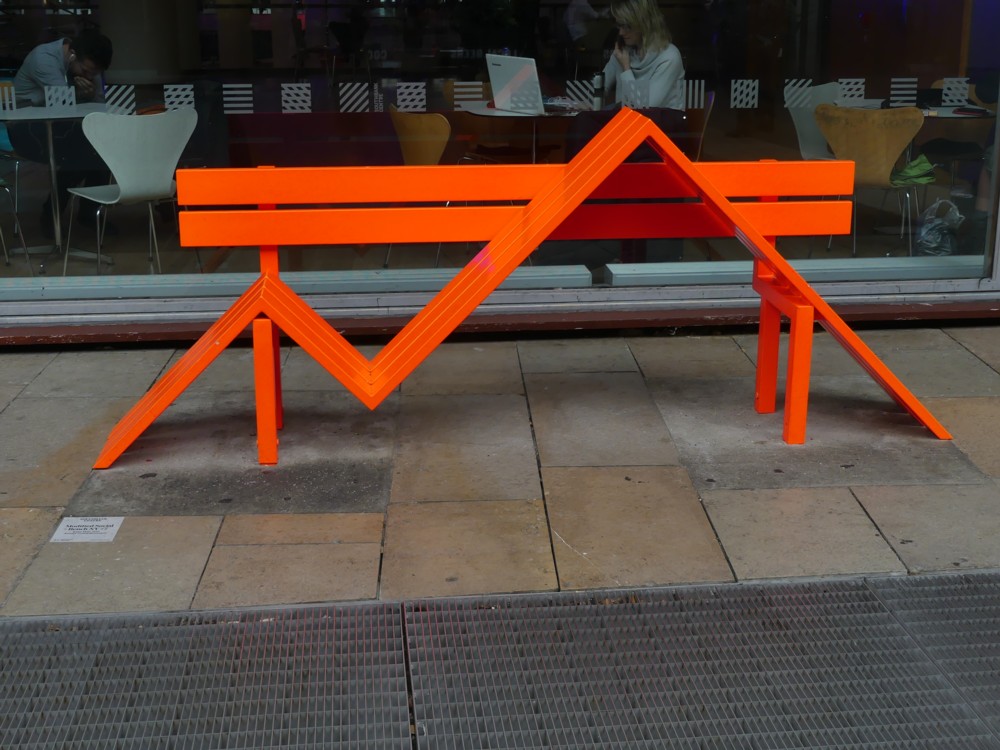
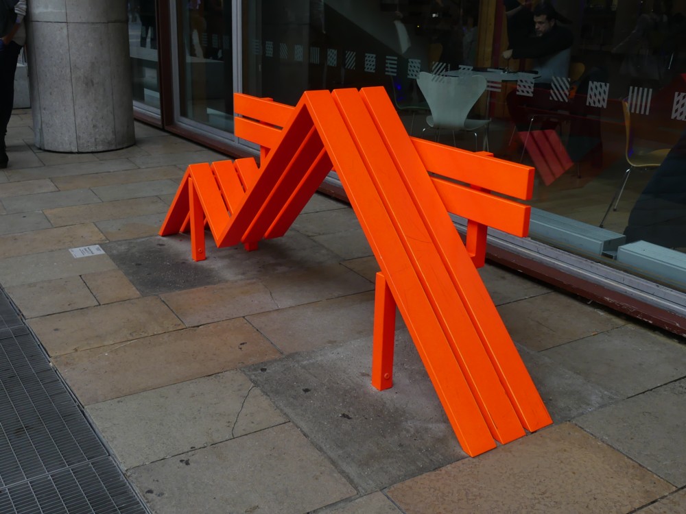
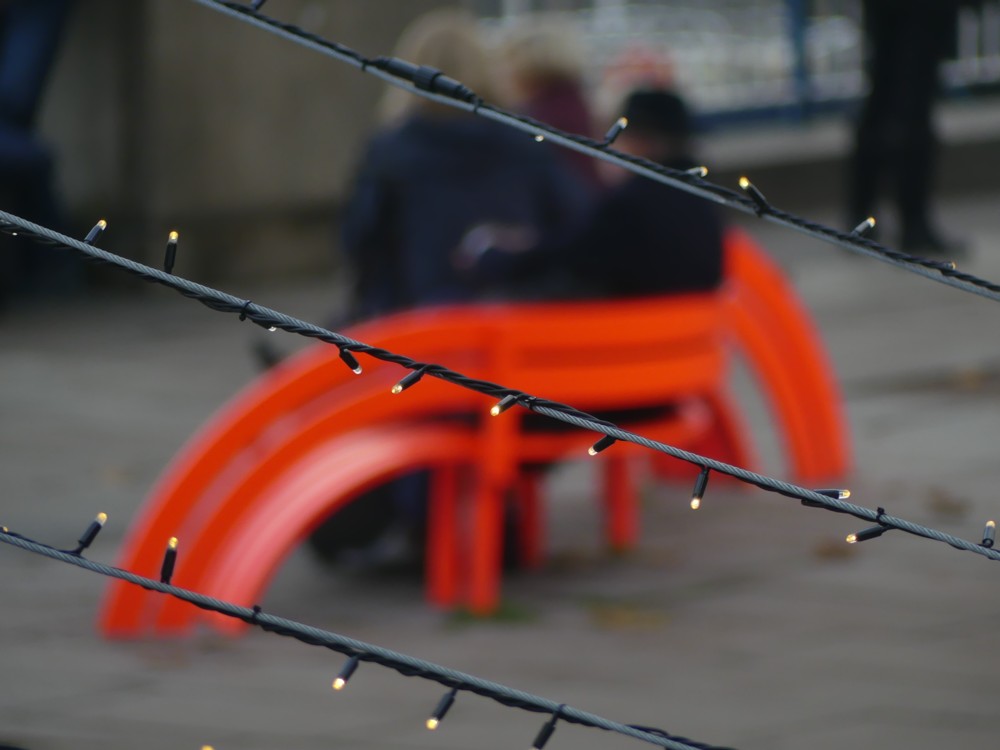
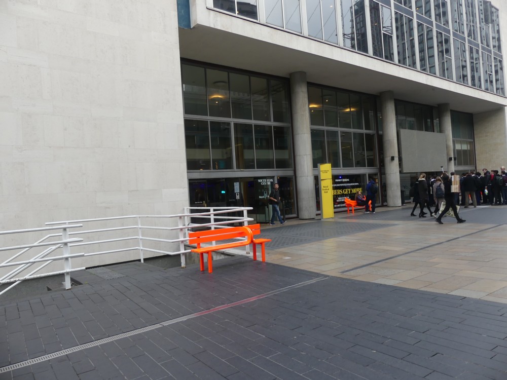
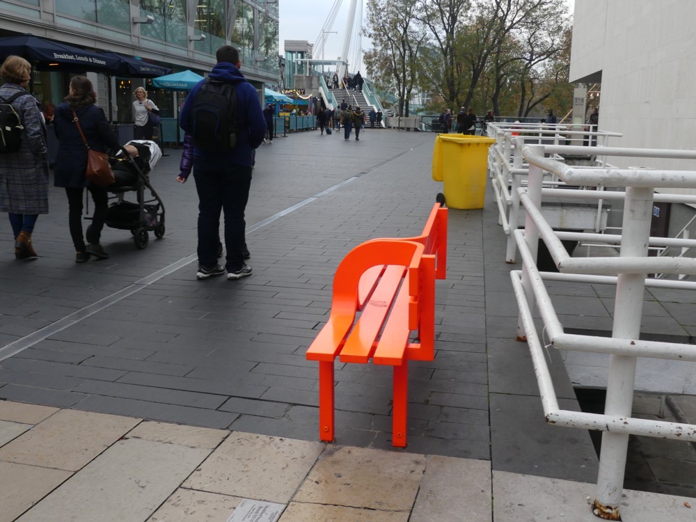
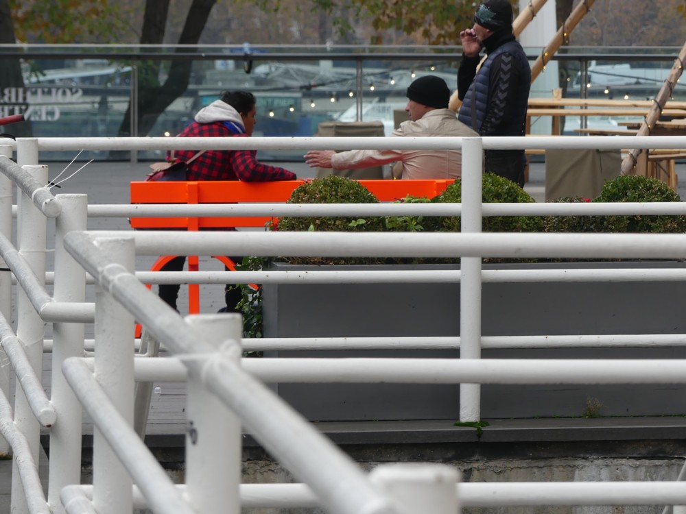
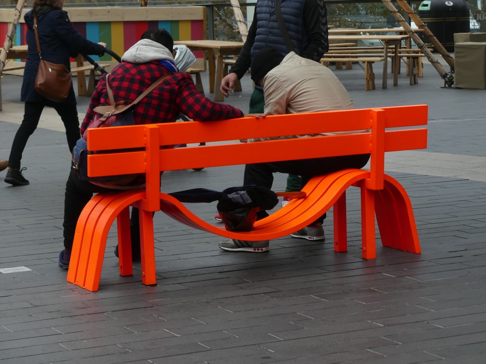
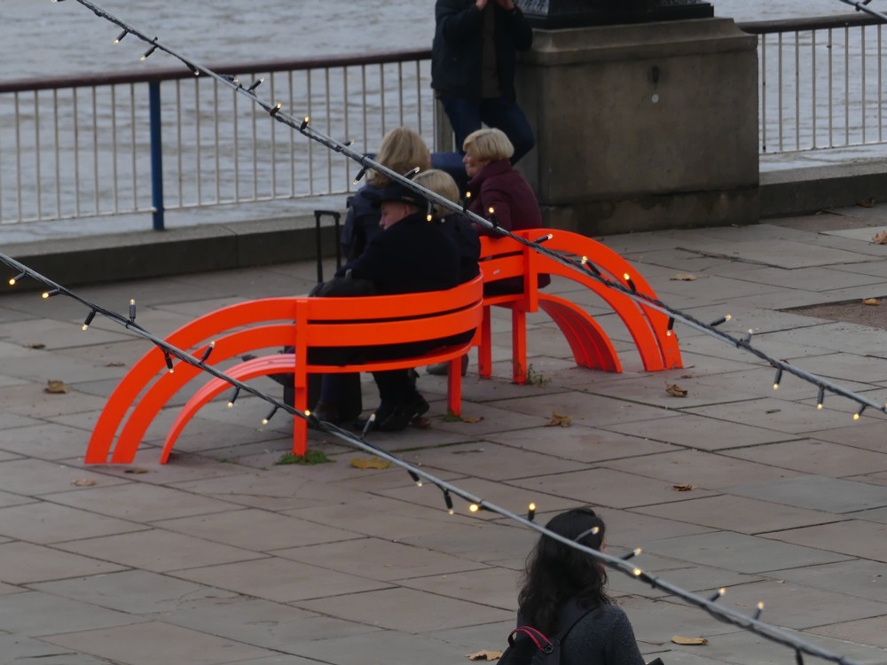
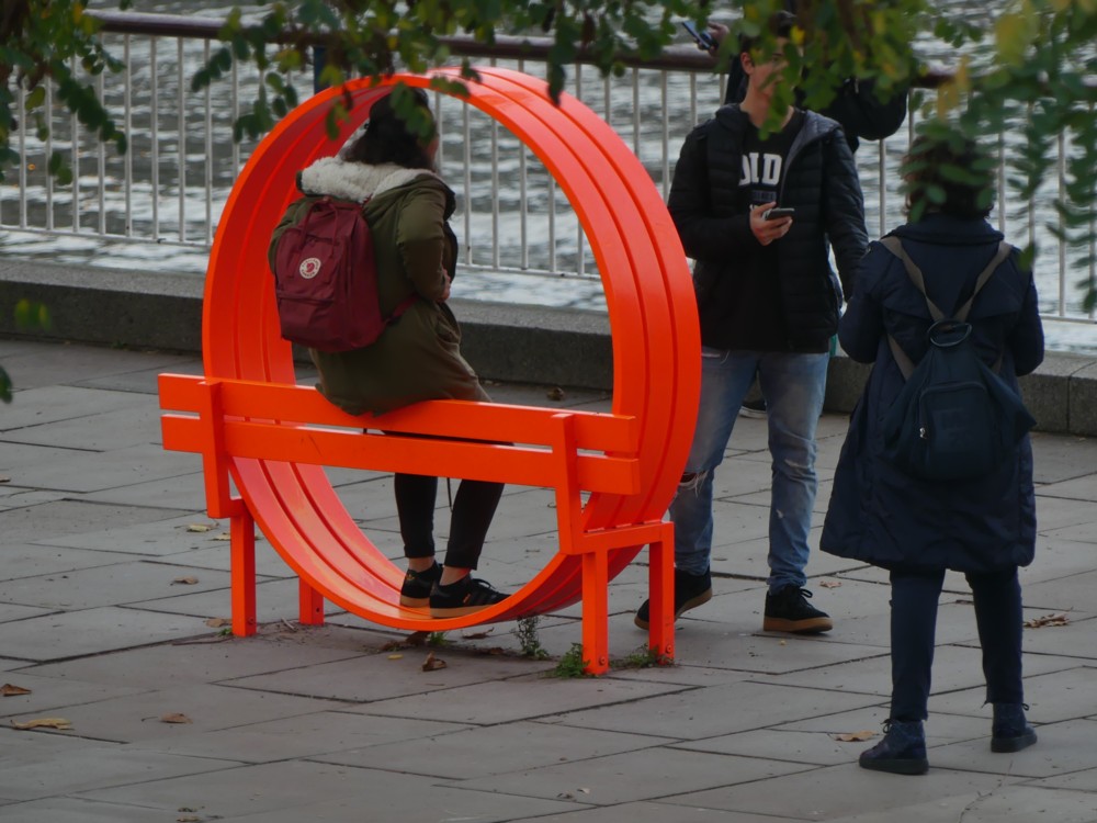
Here are some more photos, photoed on that same November day, of these sculpturised bits of furniture, concentrating more on the Royal Festival Hall context, and making it clear that the point of these things is that they can be sat on. When they can be sat on, that is. The final one above, for instance, is very bum-hostile. Number three is not much better, but as you will see below, a group of people did manage to perch themselves upon it:

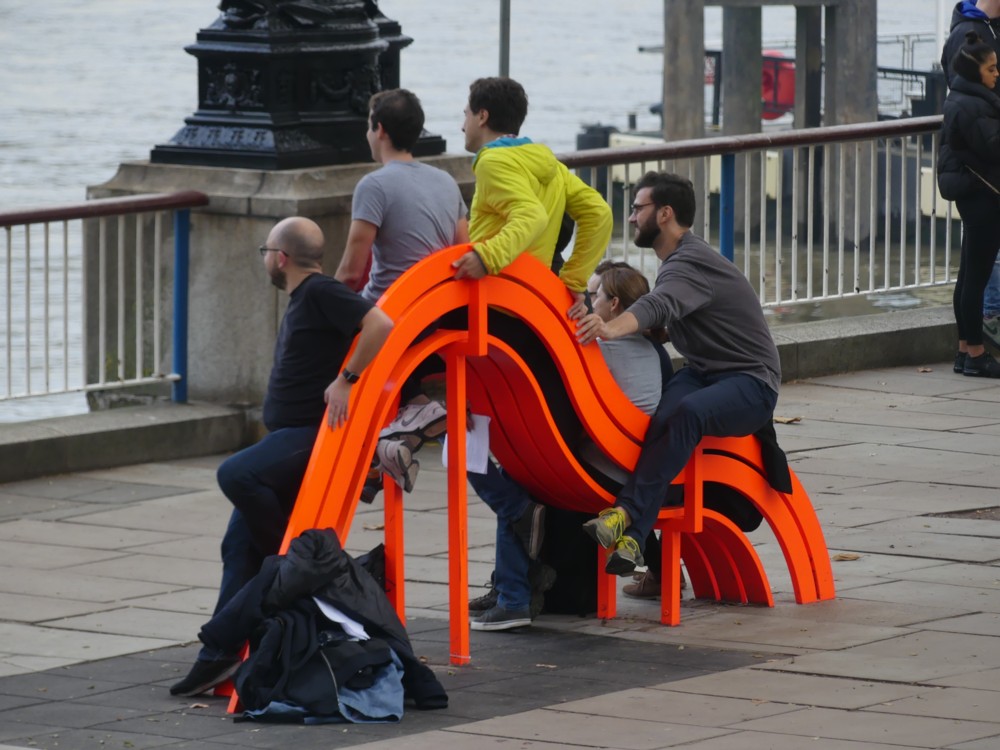
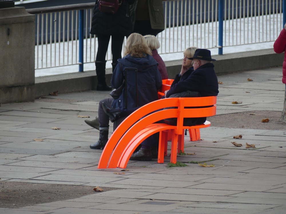
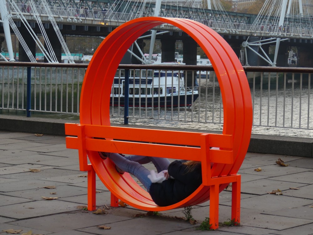
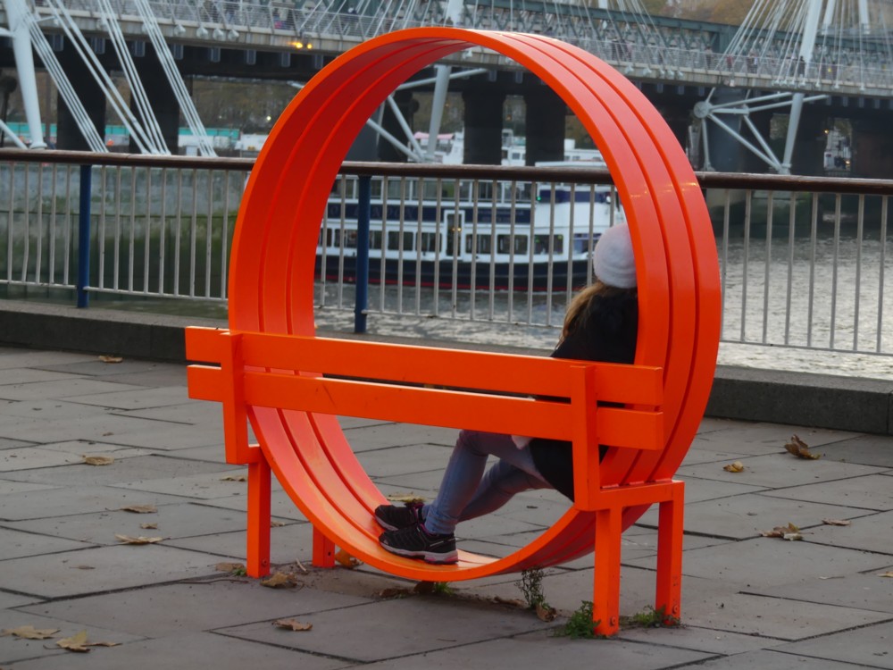
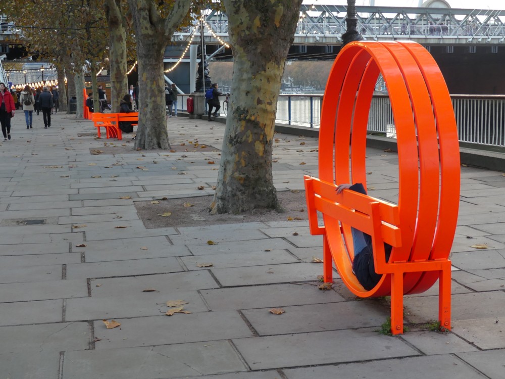
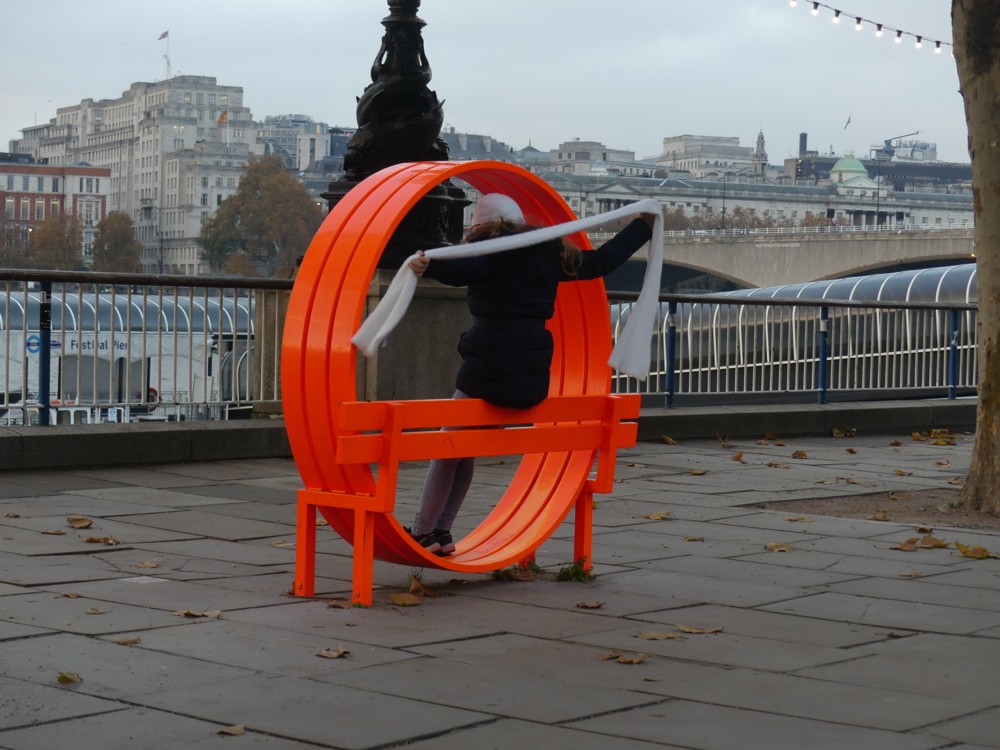
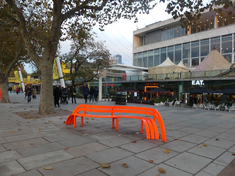
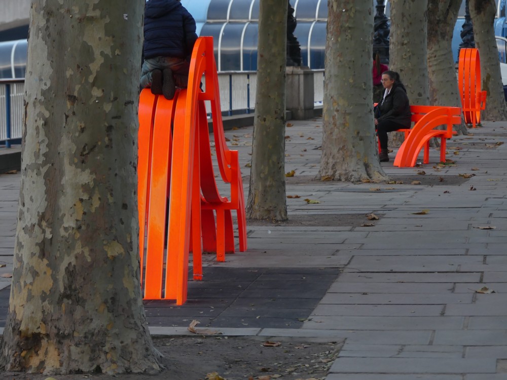
These red Things are the work of the Danish sculptor Jeppe Hein, who looks like this.

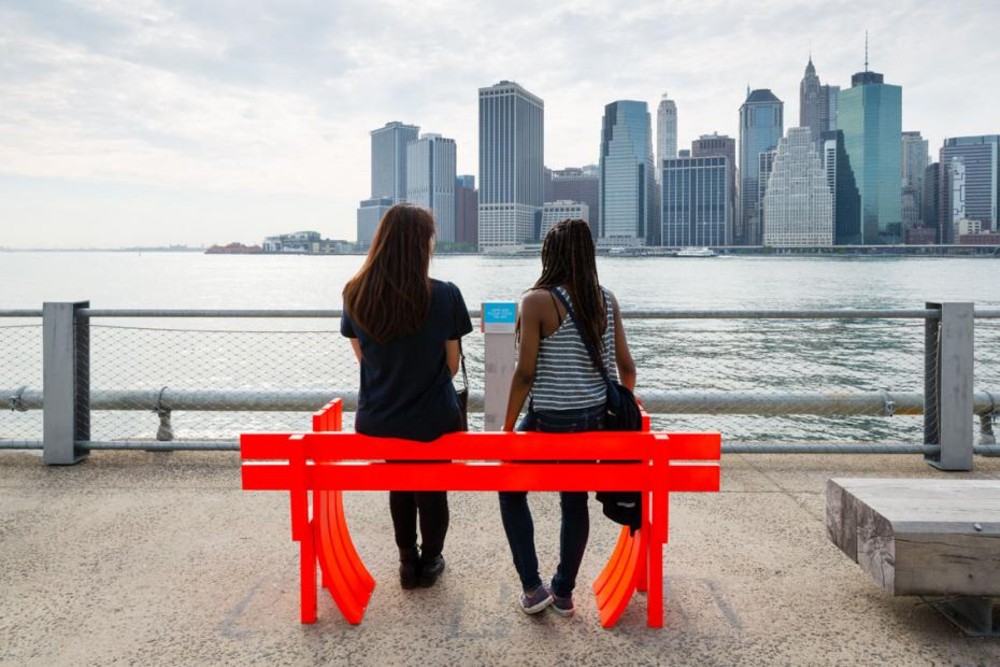
He calls them Modified Social Benches. The above red London ones were installed in 2016. And he did similar ones for New York, around the same time:

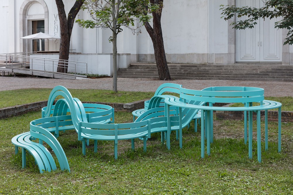
And a more complicated one, not red, in 2019, in Venice:

And various others in various other places.

This guy would appear to be a lot like Antony Gormley in how he operates. Once he has found a formula for a particular family, so to speak, of sculptures, he deploys the formula in various different spots around the world. With Gormley, it was those Gormley Men, lots or just a few of them. With this guy, benches all in the same style with local variations and complications to suit the budget and the location.

Like Gormley, Hein has devised other formulae, which strike me as a lot less appealing than this modified social bench formula.

Also like Gormley, Hein emits the usual dreary ideological orthodoxies of his time concerning such things as climate change, and as soon as he opens his mouth to explain what he reckons he is doing with this or that piece of his work, I switch off. I just like the red benches he did for London, for my reasons rather than for his. If my reasons overlap in any way with his reasons, fine. If not, also fine.

Jeppe Hein has been a very busy man.

A giant pink flamingo now presides over London

On the same photo-walk that I photoed the Red Lion (see immediately belw) I also came upon this:

And I got a hell of a shock, I can tell you. I am fond of graphic representations of London’s ever more entertaining skyline, so I took a close look at this piece of graphic fun and games. But but but!!! had they suddenly constructed a giant flamingo in the middle of London which I hadn’t heard about until now?!?

Turned out the Wheel is now the last minute dot com “London Eye”, and the pink flamingo is something to do with last minute dot com and the fact it helps you book hotels in foreign parts. At the last minute, presumably.

A giant flamingo might be quite a good idea. How about somewhere out east, beyond the Thames Barrier? That part of London could use a bit of livening up, with a giant tourist trap. Ideally, you could go up its vertical leg in a lift. Then stop off at a restaurant in the middle. Then climb up its neck on a staircase, from which you could view the estuary, and central London.

The South Bank (red) Lion

There has been lots of photo-reminiscing here lately, so here are some photos I took much more recently. Well, in May of this year anyway:

Yes, it’s the lion at the South Bank end of Westminster Bridge.

This South Bank Lion has quite a history, the strangest thing being that it used to be red. I was going to show you the “photo” of the lion when it was red that I found here, until I realised it was faked with Photoshop. But that link is worth following.

The lion hasn’t always perched on the bridge. His first home was on top of the Lion Brewery, a booze factory once based on a site now occupied by the Royal Festival Hall.

I bet the brewery would have made a better concert hall than the accursed RFH.

This photo, on the other hand, of the lion with men and scaffolding is genuine:

The photograph above was kindly shared by Nick Redman of London Photos, whose grandfather (second on the left) was one of the scaffolders who helped move the lion from the soon-to-be-demolished brewery.

I found that here. Also well worth clicking on.

I assume this must be why so many pubs are called “The Red Lion”.

Apparently Emile Zola was very fond of this lion. Blog and learn.

Two black swans in Regents Park

I believe it’s a symptom of getting old that I become less apologetic about being sentimental about animals. And birds. And especially birds who evidently have something a lot like a romantic relationship. Like these two, for instance.

Or, these two:

I encountered these two love-birds in Regents Park, in April 2005. This being after I had descending from Primrose Hill, where I had been photoing the Big Things of central London, from a great distance, with a camera that needed to be a lot better. At the time, it was the Big Thing photos that continued to interest me, and not these birds at all, until now. And while I was photoing them, I was probably just as interested in how that fence was reflected in the water as I was in the birds.

Just as there is confusion about whether the two birds by the river, linked to above in this, were ducks or geese, so too, these “swans” would appear really to be geese, approximately speaking. And according to this piece, geese can live for as much as twenty years. So, this Evening Standard piece dated January 2013, also about a pair of black swans in Regents Park, is probably about the couple I photoed.

If so, it seems that the birds I photoed split up, were then reunited, and then ended as a couple when the lady black swan got killed by a fox. Foxes eh? Cute, but no respect for bird rights.

An inflated unicorn with a serious point attached

It’s Friday, so time for some Frivilous Friday Other Creature Fun:

Photoed by me on the South Bank, under Waterloo Bridge, in the summer of 2016, in a time when you were able to purchase such non-essaential things, without having to wait for them to be delivered. Photo severely cropped to eliminate faces of strangers.

That’s it, really. So skip this next bit if all you wanted was Friday silliness. But if I want to be a bit more serious, as I find that I now do, I could and will connect this photo to one of my recent themes here, namely colourful architecture. A strand in that tapestry of thought of mine, as woven in several recent posts here, says that architecture lags behind the design of other and smaller things, because architects have to be powerful to do what they do and consequently older. And another strand in the same tapestry goes that smaller things, already designed by mere designers, who are on average younger, for their customers, ditto, are already now more colourful. Just like the above unicorn. Sooner or later, architecture will follow. Here endeth the lesson.

Also, nice hairdo.

3D printed architectural models might soon get good at doing colour

Question asked, by me – 3D printed architectural models are now no good at doing colour:

Note also that if the clever people now developing 3D printing for architectural models were to make it easy to include quite accurate and quite detailed colour variety, then that could make a huge difference when it comes to making high colour architecture for real.

Question answered, by 3D Printing ProgressMimicking Nature for Fast, Colourful 3D Printing:

Brilliantly colored chameleons, butterflies, opals – and now some 3D-printed materials – reflect color by using nanoscale structures called photonic crystals.

A new study that demonstrates how a modified 3D-printing process provides a versatile approach to producing multiple colors from a single ink is published in the journal Science Advances.

These things always take their time turning from “a new study” into a real thing. But give it about a decade, and architectural models will be looking fabulous.

Colourful Modernism

Google sends me emails about “new london architecture”. As you can imagine, there’s not a lot of news of this sort just now. But today, I received a link to a report about this, or maybe that’s these:

I smelled a young designer trying to get noticed, and I was not wrong. The thing is, the email said something about “colourful city benches”, and that intrigued me in all sorts of ways. I like public sculpture, especially if you can sit on it. I am interested in how designers are doing a lot of colour these days. And before the link even materialised, I placed a mental bet along the lines described in the first sentence of this paragraph.

Sure enough, Irene Astrain is indeed young. Well, thirties, which is young by architect standards. She only got started with her own enterprise in 2016.

(Starchitects often have to be seventy before they get to be starchitects. (Which was why Zaha Hadid’s recent death in her mere sixties was such a shock. (She should have had another thirty years of shape shifting ahead of her.)))

But back to these benches. What they say to me is that here’s a young architect, doing the old attract-maximum-attention-with-whatever-piddling-little-job-they’ll-let-me-do trick, and making two very strong statements. One: Modernism ain’t going anywhere. Two: but it is going to get much more colourful.

Time was when black and white, and what you get when you mix black and white (grey), were the most modern colours there were (I strongly recommend that link), and photography could also only do black-and-white. And for that mid-twentieth century generation of architects, colour was vulgar and trashy, even Victorian, the Victorian era having been, architecturally speaking, a very colourful and garish time. So, for the Modernists, coloured architecture was the superimposition of mere surface effect. Colour did not ooze out of the inner essence of whatever it was, the way Modernist shapes did, or were claimed to. So, black-and-white architecture was de rigueur and colour was an abomination.

(Interestingly, Le Corbusier deviated from this norm. More recently, Renzo Piano is now very old, but has still done some very colourful buildings, right here in London.)

And now, black-and-white-only is itself what a bygone era looked like. Colour is now done a lot better, in cities that are getting a lot less polluted than they used to be. Colour photography is something everyone can now do and now wants to do.

There’s more blog postings to be done about why Modernism ain’t going anywhere, and it damn well ain’t whatever you maybe might wish. But those will have to wait. Meanwhile, I promise nothing.

There are also lots of blog postings to be done, or discovered having been done by others, about how modernism is caused by, among other things, the fondness that adults have for the kind of things they played with when very young, and when very small compared to these things.

Cranes – scaffolding – colours

It’ll probably be quota photos every day here for as long as the heatwave lasts. Certainly that’s how it is today:

On the day I took this photo, I was so proud of a goose couple that I also photoed, a lot, that I hardly noticed this photo, of cranes and scaffolding. But when I was clicking through the archives, the way I do from time to time, this one stopped the clicking.

It’s the little bits of colour in a basically monotone photo, the strip of red on the crane, and in particular that little bit of yellow, bottom right, that made this photo particularly appealing. To me, anyway. I hope also to you.

Originally posted at Brian Micklethwait’s Old Blog