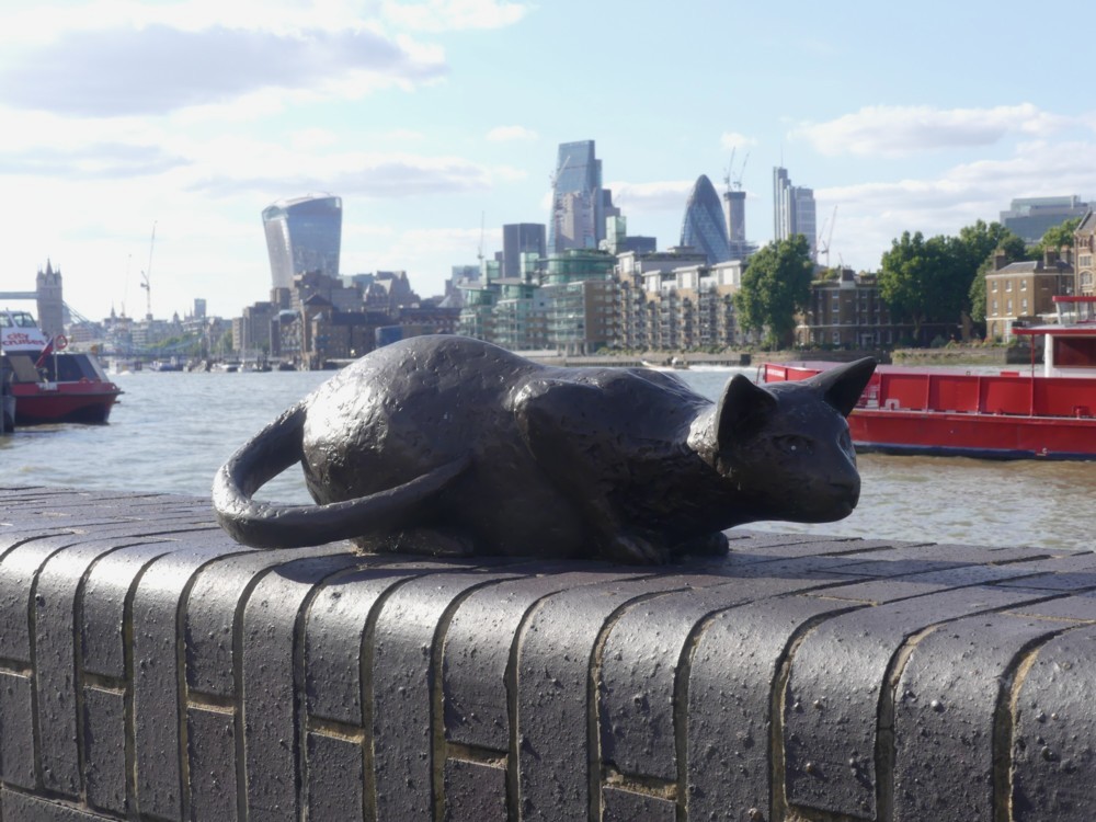
Dr Salter’s imaginary cat statue

Indeed:

I took all these statue photos yesterday, in a walk with GodDaughter 2 that I have already referred to, which started at the Shard (see below), Tower Bridge, and nearby places, and ended … well, quite a way downstream.

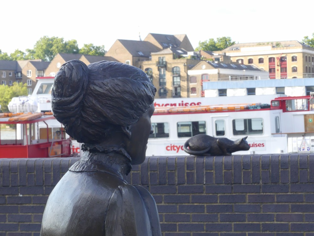
As often happens, my favourite photo of this subject was the first one I took. But I also liked this next one, which neglects what seems to be the usual Big Things of The City background and adds only wall and water:
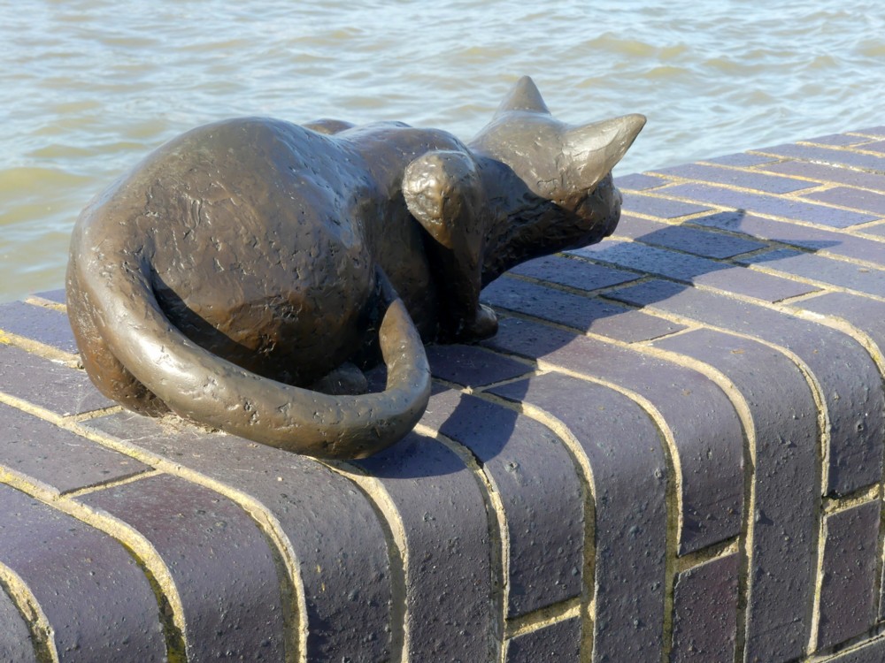
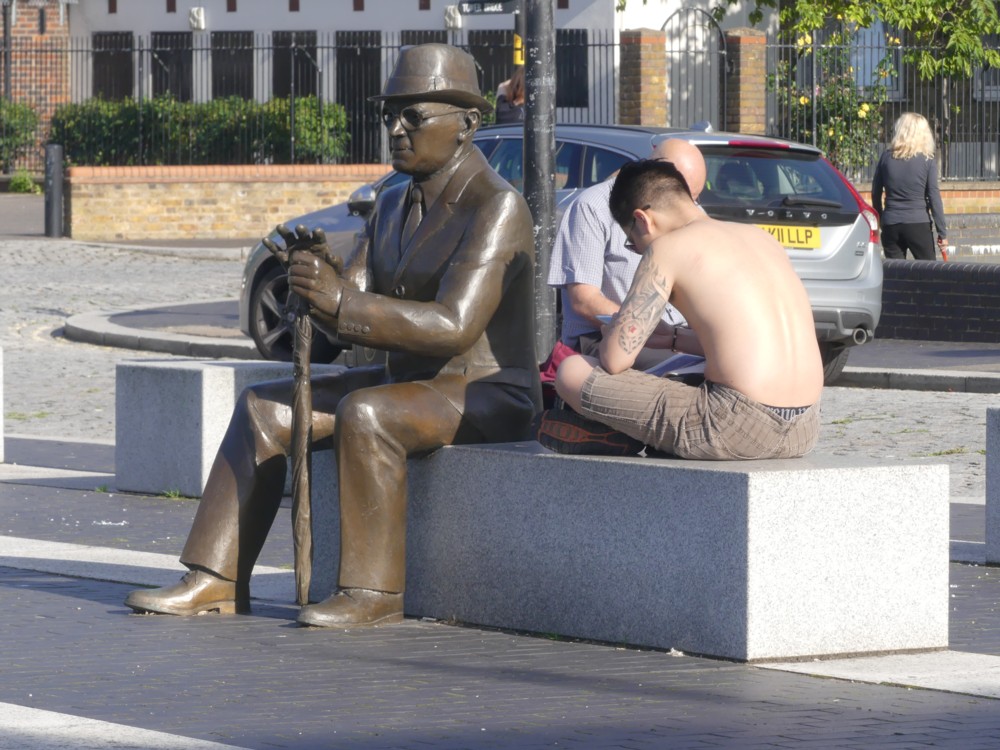
The explanation of the rather odd title of this posting is that what we have here is not so much a group of statues as a drama acted out by a group of statues. Dr Salter (see below) is looking on at his small daughter, and at her cat. But it is all taking place in his imagination, because the small daughter died tragically young. It is all very well explained, with more pictures, here. Follow that link, and you’ll even find a map of exactly where this all is.

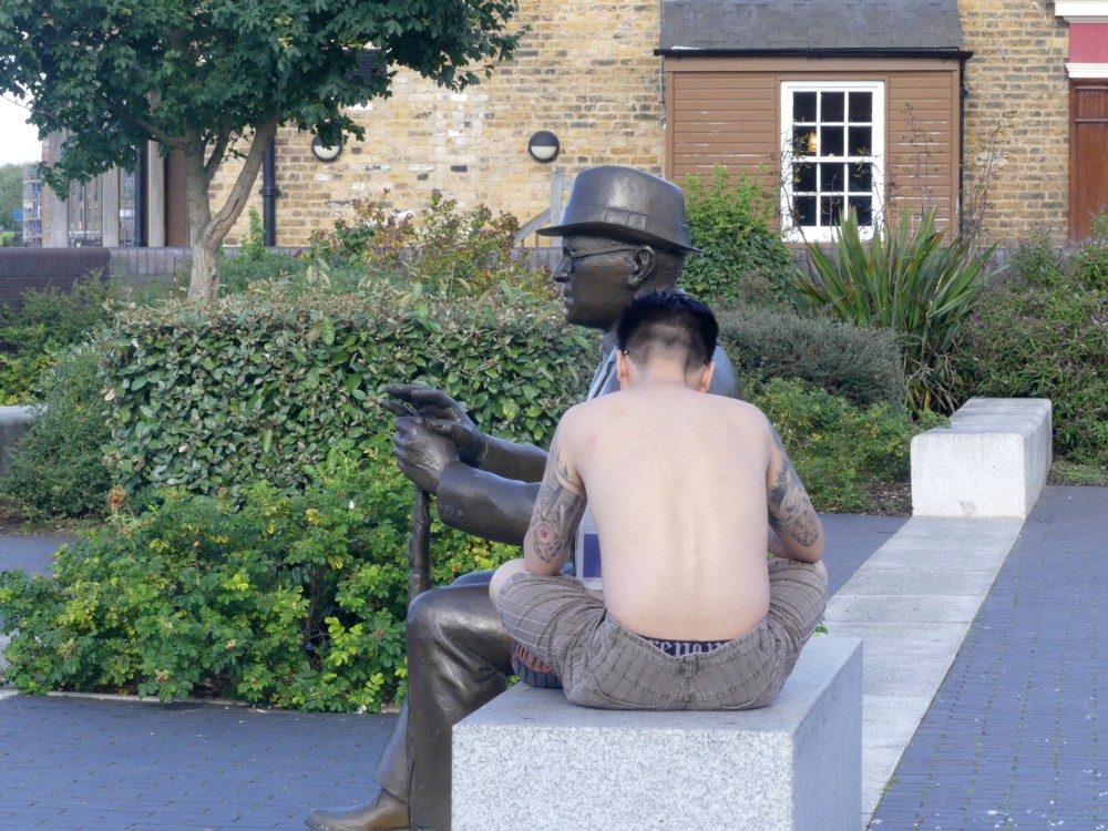
The drama gets an extra layer of drama, because the original statue of Dr Salter was stolen, for its value as scrap metal. I think I preferred the stolen one, but here is the replacement, with the addition of a young man with tattoos:

The tattoos on the front of that guy were remarkable, and I regret now not asking him to let me photo them. I know, I know, creepy. But if he had said yes, I would have been delighted, and if he had said no that’s creepy, I’d have got over it.

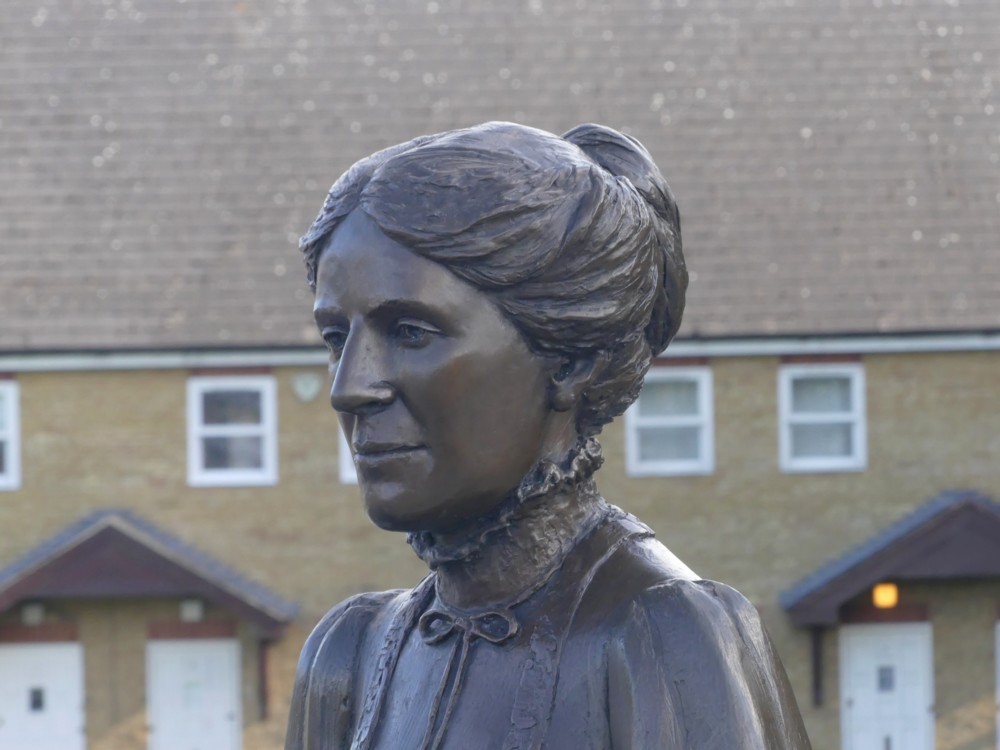
Mrs (Ada) Salter also looks on, and these two headshots of her came out quite well too:

While taking these photos, or maybe it was a bit later, I found myself musing aloud to GD2 (with her agreeing) that people seem greatly to prefer statues that are very clearly statues, made out of some sort of monochrome material such as stone or metal, rather than something more realistically coloured, a fact which has, from time to time, puzzled me. Were the latter procedure to be followed, people wouldn’t be able to tell the difference between statues and actual people, and this would freak them out.

A “realistic” painting or photo of a person is actually not realistic at all. People are complicated in shape. Paintings and photos are flat. So, if you encounter a photo or a painting of a person, even if it’s life size, there is no possibility that you will be duped into introducing yourself to it or asking it for directions. But if you encounter a genuinely realistic 3D statue of a person, only its deeply unnatural stillness would eventually tell you that this is not a real person. And this would be awkward to be dealing with on a regular basis.

A giant statue of someone, realistically coloured, might be okay. After all, miniature statues (go into any toy shop or gift shop to see what I mean) already are okay. Just as with a tiny but realistically coloured person statue, you could tell at once that a giant realistically coloured person statue was only a statue rather than a real person.

A giant cat statue, on the other hand, probably wouldn’t be a good idea. People might think: Woooaaarrrrgggghhh!!! A giant cat!!! Get me out of here now!

Originally posted at Brian Micklethwait’s Old Blog

Multiple reflections of the Shard

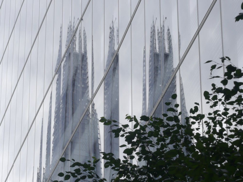
This afternoon, I was wandering about in the vicinity of the Shard, in the company of GodDaughter 2. At a moment when I could not see the Shard, I nevertheless could see this reflected version of it: Or maybe that should be versions. It looks vagule like Barcelona Cathedral, with its multiple spires.

Unhelpful reflections have been on my mind lately, having tried to take photos from inside the Shard, with its very reflective windows. This is a reminder that reflections can be fun.

Later GD2 and I walked along the river downstream, on the south side. And walked, and walked, and walked. By the time I was home I was exhausted and yet again I am in quota photo mode.

The weather forecast for tomorrow is good, so something similar may happen tomorrow, but I will try to do better.

Originally posted at Brian Micklethwait’s Old Blog

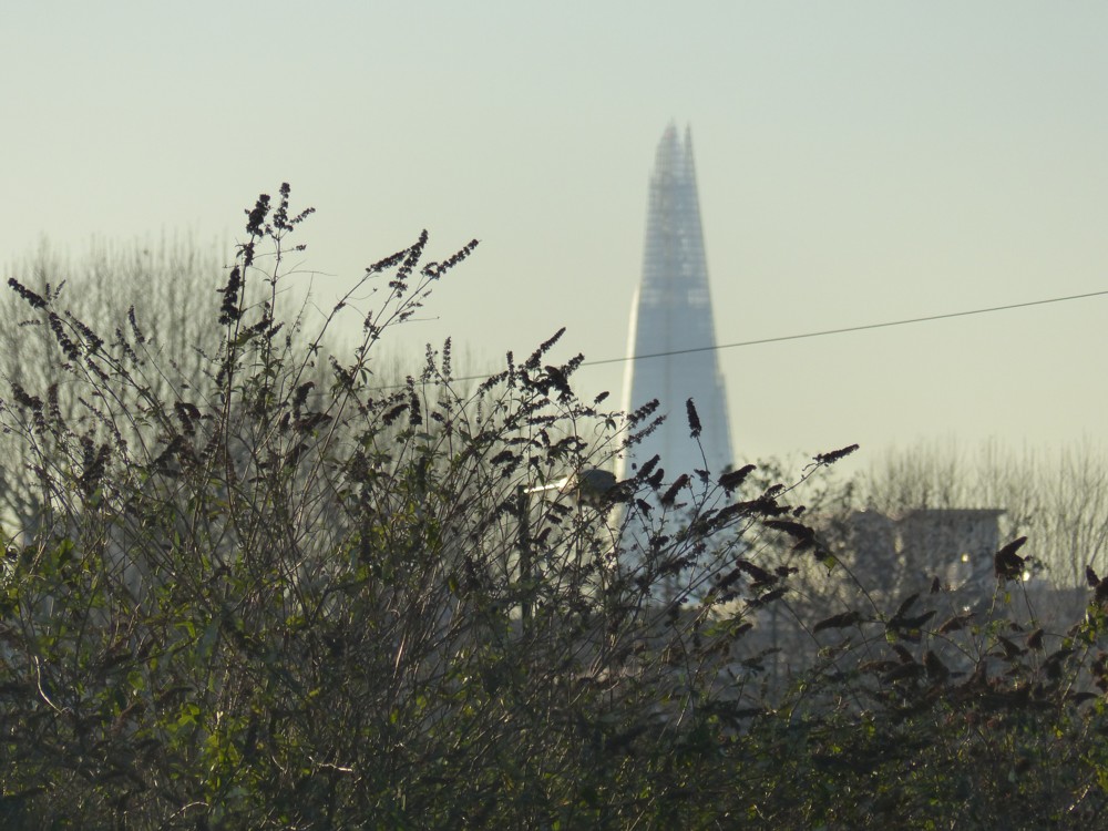
A quota photo of the Shard with foliage and two ridiculous problems solved

On the same day that I took these photos of a spiral shopping trolley sculpture, I also took this photo:

One of many other nice photos I took that day. I chose this one partly because the Shard is the big Big Thing here, just now.

The reason for a quota photo is that I have spent most of my discretionary time today solving ridiculous problems. But I did actually solve both of them, so I am now ridiculously happy.

Problem one was that my bedside radio had suddenly taken to breaking off its playing of mp2 files on the 2GB SD card I had inserted into it, after about twenty minutes, every time. Was this the 2GB SD card? Or (the horror) the radio? Turned out it was the 2GB SD card. My guess: the 2GB SD card, obtained because very ancient and hence ancient enough to fit into my ancient radio and be used both to make and to play recordings, was nevertheless insufficiently ancient. It had the word “Integral” on it. This suggests excessive speed to me. At the very least, an air of impatience. Anyway, my radio couldn’t be doing with it. So, I tried a different and more ancient-looking 2GB SD card, and that worked. Hurrah.

Problem two was that my debit card had stopped working, and I had a vague – but only vague – recollection of having received a letter from my bank with a new debit card in it. But where was it? There followed two hours of searching, but in a manner which made things more tidy rather than less tidy, which is not always the way when you are searching for something. Key fact: I was not in too much of a hurry. It is searching for something in a hurry that really makes chaos. Anyway, I eventually found the new debit card, in the last place I looked. Hurrah times two, making three hurrahs in all.

A good day. And, I hope you agree, a good quota photo.

Originally posted at Brian Micklethwait’s Old Blog

Two Seifert roof clutter clusters

It’s no great surprise that, at the website of the hotel that now calls itself Park Tower Knightsbridge, they are keener to show you pictures of the hotel’s interiors and of the views to be seen from the hotel, than they are to show you what the hotel itself looks like to the outside world.

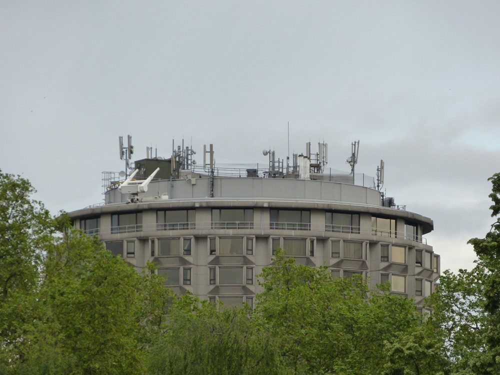
That being this:

That’s a photo of this building that I took five years ago, from Hyde Park, which is not a place I visit very often. Personally, I am rather fond of this building. But I am not the sort of person who would ever stay there. I’m guessing that those who do stay there are not that fond of how it looks from the outside.

Park Tower Knightsbridge was designed by my favourite architect from the Concrete Monstrosity era. Favourite in the sense that when it comes to your typical Concrete Monstrosity architect, I hate almost all of what they did. With Richard Seifert, I just hate some of it, and rather like quite a lot of it.

Especially now that this style is in headlong retreat, and all the arguments about it concern whether this or that relic of the Concrete Monstrosity era should or should not be dismantled. When this style was on the march, smashing everything in its path to rubble, I would gladly have said goodbye to Park Tower Knightsbridge (or whatever it started out being called), if that was what it would have taken to stop the Concrete Monstrosity style in its tracks. But now, I favour the preservation of a decent proportion of London’s Concrete Monstrosities. I suspect that they may turn out, in the longer run, like the medieval castles of old (definitely feared and hated when first built), in eventually being regarded as charmingly picturesque.

And, I especially like the Park Tower Knightsbridge, because of its striking concrete window surrounds, and its non-rectangularity. See also No. 1 Croydon, which I think may be my absolute favourite Seifert.

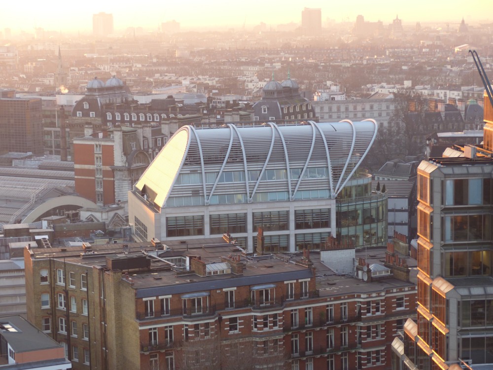
Striking concrete window surrounds and non-rectangularity might also be why I like this next building, One Kemble Street, also designed by Richard Seifert, and already featured here in this posting, which includes a photo of how it looks when viewed from the upstairs bar of the Royal Opera House Covent Garden.

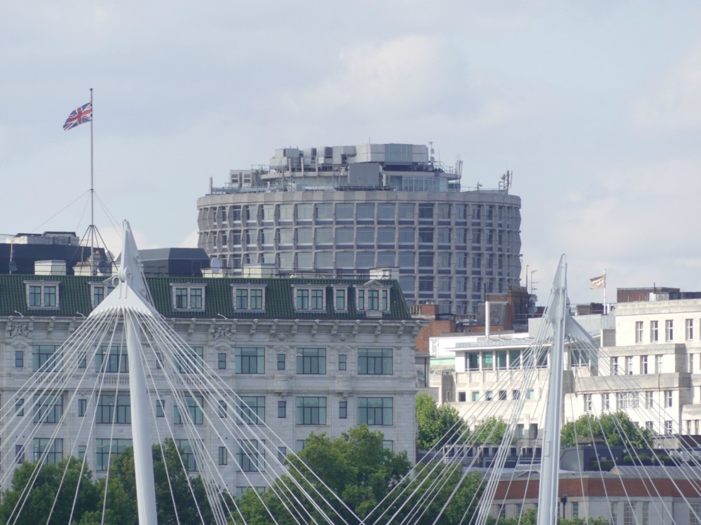
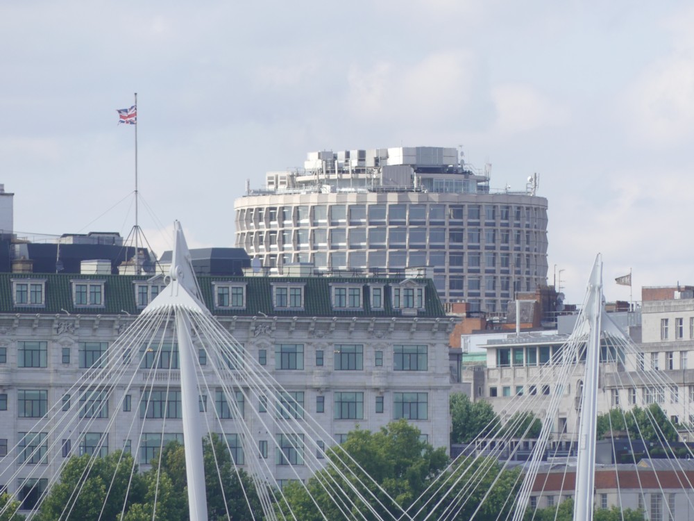
I took these photos, within a few seconds of each other, minutes before taking this rather blurry photo of the ROH.

In addition to being a posting about how I am rather fond of these two Seifert buildings, it is also a rumination upon roof clutter.

Note how both these buildings have an abundance of roof clutter perched on their tops. But note also how that clutter is so arranged as to be largely invisible to anyone standing anywhere at all near to the building.

If you image google either One Kemble Street or Park Tower Knightsbridge, what you mostly get are these close-up views, with all the roof clutter out of sight. It’s like those who own these buildings care very much about the impression the buildings give to passers-by, and most especially to those who actually go into the building, but do not care about how the buildings look to the rest of London. They probably figure that nobody really sees these buildings, except from nearby where you can’t miss them. But from a distance, and now that the architectural fashion that gave birth to them has been replaced by other fashions, they just, to most eyes, fade into the general background architectural clutter which is London itself. If there is clutter on top of them, well, that’s London for you. London, like all big cities these days, abounds in roof clutter.

I don’t know. I’m still trying to get my head around these thoughts. Maybe it’s just convention. On stage appearances matter, and offstage appearances do not. When it comes to how things look, the side walls of these buildings count. They’re on stage. Their roofs do not count. They’re off stage.

Originally posted at Brian Micklethwait’s Old Blog

I don’t know whether it’s the weather or my camera

I have a new camera, and I am not as happy as I would like to be about the photos I am photoing with it. They often seem vague and blurry, as if seen through a mist.

But then again, the humidity levels during the last week or two have been very high. Maybe the views have all looked as if seen through a mist because they were seen through a mist.

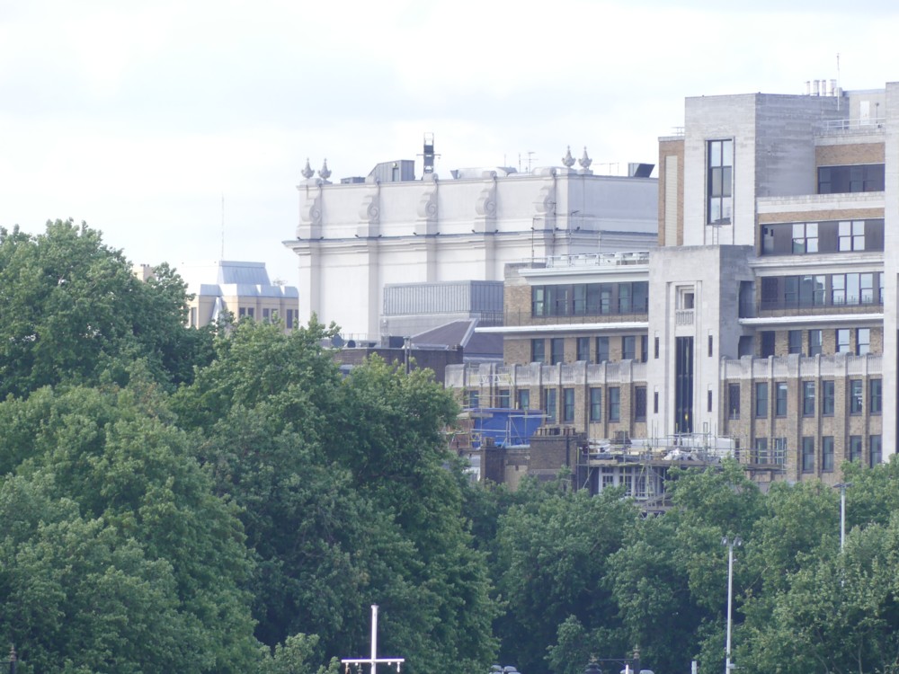
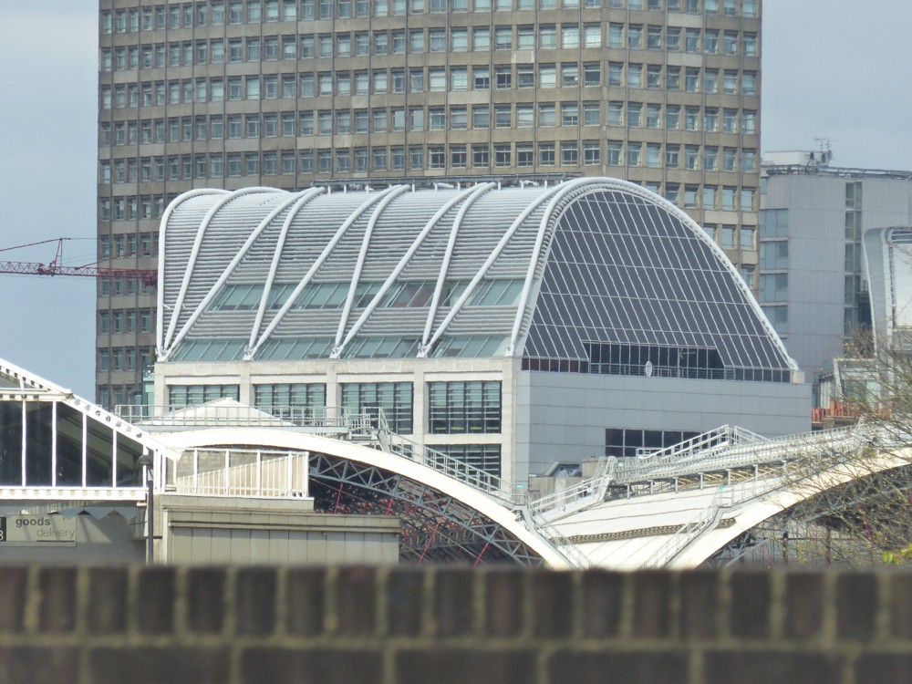
Here, for instance, is a photo of a favourite building of mine, the big decorated box that is the Royal Opera House Covent Garden, as seen from Westminjster Bridge, which is quite a way away:

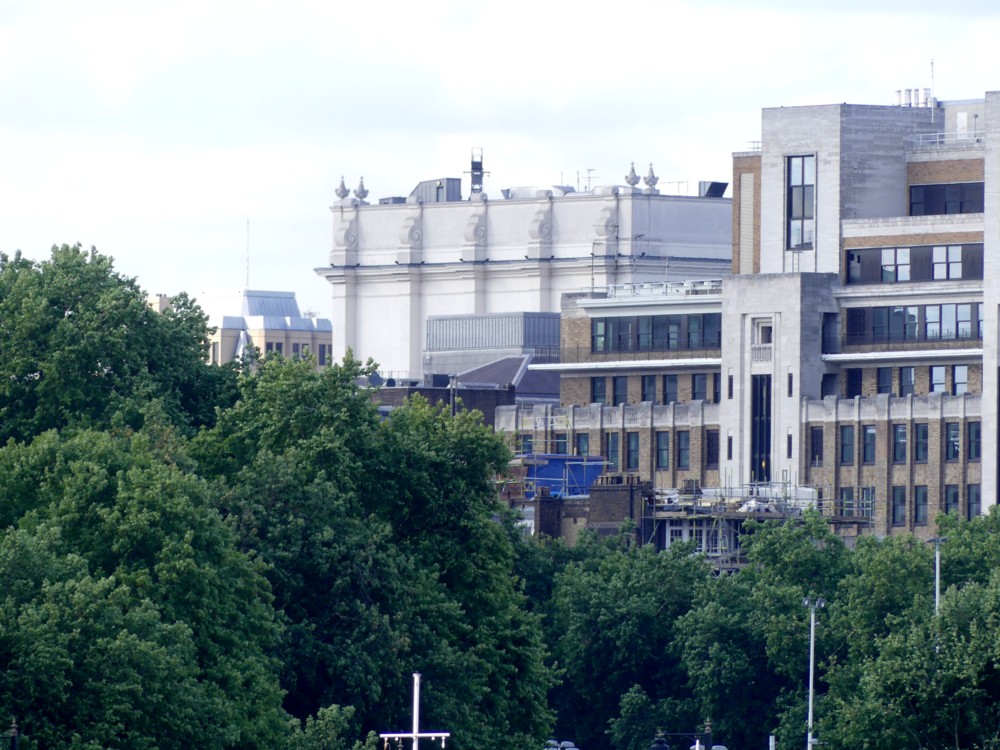
But I got to work with my Photoshop clone, and beefed up the contrast, and darkened things a bit.

Thus:

Which looks a bit better. I’ve chased away some of the mist. The trees look greener. The details of the ROH’s exterior decoration are clearer.

I have a vague recollection of trying to reset my camera, so that it did things more darkly and more contrastingly. Maybe at that point, I contrived to do the opposite of what I thought I was doing.

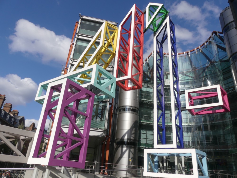
But then again, not long after taking that photo, I took this one, of the giant 4 outside the Channel 4 headquarters building at the top end of Horseferry Road, a short walk away from where I live. I often go past it on my way home after an afternoon of wandering, and so it was that day, nearly a week ago now:

That looks bright enough and clear enough, doesn’t it? That’s without any zoom, i.e. space filled with blurriness. And without this weather making its presence felt, the picture doesn’t look like it needs any artificial editing attention. So maybe the camera is fine, and it has been the weather. And I just made the weather better.

Originally posted at Brian Micklethwait’s Old Blog

David Bowie dead – 2005 Ashes winners alive

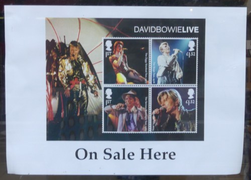
Wandering along the Strand towards Embankment Tube, after Turandot had finished, I spied this sign on the inside of a shop window:

I had not realised that there are now David Bowie stamps. Apparently so. Ten in all. The ones above, and six more featuring LP covers.

You know what they mean, but the phrase “DAVID BOWIE LIVE” seems rather … jarring. What got Bowie onto these stamps now rather than any sooner, was that instead of being live, he is now dead (LINK TO THE OLD BLOG). Only dead people, or royals, can be on stamps, right?

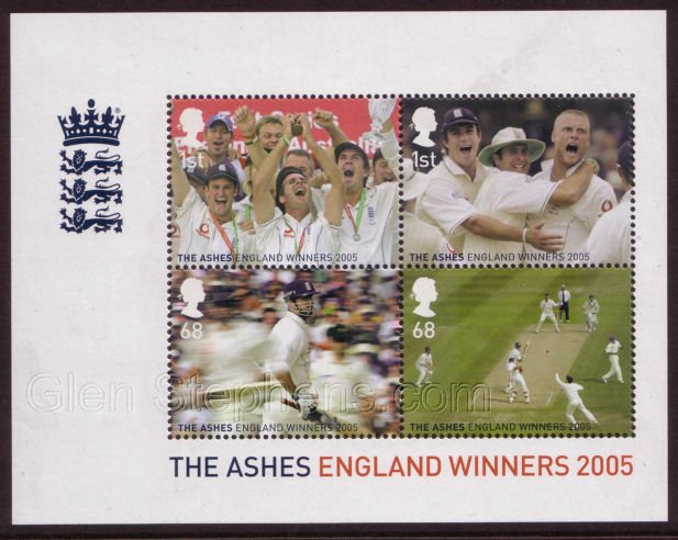
Not quite. If you were an England cricketer playing in the 2005 Ashes that England won, you might also have become an honorary royal:

Scroll down here, for that picture, together with some rather sneering and very Australian references to Britain’s alleged lack of sporting prowess, which (says the Australian sneerer) explains why so many went crazy (LINK TO THE OLD BLOG) when those Ashes were won. And why the Post Office also went crazy and broke its own rule of us only being allowed, on stamps, to see dead people.

One Kemble Street and its roof clutter as seen from the ROH floating bar

The best thing about seeing Turandot at the R(oyal) O(pera) H(ouse) earlier in the week was definitely seeing Turandot. But almost as good was what I saw during one of the intervals.

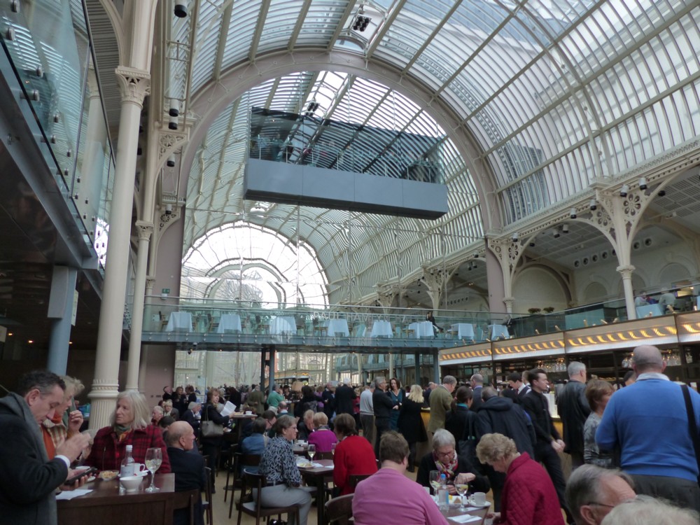
So, do you remember this?

The “this” I am referring to is the disembodied rectangular box hovering up near the roof there. I copied and pasted the sanskrit my blogging system demands for that photo from this earlier ROH posting. To quote my earlier description in that earlier posting:

I especially like that disembodied clutch of drinkers, suspended up there as if in mid air, but actually in mid mirror.

All of which means that you don’t need to remember it, because I just told you again.

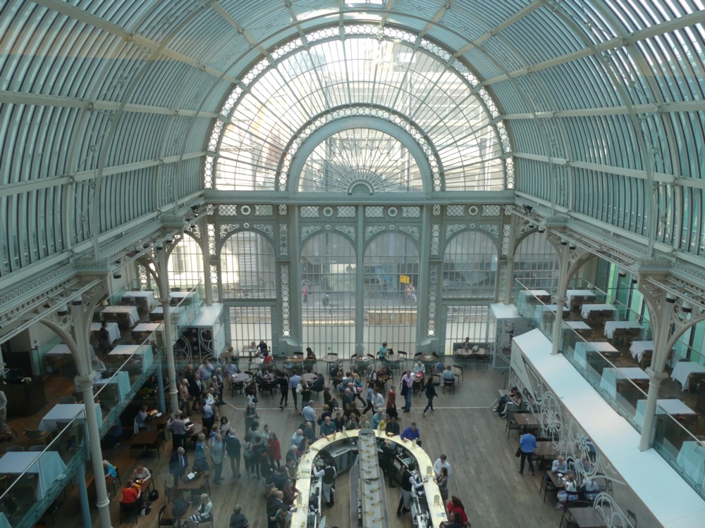
Well, during the interval in question, I found myself stretching my legs inside this aerial box. From it, I got views like this:

Which was all very fine, although I can’t really tell how good or bad this photo is, because I only have this terrible little replacement screen to look at it on.

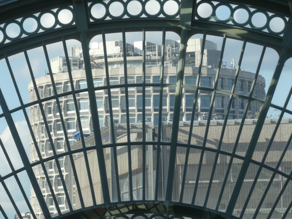
But then, things got even more interesting. I looked through that big semi-circular window, and saw other interesting things. In particular I saw this:

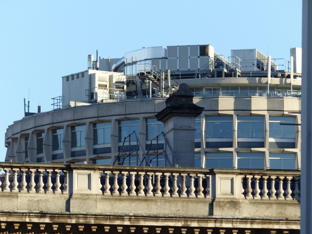
That is one of London’s finer assemblages of roof clutter, made all the more magnificent by being anarchically perched, like a tiny shanty town, upon one of London biggest and blandest and most geometrically severe pieces of sculpted Big Thingness from the Concrete Monstrosity era. Namely: One Kemble Street, which used to be known by the much cooler name of Space House.

If you image google for One Kemble Street, you get a deluge of photos of One Kemble Street, but just about all of them are taken from below. It’s like they’re ashamed of that marvellous roof clutter. But why? It is magnificent.

Here is another view of part of this roof clutter:

That was taken in December 2014, on the same day I photoed the floating bar in the sky, in the first photo, above.

Memo to self: check it out again, and try to photo the whole thing, in nice weather like that.

Originally posted at Brian Micklethwait’s Old Blog

Meanwhile in East London …

Indeed:

Click on that sliver of horizontality to see the building in question.

No doubt this has already received much www attention. And now, I attend to it. Photos taken by me, outside Hampton Wick Overground Station, yesterday.

The graffiti in the Hampton Hackney Wick and surrounding areas is dispiritingly ubiquitous. I prefer the way my part of town handles graffiti, which is for it all to happen in a tunnel.

Originally posted at Brian Micklethwait’s Old Blog

When what I think it is determines how ugly or beautiful I feel it to be

I am intrigued by how political opinions influence aesthetic feelings. Can you think that something is beautiful merely because it is the way that you think, in a political sort of way, that it ought to be? I say: yes.

I have been experiencing an illustration of this tendency recently. And the effect was thrown into sharp relief by the fact that I changed my idea of what the thing was, and that changed how I felt about it aesthetically. Although the thing itself hadn’t changed at all, I immediately found myself liking the look of it better. I had felt it to be ugly. Now, although I wouldn’t call this thing very beautiful, I don’t see it as ugly any more.

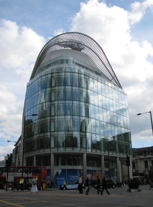
This is the thing that I had been regarding as ugly, It is to be seen across the road from Victoria Station:

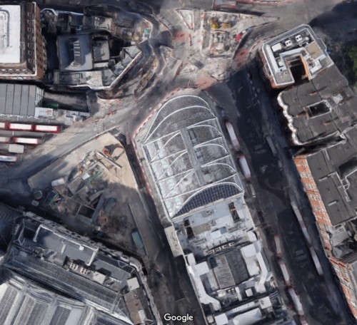
The ugliness of it is in its non-symmetry, and in the utterly irrational and incoherent contrast between the rectangular block in the middle of it and the curvey bits on the top and at one end. Why would you make a thing looking like that?

The best way to see how ugly this thing is (or was), is to look at it from above. Here is the google satellite version:

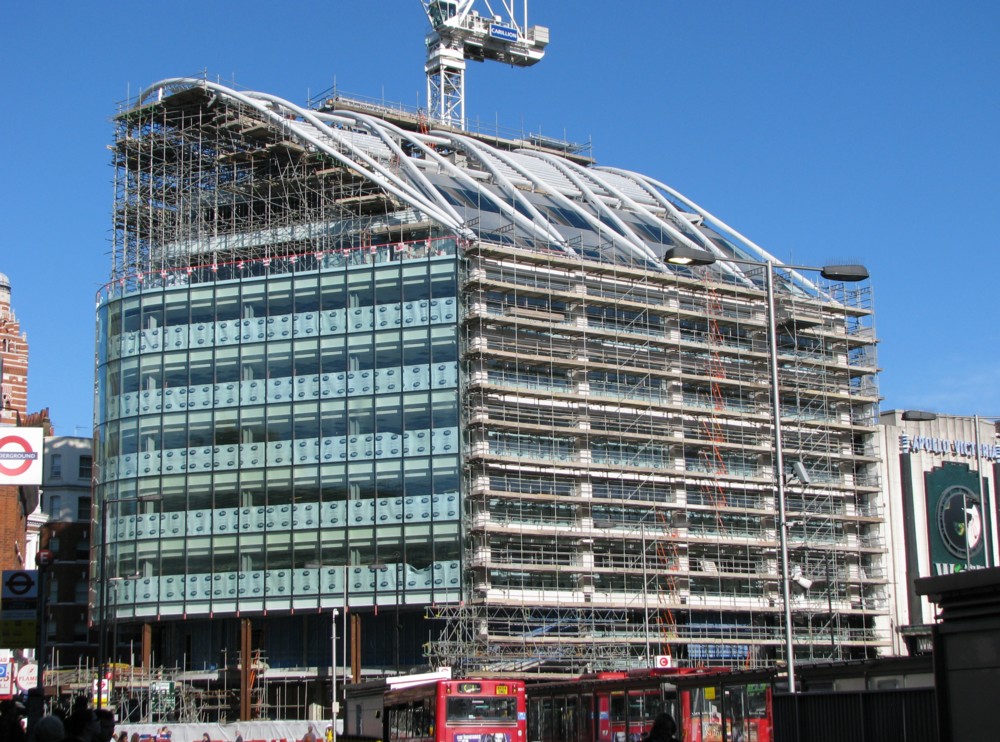
But then what should have been obvious to me all along became obvious. The rectangular block wasn’t designed into the building we are looking at. It had been there all along. The curvey bits had merely been added to the rectangular block, at one end and on the top. This building wasn’t all one design. It was a doubling up of designs:

There you see a photo, which I took in 2009, of this thing while they were doing it. It doesn’t prove that it was done in two entirely distinct stages, of which this is merely the second stage, but it seems to suggest that. The new building activity seems to concern the curvey bits on the top. The scaffolding next to the rectangular bits looks much more like the kind of scaffolding you put up when you are merely revamping an already existing building. And that, I am almost sure, is what is happening there, to the rectangular bits.

What I now see when I look at this ungainly thing is that rather than it being a very ugly piece of one-off design, I now see it as a charmingly quaint urban agglomerative confluence of constrasting styles, such as London contains a hundred examples of, and hurrah for London. London itself, as a whole, is just such a multiple design confluence. Old meets new, and both live to tell the tale. Or in this case new meets newer. This weird-looking building is a two-off design, you might say. It is a two-off design, and it looks exactly the sort of way a two-off design ought to look.

If I am wrong about it being a two-off design and I learn that actually it was all designed at once, I’ll probably go back to thinking it ugly.

Here are some more pictures of it that I have taken since then, from various angles:

That picture, to my eye, makes it look downright beautiful. As does this next one, taken looking into the evening sun from the top of Westminster Cathedral, even more so:

But now, the plot thickens, or maybe that should be: the plot gets thinner, back to its original state.

My internet searching skills are very primitive. I have just had yet another go at finding out what this odd building is called, at any rate by those who own it or who are in the business of renting it out. And I have finally managed to learn that they call it “The Peak”. Heaven knows why. It doesn’t look like much of a peak.

Anyway, knowing this, I eventually found my way to this description of The Peak. And what do you know? (More precisely: What the hell do I know?) It would appear that this ungainly thing was what I had originally assumed it to be: a one-off design. The whole thing was built all in one go. So what had seemed obvious to me was not even true, let alone obvious.

The Sheppard Robson designed building adjoins the Apollo Theatre and replaces two existing structures. The Vauxhall Bridge Road and Wilton Road elevations incorporate robust Portland stone-clad columns and spandrels with intricately designed glass solar shading louvres between.

The louvres provide a dynamic visual effect to the building both during the day and at night. The prow of the building facing Victoria Street is curved, following the site boundary, and an arcade has been provided at street level to substantially increase the pavement width along one of the busiest pedestrian thoroughfares in central London.

So, what will I now feel about this building? Will I go back to feeling that it is ugly?

This will not be a decision. It will simply be a fact, which I will discover by introspection. How do I now feel? As of now: not sure. My mind may decide that, because it had, for a while, been deceived by this building, and dislike it more than ever before. But, I am starting to suspect that, having found beauty in this object, even though this finding was based on an error, my mind will be reluctant to surrender this happy feeling.

Incidentally, I have already posted here a photo of the roof of this building, and in particular of the crane that sprouts out of that roof to clean the windows. I’m talking about the last of the three photos in this posting.

Originally posted at Brian Micklethwait’s Old Blog

Lea River footbridge

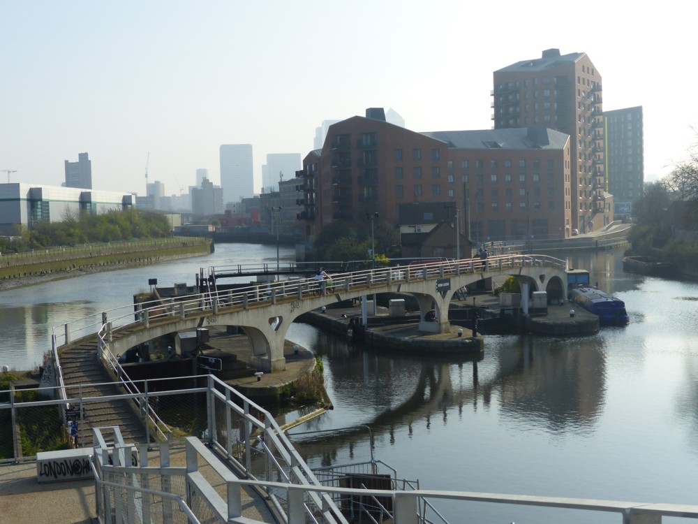
I like this footbridge, and I like this photo of this footbridge:

I took this photo on the same day I took this gasometer with towers photo, and these cat photos (LINK TO THE OLD BLOG).

We are looking down from the road bridge that takes Twelvetrees Crescent over the River Lea and Bow Creek. It’s a delightful spot, to be found at the top right end of the Limehouse Cut. On the right, we see the Limehouse Cut about to make its bee-line for the Limehouse Basin. And on the left, the River Lea is about to wend its very winding way down to the River. Where the Lea empties itself into the Thames is right near where I took these fish photos.

The reason I cross-reference all these photo-postings of mine is because the idea of these expeditions is not just to see amusing things in isolation, but in addition to that to build up the bigger picture in my mind of what that part of London, and in particular its waterways, is like. All these walks need to join up with each other, in reality and in my head. The latter I achieve by trawling back through my photo archives, by repeatedly meandering about in google maps, and by connecting up this blog posting with that one. And by going on more expeditions.

Originally posted at Brian Micklethwait’s Old Blog