Debussy and Sibelius at Blackheath Halls

Yesterday, my friend Nico invited me to an orchestral concert that he was playing in. He was playing the drums. But this was not some ghastly rock and roll ordeal, it was an orchestral concert, in Blackheath.

Blackheath has a place called Blackheath Halls, and last night, the Blackheath Halls Orchestra performed, in the particular Blackheath Hall called the Great Hall, works by Debussy (the Nocturnes) and Sibelius (the 7th Symphony). I’d offer a link to the announcement of this event, but now that it’s happened, the announcement of it has disappeared, like it never happened.

This Great Hall actually is pretty great. Just recently, it has had its seating redone, with a flat floor being replaced by a slab of raked seating. I photoed these after the concert had finished, and they looked like this:

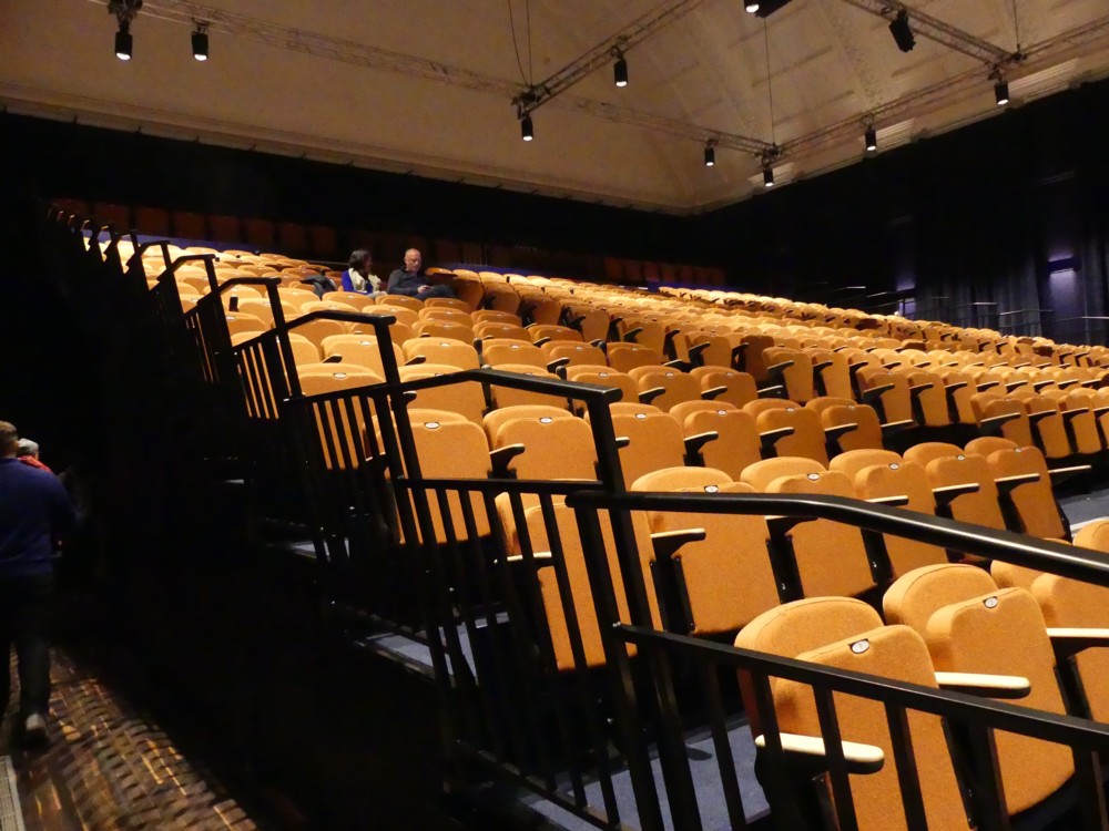
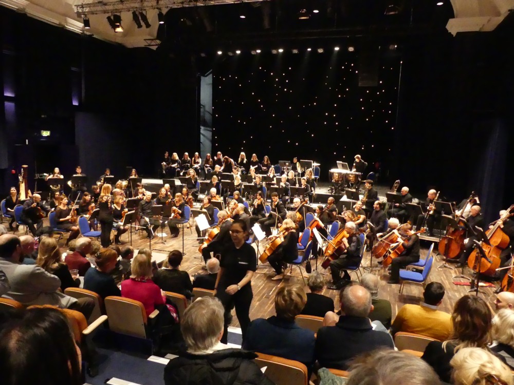
What that meant was that we in the audience had a great view of everything.

Here is a photo I took of how things looked as the orchestral players were making their way onto the stage at the beginning:

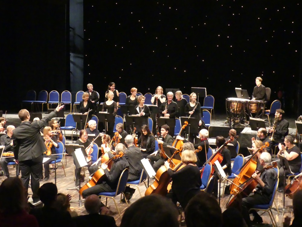
Here is a photo I took of conductor Christopher Stark, just before he embarked on the Sibelius symphony.

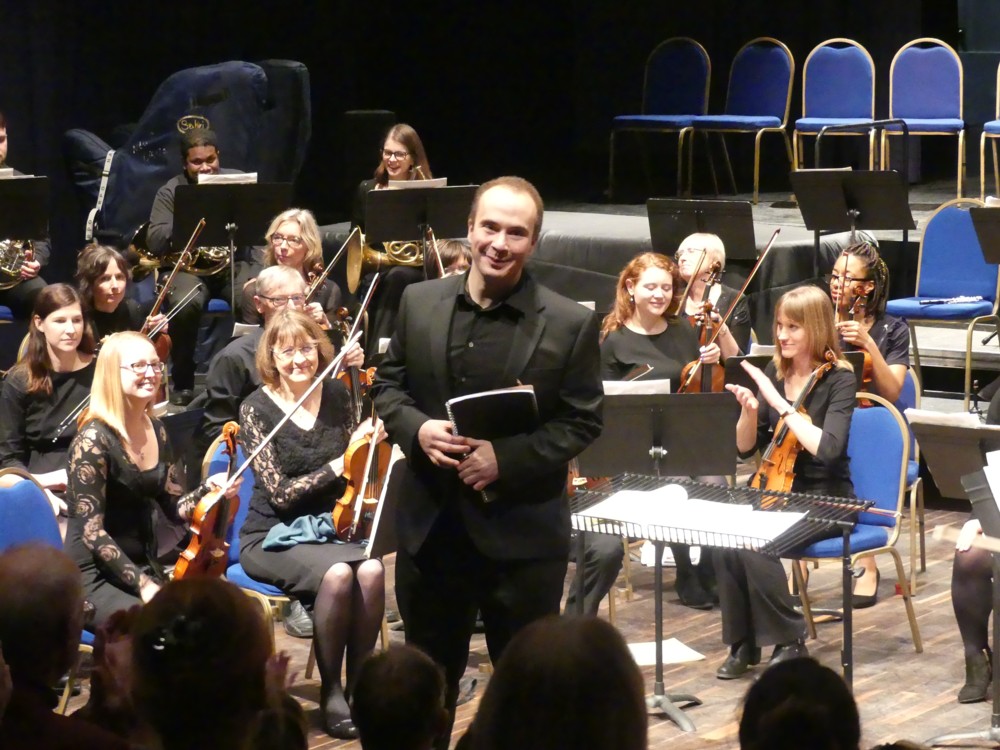
And here is a photo taken at the end, when the applause was loud and long, which includes my friend Nico and his drums. Was Nico the best? Maybe. I really couldn’t say. But he was, at any rate in the Sibelius, the highest up.

So, what to say about the music, and the performances? Well, the Blackheath Halls orchestra is an amateur orchestra, and if the sounds they made are anything to go by, the hardest task facing an amateur orchestra is when its violin section must play very high notes, very quietly. That is when ensemble is tested to destruction. I blame nobody for this. On the contrary, this was exactly the sort of thing I was eager to learn about, not having witnessed an amateur orchestra in action for about half a century.

Today, I played a CD I possess of these Debussy Nocturnes, with Pierre Boulez conducting the Cleveland Orchestra, on Deutsche Grammophon. And guess what: it is a more polished performance than the Blackheath Halls Orchestra managed last night. But having heard, and watched, amateurs play these pieces, I now know them a lot better.

In the second Nocturne, there is a big march, and Nico was in his element. He did an excellent job, then and throughout, with his usual dignity and exactitude and his usual total absence of fuss. I never caught the conductor looking at him, which, I believe, was because the conductor wasn’t worried about Nico. He had other worries to attend to.

That these Blackheath violinists had nothing to reproach themselves for became clear during part two of the concert. There was a particularly striking passage in the Sibelius, when, instead of having to play high and soft, they played very low and very loud. They sounded terrific.

So did the rest of the Sibelius, to me, but only after I did something rather surprising.

Christopher Stark, as conductors tend to do nowadays on occasions like this one, said a few words about each piece of music before he conducted it. And what he had to say about the Sibelius included how this symphony, instead of being chopped up into separate movements, quick and slow, with silent gaps in between, is instead all in one movement, but that during this one movement, the music “morphs” (his word) from one rhythm to another, fast to slower, slow to faster. At certain points of the piece there are both a fast little rhythm and a bigger and slower rhythm, both happening at the same time, in time with each other.

Stark’s conducting was as good as his words. However, when I watched him conduct, I was only able to hear the fast little rhythm. I missed those longer and slower rhythms. This was probably because not only Stark’s arms and fingers but his entire body were all concentrated on communicating exactly how that fast little rhythm should be played.

So, I closed my eyes.

And, immediately, I heard both rhythms, just as he had described them. There was absolutely nothing wrong with the musical results he was getting. It was just that the visual methods he was using were preventing me from hearing those results properly.

I kept my eyes closed for the rest of the performance, which I thoroughly enjoyed. As did the rest of the audience, judging by the enthusiastic applause at the end.

What the hell, you may be asking, was the point of going to a concert, at which I could see, very well, all the musicians in action, if I then shut my eyes? The point is: I was able to experience the extremity of this contrast. Had I only been listening, as with a CD or a radio performance, that contrast would not have registered. As it was, the moment when I shut my eyes was, for me, extraordinary.

Usually, I experience this effect at chamber music concerts, where the “body language” of the musicians constantly illuminates the nature of the music, and causes me, literally, to hear it better.

But, because (I surmise) the conductor last night was more bothered about getting his musicians to play the music as well as he could make them, than he was about explaining the music to us, the audience, with his visual gestures, I actually heard the music differently, and less well, when I watched him conducting. Again, I am blaming nobody. On the contrary, it was a most interesting thing to see and hear.

It helped a lot that Stark was able to explain something of the music, and in particularly this rhythmic aspect of it, with … words. Things conductors don’t usually bother with, on the night, for the benefit of the audience.

Another aspect of the evening that was fun was how the audience and the musicians mingled. I mean, how often, at an orchestral concert, does the man on the drums come and talk with you during the interval, and thank you for coming? That would never happen with the London Symphony Orchestra. During our conversation, I thanked Nico for telling me about this event and telling me also, beforehand, that the hall was architecturally interesting, in itself and because it had recently been remodelled. That helped to persuade me to come, and I am very glad that I did.

Originally posted at Brian Micklethwait’s Old Blog

Birds on a girder

Time for some more horizontality:

Click on that to get the 1000×750 original bigger picture, which I found here.

Notice the title of the posting. Hartley really is fascinated by colour, whether present, as here (in the sky), or absent, as is the case for the black and white birds here.

Interesting that stripping out the context, which makes it that bit clearer that these are birds, makes these birds that little bit harder to see clearly, as birds.

Originally posted at Brian Micklethwait’s Old Blog

A big kid playing with bricks

I have a friend who roams the earth working in exotic places. Friend supplies this photo of where Friend will be staying tonight:

It’s alright for some. Taken with a smartphone (what else?), in Rotterdam, earlier today.

More seriously, what this building makes me think is what I have long thought, which is that modern architecture is, a lot of it, about what kind of aesthetic experiences architects had when they were little kids. Does this Big Thing not look like big bricks of the sort given to small children, piled up rather inexpertly on top of each other, and now looking as big as it looked to a small kid? That’s what it looks like to me. Not that there’s anything wrong with that.

Good to have the arse of the ship there, to show how big this Big Thing is.

Originally posted at Brian Micklethwait’s Old Blog

Peak Remembrance?

Yesterday, I went on a shopping expedition which involved boarding a train at Charing Cross, which I planned to reach by going first to St James’s Park tube.

The first of the photos below (1.1) is of a taxi, parked close to where I live, with some sort of poppy related advert on it. I like to photo taxis covered in adverts. Temporariness, the passing London scene, will get more interesting as the years pass, blah blah.

Then, in Strutton Ground, just this side of Victoria Street, I encountered two besuited gentlemen wearing military berets and medals. I photoed them both, with their permission, and I post one of these photos here (1.2), also with their permission. Sadly, the other photo didn’t come out properly.

It was only at this point that I realised that, the following day (i.e. today) being Remembrance Sunday and what’s more the exact one hundredth anniversary of the Armistice of November 1918, London in the Westminster Abbey area would already be awash with Remembrance Sunday photo-ops. My shopping could wait a while, and I turned right down Victoria Street.

The seven other photos below mostly involve small wooden crosses and dead autumn leaves – autumn 2018 arrived at Peak Dead Leaf yesterday – but they also include another poppy related advert, this time on a the side of a bus (3.3), which I photoed in Parliament Square:

Sadly, the plasticated documents referring to “British Nuclear Test Veterans” (2.1) were insufficiently plasticated to resist the effects of the rain. It began to rain some more when I was arriving at Charing Cross station and it did not stop for several hours, so I’m guessing these lists suffered further rain damage. It’s odd how little sadnesses like this stick in your mind, in amongst the bigger sadnesses being remembered.

The autumn-leaves-among-crosses photos, all taken outside Westminster Abbey, are but a few of a million such that must have been taken over this weekend, in London and in many other places. Is it proper to include two mere advert photos, even if they are poppy related adverts, in such poetically symbolic and dignified company? I chose to do this because one of the things I find most interesting about these Remembrance remembrances is that, as each year of them passes, they don’t seem to be getting any smaller. People still want remember all this stuff, even though all the veterans of World War 1 are now gone. Hence the adverts. If the adverts didn’t get results, they’d not be worth their cost.

As to why these remembrances continue to be remembered, and by such huge numbers of people, year after year, I think one reason is that each political tribe and faction can each put their own spin on the sad events being remembered, but in the privacy of their own minds. For some political partisans, these ceremonies and symbols are a chance to wallow in the pageantry of patriotism. For others, they are an opportunity to rebuke such nationalists, for stirring up the kinds of hostility that might provoke a repeat of the sad events being remembered. “Patriotism” and “nationalism” being the words used to salute, or to denounce, the exact same sentiments. But declaring red poppies to be a warning that the defence budget should be increased, or that they are anti-Trump and anti-Brexit symbols that Trump supporters and Brexiteers have no right to wear, would be too vulgar and partisan, so on the whole this kind of vulgarity and partisanship is not indulged in, not out loud.

The phenomenon of the political meeting where all present hear the same words but where each understands them to mean different things – I’m thinking of such words as “Britain”, “freedom”, “democracy” and “common sense” – has long fascinated me. Remembrance ceremonies remind me, on a larger scale, of such meetings. I attended many such little political meetings myself before I decided that mainstream politics was not for me, and switched to libertarianism, where meanings are spelt out and arguments are had rather than avoided.

For less obsessively political people, Remembrance ceremonies and symbols are simply an opportunity to reflect on the sadness of history in general, and in particular the sadness of the premature deaths of beloved ancestors – or, perhaps worse – hardly known-about ancestors. We can at least all agree that premature death, in whatever circumstances, is a sad thing to contemplate. And until young men entirely cease from dying in wars, Remembrance Sunday will continue to be, among other things, a meaningfully up-to-date event.

And so, year after year, these ceremonies continue. Will this year’s anniversary come to be regarded as Peak Remembrance? We shall see.

Originally posted at Brian Micklethwait’s Old Blog

Roz is now being quoted

This is not an advert for a book. Well, it is, but that’s not my purpose in showing it here. My angle is my niece, the crime fiction writer Roz Watkins, who is quoted here, enthusing about the book:

The point being that, with what seems to me like remarkable speed, Roz has turned herself into someone whose opinion about other people’s writing is considered worth quoting.

I found the above graphic at her Twitter feed, along with her thanks for having been described as “the great Roz Watkins” by a grateful publisher. Everything about Roz’s public and social media presence says to me, and I am sure to everyone else who is following her, that she is very serious about her writing career. Deadly serious, you might say.

This matters, because readers of crime fiction need to know that, if they invest their time and curiosity and shelf space, to say nothing of their cash, in a leading character, this investment will pay off. The energetic and upbeat way that Roz presents herself says that there will be plenty more books about her lead detective. There is already a second Meg Dalton tale coming out next April, and if several more Meg Daltons do not follow, at a speed no faster than (but no slower than) is consistent with the maintenance of quality, I for one will be very surprised.

Originally posted at Brian Micklethwait’s Old Blog

Brexit taxis

Whenever I see a taxi with an interesting advert on it, I try to photo it. To recycle what I said in this, there is something especially appealing about a large number of objects, all exactly the same shape, usually all decked out in the same bland colour, but each one instead decorated differently and very colourfully.

It would appear that I’m not the only one. Further evidence that taxi adverts count for more, per square inch, than other adverts do, comes in the form of the meme war that this taxi and its advert is now provoking:

The CEO of a plumbing firm has announced that his company will be paying a delivery driver to ride around London in a taxi emblazoned with the slogan ‘Bollocks to Brexit’.

Social media gobbled this up, of course, and the responses were not long in coming. There was this:

And then this:

And there will surely be many more. I hope I chance upon the original, and get a go at photoing it myself.

More taxis with regular adverts will definitely follow here, as soon as I get around to it.

LATER: And, as I should have mentioned sooner, my friend from way back, financial journo Tom Burroughes, is giving a talk this Friday, tomorrow evening, at my place, about Brexit and all that. I anticipate a more subtle and more elevated discussion than the one on these taxis.

Originally posted at Brian Micklethwait’s Old Blog

Bartok and three ladies outside South Kensington tube

Yes, here’s Bartok (again), from a slightly different angle, so that the tube station is right behind him:

A regular bloke in the street.

But now look at this. Same view, but with three newcomers, down at the bottom:

The statue of Bartok is a lot nearer to me that you perhaps assume, and crucially, those tiles look like bricks but are actually bigger than regular bricks, which makes this scene look a lot smaller than it really is.

Which is why the additional ladies at the bottom of the second photo really are so very small.

Photos taken by me yesterday.

Originally posted at Brian Micklethwait’s Old Blog

How photo-collating reminded me of some (other) good modified cliché photos

More and more of my photo-time is spent collating the photos I have already taken. Last night, for instance, I went looking for (more) photos of London taxis with adverts on them. There is something especially appealing, to me anyway, about a large number of objects all exactly the same shape, but each decorated differently. (Some time, I must go searching for my photos of elephants.)

Equally appealing, to me, were those Gormley Men (LINK TO THE OLD BLOG). In that case, each Man was the same, and undecorated in the more usual and rather bland sculpture way. But, each one was in a different place and a different sort of setting. My Gormley Men photos did not need collating, because Gormley had already collated them, by putting all his Men in the same part of London at the same time. Therefore my photos of the Gormley Men mostly collated themselves.

Not so the elephants, or taxis. When looking for taxis, I am looking for taxis photoed in the course of all manner of different photo-expeditions each with their own directories.

But my point is that in the course of all this taxi-collating, I was clicking through literally thousands of non-taxi photos, and I kept coming across non-taxi photos that I particularly liked. Like (like as in “such as” – this is not a command) this one, for instance, taken last June:

I like doing modified cliches in writing, and I also like them photographically. A view, for instance, of some London Thing that has been photoed to death, but put beside or in front of or behind something that is not so usual. Most photoers would regard the above scaffolding as a problem rather than any sort of solution, to the Eros-has-been-photoed-to-death problem.

The scaffolding’s wrapping has the effect of clearing away all the usual clutter from Piccadilly Circus and replacing it with something a lot like sky on a dull day. It puts Eros in an empty field in the countryside, you might say. And yes I know, I like clutter. But not always.

Here is another modified cliché photo:

The Wheel has been photoed to death, and that’s a view I regularly see – and regularly photo – of it, from the point where Strutton Ground meets Victoria Street, looking down Victoria Street towards Parliament Square and beyond. But that sky behind The Wheel made The Wheel look amazing, on that particular day in January of this year.

Finally, one of many photos I took this year of Battersea Power Station:

The Power Station and (if you are a craniac like me) its crane cluster are the clichés. And if you want to take the sting out of a cliché, one way is to reflect it in something. At that point its extreme recognisability becomes more a virtue and less of a bore. Its very clichéness becomes helpful to the photo.

This photo was taken from the upstream side of the Power Station, where there is already a big chunk of new flats up and running, with accompanying tasteless sculpture, coffee serving places and the like. All sparked, I believe, by the new USA Embassy.

This photo of mine turns Battersea Power Station upside down. I’ve always thought that an upside down Battersea Power Station would make a rather good table. But, until now I never thought to go looking for such a table on the www. Here we go. That took about three seconds, so I bet there are plenty more that are cheaper. This guy had the same idea, but those two links were all I could quickly find concerning this notion.

Here is another modified cliché photo of Battersea Power Station, the modification this time being smoke.

Come to think of it, all those London taxi photos I’ve been digging up are also modified cliché photos, aren’t they? London taxi = cliché, adverts = modification.

Originally posted at Brian Micklethwait’s Old Blog

Flexible electronic paper could be available in colour …

Yesterday I was writing here about how temporariness is a great softener of visual blows. If you don’t like it, wait until it goes away.

Well, here is news of progress in the technology of making how something looks something that can keep on changing:

Flexible electronic paper could be available in colour as early as next year, allowing designers to create clothing, accessories and other products that double as display screens.

Commonly used on devices such as Kindle e-readers, e-paper has until now only been available in monochrome, restricting its appeal.

But advances in flexible e-paper technology mean that products such as shoes, watches and garments could soon feature full-colour text, patters and images that can constantly change.

It won’t just be how people dress.

However, this will be a different kind of temporariness, because the changing, at least potentially, will never stop. There will be no normal that gets interrupted, which you can wait for things to get back to, the way you can with scaffolding.

But, “could be available …” means that all this will be taking a while.

Originally posted at Brian Micklethwait’s Old Blog

The last really fine day of 2018 (2): Scaffolding wrapped and unwrapped – and the Reichstag wrapped

I’ve asked it before and I’ll ask it again. Why do I regard most of Modern Art as silly, yet relish real world objects which resemble Modern Art? Objects like this:

The above photo was taken on The last really fine day of 2018, just minutes after I had taken the one in that earlier posting.

You don’t need to go to an exhibition of sloppily painted abstract art, when the regular world contains wondrous looking objects like that. And what is more, they are wondrous looking objects which have worthwhile purposes. This wondrous object is for supporting and protecting workers as they work on a building.

Here is how that same scaffolding looked, unwrapped, about a month earlier:

I particular enjoy how the sky changes colour, in my camera, when a big white Thing is inserted into the picture. (This afternoon, I encountered this, by Real Photographer Charlie Waite. Same effect.)

Thank you to the (to me) invaluable PhotoCat, for enabling me to crop both of the above photos in a way that makes them more alike in their scope and which thereby points up the differences. I’m talking about the invaluable Crop But Keep Proportions function that PhotoCat has, but which PhotoStudio (my regular Photoshop(clone)) 5.5 seems not to offer. (I would love to be contradicted on that subject.)

Despite all my grumblings about how silly most Modern Art is, I do nevertheless greatly like the way that this Big Thing (the Reichstag) looks in the pride-of-place photo featured in this BBC report, an effect which presumably makes use of the same sort of technology as we see in my photo, but on a vastly grander scale:

I have to admit that this is several orders of magnitude more impressive than my scaffolding. (Maybe that was the last really fine day of 1994.) My scaffolding looks lots better than some badly painted little abstract rectangle in an Art gallery, but it’s not nearly as effective as the Reichstag, as wrapped by Christo and Partner.

Because this Big Wrapped Thing was so very big, and because it is such a very interesting shape, it really does look like it added greatly to Berlin, in that summer of 1994. I entirely understand why all those people assembled to gaze at it. Had I been anywhere in the vicinity, I would have too. And had there been digital cameras then, I would have taken numerous photos, as would thousands of others. Thus giving permanence to this vast piece of temporariness.

Because, what I also like about this Reichstag wrapping is that, just like my scaffolding, and just like all the other wrapping done by Wrapper Christo and his Lady Sidekick, it is temporary. That BBC report calls it Pop-Up Art, and it is of the essence of its non-annoyingness that any particular piece of Pop-Up Art by Christo will soon be popping down again.

This Reichstag wrapping happened in 1994, but is now long gone. Did you disapprove of what Christo and his lady did to the Reichstag? You just had to wait it out. Soon, it would be be gone.

Do you think scaffolding, especially when wrapped, is ugly? Ditto.

Originally posted at Brian Micklethwait’s Old Blog