But are we any happier?

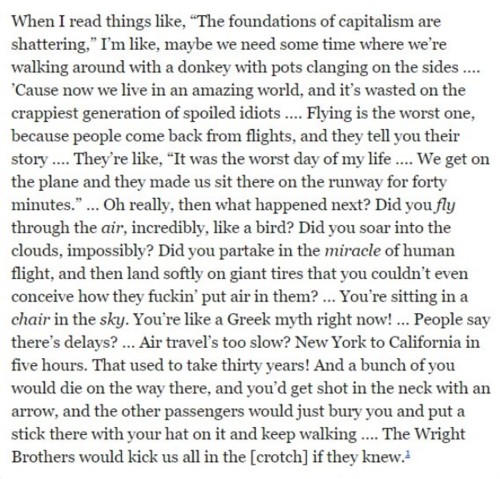
A tweet reminded me about this wonderful rant from Louis CK:

That’s the version of it, with dots inserted by him, that Steven Pinker quotes in his new book about the Enlightenment.

Pinker is concerned to explain why increasing affluence doesn’t seem to make everyone ecstatically happy. Deidre McCloskey, in her Bourgeois trilogy, is fond of talking about how the Great Enrichment has made regular people as of now nearly three thousand percent richer. So, why aren’t we three thousand percent happier? Because we don’t seem to be.

Lots of reasons. First, you are happy not according to your absolute level of affluence, but rather according to how affluent you get to be and how meaningful your life gets to be compared to what you were expecting, and compared to how well everyone else seems to be doing, because that tells you how well you could reasonably have expected to do yourself. You may well have been raised to expect quite a lot. Second, although technology hurtles along, for most this hurtling is both pleasing and rather unsettling, the less of the former and the more of the latter as time goes by. We don’t experience, in our one little life, how much better things like Twitter are than is looking after cows, out of doors, all year round, with not enough food or heating. What we experience, as we get older, is how confusing things like Twitter are, or alternatively, if we ignore something like Twitter, how demoralising it is that it has defeated us and denied us its benefits. Or how tedious air travel is, compared to what we’d hoped for rather than compared to a horse drawn wagon in a desert. Yes, I live three thousand percent better than that wretched cowherd three hundred years ago, and if a time machine took away my life and gave me his life, I’d be three thousand percent more miserable. But that’s not the same as me being three thousand percent happier than he was. Happier, yes, definitely. But not by that much.

It’s because we don’t feel that much happier that Louis CK has to rant, to remind us of how lucky we are. And that Steven Pinker has to write his book, to make the same point.

But what if progress continues to hurtle forwards? What if someone reads this posting, centuries from now, and he says: Good grief, those Twenty First Centurions were very easily satisfied. Five hours to get from New York to California?

It must have been hell.

Originally posted at Brian Micklethwait’s Old Blog

My camera is not turning photos yellow – it’s Windows Photo Viewer that is turning photos yellow

Yes, panic over. The situation seemed very bad, but instead is as described above.

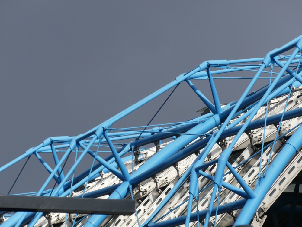
Consider this photo, of the roof of the long snakey shed that looks like it’s for growing tomatoes, where the Euro-trains used to arrive and depart from:

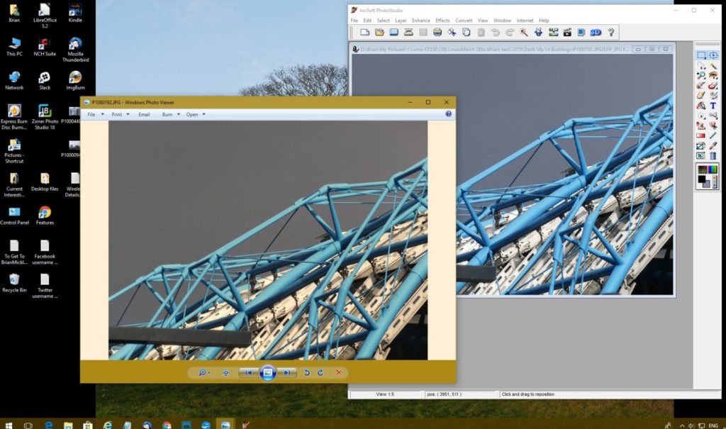
I was viewing that in Windows Photo Viewer, but then I found myself simultaneously viewing that same photo in in my photo-editing software, thus:

Do you see? Of course you do. Windows Photo Viewer, on the left, has introduced, from nowhere, a cream background, and shoved it behind and into the photo. On the right, Photoshop(clone) has ignored this cream under(over)lay, and has restored the pure blue of that Waterloo Station roof and has taken the ominous yellow tinge out of the dark grey sky. The white bits of the roof are back to being white. Put the photo in some different software for viewing my archives, and it is similarly cleansed of yellowness. All was well with the original photo, as it emerged from my camera. Windows Photo Viewer is the problem and the only problem.

So, no panic about my camera. Just a question about Windows Photo Viewer. How do I get that to behave itself? I have worked out how to change the brown at the top and bottom of the photo to any other colour you or I would like. But can I get it to stop with the cream? Can I random-punctuation-marks-in-an-angry-little-line. Suggestions anyone?

Originally posted at Brian Micklethwait’s Old Blog

Southwark Cathedral from the train

This evening I had a party at my home. All the people I invite to my Last Friday of the Month meetings were invited, and almost exactly the same number of people showed up as tend to show up for the meetings. How do they do this?

I am now completely knackered, but it wasn’t the party alone that knackered me; it was … alas, I find that I am too knackered to explain. Maybe, although I promise nothing, later.

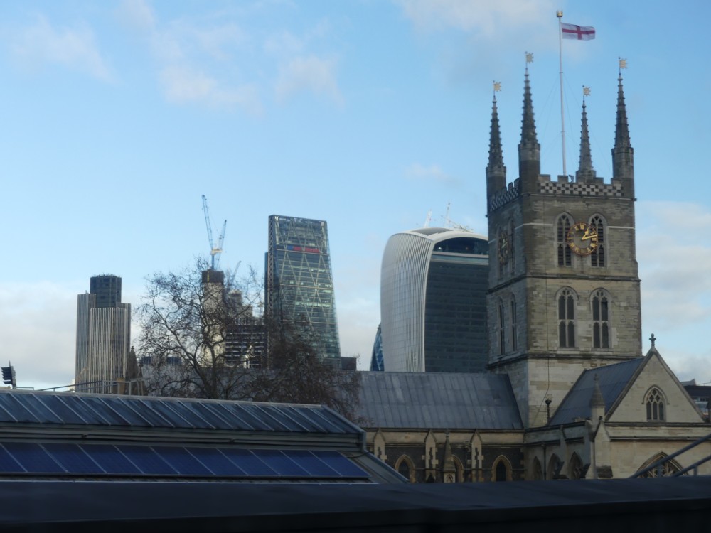
So instead, a quota photo, of Southwark Cathedral not being dwarfed by modernity:

Taken out of the train window, on my way to Hither Green.

Spot the Gherkin.

Originally posted at Brian Micklethwait’s Old Blog

Camera not conked out – I just pressed the wrong knob by mistake

My camera is pretty good, but it isn’t ideal for me. I only use a bit of it at all regularly, the automatic bit. So if, on a rainy day, I push, by mistake, some stupid knob on it that tells it to stop being automatic, it stops being automatic. And, the automatic focussing refuses to work the way it should. That’s what happened when I thought it had conked out. It’s fine. It was simply obeying orders.

I tried photoing the relevant knobs, first with mirrors and then with my mobile, but the results of all that were a blurry mess. Have you ever tried getting a camera to photo its own arse? And photoing with my mobile is something I need daylight to do half decently.

I got a much better picture of the back of my camera by going to this.

In particular, I draw your attention to this bit:

The knob with AF/AE LOCK on it needs to be pointing at AFS/AFF, and absolutely not at MF. MF means, I presume, Manual Focus. AF means automatic focus. S and the other F mean whatever they mean.

The problem arose when, in the rain and needing to possess three hands, one to hold my bag and two to operate my camera properly, I try to look at the photo I just took. That involves pressing the button with the green arrow on it. To get back to photoing, press DISP. But, what with all the rain and the confusion and only having one hand to both hold the camera and press the knobs on it, I accidentally pushed the AF/AE LOCK knob, and got it pointing at MF. By mistake. I’m guessing this would be why the AF/AE LOCK button includes the word “LOCK”. And this works a treat. I know this now.

Anyway, the upshot (metaphorically speaking) of all this is that my camera went from photos like this, just before I met up with GD2 the day before yesterday …:

… to this, not long after that, after the knob disaster had occurred …:

… and then back to this:

… when I met up with a friend yesterday, in: Hither Green.

So, panic over.

It’s an odd feeling, partially the feeling of massive relief that I won’t have to spend Christmas trying to turn whatever guarantee came with my camera into another camera, and partially the feeling that I am an idiot and that I should pay more attention to the knobs on my camera. Delight and embarrassment all mixed up together.

This is what Americans would call a “learning experience”, and although often all that this means is “total cock-up”, in this particular case they would be right.

Originally posted at Brian Micklethwait’s Old Blog

Cantilevered Thameslink seats

My journey to St Albans yesterday began rather inauspiciously. I was changing at St Pancras International, and I had hoped that I might get the chance to view the International bit, with its wide open spaces, Eurostar trains and its mighty roof. But all I did was follow the signs to “Platform B”, and that weary plod might has well have been at Green Park or Oxford Circus, for all the wide-open-spaced drama there was to be seen. And then when I was on the train, the scene outside was grim, grey and wet.

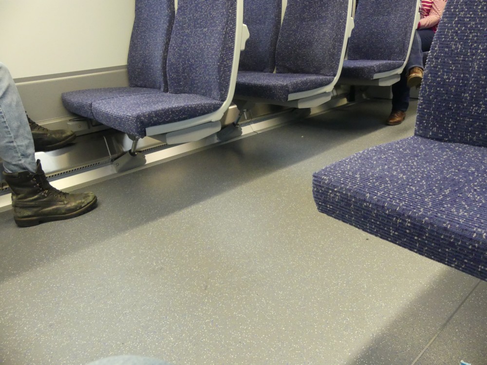
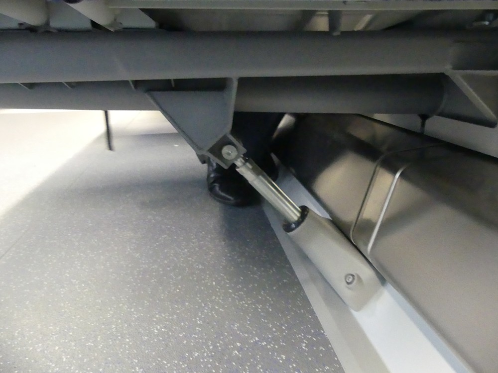
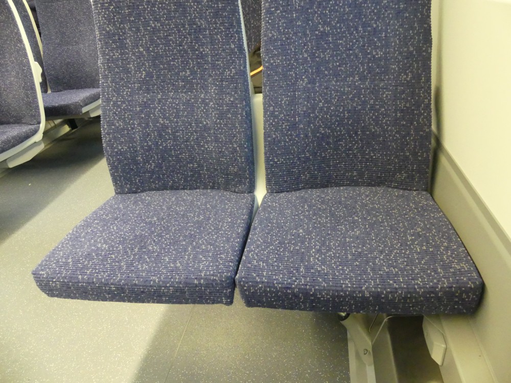
But then, I noticed the seats. The surprising thing about these was that instead of resting on the floor of the carriage, they were attached to the walls of the carriage, leaving the floor entirely unencumbered. They hovered over that floor with very little visible means of support:

Here are two closer-ups, showing the diagonal compression member that was doing all the worke:

It looked crazy, but it felt as solid as a rock. Solider in fact, when you consider the state of a lot of rocks you encounter on your travels.

What I think I see here is not so much a design for a railway carriage, as a design of a system for making railway carriages, just the way you want them. And for changing them, if you suddenly decide you want them to be different. If you wanted to redo the seating on these carriages, all you would do is undo the linear compartment at the point where the wall of the carriage nears the floor of the carriage, and make whatever changes you want. Different seats, differently spaced, whatever. The floor is untouched. If you want to change the surface of the floor, easy. When it comes to cleaning the floor, also easy.

I have a nostalgic fondness for the railway carriages of my youth, with their absurdly thick, manually operated doors, that you had to slam shut, and which all had to be shut before the train could depart. But whereas I genuinely like old cars, I cannot really mourn those old carriages. These new ones are just so much better. For starters, they are wider on the inside by about two feet, because the walls are so much thinner and because these walls curve outwards.

I also like how the latest carriages join together in a way that allows people to walk continuously through, thereby easing congestion at busy times. Here’s a rather good photo from Wikipedia which shows that. According to Wikipedia there have been complaints about there being too little leg room between the seats, and no miniature fold-down tables.

They have their reasons for imposing such discomforts. Basically, they want to enable the maximum number of commuters to be able to travel in okay comfort, rather than allow a lesser number of commuters to travel in greater comfort. Which makes sense.

My point is different. My point is that if it is later decided, perhaps in response to such grumbles, to switch to having slightly more generously spaced seats, with little fold-down tables, this would be a relatively easy operation to unleash. Newly introduced carriages could be differently configured with great ease, without needing a totally new design.

There is much to complain about in the modern world, but stuff like this just gets cleverer and cleverer.

Originally posted at Brian Micklethwait’s Old Blog

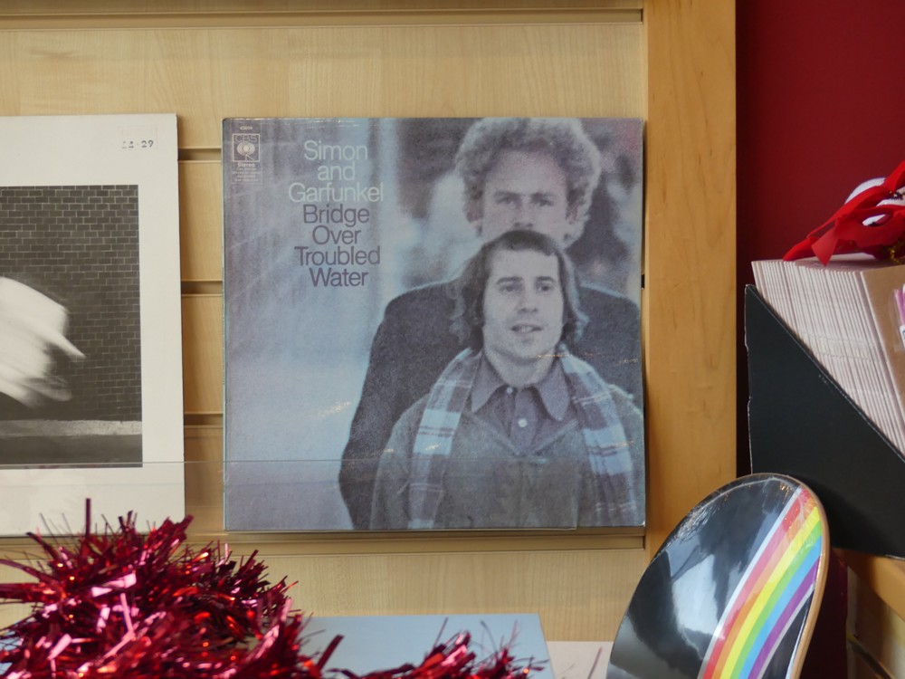
Vinyl Empire

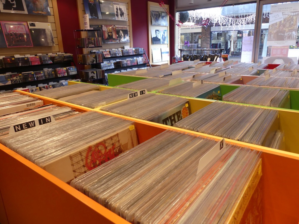
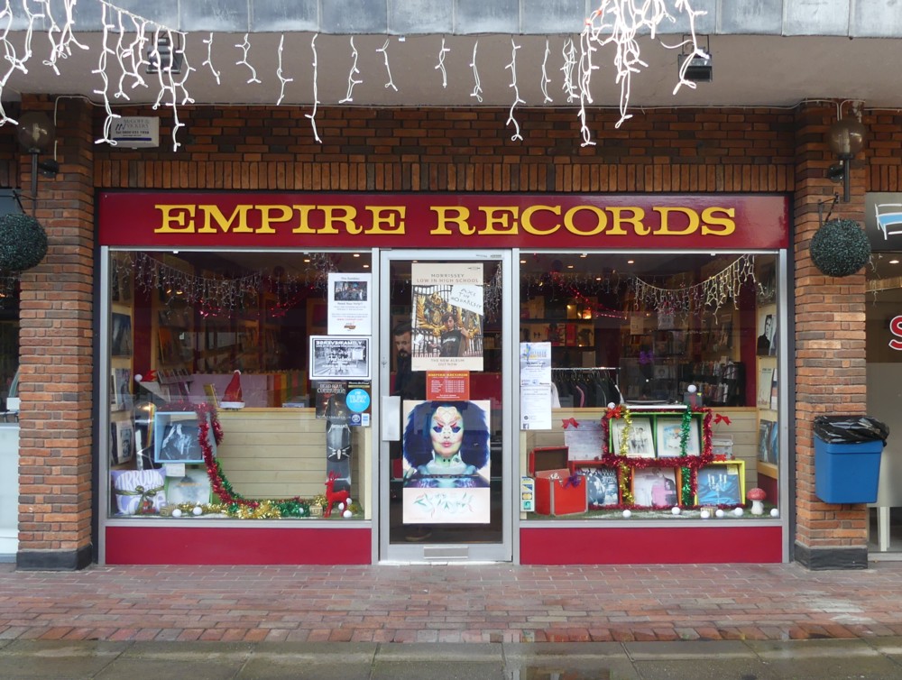
Indeed:

Opened in 2013. Still very much open 2017:

Photos by me this afternoon, in St Albans. Thanks to Darren and family for the hospitality.

LATER: Another blast from the past:

I remember liking that one a lot.

Originally posted at Brian Micklethwait’s Old Blog

Haunted!!

The previous posting, with its references to Gaspard de la nuit, had a tenuous Halloween vibe to it. But do I have any recent photos to show you, with a ghostly or spooky angle to them?

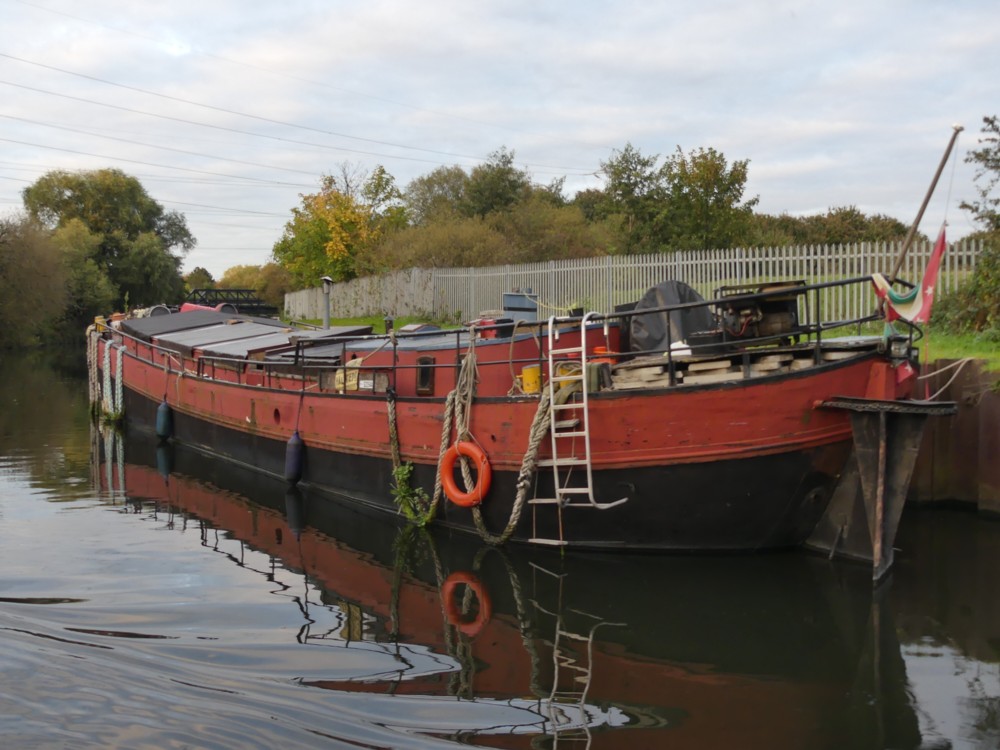
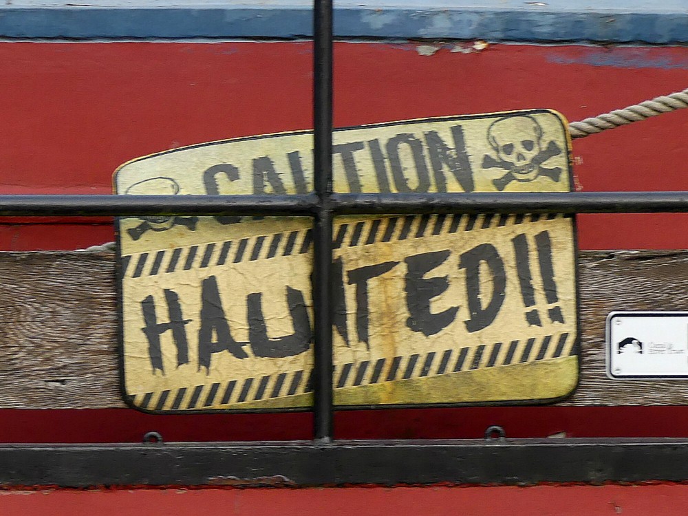
I’m afraid the best I can do is a photo of a sign on the side of a boat that I photoed on the day I also took these photos.

Here is the boat:

And here is the sign on the side of it:

I know. Not very scary.

Nevertheless, this points to a real problem of living in a canal boat. Security. As these boats multiply, and as it becomes more chic to live this way, in a manner often practised by people who are away at work for long periods, so too will the number of thieves who have a go at preying on them.

But on reflection, if I was a thief, I think the above sign might put me off. It suggests a concern about resisting thievery, and also a certain willingness to think unconventionally. What if some unsupernatural ghosts have been artificially contrived, to aid in the boat’s defence? Yes, I think I’d try another boat.

Every little helps.

Originally posted at Brian Micklethwait’s Old Blog

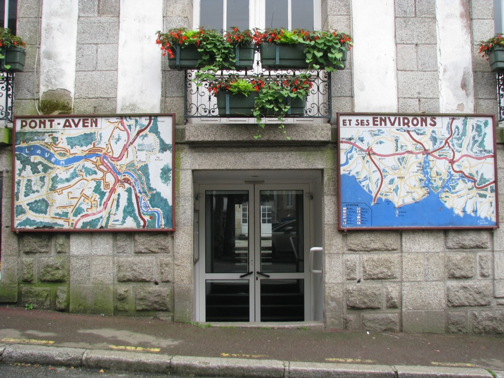
Pont-Aven et ses environs

I got bogged down semi-working on a succession of postings that never got finished. So here is a quota photo, picked out the archives pretty much at random:

There I was, trawling through a huge clutch of photos taken somewhere in Brittany, in June 2011, but not knowing where they were of. Then that photo presented itself, and all was clarified.

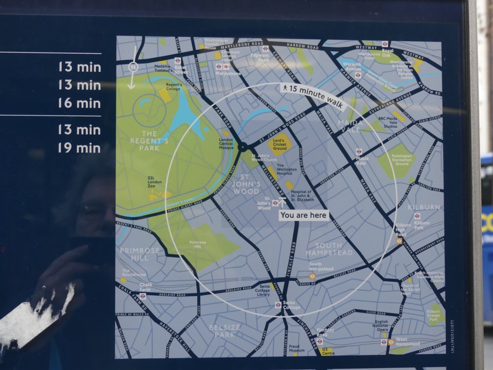
Memo to self: always photo signs, maps, signposts, in fact anything that will later tell me what I was photoing and where. I know, I know, cameras will give you map references, if you ask them nicely. But I’m a twentieth century boy. I like actual maps

Preferably with little signs on them that say: you are here. Or in this particular case, vous êtes ici, which I don’t think the above maps do have. Quel dommage.

I recently started a new directory called “You are here”, for all such map photos.

Originally posted at Brian Micklethwait’s Old Blog

Sunny Croydon

Today I was in Croydon. Not for long, but I was in Croydon. While in Croydon I took photos.

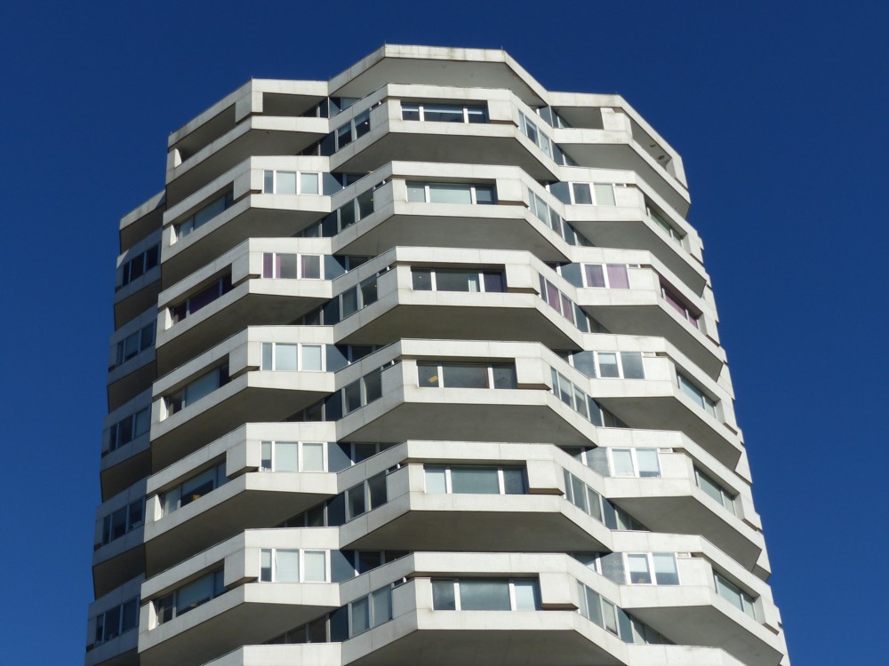
Like this one, of No. 1 Croydon:

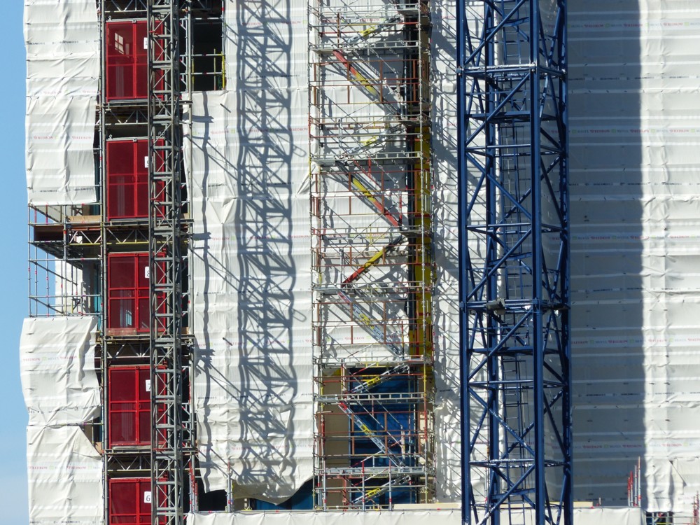
And like this one, of a buildlng which was being modified, but whose name I did not catch:

Why was I in Croydon? I had my reason. More tomorrow, or some day, or maybe never. I promise nothing.

Originally posted at Brian Micklethwait’s Old Blog

Recent taxis with adverts photos

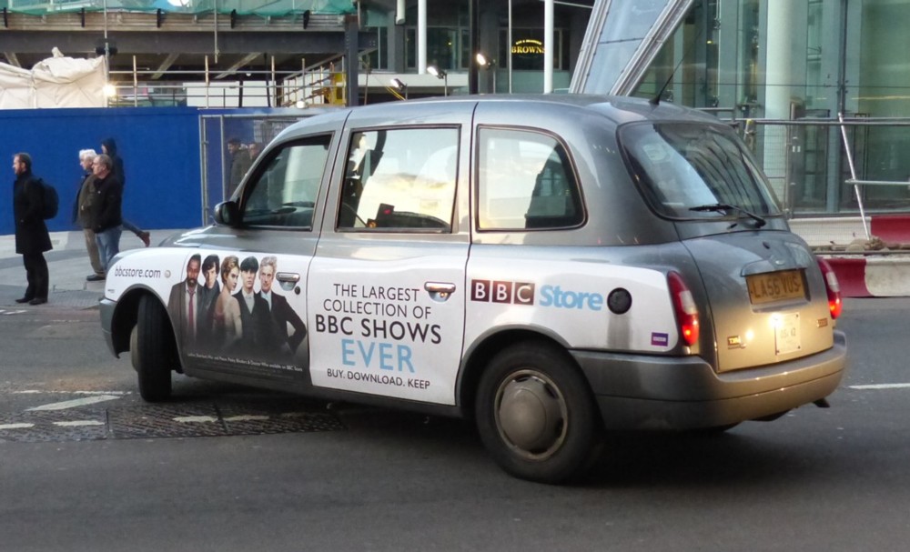
Yes, I’ve been continuing to photo taxis with adverts. Here are half a dozen of the most recent such snaps.

First up, further proof, if you need it, that the internet has not abolished television. People still like to be passively entertained, surprise surprise. But the internet is in the process of swallowing television, so that they end up being the same thing:

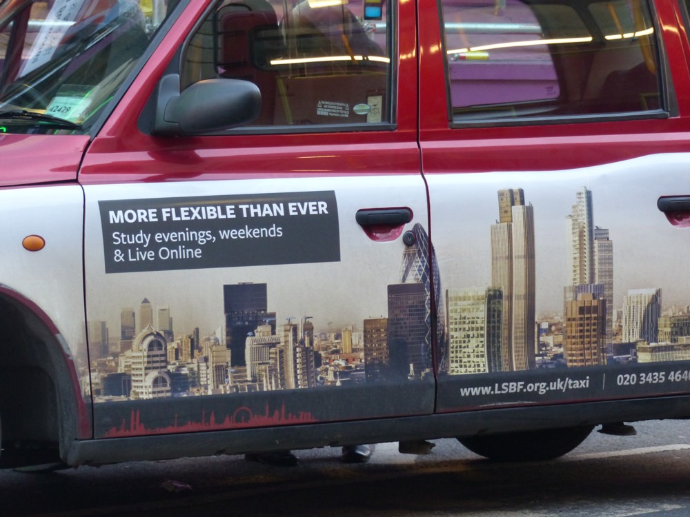
Next, become an accountant! Note how they include the word “taxi” in the advertised website, presumably to see whether advertising on taxis is worth it. Note to LSBF: I have no plans to become an accountant.

Note also the Big Things picture of London, something I always like to show pictures of here, and note also how out of date this picture is. No Cheesegrater, for a start:

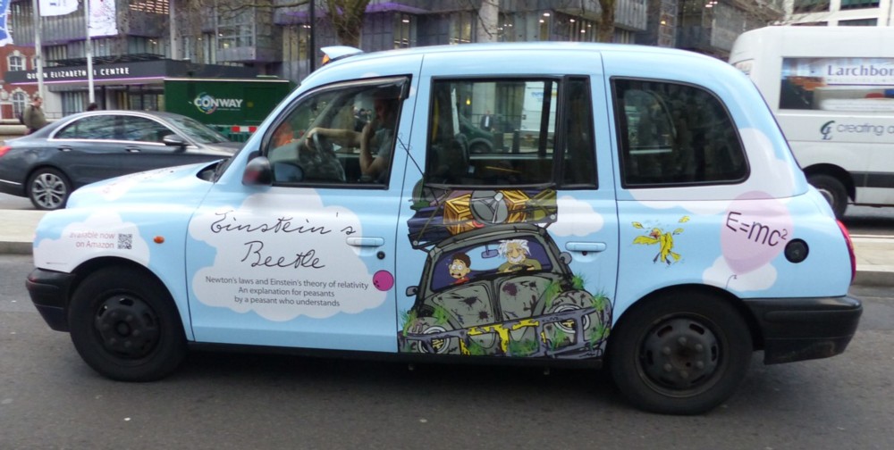
Next up, a taxi advertising a book. I do not remember seeing this before, although I’m sure it has happened before:

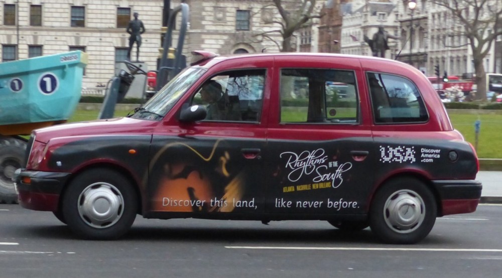
Next, Discover America. I thought it already had been:

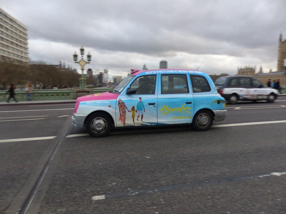
Visit a beach. I didn’t crop this photo at all, because I like how I tracked the taxi and its advert, and got the background all blurry, and I want you to see all that blurriness. Nice contrast between that and the bright colours of the advert. A little bit of summer in the grey old February of London:

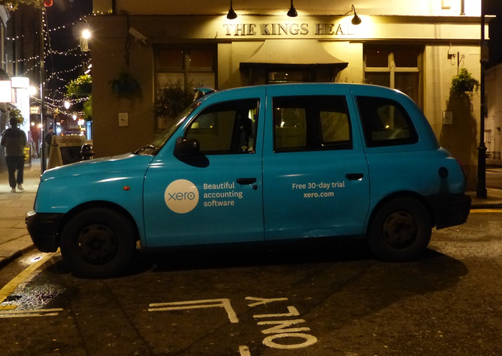
Finally, a snap I took last night, in the Earls Court area. And now we’re back in the exciting world of accountancy, this time in the form of its Beautiful accounting software:

As you can see, it was pitch dark by the time I took this. But give my Lumix FZ200 even a sliver of artificial light and something solid to focus on, and it does okay, I think. A decade ago, that photo would have been an unusable mess.

I am finding that taxi advertising changes very fast these days. All of the above photos, apart from the one with the beaches, was of an advert I had not noticed before.

Which means that in future years, these taxi photos will have period value, because the adverts will have changed over and over again with the passing of only a handful of years.

Originally posted at Brian Micklethwait’s Old Blog