Bartok and three ladies outside South Kensington tube

Yes, here’s Bartok (again), from a slightly different angle, so that the tube station is right behind him:

A regular bloke in the street.

But now look at this. Same view, but with three newcomers, down at the bottom:

The statue of Bartok is a lot nearer to me that you perhaps assume, and crucially, those tiles look like bricks but are actually bigger than regular bricks, which makes this scene look a lot smaller than it really is.

Which is why the additional ladies at the bottom of the second photo really are so very small.

Photos taken by me yesterday.

Originally posted at Brian Micklethwait’s Old Blog

How photo-collating reminded me of some (other) good modified cliché photos

More and more of my photo-time is spent collating the photos I have already taken. Last night, for instance, I went looking for (more) photos of London taxis with adverts on them. There is something especially appealing, to me anyway, about a large number of objects all exactly the same shape, but each decorated differently. (Some time, I must go searching for my photos of elephants.)

Equally appealing, to me, were those Gormley Men (LINK TO THE OLD BLOG). In that case, each Man was the same, and undecorated in the more usual and rather bland sculpture way. But, each one was in a different place and a different sort of setting. My Gormley Men photos did not need collating, because Gormley had already collated them, by putting all his Men in the same part of London at the same time. Therefore my photos of the Gormley Men mostly collated themselves.

Not so the elephants, or taxis. When looking for taxis, I am looking for taxis photoed in the course of all manner of different photo-expeditions each with their own directories.

But my point is that in the course of all this taxi-collating, I was clicking through literally thousands of non-taxi photos, and I kept coming across non-taxi photos that I particularly liked. Like (like as in “such as” – this is not a command) this one, for instance, taken last June:

I like doing modified cliches in writing, and I also like them photographically. A view, for instance, of some London Thing that has been photoed to death, but put beside or in front of or behind something that is not so usual. Most photoers would regard the above scaffolding as a problem rather than any sort of solution, to the Eros-has-been-photoed-to-death problem.

The scaffolding’s wrapping has the effect of clearing away all the usual clutter from Piccadilly Circus and replacing it with something a lot like sky on a dull day. It puts Eros in an empty field in the countryside, you might say. And yes I know, I like clutter. But not always.

Here is another modified cliché photo:

The Wheel has been photoed to death, and that’s a view I regularly see – and regularly photo – of it, from the point where Strutton Ground meets Victoria Street, looking down Victoria Street towards Parliament Square and beyond. But that sky behind The Wheel made The Wheel look amazing, on that particular day in January of this year.

Finally, one of many photos I took this year of Battersea Power Station:

The Power Station and (if you are a craniac like me) its crane cluster are the clichés. And if you want to take the sting out of a cliché, one way is to reflect it in something. At that point its extreme recognisability becomes more a virtue and less of a bore. Its very clichéness becomes helpful to the photo.

This photo was taken from the upstream side of the Power Station, where there is already a big chunk of new flats up and running, with accompanying tasteless sculpture, coffee serving places and the like. All sparked, I believe, by the new USA Embassy.

This photo of mine turns Battersea Power Station upside down. I’ve always thought that an upside down Battersea Power Station would make a rather good table. But, until now I never thought to go looking for such a table on the www. Here we go. That took about three seconds, so I bet there are plenty more that are cheaper. This guy had the same idea, but those two links were all I could quickly find concerning this notion.

Here is another modified cliché photo of Battersea Power Station, the modification this time being smoke.

Come to think of it, all those London taxi photos I’ve been digging up are also modified cliché photos, aren’t they? London taxi = cliché, adverts = modification.

Originally posted at Brian Micklethwait’s Old Blog

The last really fine day of 2018 (2): Scaffolding wrapped and unwrapped – and the Reichstag wrapped

I’ve asked it before and I’ll ask it again. Why do I regard most of Modern Art as silly, yet relish real world objects which resemble Modern Art? Objects like this:

The above photo was taken on The last really fine day of 2018, just minutes after I had taken the one in that earlier posting.

You don’t need to go to an exhibition of sloppily painted abstract art, when the regular world contains wondrous looking objects like that. And what is more, they are wondrous looking objects which have worthwhile purposes. This wondrous object is for supporting and protecting workers as they work on a building.

Here is how that same scaffolding looked, unwrapped, about a month earlier:

I particular enjoy how the sky changes colour, in my camera, when a big white Thing is inserted into the picture. (This afternoon, I encountered this, by Real Photographer Charlie Waite. Same effect.)

Thank you to the (to me) invaluable PhotoCat, for enabling me to crop both of the above photos in a way that makes them more alike in their scope and which thereby points up the differences. I’m talking about the invaluable Crop But Keep Proportions function that PhotoCat has, but which PhotoStudio (my regular Photoshop(clone)) 5.5 seems not to offer. (I would love to be contradicted on that subject.)

Despite all my grumblings about how silly most Modern Art is, I do nevertheless greatly like the way that this Big Thing (the Reichstag) looks in the pride-of-place photo featured in this BBC report, an effect which presumably makes use of the same sort of technology as we see in my photo, but on a vastly grander scale:

I have to admit that this is several orders of magnitude more impressive than my scaffolding. (Maybe that was the last really fine day of 1994.) My scaffolding looks lots better than some badly painted little abstract rectangle in an Art gallery, but it’s not nearly as effective as the Reichstag, as wrapped by Christo and Partner.

Because this Big Wrapped Thing was so very big, and because it is such a very interesting shape, it really does look like it added greatly to Berlin, in that summer of 1994. I entirely understand why all those people assembled to gaze at it. Had I been anywhere in the vicinity, I would have too. And had there been digital cameras then, I would have taken numerous photos, as would thousands of others. Thus giving permanence to this vast piece of temporariness.

Because, what I also like about this Reichstag wrapping is that, just like my scaffolding, and just like all the other wrapping done by Wrapper Christo and his Lady Sidekick, it is temporary. That BBC report calls it Pop-Up Art, and it is of the essence of its non-annoyingness that any particular piece of Pop-Up Art by Christo will soon be popping down again.

This Reichstag wrapping happened in 1994, but is now long gone. Did you disapprove of what Christo and his lady did to the Reichstag? You just had to wait it out. Soon, it would be be gone.

Do you think scaffolding, especially when wrapped, is ugly? Ditto.

Originally posted at Brian Micklethwait’s Old Blog

A bridge held up by giant hands

Not really, I don’t suppose. But that’s how it looks.

I can’t recall how I came across this amazing bridge, but I think it was my Twitter feed. My first reaction was that this was some very high class Photoshopping. But no. Here’s a report from July of this year.

This Thing is for real. It is in Vietnam:

I found that photo here.

Given that the flood of big and impressive new bridges now seems to have receded (and given that big “new” bridges are now starting to collapse), the emphasis has switched to small and impressive new bridges. Of which this one is by far the most impressive, in my opinion.

These giant hands are going to trigger a flood of similarly inventive small bridges, with sculptors and engineers collaborating to outdo each other. Not all will be beautiful, but all will very recognisable and distinctive, which is the next best thing, I think.

People love bridges. It’s not just me. Look at all the people on that bridge.

Does the bridge have a giant figure beside it, who is holding the bridge, or are there just hands? If not, maybe that will happen soon. A statue holding a bridge. Why not?

How about London getting the man who did these sculptures (LINK TO THE OLD BLOG) to design a London footbridge, somewhere, in which two more such guys are holding it up? Or four? Or six? I’ll leave that to him and his engineer. But, London, do this.

All over the world, now, people – people like me – are seeing the bridge in the photo above, and are saying: Why can’t we have something like that?

And others are saying: Oh no, how ghastly. But to hell with them. Put the first such bridge in your area somewhere really ugly, where there’s nothing to spoil. That should silence the grumblers.

Originally posted at Brian Micklethwait’s Old Blog

The Great Pagoda of Kew Gardens – and its dragons

The high point, literally, of the expedition that GodDaughter2 and I made to Kew Gardens back in August was our exploration of the Great Pagoda.

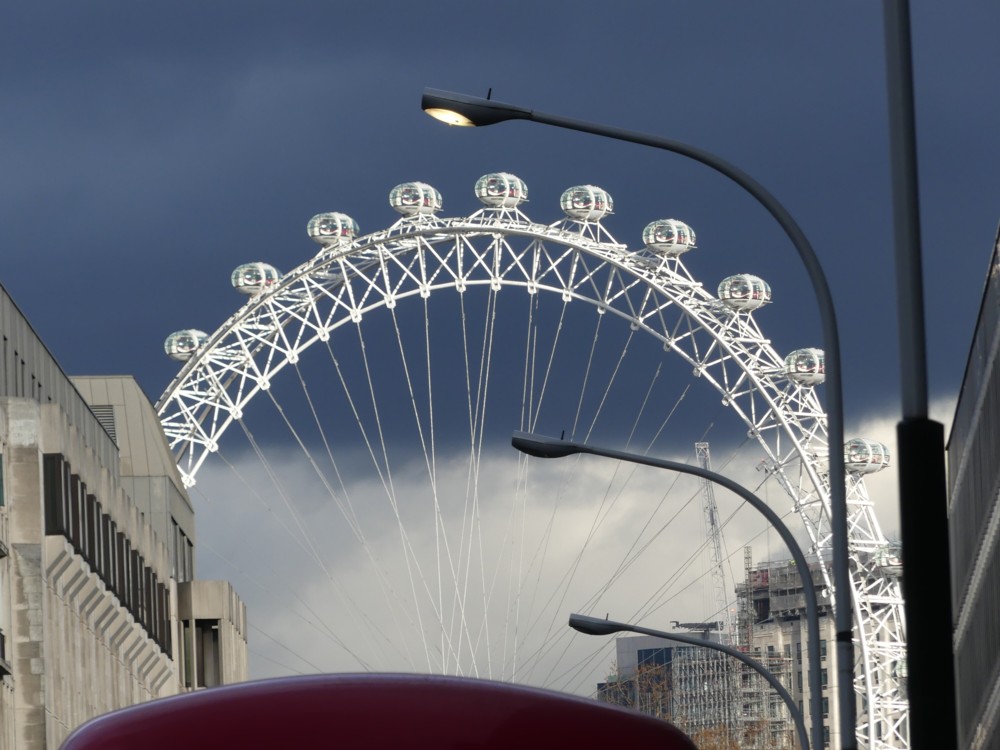
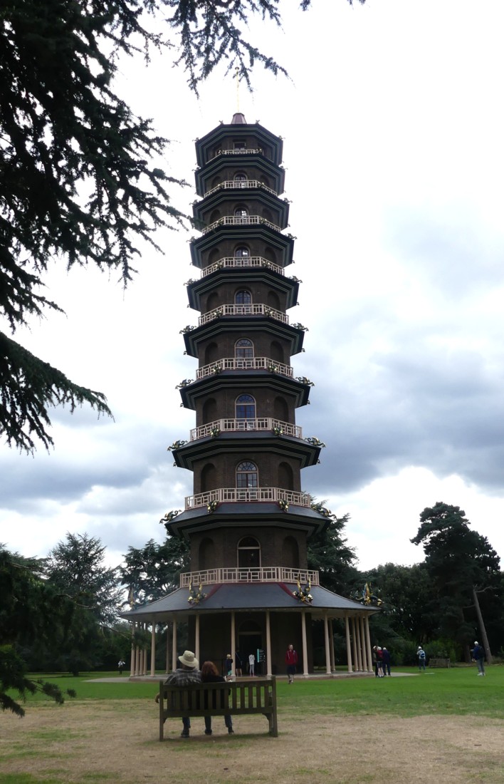
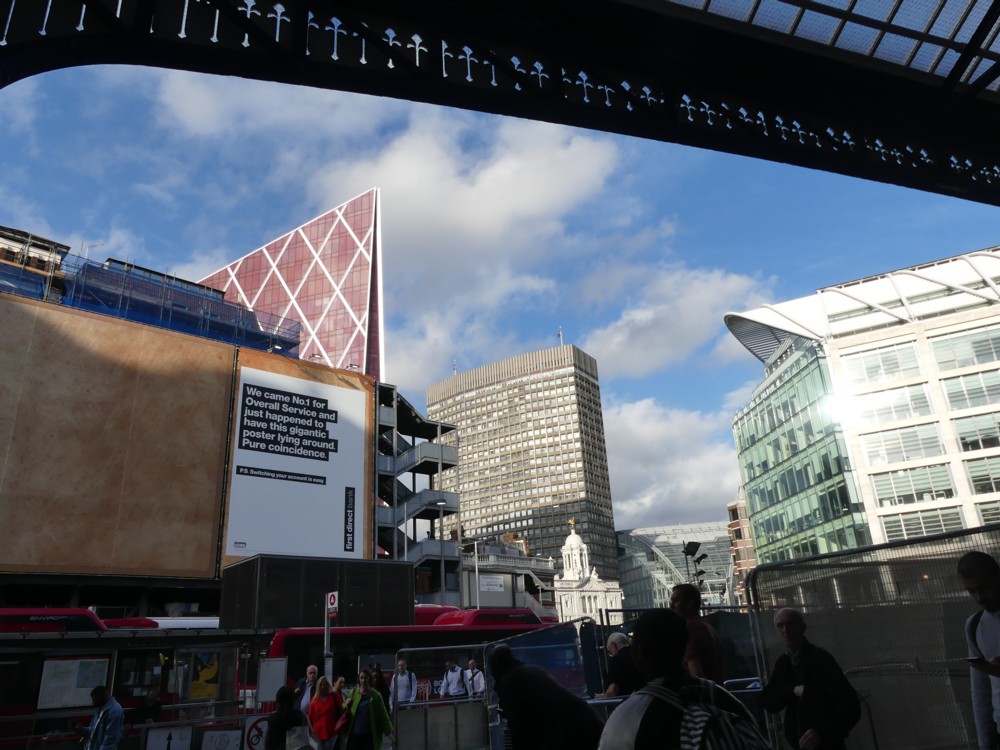
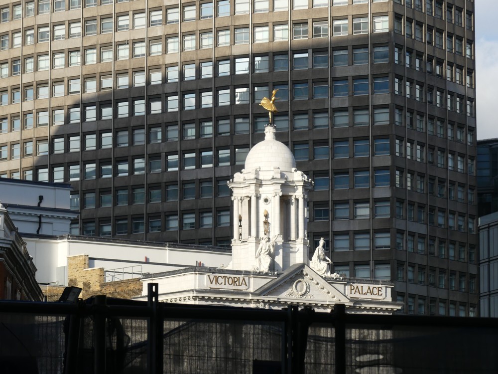
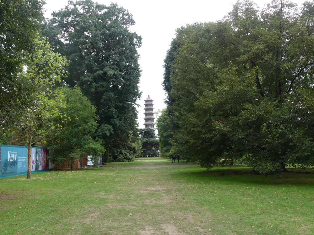
From the top of the Great Pagoda, you can see the Big Things of Central London. But what the Great Pagoda itself looks like is also worth examining.

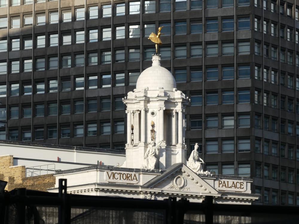
Here is an early view we had of it:

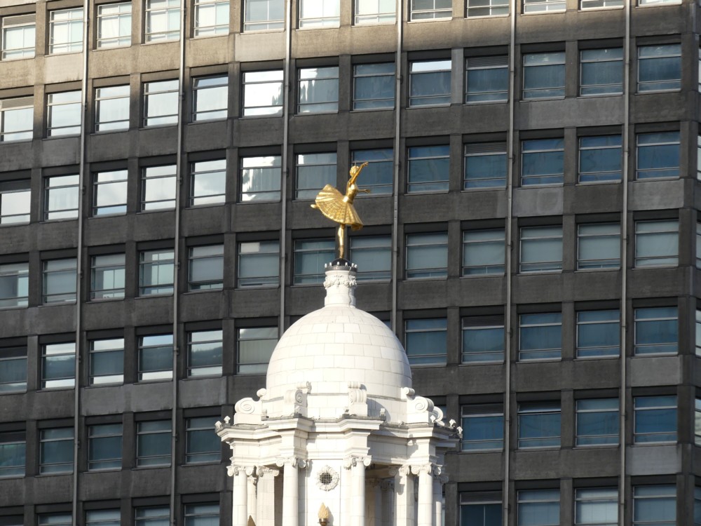
And here is how it looked when we got closer:

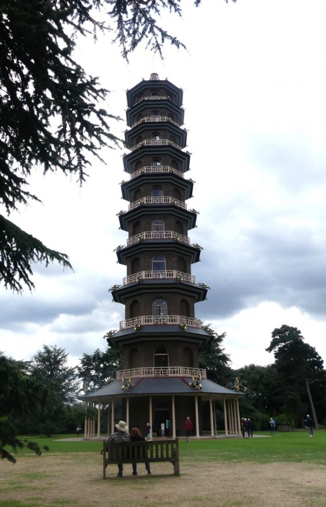
The Daily Mail describes the Great Pagoda as Britain’s First Skyscraper.

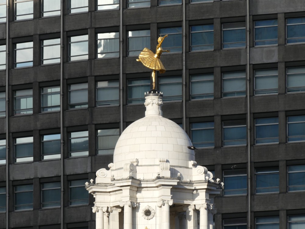
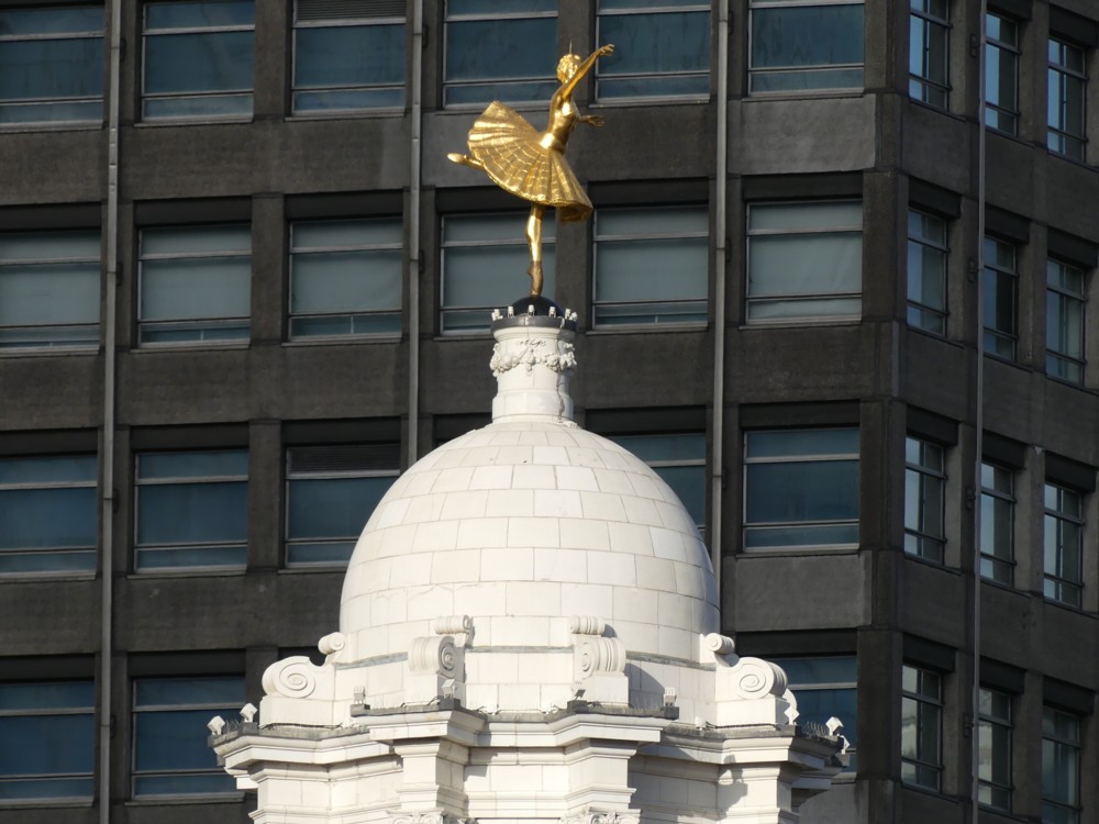
Now look how it looked when we got closer still:

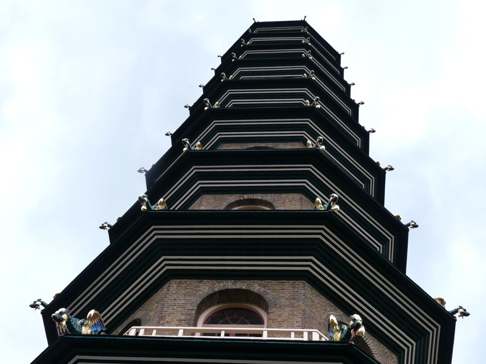
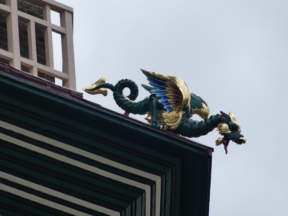
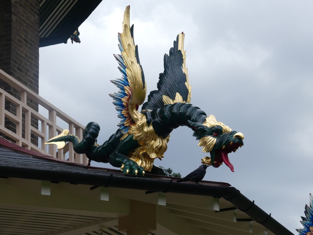
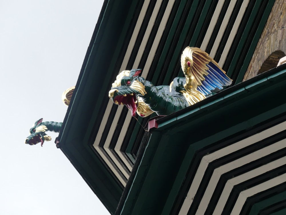
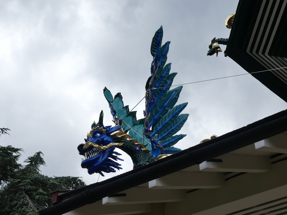
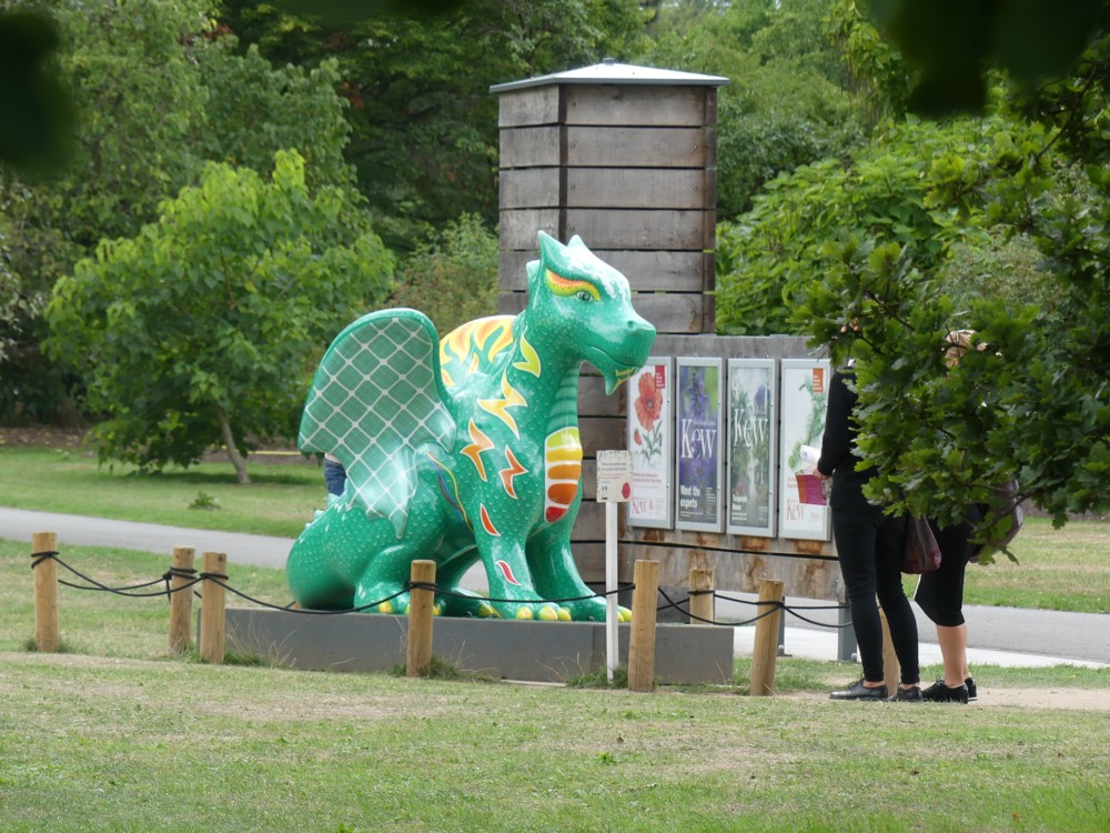
So, what are those sticky-outy things on the corners of each sticky-outy roof?

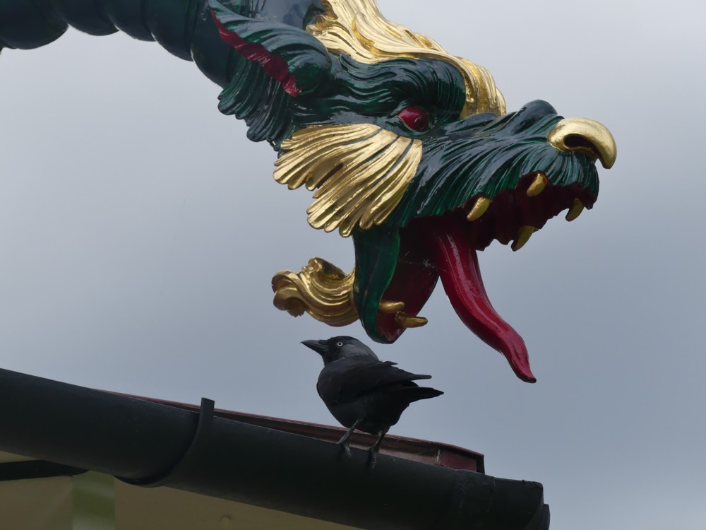
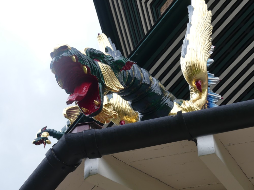
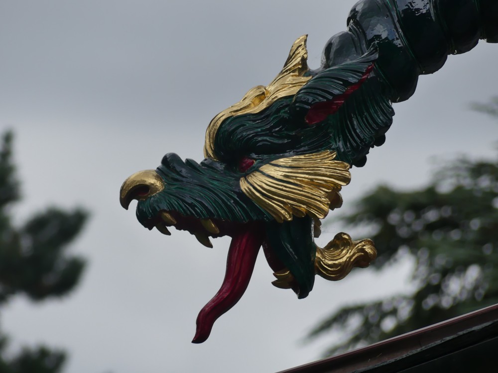
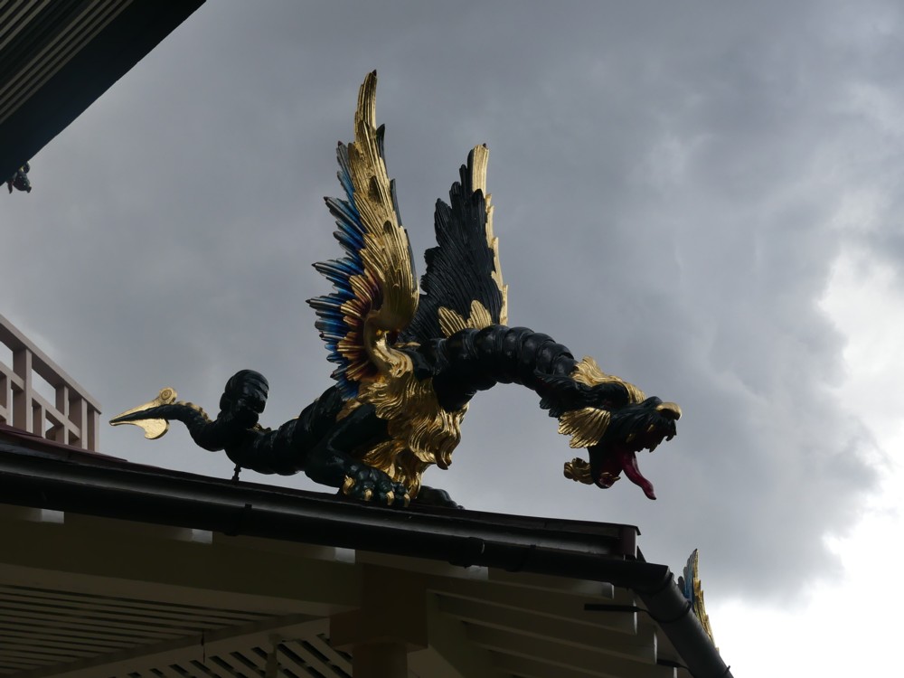
That’s right, dragons. And we’re not talking merely inflated dragons. These are solid looking and scary. You couldn’t kill these dragons with a mere pin prick, and you wouldn’t dare to try.

Most of the Great Pagoda dragons look like this:

We discovered when we got there that the recent restoration of this Great Pagoda had, only a few weeks before our visit, been completed. We got very lucky with that.

Read more about these dragons, and about the Pagoda that they now guard, in this Guardian report.

This Great Pagoda, London’s very first Big Thing, was built by Sir William Chambers in 1762. The dragons were a feature of the original Pagoda, but in 1784 they were removed. Being made of wood, and following a burst of wet weather, they had started to rot.

Wikipedia says that Kew Gardens was adopted as a national botanical garden in 1840. Would that be when the Pagoda was opened to the general public? Whenever exactly that was, Kew Gardens and the Great Pagoda have been what we now call visitor attractions for quite a while now.

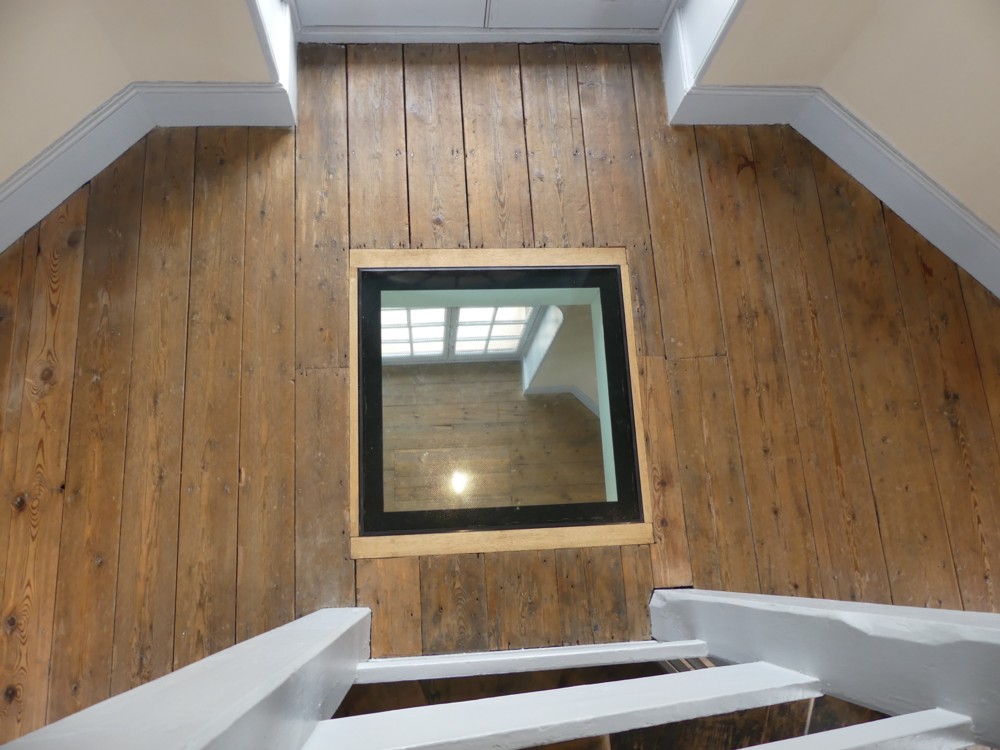
During World War 2, the Great Pagoda was used to test bombs. You can still see one of the holes they made in all the floors, to allow the bombs to fall. Keeping that for everyone to see now is a nice touch, I think.

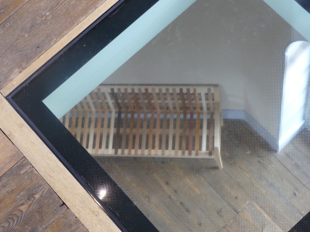
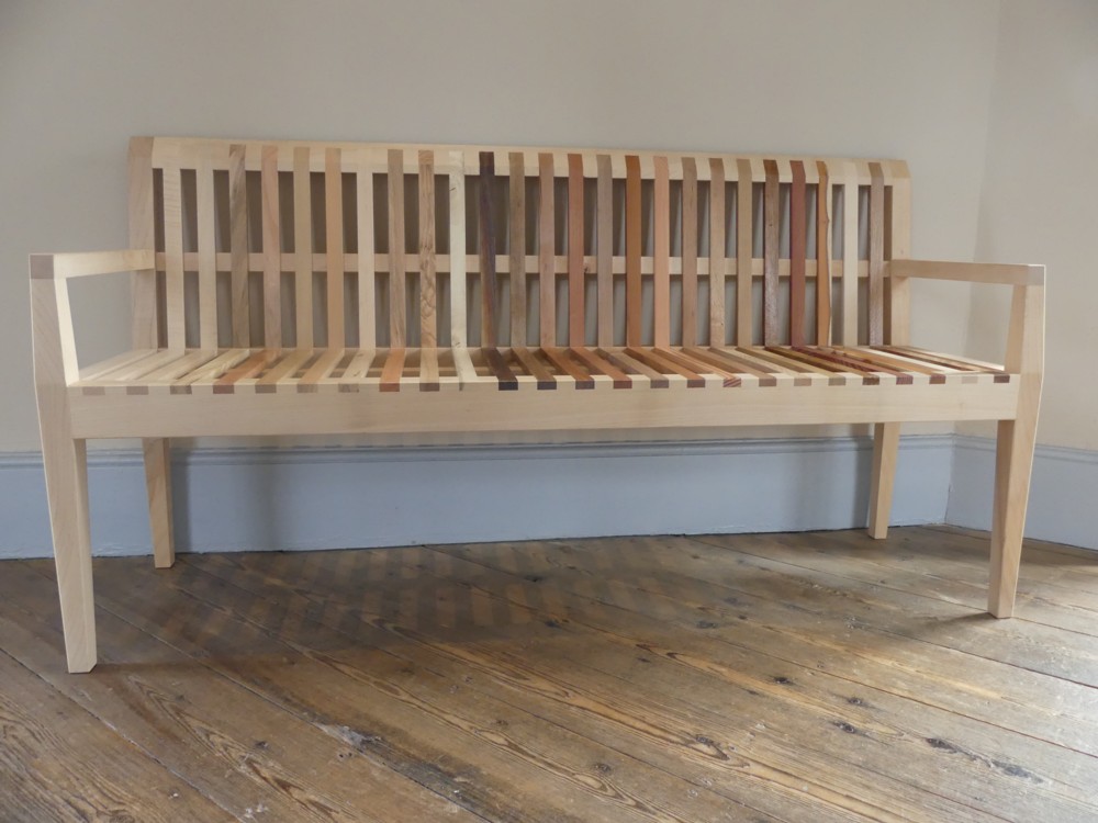
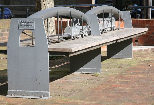
Kew Gardens contains lots of greenery, and green stuff on sticks. What do they call those things? Trees. Kew Gardens has lots and lots of trees, of many different brands.

So, on the left here, the hole in the floor. On the right there, the seat made from many trees:

And in the middle, the seat, seen through the hole.

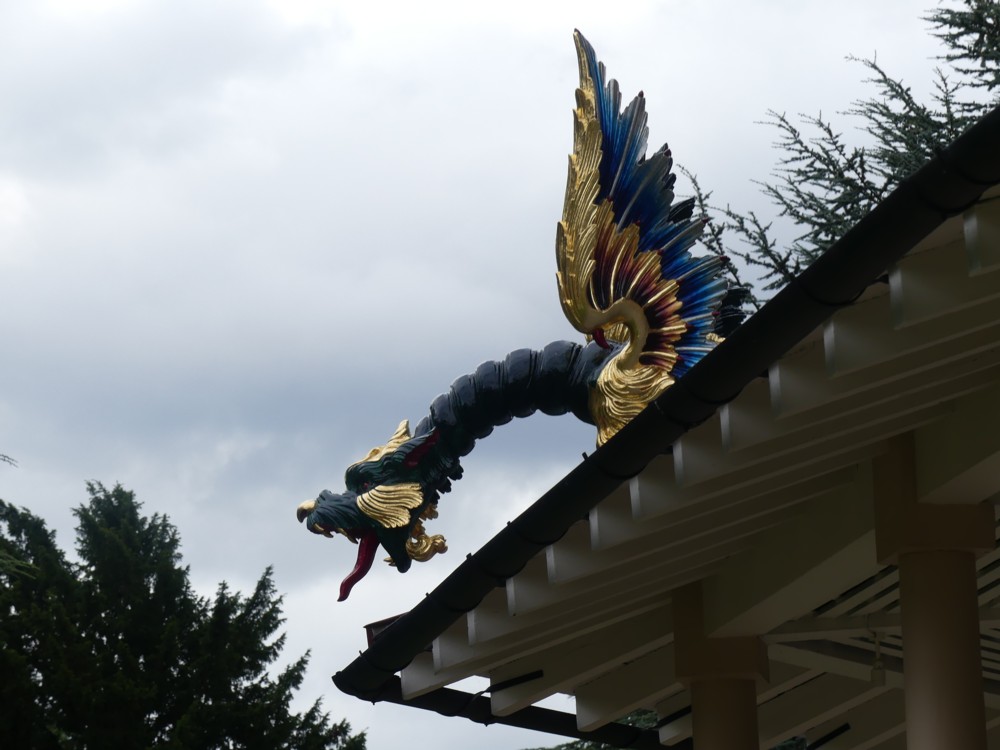
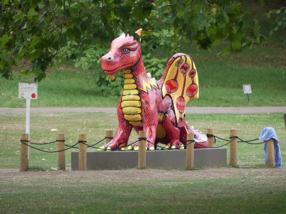
But back to those dragons. The old rotting dragons have now been almost entirely replaced by 3D printed dragons, which look solid but which are actually far lighter than the old-time originals.

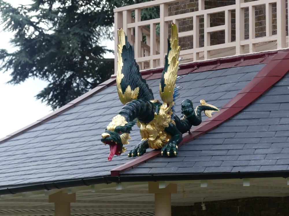
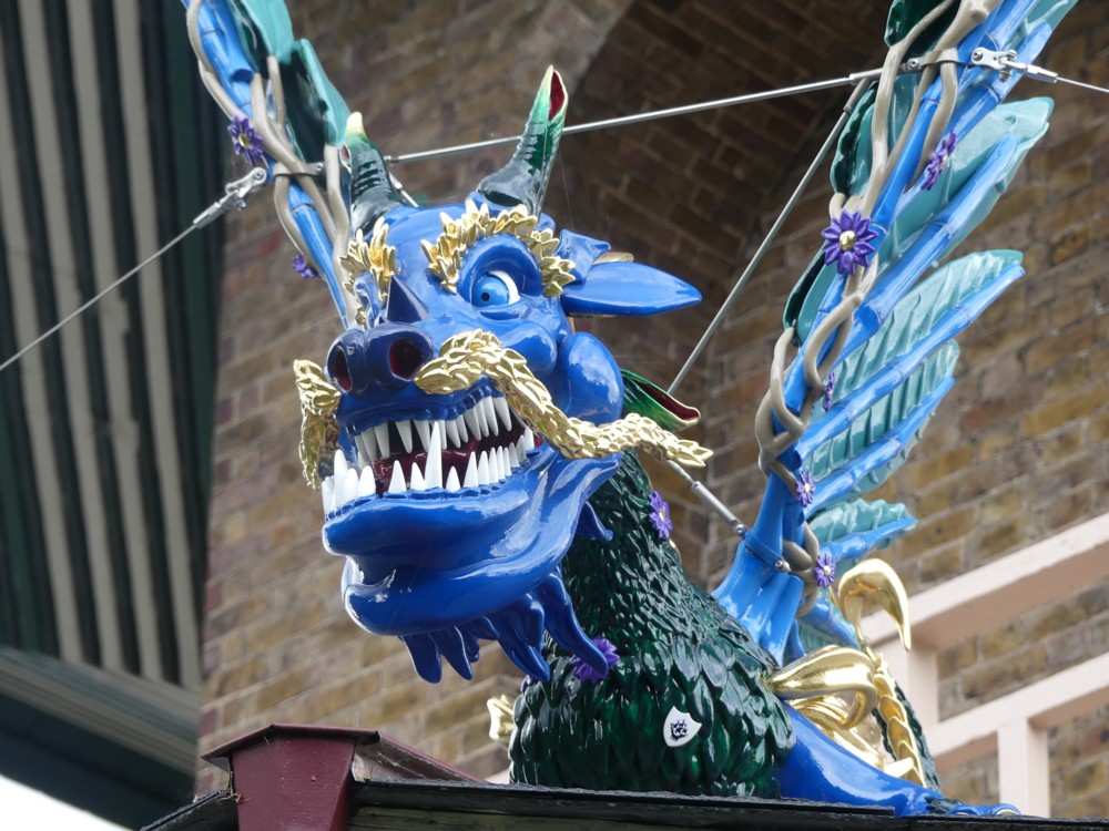
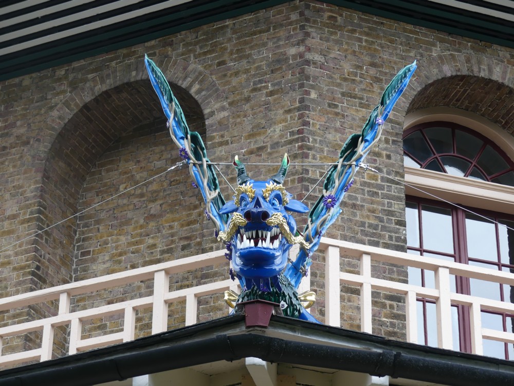
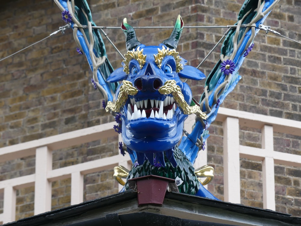
On the lowest roof, right near the ground, there was a different sort of dragon, which looked like this:

I wonder what the story was of that one, for there did indeed seem to be only one such blue dragon. Had the original plan been to make all the dragons like that one? But did its structural weakness cause them to abandon that plan, and go with the other darker green dragon with its scary red tongue, and with its rather more solid wings? Don’t know, but whatever the story is, the winning dragon design is pretty good also.

Everything about how the Great Pagoda looks, inside as well as its exterior, says: class. This is a visitor attraction that I warmly recommend. There is no lift, not originally of course, and not now, but the steps, although quite numerous, are at a comfortably mild angle – rather than, say, like the ones in the Monument. Even better, each flight of steps you go up causes you to reach another actual floor, of the sort you can stand on, with windows looking outwards. So, oldies like me can go up two floors, say, and then have a comfortable breather, without blocking anyone else on the stairs. If we are on the right floor, we can even use that multi-treed seat (see above).

The weather on the day that GD2 and I visited Kew Gardens was not perfect. The dragons look rather dark and menacing in my photos. But that look works, I think. And as days out go, this day out was pretty much perfect.

Originally posted at Brian Micklethwait’s Old Blog

Pavlova in front of “Portland House”

Yesterday I was in Victoria Station, and as I emerged from it into … that mess of activity outside the front entrance, I noticed that the light seemed particularly appealing. At first what got my attention was the combined effect of the mess in the foreground, in the dark, and the assorted Medium Sized Things in the background, totally mismatched and just jambed down together in the London style, all illuminated. (See photos 1.1 and 1.2 below.)

But then, I found myself zeroing in, yet again, on Pavlova. What got me noticing her was that, finally, I seemed to have found the right moment to photo her with that big concrete lump that calls itself “Portland House” behind her. I have done this a lot, but it has never worked until now. This time, there was a shadow behind Pavlova, while Pavlova herself, and the dwarfed-by-modernity theatre on the top of which Pavlova dances, were both picked out by the light, a combination of circumstances I have never before encountered, or if I did I didn’t notice.

I took many photos of this effect. Partly because I can’t decide which one I like best, and partly because I think these photos look good when small, here are 3×3=9 of them:

Maybe the Wikipedia entry for Portland House does say who originally designed this unlovely edifice, but if it does, I couldn’t find that. Wikipedia does note, however, that Portland House is a miniature rip-off of the Pan Am Building in New York, now called something else.

Further googling got me to a piece by Mike Higginbottom entitled Pan-Am’s London sibling. He rather likes it. Plus, he name checks the now pretty much forgotten architect of said sibling: Howard Fairbairn & Partners. Modern Movement hulks by big name modernists sometimes have a certain in-your-face impact and memorability about them. But this hulk has always seemed to me to epitomise Modern Movementism at its dreariest. It’s not even “brutal”, just big, bland and boring. I greatly prefer Nova, the red diagonalised Medium Sized Thing nearby, which is also to be seen in photos 1.1 and 1.2 above.

Originally posted at Brian Micklethwait’s Old Blog

Another go at Bartok – and two competitions

I was summoned to Chateau Samizdata (which is in South Kensington these days) for lunch today, which meant that when I walked past that Bartok statue at lunchtime today, the light was behind me, rather than in front of me and behind Bartok.

So I was able to have another go at photoing him:

But with rather mixed results. The change in lighting made a lot less difference than I had been hoping.

I spent the late afternoon and the evening (a) doing stuff at home, and (b) keeping track of the climaxes of two competitions, this one, which was won by pianist Eric Lu, and this one, which was won by the Worcestershire cricket team. Which means Worcestershire have had a mixed season, having also been relegated from Division One of the County Championship. It was like them winning the FA cup but also getting relegated from the Premier League. However, getting relegated from Division One of the Country Championship makes far less financial difference than dropping out of the Premier League. So Worcester are probably now pretty happy. Counties doing well in one format but badly in another is quite frequent. They all say that, of course, they want to win everything. But in reality, they prioritise this and neglect that.

Tonight, Radio 3 played the last two Leeds Piano Competition concerto performances, the three others having been played last night. I will be checking out the performance of Beethoven 1 from last night, because, while they were waiting for them to pick the various prize winners, they played part of a chamber music performance by the guy who had played Beethoven 1, which sounded excellent. Also, this guy came second in the overall competition, so he’s pretty good.

Tonight’s Beethoven 4, from winner Lu, was excellent, albeit somewhat more subdued than I think Beethoven had in mind when he composed this piece. Lu’s was a very “private” performance of what was actually, I think, written as a rather public piece (about private feelings). But that’s very much a matter of (my) opinion. Given what Lu was doing, he did it very well. Besides which, who would want all concerto performances to sound the same? Beethoven might have been surprised by Lu’s delicate and subtle performance, but that doesn’t mean he’d have minded. On the contrary, he would probably be amazed and delighted that people were still playing the thing at all.

Tonight’s other concerto, the Schumann, was similar in artistic intention to Lu’s Beethoven 4, but to my ear it involved a few too many wrong notes. The Radio 3 commentators didn’t mention these wrong notes, but I don’t think I imagined them. I think they chose to ignore them.

Bartok wrote three Piano Concertos, each very fine in their contrasting ways. None of these were played in the final of the Leeds Piano Competition.

LATER: I’ve just been listening to another county game, just started on Sept 18th, and I realise that the piece I linked to about Worcester getting relegated was dated 2015. Theoretically, they could still avoid relegation this year. But they’re not going to. They’ve just been bowled out for 94 by Essex, and they are about thirty points shy of safety, with Yorks and Lancs both having to cock it up big time for them to escape. As it is, Worcs and Lancs both look doomed to the trop. But, in theory, Worcs are still in with a chance of avoiding this.

I am very sorry to have misled you, in the unlikely event that I did, and that you care.

Originally posted at Brian Micklethwait’s Old Blog

A concrete pump?

Earlier in the week, on my way to St James’s Park tube, and again on my way back home from St James’s Park tube, I photoed what I described to Google as a “concrete pump”.

This concrete pump was helping to build a clutch of apartment blocks where the old New Scotland Yard used to be, before New Scotland Yard moved to a new New Scotland Yard, back where the original Scotland Yard used once to be.

I got enough images to suggest that a “concrete pump” is indeed what this extraordinary contraption is, but not enough to suggest that I had named the contraption correctly, using the preferred words of those who deploy it.

Nevertheless, enjoy. I did, especially the close-ups of the joints.

All this, just to be able to squirt concrete from a lorry into a hole. (I’m guessing, from the invisibility of building action behind all the solid fences, that his concrete was for the foundations. This being where concrete, as opposed to steel on its own, still seems to be essential.) And with a big long arm like that one, with all its joints, I’m guessing it can reach all sorts of complicated and out-of-the-way spots. (If you guess that I do a lot of guessing when I see something like this, then you guess right.)

There must be a reason why they don’t use a flexible tube, but have to make do with a rigid tube, but with the occasional rotating joint. So elaborate are those joints that they end up looking biological rather than merely mechanical. So, as with the previous posting, also about technology rather than biology, I have categorised this posting as, among other things, “other creatures”. (I’ve also added “sculpture” to the category list. Does regular sculpture come any better than this? Sometimes maybe, but not very often.)

The concrete itself must be a marvel of blending and general wonderfulness. Able to travel as a near-liquid along this elaborate pipe, under (guess) great pressure (another guess: that’s why the pipe has to be made of metal rather than of something bendier), but then able, at exactly the right time, to solidify in the deep cylindrical holes into which it is squirted. At which point it has to stay solid for ever. (Is something added, at the critical moment, to make it solidify?)

There is much that is very wrong with the world. This sort of stuff is what is very right with the world.

Originally posted at Brian Micklethwait’s Old Blog

A Brunel bridge seat and the Brunel museum

So I went looking for interesting new bridges, as I do from time to time, but found nothing interesting that I didn’t know about. Like I say, the bridge news these days is when they collapse.

So I gave up on bridges, and instead thought about doing a posting about the Brunel Museum, which I visited on Saturday. There is, of course, a website. But there is also a Wikipedia entry. And look what I found there. That’s right, it’s the Royal Albert Bridge, Saltash, made smaller and sittable upon, with a train:

I’m pretty sure that, while waiting to be told about the nearby Brunel tunnel under the Thames (set in motion by Brunel’s dad Marc), I and my two pals were sitting sipping our drinks within a few feet of this bridge-bench. But it was dark, and I only found out about it just now.

Here are two things I did see:

On the left, a bust of Marc Brunel, in the little museum. On the right, a photo of son Isambard Kingdom Brunel, the famous photo with the huge chains behind him, projected onto the extremely grubby and deranged wall of the place where we listened to a lecture about the tunnel. The guy is saying: “Well, you just can’t get the walls these days.”

No, he wasn’t. He was saying something I didn’t catch because I wasn’t concentrating hard enough to make it out. That being because the acoustics of this strange vertical cylinder in the ground were about as reverberationally bad as acoustics are able to be, and I could only make out about one in three of the words spoken by the guy, despite him being an actor who enunciated very clearly, and despite him standing about four yards from where we were sitting.

But despite all of the above, it was a fun evening. Basically (a) because of the company, and (b) because now, when people ask me if I know anything about the Brunel Museum in Bermondsey, I can now say: Yes. I’ve been there. And because I had fun photoing.

Originally posted at Brian Micklethwait’s Old Blog

Hurrah for the inflated plastic dragons of Kew Gardens

Today I had in mind to tell you about the dragons that adorn the Great Pagoda in Kew Gardens, which is the Pagoda from the top of which you can see the Big Things of London.

But I spent today paying attention to cricket, and fretting about whether enough people would attend my Brian’s Last Friday Meeting, that happened earlier this evening, so I did not manage to say anything here about the above mentioned dragons. Too complicated.

Now that it is late evening, and the meeting has successfully concluded (thank you Vera Kichanova, terrific), I only have time and energy to tell you about these two particular dragons, which are inflated and made of plastic:

What these inflated plastic dragons tell you is that Kew Gardens, in addition to being a place of Outstanding Scientific Interest, is also what is now called a Visitor Attraction. A place, in other words, to which children are glad to go to rather than rebellious about being made to go. And there is nothing like friendly inflated plastic dragons with goofy smiles on their faces to make children feel welcome.

I, meanwhile, have no particular objection to visiting a Visitor Attraction. Before I had a digital camera, I used to be snobbish about going to places which other people in large numbers also liked. But since acquiring my first digital camera (I am now on about my seventh) and since acquiring the hobby of photoing other digital photoers, I find that my former distaste for Visitor Attractions has melted away. The more people there are at a particular spot (and if they can bring their children without their children objecting, there will be more people) the more chance there is that there will be people photoing, and that makes me happy.

So: hurrah for the inflated plastic dragons of Kew Gardens. Which I also quite like myself.

Originally posted at Brian Micklethwait’s Old Blog