22 dwarfs 42

A year ago I did a posting about Twentytwo Bishopsgate, which is about to be the tallest Big Thing in the City of London Big Thing Clump. It featured this explanatory image of what was then about to happen to that Big City Clump:

I’m not sure what the current status of “1 Undershaft” is just now, which is potentially the biggest Big City Thing of the lot. I seem to recall reading that there were delays. The internet now seems rather coy about this project. 22 Bishopsgate, however, is roaring upwards.

And no photo I have so far taken of 22 Bishopsgate illustrates the scale of this roar better than this one, which I took yesterday, when on my way from Angel to the City, which means that I was approaching the Big City Clump from a northerly direction:

What we see there is what used to be one of the City’s biggest Big Things, the NatWest Tower, or “Tower 42” as they now want us to call it. Behind it, dwarfing it, still not as big as it will be, is 22 Bishopsgate.

When I took this photo, such is my eyesight that I wasn’t sure if I was looking at the actual Tower 42, or a reflection of it in the glass surface of 22 Bishopsgate. It just seemed too small to be the actual Big Thing itself. But clearly, it is.

In the graphic above with all the names, Tower 42 is now so small and so antique that it doesn’t even get named. It’s the dark one on the left, behind where it says “Mitsubishi Tower”.

Originally posted at Brian Micklethwait’s Old Blog

The light at the end of the Beech Street tunnel

Today, I was meeting a friend in the area of Angel tube, and then, because the weather was so good, I decided to walk a little, to the canal nearby, and then south, towards the City. I took many photos. But as often happens when I photo ordinary things but in better than ordinary light, one of the best photos I photoed was something of a surprise. It happened right near the end. It was getting dark before I reached the City, and a signpost sent me along that strange tunnel near Barbican tube, to Barbican tube.

This is the tunnel I’m talking about:

I googled “Barbican tunnel” when I got home, and soon learned that this is apparently the Beech Street tunnel, although all it said on google maps was “B100”. Earlier this year, there was a apparently some sort of light show on show in this tunnel. But this evening what got my attention was the light at the end of the tunnel, which looked like this:

The natural pink and yellow of the sunset is what makes this, but I also like the non-natural green of the traffic lights, and the green reflections in the tunnel roof, joining in with those green roofs beyond.

In the distance, a crane. In London, cranes are hard to avoid. Not that I’d want to.

Originally posted at Brian Micklethwait’s Old Blog

At the Grafton Arms (after recording a talk)

Recently I and Patrick Crozier visited the Grafton Arms. I rather like this pub. These guys also like this pub, because of the Goon Show. Apparently the Goons wrote some of their scripts there, in an upstairs room.

A fact commemorated by this mirror behind the bar, which I only noticed on this visit:

If you look carefully there, you can see me and my camera. Well, it is a mirror. I should have tried to include Patrick.

What took Patrick and me to the Grafton Arms was that we had just been doing one of our recorded conversations, and we needed refreshment. Tune in to the latest one, by going here.

My favourite of these conversations so far has been the one we did about WW1, concerning which Patrick is something of an expert. Our next, or so I hope, will be about transport, concerning which Patrick is also something of an expert.

Originally posted at Brian Micklethwait’s Old Blog

Centre Point – lit

Here’s the original, i.e. the Hartley version:

And here’s another way of looking at the same thing, i.e. cropped into a square:

I have long believed that the Le Corbusier version of the Modern Movement in Architecture has its origins in the South of France and the north of Africa for a very good reason, which is that the light there is such that it looks good there. Anything looks good there, but concrete looks especially good..

And when the light is like that in London, it looks good in London too.

The photo taken three days ago.

Originally posted at Brian Micklethwait’s Old Blog

Homage to Hartley: The V&A under a very blue sky

I tried to put together a more complicated posting about, well, wait and see. But it is taking too long, so here is something simpler.

A favourite blogger of mine is Mick Hartley, who oscillates between the insanities of the anti-semites and the Islamists (heavy overlap there) and photos. Photos by himself, and by others.

The photos by others are often antique and black and white. His photos are in colour, and they are typically very colourful indeed, especially when the sky is very blue.

Colour is an obsession of Hartley’s, both when it is present, and when it is not.

Here is a photo I recently took, which is the sort of photo Mick Hartley would take, if he ever went West:

That’s the Victoria and Albert Museum, unless I am mistaken (as I might well be), photoed by me from the big old road that goes from the Albert Hall (and more to the point from the Royal College of Music, where GodDaughter 2 had been performing) down to South Kensington Tube. This I know, because of a photo I took of a street map, moments after taking my Hartleyesque photo above:

That being the relevant detail. I never regret map photos.

By the look of it, the V&A is a building I should explore. Especially its upper reaches. Maybe there are views.

Originally posted at Brian Micklethwait’s Old Blog

Bartok and three ladies outside South Kensington tube

Yes, here’s Bartok (again), from a slightly different angle, so that the tube station is right behind him:

A regular bloke in the street.

But now look at this. Same view, but with three newcomers, down at the bottom:

The statue of Bartok is a lot nearer to me that you perhaps assume, and crucially, those tiles look like bricks but are actually bigger than regular bricks, which makes this scene look a lot smaller than it really is.

Which is why the additional ladies at the bottom of the second photo really are so very small.

Photos taken by me yesterday.

Originally posted at Brian Micklethwait’s Old Blog

How photo-collating reminded me of some (other) good modified cliché photos

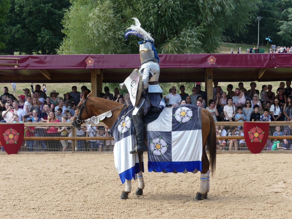
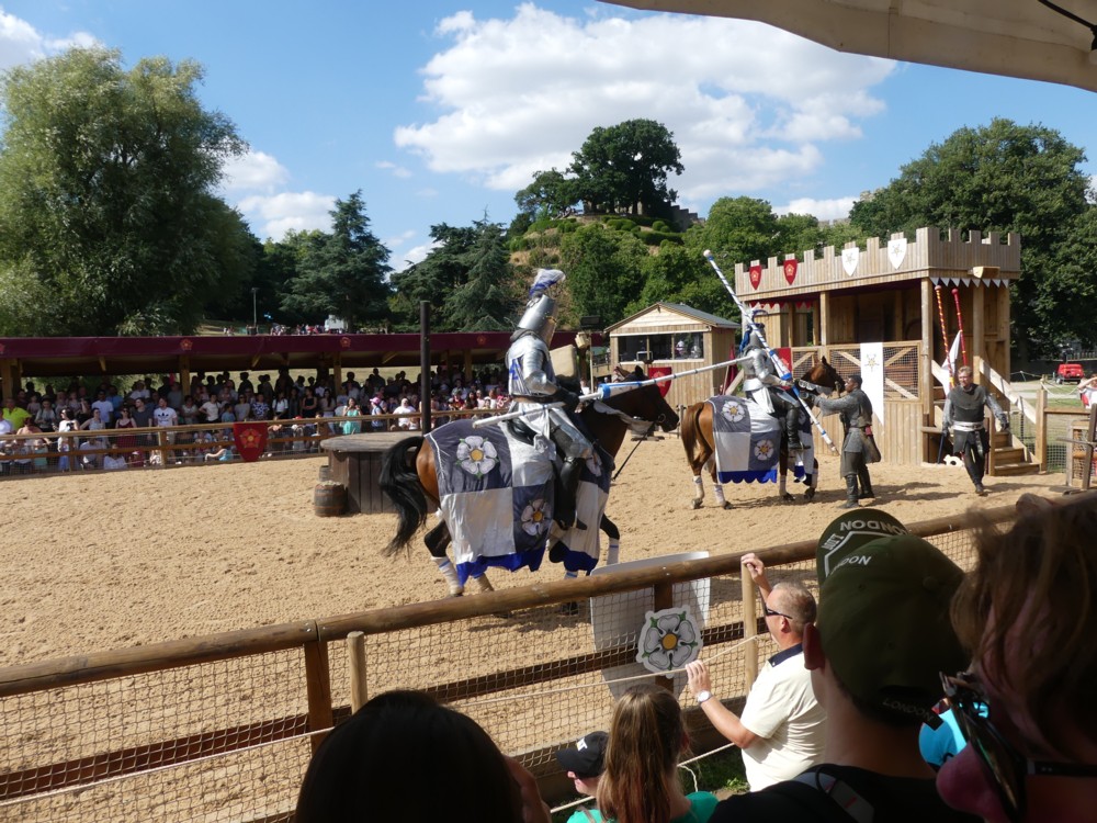
More and more of my photo-time is spent collating the photos I have already taken. Last night, for instance, I went looking for (more) photos of London taxis with adverts on them. There is something especially appealing, to me anyway, about a large number of objects all exactly the same shape, but each decorated differently. (Some time, I must go searching for my photos of elephants.)

Equally appealing, to me, were those Gormley Men (LINK TO THE OLD BLOG). In that case, each Man was the same, and undecorated in the more usual and rather bland sculpture way. But, each one was in a different place and a different sort of setting. My Gormley Men photos did not need collating, because Gormley had already collated them, by putting all his Men in the same part of London at the same time. Therefore my photos of the Gormley Men mostly collated themselves.

Not so the elephants, or taxis. When looking for taxis, I am looking for taxis photoed in the course of all manner of different photo-expeditions each with their own directories.

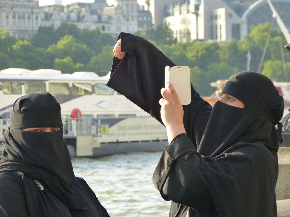
But my point is that in the course of all this taxi-collating, I was clicking through literally thousands of non-taxi photos, and I kept coming across non-taxi photos that I particularly liked. Like (like as in “such as” – this is not a command) this one, for instance, taken last June:

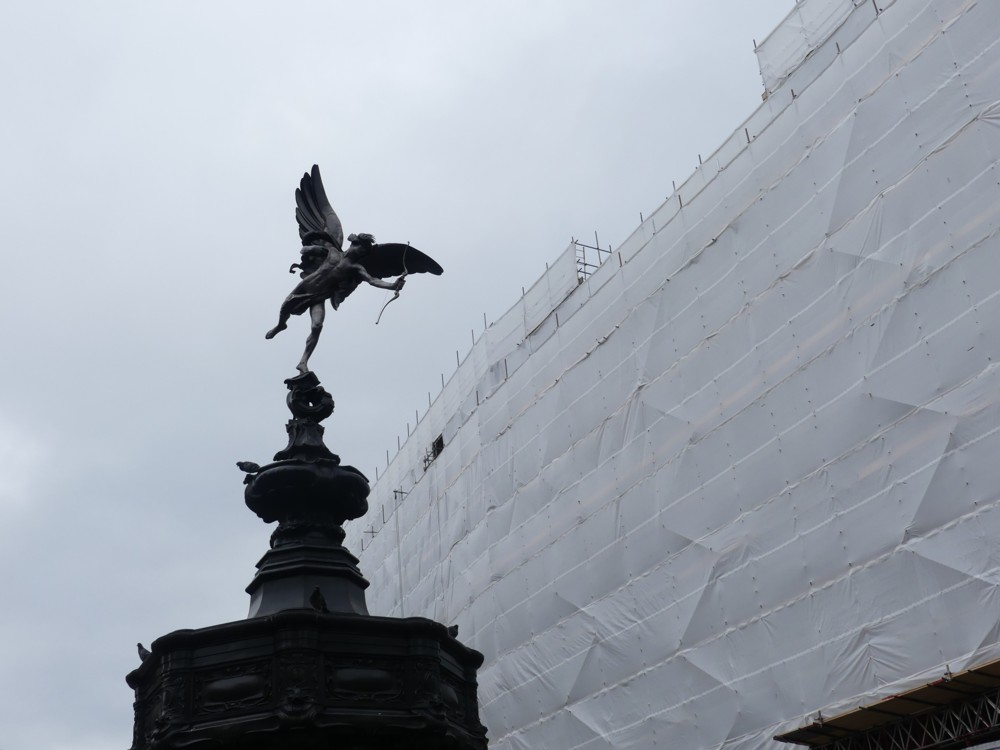
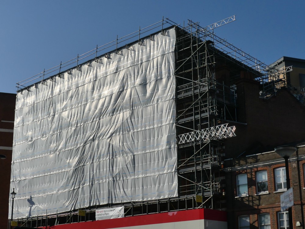
I like doing modified cliches in writing, and I also like them photographically. A view, for instance, of some London Thing that has been photoed to death, but put beside or in front of or behind something that is not so usual. Most photoers would regard the above scaffolding as a problem rather than any sort of solution, to the Eros-has-been-photoed-to-death problem.

The scaffolding’s wrapping has the effect of clearing away all the usual clutter from Piccadilly Circus and replacing it with something a lot like sky on a dull day. It puts Eros in an empty field in the countryside, you might say. And yes I know, I like clutter. But not always.

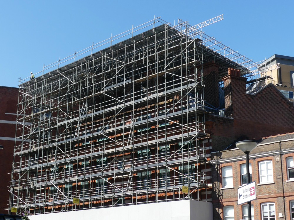
Here is another modified cliché photo:

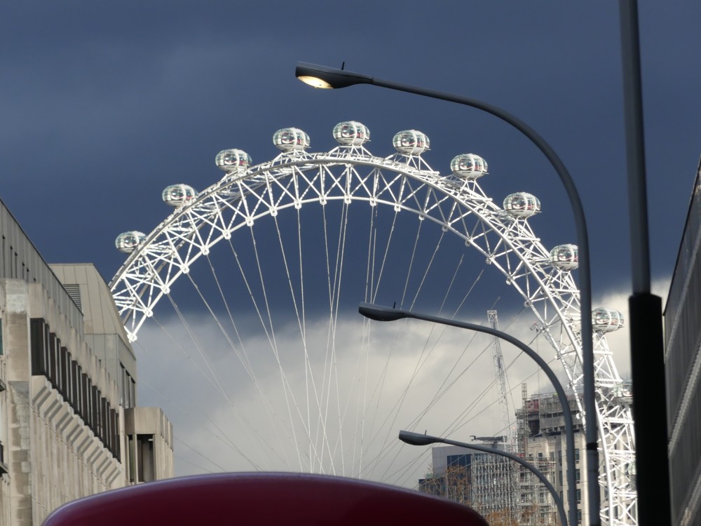
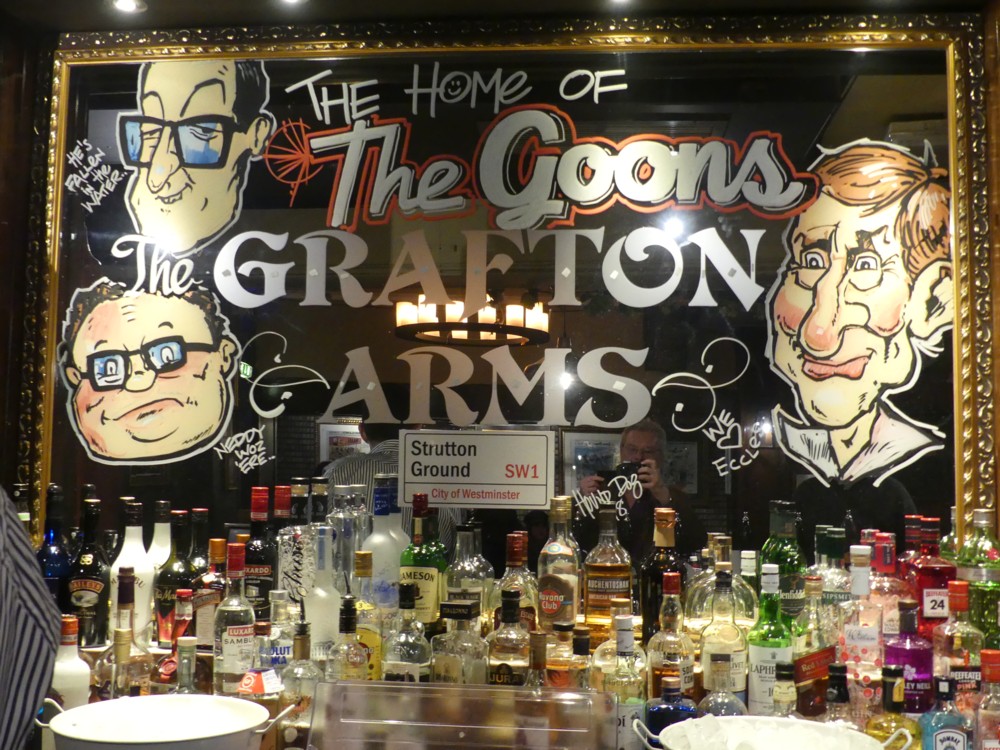
The Wheel has been photoed to death, and that’s a view I regularly see – and regularly photo – of it, from the point where Strutton Ground meets Victoria Street, looking down Victoria Street towards Parliament Square and beyond. But that sky behind The Wheel made The Wheel look amazing, on that particular day in January of this year.

Finally, one of many photos I took this year of Battersea Power Station:

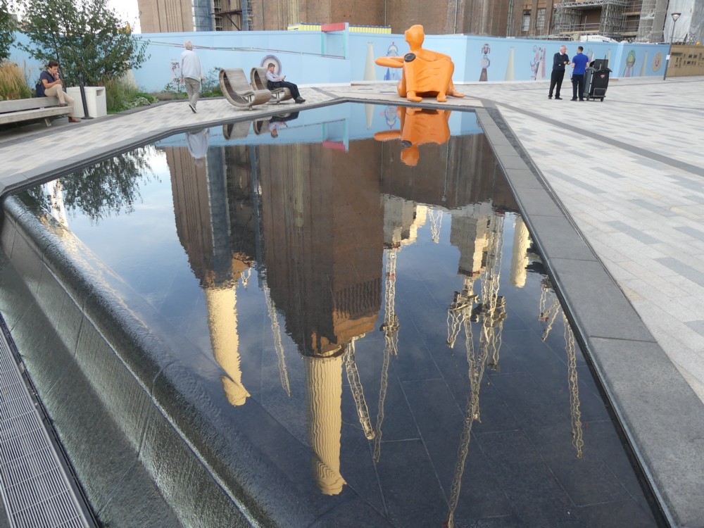
The Power Station and (if you are a craniac like me) its crane cluster are the clichés. And if you want to take the sting out of a cliché, one way is to reflect it in something. At that point its extreme recognisability becomes more a virtue and less of a bore. Its very clichéness becomes helpful to the photo.

This photo was taken from the upstream side of the Power Station, where there is already a big chunk of new flats up and running, with accompanying tasteless sculpture, coffee serving places and the like. All sparked, I believe, by the new USA Embassy.

This photo of mine turns Battersea Power Station upside down. I’ve always thought that an upside down Battersea Power Station would make a rather good table. But, until now I never thought to go looking for such a table on the www. Here we go. That took about three seconds, so I bet there are plenty more that are cheaper. This guy had the same idea, but those two links were all I could quickly find concerning this notion.

Here is another modified cliché photo of Battersea Power Station, the modification this time being smoke.

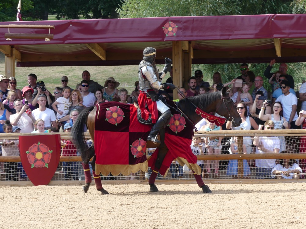
Come to think of it, all those London taxi photos I’ve been digging up are also modified cliché photos, aren’t they? London taxi = cliché, adverts = modification.

Originally posted at Brian Micklethwait’s Old Blog

The performing horses of Warwick Castle: Nice legs – shame about the faces

Over the summer, a friend of mine was performing in a show at Warwick Castle about the Wars of the Roses. And early last August a gang of her friends and family went there to see this, me among them. It was a great show, albeit wall-to-wall Tudor propaganda, and a great day out.

Warwick Castle is quite a place, being one of Britain’s busiest visitor attractions. It’s No 9 on this list.

I of course took a ton of photos, and in particular I photoed the horses in this show, the crucial supporting actors, you might say. The stage was out of doors, of course, and long and thin, the audience on each side being invited to support each side in the wars. Long and thin meant that the horses had room to do lots of galloping.

None of the photos I took were ideal, but quite a few were okay, if okay means you get an idea of what this show was like:

The basic problem, I now realise, is that the horse heads were at the same level as the audience on the opposite side to my side. As Bruce the Real Photographer is fond of saying, when photoing people, you start by getting the background right. And I guess he’d say the same of horses. Well, this time, for these horses, I’m afraid I didn’t.

So it was a case of nice legs, shame about the faces. (That link is to a pop song from my youth, the chorus of which glued itself to my brain for ever. I particularly like the bit where they sing: “Shame about the boat race”.)

I recommend the show’s own Real Photographer, for better photos, potted biogs of the leading historic characters, and a little bit about the enterprise that did this show.

Originally posted at Brian Micklethwait’s Old Blog

The last really fine day of 2018 (2): Scaffolding wrapped and unwrapped – and the Reichstag wrapped

I’ve asked it before and I’ll ask it again. Why do I regard most of Modern Art as silly, yet relish real world objects which resemble Modern Art? Objects like this:

The above photo was taken on The last really fine day of 2018, just minutes after I had taken the one in that earlier posting.

You don’t need to go to an exhibition of sloppily painted abstract art, when the regular world contains wondrous looking objects like that. And what is more, they are wondrous looking objects which have worthwhile purposes. This wondrous object is for supporting and protecting workers as they work on a building.

Here is how that same scaffolding looked, unwrapped, about a month earlier:

I particular enjoy how the sky changes colour, in my camera, when a big white Thing is inserted into the picture. (This afternoon, I encountered this, by Real Photographer Charlie Waite. Same effect.)

Thank you to the (to me) invaluable PhotoCat, for enabling me to crop both of the above photos in a way that makes them more alike in their scope and which thereby points up the differences. I’m talking about the invaluable Crop But Keep Proportions function that PhotoCat has, but which PhotoStudio (my regular Photoshop(clone)) 5.5 seems not to offer. (I would love to be contradicted on that subject.)

Despite all my grumblings about how silly most Modern Art is, I do nevertheless greatly like the way that this Big Thing (the Reichstag) looks in the pride-of-place photo featured in this BBC report, an effect which presumably makes use of the same sort of technology as we see in my photo, but on a vastly grander scale:

I have to admit that this is several orders of magnitude more impressive than my scaffolding. (Maybe that was the last really fine day of 1994.) My scaffolding looks lots better than some badly painted little abstract rectangle in an Art gallery, but it’s not nearly as effective as the Reichstag, as wrapped by Christo and Partner.

Because this Big Wrapped Thing was so very big, and because it is such a very interesting shape, it really does look like it added greatly to Berlin, in that summer of 1994. I entirely understand why all those people assembled to gaze at it. Had I been anywhere in the vicinity, I would have too. And had there been digital cameras then, I would have taken numerous photos, as would thousands of others. Thus giving permanence to this vast piece of temporariness.

Because, what I also like about this Reichstag wrapping is that, just like my scaffolding, and just like all the other wrapping done by Wrapper Christo and his Lady Sidekick, it is temporary. That BBC report calls it Pop-Up Art, and it is of the essence of its non-annoyingness that any particular piece of Pop-Up Art by Christo will soon be popping down again.

This Reichstag wrapping happened in 1994, but is now long gone. Did you disapprove of what Christo and his lady did to the Reichstag? You just had to wait it out. Soon, it would be be gone.

Do you think scaffolding, especially when wrapped, is ugly? Ditto.

Originally posted at Brian Micklethwait’s Old Blog

Photoers from 2013: Varieties of facelessness

Photoer facelessness can be contrived in many ways, not least by the camera itself getting in the way. Then there’s photoing them from behind. Or having something else between their face and the camera photoing them. And of course there’s cropping.

Here’s another little clutch of not-then-posted but ready-to-go photoer photos, found when looking for something else. The guy holding up the red camera with two fingers, V-sign style, had already had the top of his face cropped off. But nothing further then happened.

My favourites, from the facelessness point of view, are the first photo and the last photo:

Burka Lady on the left looks like she had clocked me photoing her. But my guess is she and her friend were getting a lot of that.

Number 7, or 3.1, or bottom left or whatever we call her, is rather recognisable. But that interested me a lot. What is she doing with her two cameras? Trying to take identical photos, to compare her cameras? If so, I wonder how the phone did compared to the regular camera? Rather well, I’m guessing.

Originally posted at Brian Micklethwait’s Old Blog