My camera is not turning photos yellow – it’s Windows Photo Viewer that is turning photos yellow

Yes, panic over. The situation seemed very bad, but instead is as described above.

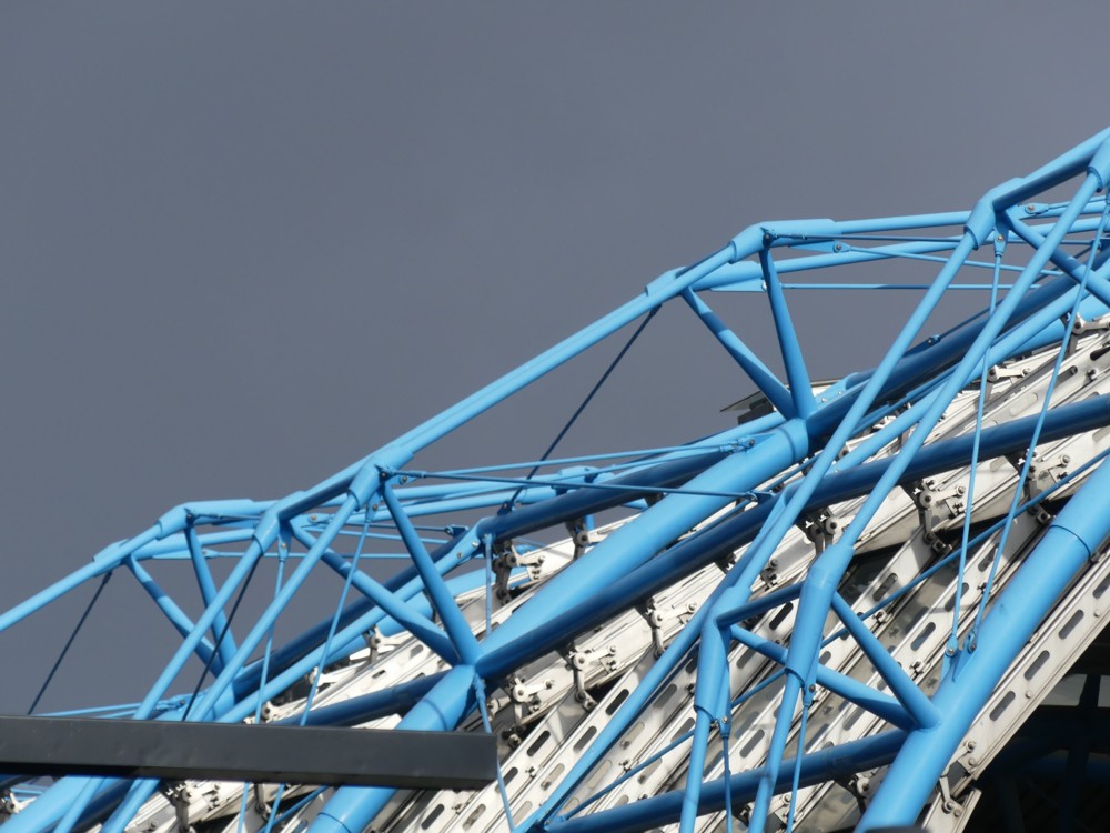
Consider this photo, of the roof of the long snakey shed that looks like it’s for growing tomatoes, where the Euro-trains used to arrive and depart from:

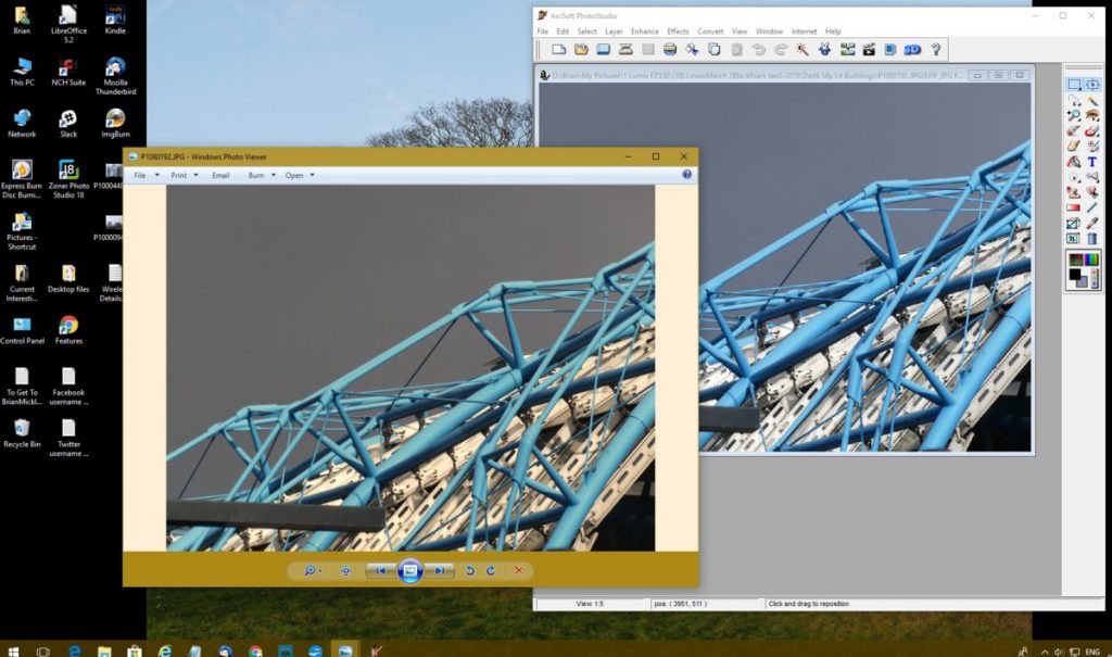
I was viewing that in Windows Photo Viewer, but then I found myself simultaneously viewing that same photo in in my photo-editing software, thus:

Do you see? Of course you do. Windows Photo Viewer, on the left, has introduced, from nowhere, a cream background, and shoved it behind and into the photo. On the right, Photoshop(clone) has ignored this cream under(over)lay, and has restored the pure blue of that Waterloo Station roof and has taken the ominous yellow tinge out of the dark grey sky. The white bits of the roof are back to being white. Put the photo in some different software for viewing my archives, and it is similarly cleansed of yellowness. All was well with the original photo, as it emerged from my camera. Windows Photo Viewer is the problem and the only problem.

So, no panic about my camera. Just a question about Windows Photo Viewer. How do I get that to behave itself? I have worked out how to change the brown at the top and bottom of the photo to any other colour you or I would like. But can I get it to stop with the cream? Can I random-punctuation-marks-in-an-angry-little-line. Suggestions anyone?

Originally posted at Brian Micklethwait’s Old Blog

Shazam for art

I am trying once again to clear open windows from my computer. Two days ago I referred to something very interesting that had been hanging around for some time on my computer screen. I am now doing this again.

This photo explains it pretty well:

This appeared at Dezeen early in October, and I’ve been meaning to mention it hear ever since.

You want more? Here you go:

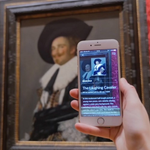
An app has launched that allows users to instantly identify artworks and access information about them, by simply scanning them with a smartphone.

Smartify launched at the Royal Academy of Arts in London last week. It has been described by its creators as “a Shazam for the art world”, because – like the app that can identify any music track – it can reveal the title and artist of thousands of artworks.

It does so by cross-referencing them with a vast database that the company is constantly updating.

There was a time when art galleries and museums would try to stop you taking photos, but those days are pretty much gone. It was the smartphoners what done this, because there are just too many of them to stop with their photoing, and anyway this can’t be done because you can never really tell whether they are taking photos or whether they are just doing social media with their mates or catching up on their emails. This app will end this argument for ever. People are just not going to tolerate being told that they mustn’t use this in an art gallery, and if they do use it, its use will look exactly like they are photoing. The key to stopping photoing is that you have to know when it is happening.

Originally posted at Brian Micklethwait’s Old Blog

Brushing up my Shakespeare

A few weeks ago, I watched and recorded a Shakespeare documentary series, in one episode of which Jeremy Irons talked about, and talked with others about, the two Henry IV plays. And that got me watching two recorded DVDs that I had already made of these plays, the BBC “Hollow Crown” versions, with Irons as King Henry and Tom Hiddleston as the King’s son, Prince Hal. While watching these, I realised how little I really knew these wonderful plays, and how much I was enjoying correcting that a little.

More recently, partly spurred on by what Trevor Nunn in that same documentary series had to say about it, I have been doing the same with The Tempest, this time making use of a DVD that I long ago purchased for next to nothing in a charity shop but had failed ever to watch.

By accident, when this DVD of The Tempest began, there were subtitles to be seen, and I realised that these written lines, far from getting in the way, only added to my enjoyment, so I left them on. And, if subtitles were helping, why not the entire text? Maybe I possess a copy of The Tempest, but if so I could not find it, so instead, I tried the internet, which quickly obliged. My eyesight not being the best, I beefed up the magnification of the text until it was nearly as big as those subtitles. So, I watched, I read subtitles, and I was able to see who was saying what, and what they were about to say. And very gratifying it all was:
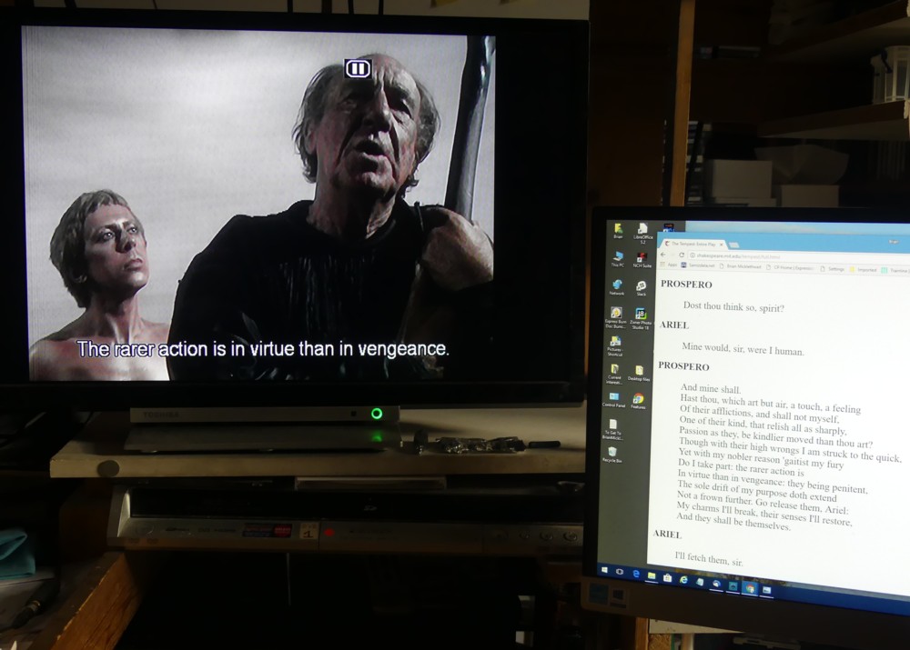
On the telly, on the left, David Dixon as Ariel and, on the right, Michael Hordern as Prospero, both very impressive.

And here, should you be curious, is the text they were enacting at that particular moment, as shown on the right of the above photo, but now blown up and photoshop-cloned into greater legibility:
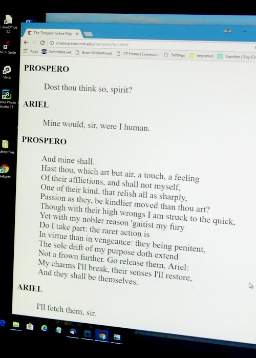
I think the reason I found this redundancy-packed way of watching The Tempest so very satisfying is that with Shakespeare, the mere matter of what is going on is secondary to the far more significant matter of exactly what is being said, this latter often consisting of phrases and sentences which have bounced about in our culture for several centuries. As ever more people have felt the need to recycle these snatches or chunks of verbiage, for their own sake, and because they illuminate so much else that has happened and is happening in the world, so these words have gathered ever more force and charismatic power. As the apocryphal old lady said when leaving a performance of Hamlet: “Lovely. So full of quotations.”

The thing is, Shakespeare’s characters don’t just do the things that they do, and say only what needs to be said to keep the plot rolling along. They seek to find the universal meaning of their experiences, and being theatrical characters, they are able, having found the right words to describe these experiences, to pass on this knowledge to their audiences. This is especially true of Hamlet, because central to Hamlet’s character is that he is constantly trying to pin down the meaning of life, in a series of what we would now call tweets, and consequently to be remembered after his death.

Prospero in The Tempest is not quite so desperate to be remembered, any more, we are told, than Shakespeare himself was. In Prospero, as Trevor Nunn explained in his documentary about The Tempest, many hear Shakespeare saying goodbye to his career as a theatrical magician and returning to his provincial life of Middle English normality. But Shakespeare was Shakespeare. He couldn’t help creating these supremely eloquent central characters. Even when all they are doing is ordering room service, or in the case of Prospero doing something like passing on his latest instructions to Ariel, they all end up speaking Shakespeare, with words and phrases that beg to be remembered for ever. These famous Shakespeare bits are rather like those favourite bits that we classical music fans all hear in the great works of the Western musical cannon.

So, a way of watching these plays that enables these great word-clusters to hang around for a while is just what you want. (Especially if, like Prospero, you are getting old, and your short-term memory is not what it was.) It also helps being able to press the pause button from time to time, to enable you to savour these moments, to absorb their context, better than you could if just watching the one unpausable performance in front of you. Although I agree, having a pause symbol on the furrowed brow of Prospero, as in my telly-photo above, is not ideal.

I am now browsing through my Shakespeare DVD collection, wondering which one to wallow in next.

Originally posted at Brian Micklethwait’s Old Blog

A railway without rails in China

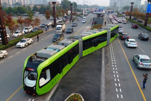
The usually ignorable but occasionally very interesting Dezeen has one of its very interesting postings up now, about a driverless bus/train, in China, which looks like this:

That reminds me a bit of those road-trains that they have in Australia.

The system works by scanning the painted road markings, using sensors on the underside of the vehicle. These sensors are able to detect pavement and road dimensions by the millimetre, and send travel information to the train whilst in transit.

Clever. And a lot simpler than a lot of stuff involving seeing and avoiding people, and seeing and avoiding other vehicles, with multiple sensors and artificial intelligence and whatnot. The people have to avoid this bus, just like they have to avoid trams now. This is not a self-driving vehicle. It is merely a development of the driverless train, like the DLR, but with computers and road markings to keep the thing on the straight and narrow rather than rails.

Driverless cars on regular roads, roads with no special markings, are still a few years off, I believe. Too complicated. Too many unknown unknowns. But driverless buses like these, driving along predictable routes, will be no harder to manage than trams or trolley buses are now.

Nobody knows what the long-term impact of driverless vehicles is going to be, other than that it will be very big. But one possible future is that lots of railways might soon be flattened into virtual railways not unlike this one, which will be a whole lot easier to travel along than a regular road.

Meanwhile, I love how, in the picture above, in the bottom right corner, there’s a guy who looks like he’s taking a picture of the cab of this bus, a cab with nobody in it.

Originally posted at Brian Micklethwait’s Old Blog

Twentytwo

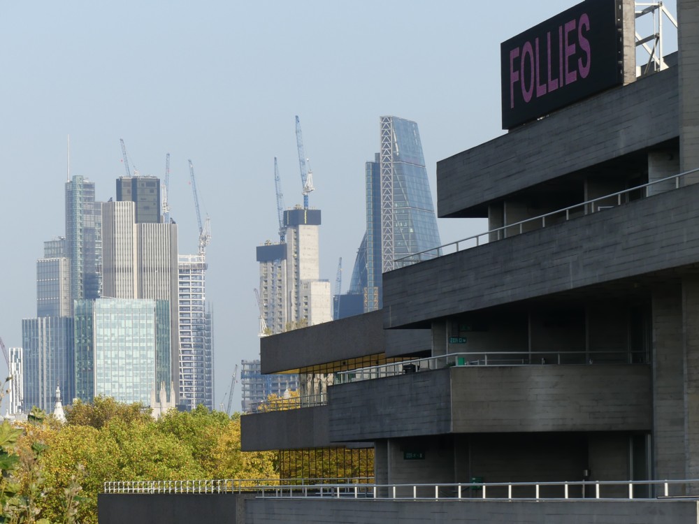
Last Sunday, I photoed those wonky looking cranes. I also took this photo:

That’s not at all what I think, but lots of people do think that those City of London Big Things are indeed follies. Follies being a show that the National Theatre, that concrete thing on the right, was advertising when I walked past it.

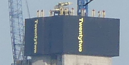
I find the Big Things of the City hard to keep track of, given that I do try. Let’s have a closer look at those vertical concrete lumps, that look they will turn into something very big:

There you go. Once you have a name like that, the gates of the Internet open.

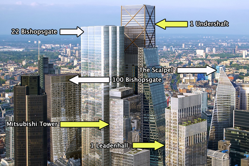
So, what’s the City of London about to look like next? The most useful answer I got was this:

That being the picture at the top of a Londonist posting from last July.

Quote:

Based on the visuals, these projects are a mixed bag of ho-hum and coo-wow. Taken together, they make for a crowded cluster that’ll almost entirely obscure the much-loved Gherkin building, once so dominant on the skyline.

A particularly coo-wow part of the story being the Scalpel. See above.

The rather ungainly 22 Bishopsgate, which is going up where the Helter Skelter would have gone until the financing for it collapsed, is going to be the tallest Big Thing in London, for a short while, just until that big boxy tower (“1 Undershaft”) with the diagonals on it goes even higher.

22 Bishopsgate will have a free viewing platform, according to this report from two years ago:

At the top of the building will be a double-height public viewing gallery, which will have dedicated lifts, be free to the public and sit alongside a two-storey public restaurant and bar.

I can’t wait, as people say when they’re just going to have to wait and are actually quite capable of waiting, in a state of impeccable mental equanimity.

This is the kind of building of which it will be said: The view from 22 Bishopsgate is magnificent. From 22 Bishopsgate, you will not see 22 Bishopsgate. They used to say this about the National Theatre.

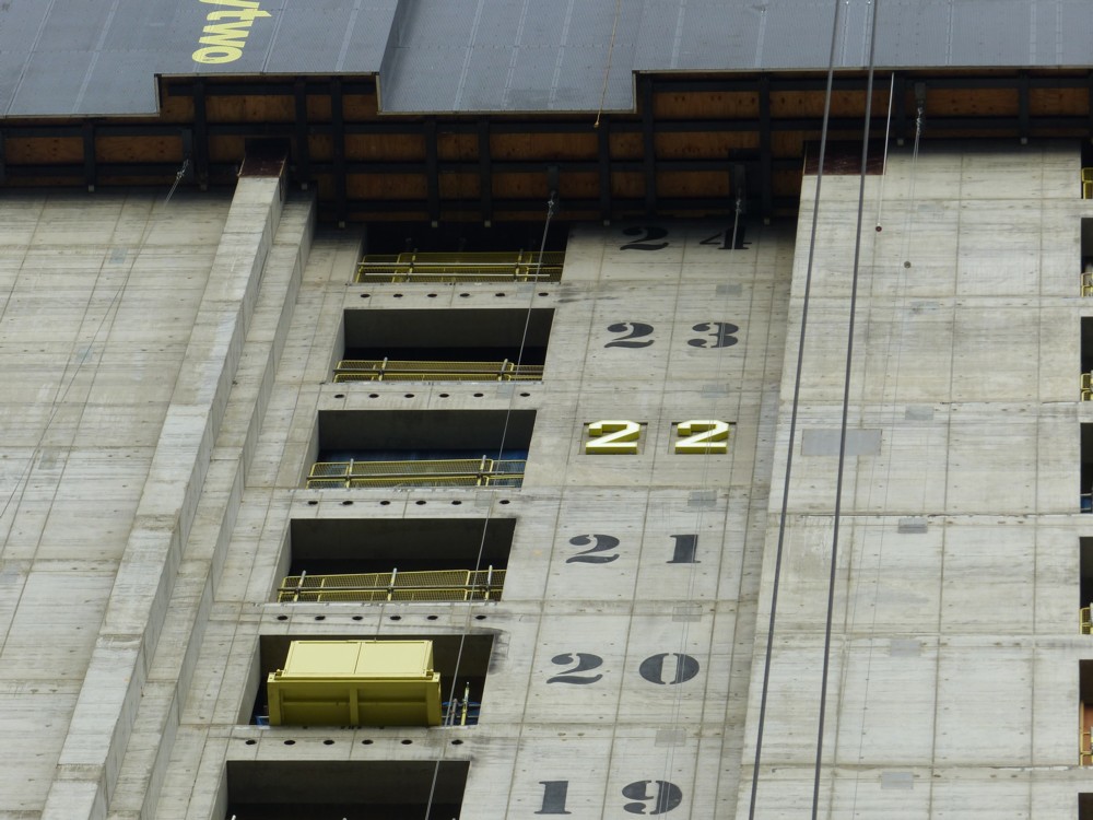
I sseem to recall taking some closer-up photos of all this activity a few months back. I must take another look at those. And … I just did. June 3rd, earlier this year.

I particularly like this one:

Very stylish.

Originally posted at Brian Micklethwait’s Old Blog

Pont-Aven et ses environs

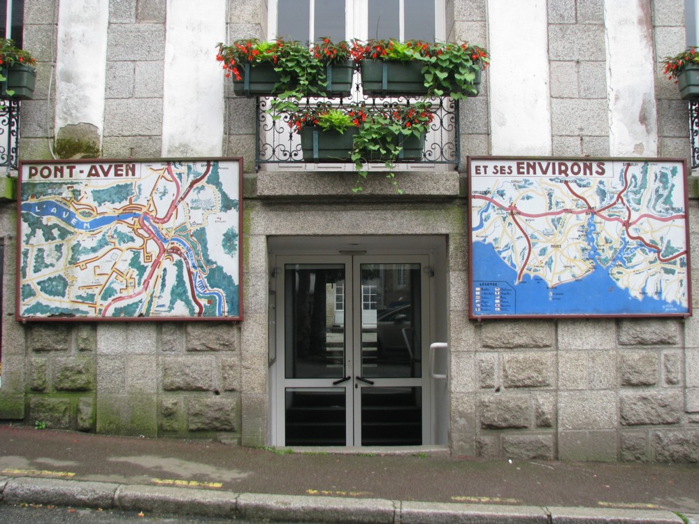
I got bogged down semi-working on a succession of postings that never got finished. So here is a quota photo, picked out the archives pretty much at random:

There I was, trawling through a huge clutch of photos taken somewhere in Brittany, in June 2011, but not knowing where they were of. Then that photo presented itself, and all was clarified.

Memo to self: always photo signs, maps, signposts, in fact anything that will later tell me what I was photoing and where. I know, I know, cameras will give you map references, if you ask them nicely. But I’m a twentieth century boy. I like actual maps

Preferably with little signs on them that say: you are here. Or in this particular case, vous êtes ici, which I don’t think the above maps do have. Quel dommage.

I recently started a new directory called “You are here”, for all such map photos.

Originally posted at Brian Micklethwait’s Old Blog

David Hockney likes having servants!

To quote my own earlier words about David Hockney:

What I particularly like about him is that he doesn’t indulge in the usual artistic sport of epater-ing the bourgeoisie. He is content to be bourgeoisie.

And as if to prove me right, in the same book I was referring to, I later encounter (pp. 105-106) this amazingly honest Hockney outburst:

The best form of living I’ve ever seen is Monet’s – a modest house at Giverny, but very good kitchen, two cooks, gardeners, a marvellous studio. What a life! All he did was look at his lily pond and his garden. That’s fantastic. He was there for forty-three years. …

Two cooks! Gardeners! How rare it is to encounter such full-throated pleasure being taken in the idea of having servants to look after you!

You can feel the people who try to decide these things going off Hockney, and I’m guessing that this has been going on for some time. I’m not saying that Adrian Searle, for instance, doesn’t mean the things he says in this Guardian piece about Hockney’s pictures over the years. And I actually rather share some of Searle’s preferences as to which Hockney pictures are nice and which are not so nice. Searle says they’ve got worse, basically.

However, I suspect that Hockney’s real crime is that he started out looking like a radical homosexualist, but then when homosexuality settled back into being just part of the scenery of modern affluent, successful, happy life, Hockney was revealed as being not angry about modern, affluent, successful, happy life. He just wanted that sort of life for himself, and for many decades now, he has had it. He would have been angry only if denied such a life by anti-homosexualists. But he wasn’t. As soon as the world started happily tolerating Hockney’s not-so-private life and made his picture-making life affluent and successful, Hockney was content happily to tolerate the world and to revel in its visual pleasures, natural and electronic. The Grand Canyon! iPhones! Bridlington!

Capitalism? Commerce? Hockney’s not angry about it. He’s part of it. He produces it, he consumes it, he applies it to his work, he knows this, and he loves it. And he has long surrounded himself with a small and happy team of assistants and cooks and bottle-washers of all the sorts that he needs, to enable him, Monet-style, to concentrate on his picture-making. Hockney is the living embodiment of the glories of the division of labour. Aka: social inequality.

I surmise that this is what really makes Searle’s readers (i.e. Guardian readers) angry about Hockney, not the claim that his pictures have got worse. They’re angry about modern life, and they’re angry that David Hockney isn’t angry about modern life.

And I suspect that Hockney is, in the eyes of Those Who Try To Decide These Things, helping to take the Impressionists down with him.

Originally posted at Brian Micklethwait’s Old Blog

Repairig the etters o y eyboard

I opened a special word processing file, to make sure that the signals I was sending didn’t go anywhere else:

Cccccccccccccccccccccccccccccccccccccccccccccccc
cccccccccccccccccccccccccccccccccccccccccccccccccccmnnnnnnn
nnnnnnnnnnnnnnnnnnnnnnnnnnnnnnnnnnnnnnnnnnnnnnnnnnn nnnnnnnnnnnnnnnnnnnnnnnnnnnnnnnnnnnnnnnnnnnnnnnmmmmm
mmmmmmmmmmmmmmmmmmmnmmmmmmmmmmmmmmn
mmmmmmmmmmmmmmmmmmmmmmmmmnmccccmncnmm
mmmmmcvvvvvvvvvcvnmmmmmmmmmmmmmmmmmmmmmm
mmmmmmmmmmmmmmmmmmmmmmmmmmmmmmmmmmm
mmmmnvclllllllllllllllllllllllllllllllllllllllllllllllllllllkkkkkkkkkkkkkkkkkkkkkkk
kkkkkkkkkkkk,,,,,,,,,,,,,,,,,,,,,,,,,,,,,,,,…………………………………………..
……………………………………………………………………………………….l…
……lllll.kkkkllllllllllllllllllllllllllll,kl

But what was I doing?

This. (I had to cheat by adding lots of carriage returns to the above gibberish, or this posting would have broken this blog):

That’s the trouble with keyboards. Their letters disappear. I’m sure that when the people who make these keyboards release them into the wild, they believe that they’ve done everything possible to stop this sort of thing, and that the letters will last for ever. But they never do.

I particularly like what I did with the horizontal Vs there.

Originally posted at Brian Micklethwait’s Old Blog

XYZprinting’s full-colour 3D printer ‘paints’ your builds as it makes them

Here.

I still don’t know what the domestic 3D printing killer app is going to be, and nor does anyone else. But, this feels like it brings it closer.

Originally posted at Brian Micklethwait’s Old Blog

Aug ’17 OSB6: Camden Highline

The titles of these things were getting to be too long-winded.

So yes, the Camden Highline.

Bid to turn disused railway between Camden Town and King’s Cross into elevated ‘Highline’ park

Sadiq Khan throws weight behind Camden highline project

The official website.

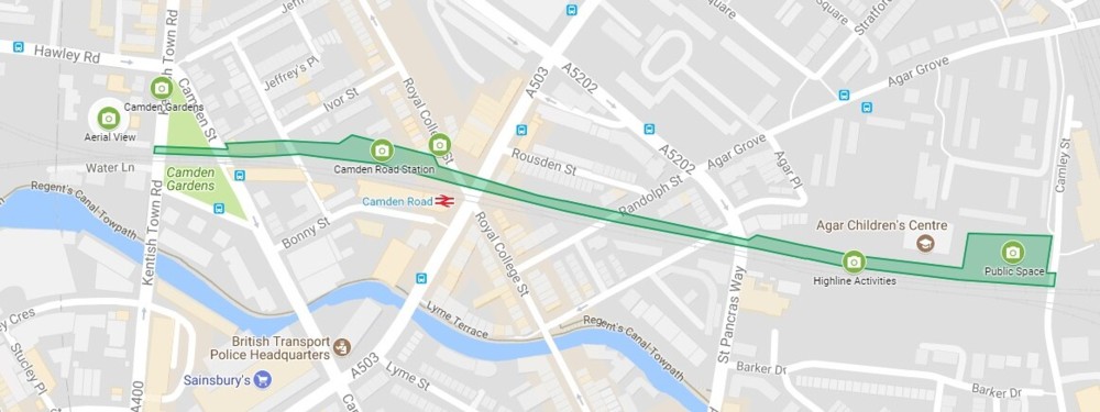
Where they hope it will be, just north of the Regent’s Canal:

Click on that to get it twice as big, and consequently (if your eyesight is anything like mine) legible.

Those little green circles are cameras. Presumably this means good places for photography. If and when they contrive this, I will definitely be checking it out.

Long moderately high platforms, even ones that are not very high, often supply great views, because you can walk along them until the great views appear.

Originally posted at Brian Micklethwait’s Old Blog