Cantilevered Thameslink seats

My journey to St Albans yesterday began rather inauspiciously. I was changing at St Pancras International, and I had hoped that I might get the chance to view the International bit, with its wide open spaces, Eurostar trains and its mighty roof. But all I did was follow the signs to “Platform B”, and that weary plod might has well have been at Green Park or Oxford Circus, for all the wide-open-spaced drama there was to be seen. And then when I was on the train, the scene outside was grim, grey and wet.

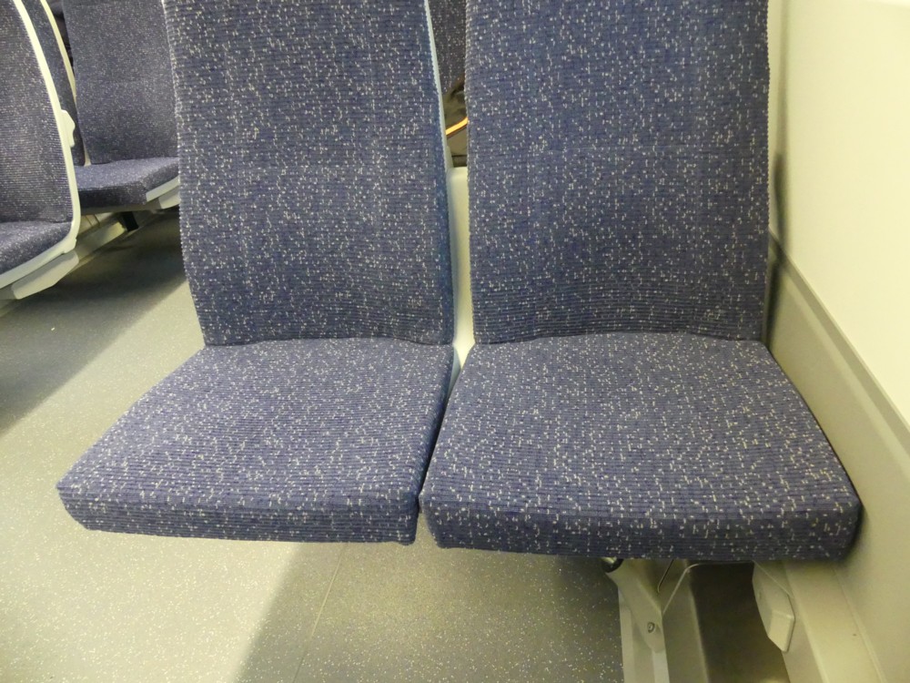
But then, I noticed the seats. The surprising thing about these was that instead of resting on the floor of the carriage, they were attached to the walls of the carriage, leaving the floor entirely unencumbered. They hovered over that floor with very little visible means of support:

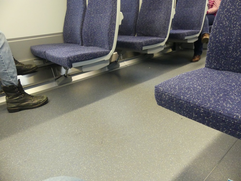
Here are two closer-ups, showing the diagonal compression member that was doing all the worke:

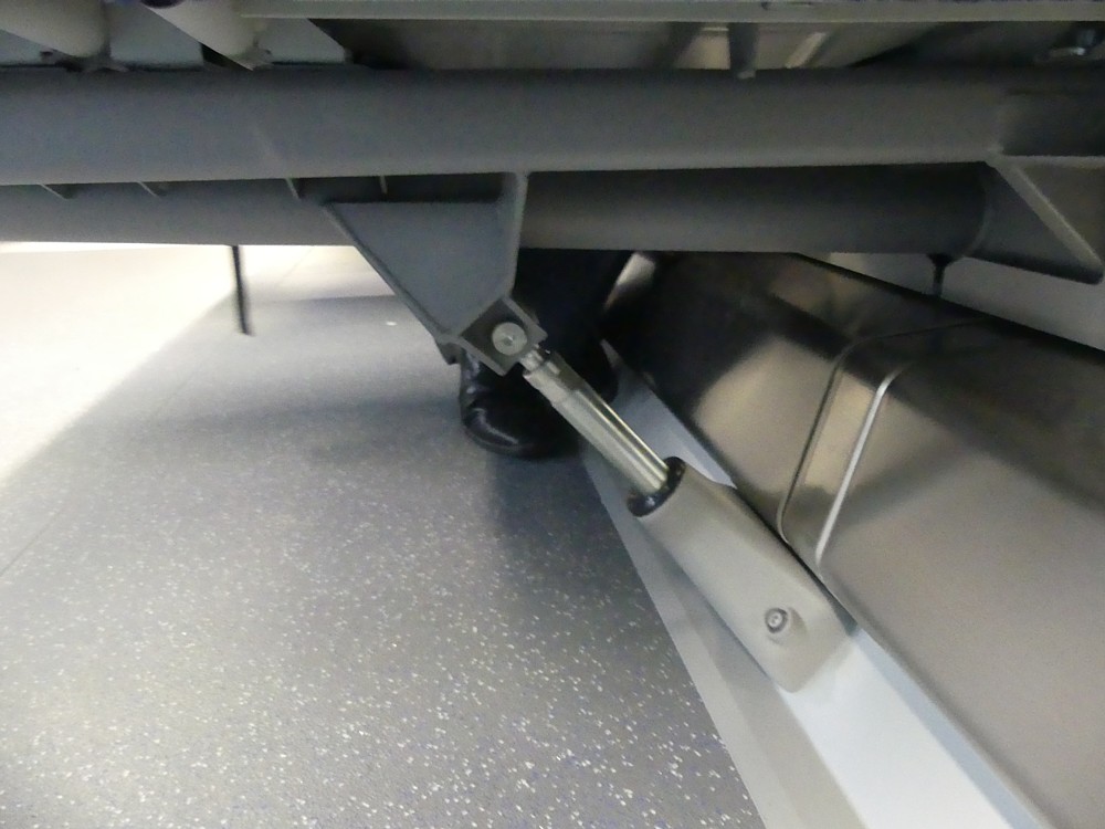
It looked crazy, but it felt as solid as a rock. Solider in fact, when you consider the state of a lot of rocks you encounter on your travels.

What I think I see here is not so much a design for a railway carriage, as a design of a system for making railway carriages, just the way you want them. And for changing them, if you suddenly decide you want them to be different. If you wanted to redo the seating on these carriages, all you would do is undo the linear compartment at the point where the wall of the carriage nears the floor of the carriage, and make whatever changes you want. Different seats, differently spaced, whatever. The floor is untouched. If you want to change the surface of the floor, easy. When it comes to cleaning the floor, also easy.

I have a nostalgic fondness for the railway carriages of my youth, with their absurdly thick, manually operated doors, that you had to slam shut, and which all had to be shut before the train could depart. But whereas I genuinely like old cars, I cannot really mourn those old carriages. These new ones are just so much better. For starters, they are wider on the inside by about two feet, because the walls are so much thinner and because these walls curve outwards.

I also like how the latest carriages join together in a way that allows people to walk continuously through, thereby easing congestion at busy times. Here’s a rather good photo from Wikipedia which shows that. According to Wikipedia there have been complaints about there being too little leg room between the seats, and no miniature fold-down tables.

They have their reasons for imposing such discomforts. Basically, they want to enable the maximum number of commuters to be able to travel in okay comfort, rather than allow a lesser number of commuters to travel in greater comfort. Which makes sense.

My point is different. My point is that if it is later decided, perhaps in response to such grumbles, to switch to having slightly more generously spaced seats, with little fold-down tables, this would be a relatively easy operation to unleash. Newly introduced carriages could be differently configured with great ease, without needing a totally new design.

There is much to complain about in the modern world, but stuff like this just gets cleverer and cleverer.

Originally posted at Brian Micklethwait’s Old Blog

Vinyl Empire

Indeed:

Opened in 2013. Still very much open 2017:

Photos by me this afternoon, in St Albans. Thanks to Darren and family for the hospitality.

LATER: Another blast from the past:

I remember liking that one a lot.

Originally posted at Brian Micklethwait’s Old Blog

Two more leaning tower cranes

I knew this would happen. Ever since I noticed those leaning tower cranes of London, which looked like they might be about to collapse through the unbalanced weight at the top of them, I knew that as I wandered through my photo-archives I’d find more such pairs of leaning tower cranes, leaning in opposite directions to each other, and looking like they should have collapsed and caused a flurry of shocked news reports, but which never actually did that.

And I just did:

Taken from the top of the Monument, on the same day as the photo below of the Walkie-Talkie.

At the time, all I thought I was photoing was a nice sunset and some nice cranes, posing nicely in front of The Wheel. But those two cranes on the right there seem to be in that same state of strong disagreement about what exactly vertical is, and for the same reason.

Yet, if either of those cranes had collapsed, late on in the year 2012, I am sure that we would have heard about it, and that I would have remembered it. Clearly, they did not collapse. They were just leaning over a bit.

All those cranes that we see were working on, among other buildings, two rather striking buildings that are now finished. I’m talking about the two stumps now blocking the view of the Shell Building. There is, on the right, in between the two leaning cranes discussed above, 240 Blackfriars. And to the left of 240 Blackfriars, as we look, the innards of the Tate Modern Extension, from which further lovely views out over lovely London were to materialise.

Originally posted at Brian Micklethwait’s Old Blog

Monument dwarfed by Walkie-Talkie

Indeed. I was going through the I Just Like It file, and came across two, independently selected, which make a nice pair.

First, taken in November 2012, the Walkie-Talkie while still under construction, viewed from the top of the Monument:

And second, taken in January 2016, the Monument now just about visible in the scrimmage of smaller London

The Walkie-Talkie looks very big from the top of the Monument.

The Monument looks very small from the top of the Walkie-Talkie.

And while we’re about it, here is another photo that links these two buildings. Taken on that same day in November 2012, back on the ground, with a little sign on the right there, saying “Pudding Lane”.

The Monument remembers those who died in the Great Fire of London of 1666. Pudding Lane, or so I was always told, was where that fire started.

Also, three days after taking that photo of the Monument from above, above, I took this photo of the Monument from below, along with another sign, this time a temporary sign telling me how to get to the Monument:

The way to get to the Monument was not, it would seem, the obvious way to get to the Monument.

Originally posted at Brian Micklethwait’s Old Blog

Christmas is coming

Indeed:

Photoed by me in Oxford Street this afternoon,

Like I said: perfunctory.

Originally posted at Brian Micklethwait’s Old Blog

Leadenhall Market

Yesterday I showed a photo that I actually took yesterday, rather than last year or last decade. And today I’m doing the same. I’m showing you another photo that I took yesterday:

That’s the inside of the domed roof in the middle of Leadenhall Market in the City of London. This is another of those photos which is a lot easier to take if you have a twiddly screen, such as I always now have.

Here is the next photo I took, to show you which place I mean:

To me, one of the odder things about Leadenhall Market is that all the enterprises plying their trade in it would seem to be obliged by the house rules to proclaim their names in the exact same style and size of lettering. This is not what you get in most shopping centres, which is what this place basically is. But, fair enough: their gaff, their rules. And although in one sense this is uniformity gone a bit mad, in another sense it is variety, because this is not something you see very often.

It is clearly a recent thing, and Wikipedia confirms this:

Between 1990 and 1991 the market received a dramatic redecoration which transformed its appearance, enhancing its architectural character and detail. The redecoration scheme received a special mention in the Civic Trust Awards in 1994.

Ah yes. Commercial, you understand, but not too commercial. The subtle business of not being too businesslike.

I passed through this place on my way to Monument tube, having been wandering towards the City and its Big Things from the Bethnal Green area, enjoying the last daylight of a very fine yesterday. Of which maybe more here later, and of which maybe not more here later. (This blog is also not very businesslike.)

Originally posted at Brian Micklethwait’s Old Blog

The electricity meter man photos my electricity consumption with his mobile

Indeed. And, I got him to hold the pose while I photoed it:

Okay, mine’s a rubbish picture, but: you get the picture, and in any case the fact that you can’t read the numbers is a feature rather than a bug. I’m sure he got his picture. He has already typed into his other little machine a note of my address and electricity score. So it will be entirely clear to him which number he is confirming, or conceivably correcting, with his photo.

Just another example of what mobiles contribute to the economy, not just by doing newsworthy stuff like transmit big gobs of money or send portentous messages to and from people on the move, but simply by helping workers to do little bits of work. Often, mobiles and their cameras are used to record the progress of work. This is using mobiles and their cameras actually to do the work, because this particular work is recording.

I know: smart meter. Well, someone recently tried to install one, but for some reason it couldn’t be done, or not yet.

To really appreciate this, you have to have experienced what happens to your electricity bill when your electricity consumption is recorded wrongly.

Originally posted at Brian Micklethwait’s Old Blog

EXCLUSIVE IT LIAN LOUNGE, DIN G & BEDROOM FUR ITURE

It’s been a while since there’s been any horizontality here. (That isn’t the most recent piece of horizontality here, just one that I happen especially to like.) So, allow me now to correct this, thus:

Click to get the bigger original.

It’s a shop just off Lea Bridge Road, opposite the station. Photoed by me almost exactly one year ago.

Originally posted at Brian Micklethwait’s Old Blog

A recognisable Lancaster and a recognisable Vulcan

When it comes to showing off my photos, I am currently in full-on retro mode, and my latest little retrospective is of a few more photos I took when I was At the 2010 Farnborough Air Show, those being a rather greater number of photos which I posted from that show at the time, at Samizdata.

All four of these photos here feature the Avro Lancaster, and the final one also features a Lancaster and also the mighty Avro successor to the Lancaster, the Vulcan:

It was a great day. And it got me thinking quite a bit more about the Avro Lancaster, and in particular about its highly distinctive and recognisable shape.

Originally posted at Brian Micklethwait’s Old Blog

Fewer Big Things then

Busy day. Busy evening. So just a couple of quota photos, both taken a little under ten years ago, just before Christmas 2007.

First, Guys Hospital, looking as good as it ever could:

At first, all I was thinking was: artistic impression. But it also has interesting info in it. No Shard. Which got me noticing another, at the time very commonplace photo, of the Gherkin. Also interesting info in it. No nearby Big Things. There it stands, in splendid isolation.

I also photoed lots of photoers that day, and have so far showed you only some of them (LINK TO THE OLD BLOG). There are several more good photoer photos deserving of resuscitation, all with impeccably concealed faces, but these will have to wait.

Originally posted at Brian Micklethwait’s Old Blog