Transport chat with Patrick Crozier (and sorry for the delay telling you about it)

With blogging, excellence is the enemy of adequacy, and often what you think will be excellence turns out not to be.

Eight days ago now, Patrick Crozier and I had one of our occasional recorded chats, about transport this time. Train privatisation, high speed trains and maglevs, robot cars, that kind of thing. I think it was one of our better ones. We both had things we wanted to say that were worth saying, and both said them well, I think. Patrick then did the editing and posting on the www of this chat in double quick time, and I could have given it a plug here a week ago. If I have more to say about transport, I can easily do other postings. But, I had some stupid idea about including a picture, and some other stuff, which would all take far too long, and the simple thing of supplying the link to this chat here was postponed, and kept on being postponed.

Usually, this kind of thing doesn’t matter. So, I postpone telling you what I think about something. Boo hoo. But this time I really should have done better.

There. All that took about one minute to write. I could have done this far sooner. Apologies.

Originally posted at Brian Micklethwait’s Old Blog

Peak Remembrance?

Yesterday, I went on a shopping expedition which involved boarding a train at Charing Cross, which I planned to reach by going first to St James’s Park tube.

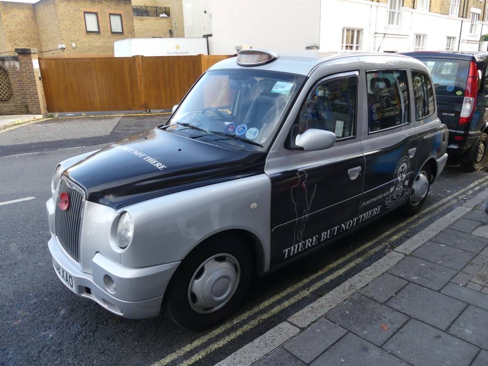
The first of the photos below (1.1) is of a taxi, parked close to where I live, with some sort of poppy related advert on it. I like to photo taxis covered in adverts. Temporariness, the passing London scene, will get more interesting as the years pass, blah blah.

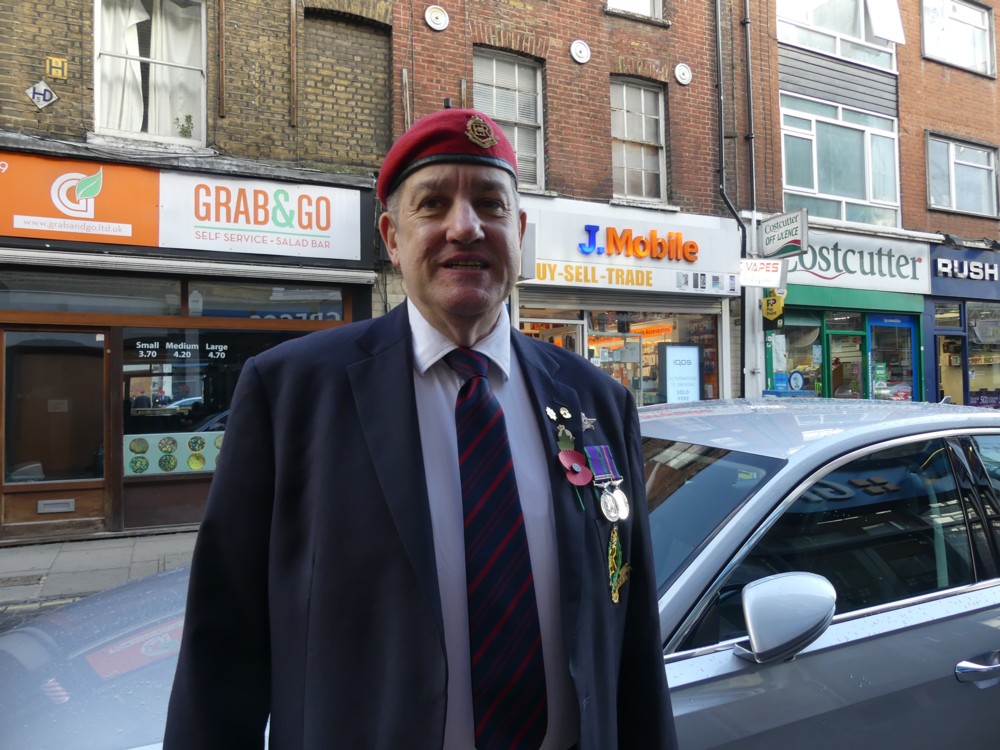
Then, in Strutton Ground, just this side of Victoria Street, I encountered two besuited gentlemen wearing military berets and medals. I photoed them both, with their permission, and I post one of these photos here (1.2), also with their permission. Sadly, the other photo didn’t come out properly.

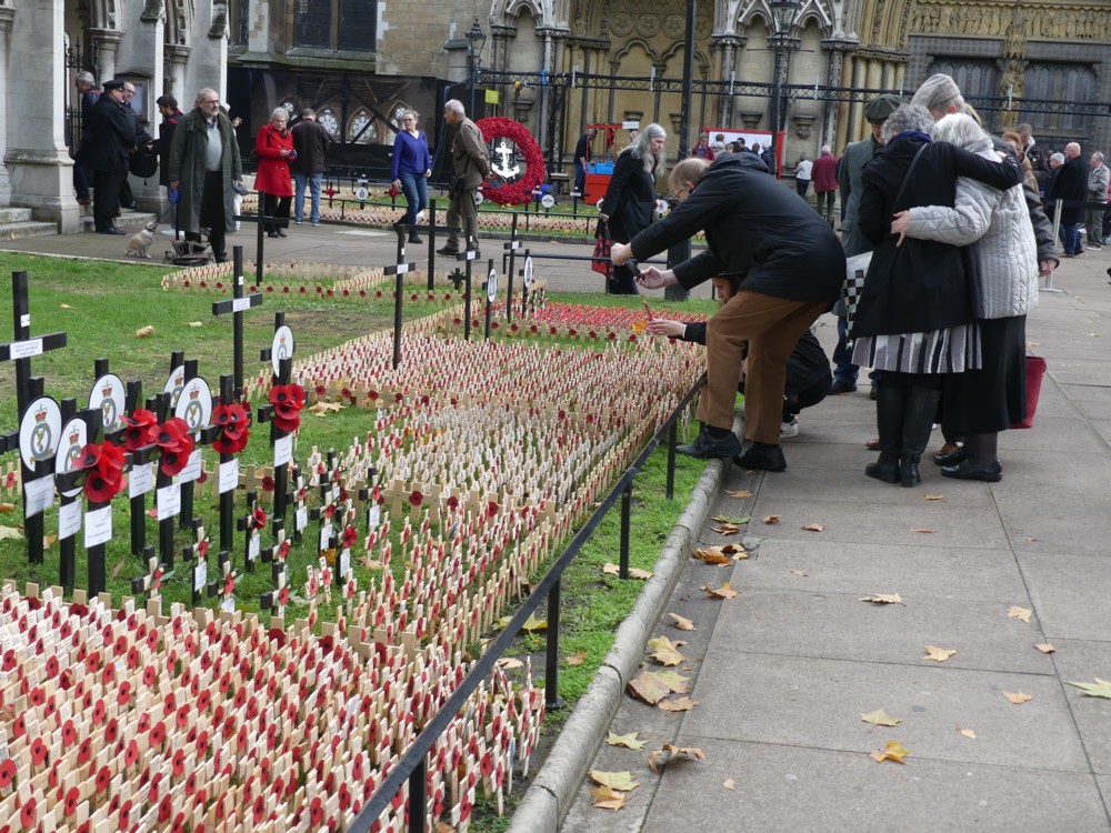
It was only at this point that I realised that, the following day (i.e. today) being Remembrance Sunday and what’s more the exact one hundredth anniversary of the Armistice of November 1918, London in the Westminster Abbey area would already be awash with Remembrance Sunday photo-ops. My shopping could wait a while, and I turned right down Victoria Street.

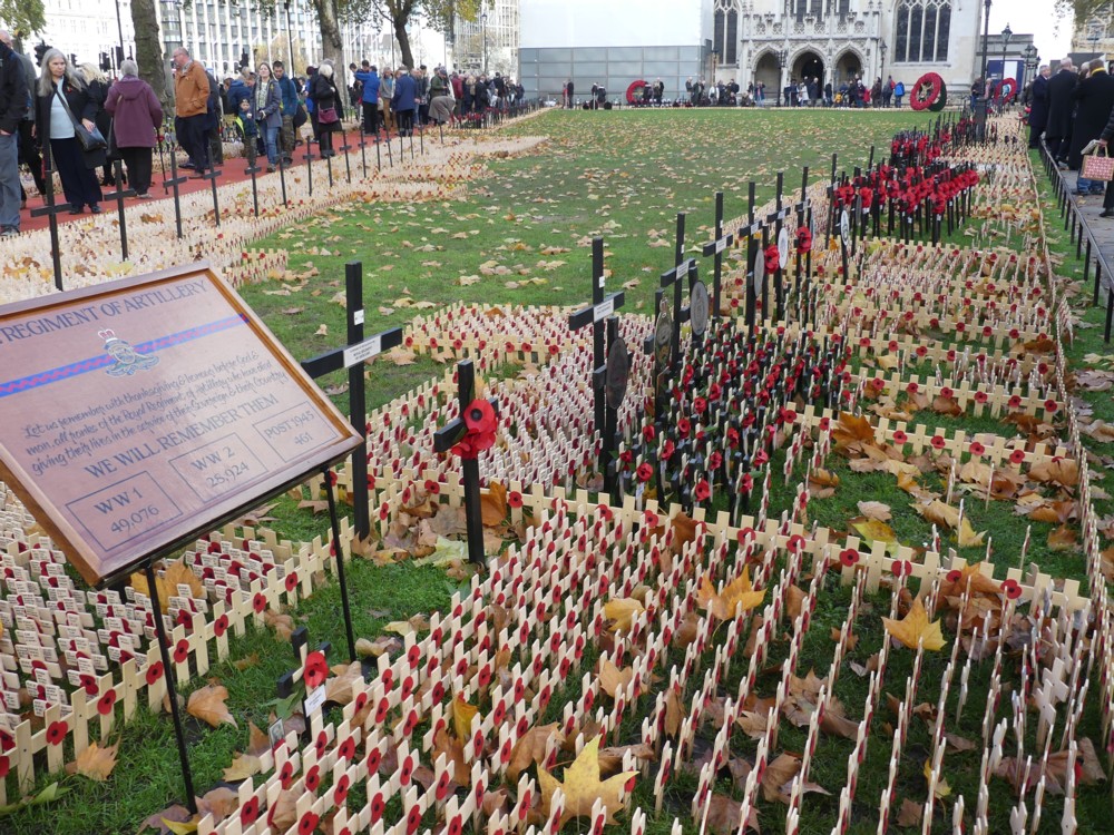
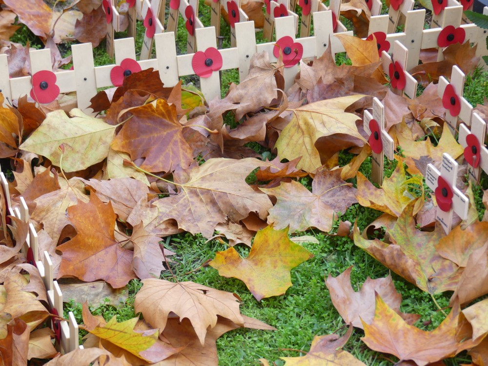
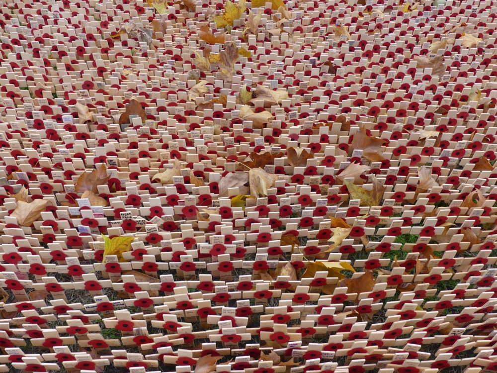
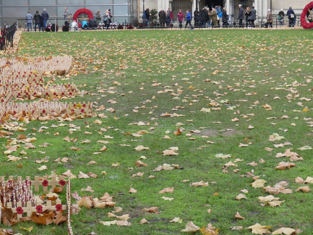
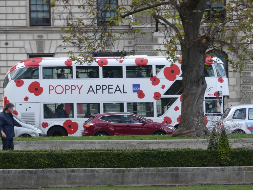
The seven other photos below mostly involve small wooden crosses and dead autumn leaves – autumn 2018 arrived at Peak Dead Leaf yesterday – but they also include another poppy related advert, this time on a the side of a bus (3.3), which I photoed in Parliament Square:

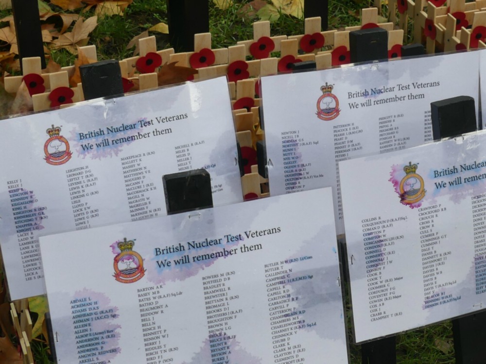
Sadly, the plasticated documents referring to “British Nuclear Test Veterans” (2.1) were insufficiently plasticated to resist the effects of the rain. It began to rain some more when I was arriving at Charing Cross station and it did not stop for several hours, so I’m guessing these lists suffered further rain damage. It’s odd how little sadnesses like this stick in your mind, in amongst the bigger sadnesses being remembered.

The autumn-leaves-among-crosses photos, all taken outside Westminster Abbey, are but a few of a million such that must have been taken over this weekend, in London and in many other places. Is it proper to include two mere advert photos, even if they are poppy related adverts, in such poetically symbolic and dignified company? I chose to do this because one of the things I find most interesting about these Remembrance remembrances is that, as each year of them passes, they don’t seem to be getting any smaller. People still want remember all this stuff, even though all the veterans of World War 1 are now gone. Hence the adverts. If the adverts didn’t get results, they’d not be worth their cost.

As to why these remembrances continue to be remembered, and by such huge numbers of people, year after year, I think one reason is that each political tribe and faction can each put their own spin on the sad events being remembered, but in the privacy of their own minds. For some political partisans, these ceremonies and symbols are a chance to wallow in the pageantry of patriotism. For others, they are an opportunity to rebuke such nationalists, for stirring up the kinds of hostility that might provoke a repeat of the sad events being remembered. “Patriotism” and “nationalism” being the words used to salute, or to denounce, the exact same sentiments. But declaring red poppies to be a warning that the defence budget should be increased, or that they are anti-Trump and anti-Brexit symbols that Trump supporters and Brexiteers have no right to wear, would be too vulgar and partisan, so on the whole this kind of vulgarity and partisanship is not indulged in, not out loud.

The phenomenon of the political meeting where all present hear the same words but where each understands them to mean different things – I’m thinking of such words as “Britain”, “freedom”, “democracy” and “common sense” – has long fascinated me. Remembrance ceremonies remind me, on a larger scale, of such meetings. I attended many such little political meetings myself before I decided that mainstream politics was not for me, and switched to libertarianism, where meanings are spelt out and arguments are had rather than avoided.

For less obsessively political people, Remembrance ceremonies and symbols are simply an opportunity to reflect on the sadness of history in general, and in particular the sadness of the premature deaths of beloved ancestors – or, perhaps worse – hardly known-about ancestors. We can at least all agree that premature death, in whatever circumstances, is a sad thing to contemplate. And until young men entirely cease from dying in wars, Remembrance Sunday will continue to be, among other things, a meaningfully up-to-date event.

And so, year after year, these ceremonies continue. Will this year’s anniversary come to be regarded as Peak Remembrance? We shall see.

Originally posted at Brian Micklethwait’s Old Blog

Sign of our time

Seen recently on Facebook:

I like all the reflections in the background. And what happens to the guy’s head. Real Photographers tend to avoid all that stuff. I seek it out.

Is this a reference to Brexit, Trump etc., or am I reading too much into this?

Originally posted at Brian Micklethwait’s Old Blog

The title of my talk at Christian Michel’s on Jan 6th 2019

I have just been contacted by Christian Michel for the title of my annual 6/20 talk at the beginning of next year. I kept him waiting for a day, because I wanted to get this more right than I would have if I had just dashed off a reply in a few minutes. But the job got done, as best I could manage.

Here it is: “The difficulty and the ease of the making of and the distribution of cultural objects: A history of human civilisation in three layers”.

Does that explain itself? It doesn’t? Maybe you should attempt to attend. Maybe I’ll write it out beforehand, read it out on the night (that often works very well), and post it here.

Originally posted at Brian Micklethwait’s Old Blog

Sardar Patel goes large

I do like Dezeen. Mostly it’s just Posh Modernism, but every so often it reports on something a lot more interesting.

Like: what is now the world’s tallest statue, four times the size of the Statue of Liberty, recently erected in Gujarat state, India.

This looks for all the world like it’s Photoshopped, but it truly isn’t:

Vallabhbhai Patel (31 October 1875 – 15 December 1950), popularly known as Sardar Patel, was an Indian politician who served as the first Deputy Prime Minister of India. He was an Indian barrister and statesman, a senior leader of the Indian National Congress and a founding father of the Republic of India who played a leading role in the country’s struggle for independence and guided its integration into a united, independent nation. …

Prediction: a Global Big Statue Race.

Originally posted at Brian Micklethwait’s Old Blog

BMdotcom financial quote of the day

In this:

Apple, Microsoft, Amazon, Google and Facebook have a combined market capitalization of $3.7 trillion, equal to Germany’s gross domestic product last year.

Quoted at Instpundit by Stephen Green, who says that this is an “incredible figure”. It certainly is very big, if that’s what “incredible” means, when you are describing a very big number.

Originally posted at Brian Micklethwait’s Old Blog

More modern architectural colour

I recall speculating here (by quoting Bill Bryson) that a reason why Modernism is so monochromatic is that there was a time about a hundred years ago when the two hardest colours to get right in painted form, and hence the two most modern colours, were: black; and: white.

Early, monochrome photography was also a big reason for architectural modernity not to care about colour. The most modern buildings were the ones that looked like black and white photos.

This has been a long time changing, but changing it finally is. There was Renzo Piano, and his brightly coloured buildings near Centre Point in London. And now here comes this, by Jean Nouvel:

It’s the right hand of the two towers that I’m concerned with here, not with the other tower, or not with the crane or the bridge, bonuses though the latter two undoubtedly are.

Jean Nouvel has tricked his tower out in red, white and blue. It’s in Marseille, and is called La Marseillaise.

My immediate reaction is: a bit of a mess. Looks like he did this with three cans of spray paint, and in about twenty seconds. But, if I got to see it in the flesh, with all the complexities of the detailing, I might well like it a lot.

But my opinion about the beauty or lack of it of this building is beside my point, which is that colour is finally creeping into fashion, as part of architectural modernity.

It has taken a long time, because architectural fashion always does take a long time. This is because architects, unlike more regular artists, peak very late, a bit like classical conductors and for the same reason. Which is that architects (like conductors), in order to peak, have to be very powerful, by which I mean, liked and supported and paid for by lots of other powerful people. Powerful people tend to be old.

And sure enough, when I looked up the architect of this tricoloured tower, Jean Nouvel, I learned that his is now 73, having been born in 1945. In other words, he is now entering the architectural promised land, that land being where he can design buildings exactly as he pleases, and the clients build them and reckon themselves lucky to have got him.

I could now add other coloured modernism photos, and make further points about why this trend is now happening, and happening so powerfully. But the trick with blogging is to keep it brief, and if a subject matters to you, to come back to it again and again, while linking back to earlier pieces which make the same big point.

So, expect plenty more here about coloured architectural modernity.

Originally posted at Brian Micklethwait’s Old Blog

22 dwarfs 42

A year ago I did a posting about Twentytwo Bishopsgate, which is about to be the tallest Big Thing in the City of London Big Thing Clump. It featured this explanatory image of what was then about to happen to that Big City Clump:

I’m not sure what the current status of “1 Undershaft” is just now, which is potentially the biggest Big City Thing of the lot. I seem to recall reading that there were delays. The internet now seems rather coy about this project. 22 Bishopsgate, however, is roaring upwards.

And no photo I have so far taken of 22 Bishopsgate illustrates the scale of this roar better than this one, which I took yesterday, when on my way from Angel to the City, which means that I was approaching the Big City Clump from a northerly direction:

What we see there is what used to be one of the City’s biggest Big Things, the NatWest Tower, or “Tower 42” as they now want us to call it. Behind it, dwarfing it, still not as big as it will be, is 22 Bishopsgate.

When I took this photo, such is my eyesight that I wasn’t sure if I was looking at the actual Tower 42, or a reflection of it in the glass surface of 22 Bishopsgate. It just seemed too small to be the actual Big Thing itself. But clearly, it is.

In the graphic above with all the names, Tower 42 is now so small and so antique that it doesn’t even get named. It’s the dark one on the left, behind where it says “Mitsubishi Tower”.

Originally posted at Brian Micklethwait’s Old Blog

At the Grafton Arms (after recording a talk)

Recently I and Patrick Crozier visited the Grafton Arms. I rather like this pub. These guys also like this pub, because of the Goon Show. Apparently the Goons wrote some of their scripts there, in an upstairs room.

A fact commemorated by this mirror behind the bar, which I only noticed on this visit:

If you look carefully there, you can see me and my camera. Well, it is a mirror. I should have tried to include Patrick.

What took Patrick and me to the Grafton Arms was that we had just been doing one of our recorded conversations, and we needed refreshment. Tune in to the latest one, by going here.

My favourite of these conversations so far has been the one we did about WW1, concerning which Patrick is something of an expert. Our next, or so I hope, will be about transport, concerning which Patrick is also something of an expert.

Originally posted at Brian Micklethwait’s Old Blog

The performing horses of Warwick Castle (2): After the show

Remember those performing horses of Warwick Castle, galloping up and down on a thin rectangular arena, telling the story of the Wars of the Roses. Course you do. I showed you a spread of photos of them, but wasn’t that impressed with how those photos came out.

Well, after the show, all of us friends and family of one of the performers went backstage, so to speak, to shake hands with the guys in their armour and to say hello also to the horses.

And the photos I took of the horses seemed to me rather better:

It helped that the horses were standing still. It also helped that the background was much easier to choose and mostly looked quite different from the horses heads.

I also prefer the way horses look when they aren’t wearing complicated costumes. There’s nothing like quite like a horse, unclothed, in sunshine.

That hoods that a couple of the horses are wearing are not cruel. They’re to keep the flies off their eyes.

The actual war horses that fought the Wars of the Roses would have been a lot stockier and heavier than these horses. These ones are retired race horses. Which is okay, because they are actors.

Originally posted at Brian Micklethwait’s Old Blog