Homage to Hartley: The V&A under a very blue sky

I tried to put together a more complicated posting about, well, wait and see. But it is taking too long, so here is something simpler.

A favourite blogger of mine is Mick Hartley, who oscillates between the insanities of the anti-semites and the Islamists (heavy overlap there) and photos. Photos by himself, and by others.

The photos by others are often antique and black and white. His photos are in colour, and they are typically very colourful indeed, especially when the sky is very blue.

Colour is an obsession of Hartley’s, both when it is present, and when it is not.

Here is a photo I recently took, which is the sort of photo Mick Hartley would take, if he ever went West:

That’s the Victoria and Albert Museum, unless I am mistaken (as I might well be), photoed by me from the big old road that goes from the Albert Hall (and more to the point from the Royal College of Music, where GodDaughter 2 had been performing) down to South Kensington Tube. This I know, because of a photo I took of a street map, moments after taking my Hartleyesque photo above:

That being the relevant detail. I never regret map photos.

By the look of it, the V&A is a building I should explore. Especially its upper reaches. Maybe there are views.

Originally posted at Brian Micklethwait’s Old Blog

How the London Underground pioneered credit cards

Again with the maybe-betrayed-confidence-but-I-hardly-think-so routine. Michael Jennings tells me and whoever else he told, on Facebook, that he liked this Forbes piece, about how Digital Currencies And Credit Cards Have Subways To Thank For Their Existence.

Quote:

The following century …

… i.e. the twentieth century …

… saw an explosion in urban populations, and a requisite growth in the world’s railway network, but this was not accompanied by a substantial changes in the world of ticketing. Manually-operated entry gates to train stations had slowly become more common, but most public transport passengers continued to rely on bits of paper – or occasionally, metal tokens – to get around their city.

In 1950s London, this was starting to cause problems. The Tube network was bigger and busier than ever, which prompted operators to consider installing automated gates, like those in NYC. “We knew that this would help ease congestion, but it was complicated by the fact that London has always had fares based on distance,” Shashi Verma, Chief Technology Officer of Transport for London (TfL), told me, “Standard metal tokens weren’t an option.” So, the then-named London Transit Authority started looking at alternatives. The result, which was released to the world in 1964, was the printed magnetic stripe. The idea of using magnetism to store information had been around since the late 1800s, and magnetic tape was patented in 1928 by audio engineer Fritz Pfeulmer. But transport was its very first ‘real-world’ application. A full decade before the now-ubiquitous black/brown magnetic stripe was added to a single bank card, it was printed onto millions of tickets for the London Underground.

I miss Transport Blog. The old link to it no longer works, and it would appear that it is no more.

Originally posted at Brian Micklethwait’s Old Blog

The performing horses of Warwick Castle: Nice legs – shame about the faces

Over the summer, a friend of mine was performing in a show at Warwick Castle about the Wars of the Roses. And early last August a gang of her friends and family went there to see this, me among them. It was a great show, albeit wall-to-wall Tudor propaganda, and a great day out.

Warwick Castle is quite a place, being one of Britain’s busiest visitor attractions. It’s No 9 on this list.

I of course took a ton of photos, and in particular I photoed the horses in this show, the crucial supporting actors, you might say. The stage was out of doors, of course, and long and thin, the audience on each side being invited to support each side in the wars. Long and thin meant that the horses had room to do lots of galloping.

None of the photos I took were ideal, but quite a few were okay, if okay means you get an idea of what this show was like:

The basic problem, I now realise, is that the horse heads were at the same level as the audience on the opposite side to my side. As Bruce the Real Photographer is fond of saying, when photoing people, you start by getting the background right. And I guess he’d say the same of horses. Well, this time, for these horses, I’m afraid I didn’t.

So it was a case of nice legs, shame about the faces. (That link is to a pop song from my youth, the chorus of which glued itself to my brain for ever. I particularly like the bit where they sing: “Shame about the boat race”.)

I recommend the show’s own Real Photographer, for better photos, potted biogs of the leading historic characters, and a little bit about the enterprise that did this show.

Originally posted at Brian Micklethwait’s Old Blog

The last really fine day of 2018 (2): Scaffolding wrapped and unwrapped – and the Reichstag wrapped

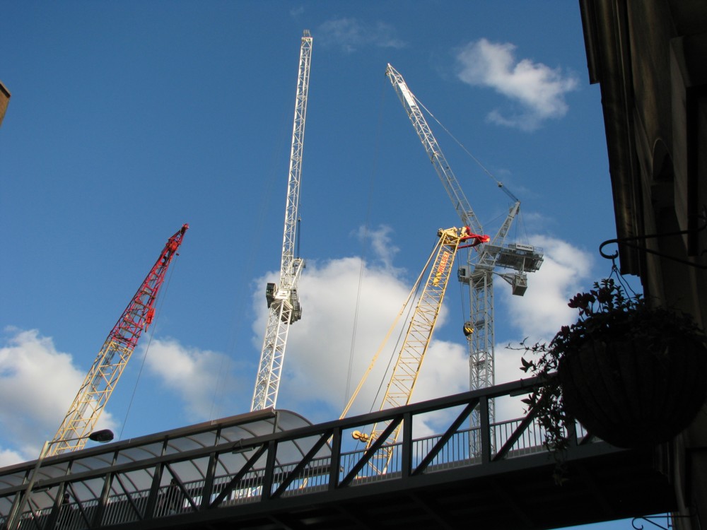
I’ve asked it before and I’ll ask it again. Why do I regard most of Modern Art as silly, yet relish real world objects which resemble Modern Art? Objects like this:

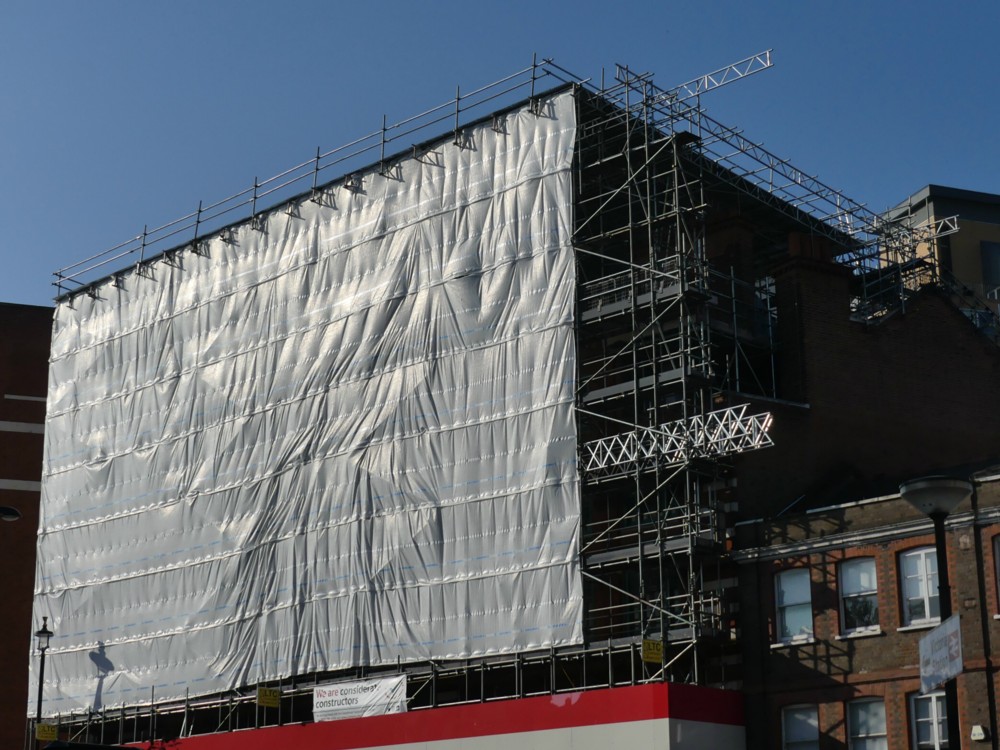
The above photo was taken on The last really fine day of 2018, just minutes after I had taken the one in that earlier posting.

You don’t need to go to an exhibition of sloppily painted abstract art, when the regular world contains wondrous looking objects like that. And what is more, they are wondrous looking objects which have worthwhile purposes. This wondrous object is for supporting and protecting workers as they work on a building.

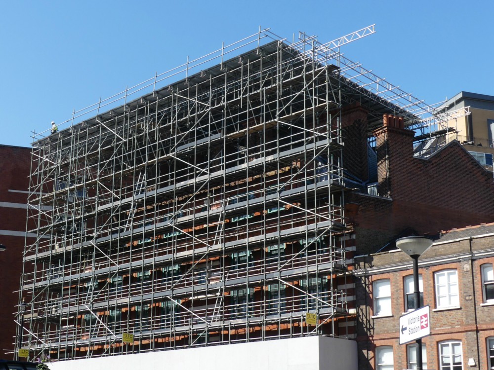
Here is how that same scaffolding looked, unwrapped, about a month earlier:

I particular enjoy how the sky changes colour, in my camera, when a big white Thing is inserted into the picture. (This afternoon, I encountered this, by Real Photographer Charlie Waite. Same effect.)

Thank you to the (to me) invaluable PhotoCat, for enabling me to crop both of the above photos in a way that makes them more alike in their scope and which thereby points up the differences. I’m talking about the invaluable Crop But Keep Proportions function that PhotoCat has, but which PhotoStudio (my regular Photoshop(clone)) 5.5 seems not to offer. (I would love to be contradicted on that subject.)

Despite all my grumblings about how silly most Modern Art is, I do nevertheless greatly like the way that this Big Thing (the Reichstag) looks in the pride-of-place photo featured in this BBC report, an effect which presumably makes use of the same sort of technology as we see in my photo, but on a vastly grander scale:

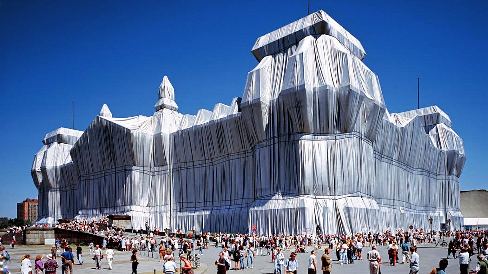
I have to admit that this is several orders of magnitude more impressive than my scaffolding. (Maybe that was the last really fine day of 1994.) My scaffolding looks lots better than some badly painted little abstract rectangle in an Art gallery, but it’s not nearly as effective as the Reichstag, as wrapped by Christo and Partner.

Because this Big Wrapped Thing was so very big, and because it is such a very interesting shape, it really does look like it added greatly to Berlin, in that summer of 1994. I entirely understand why all those people assembled to gaze at it. Had I been anywhere in the vicinity, I would have too. And had there been digital cameras then, I would have taken numerous photos, as would thousands of others. Thus giving permanence to this vast piece of temporariness.

Because, what I also like about this Reichstag wrapping is that, just like my scaffolding, and just like all the other wrapping done by Wrapper Christo and his Lady Sidekick, it is temporary. That BBC report calls it Pop-Up Art, and it is of the essence of its non-annoyingness that any particular piece of Pop-Up Art by Christo will soon be popping down again.

This Reichstag wrapping happened in 1994, but is now long gone. Did you disapprove of what Christo and his lady did to the Reichstag? You just had to wait it out. Soon, it would be be gone.

Do you think scaffolding, especially when wrapped, is ugly? Ditto.

Originally posted at Brian Micklethwait’s Old Blog

Photoers from 2013: Varieties of facelessness

Photoer facelessness can be contrived in many ways, not least by the camera itself getting in the way. Then there’s photoing them from behind. Or having something else between their face and the camera photoing them. And of course there’s cropping.

Here’s another little clutch of not-then-posted but ready-to-go photoer photos, found when looking for something else. The guy holding up the red camera with two fingers, V-sign style, had already had the top of his face cropped off. But nothing further then happened.

My favourites, from the facelessness point of view, are the first photo and the last photo:

Burka Lady on the left looks like she had clocked me photoing her. But my guess is she and her friend were getting a lot of that.

Number 7, or 3.1, or bottom left or whatever we call her, is rather recognisable. But that interested me a lot. What is she doing with her two cameras? Trying to take identical photos, to compare her cameras? If so, I wonder how the phone did compared to the regular camera? Rather well, I’m guessing.

Originally posted at Brian Micklethwait’s Old Blog

Apartments on a bridge in Stockholm

That’s the plan anyway. Read about it in a Dezeen posting entitled Urban Nouveau wants to save Stockholm’s Gamla Lidingöbron bridge by building homes in it:

Urban Nouveau has designed the scheme in response to Lidingö Municipality’s plans to tear down the Gamla Lidingöbron bridge, which links the Swedish capital to the island of Lidingö, and replace it with a modern structure.

I like the sound of this, and the look of it:

Oh, sorry, no, that’s the old version of London Bridge. (I recommend having a browse of that full-size. (it’s 6144 x 1024.))

The thing is, a bridge, for all the grand vistas you can often see from it, can be a rather forbidding and even boring thing to walk across. It’s like walking along a huge boulevard. Sounds good, but too little changes as you progress. To make bridges pleasurable to walk across, you need stuff on them.

Which is why I am prejudiced in favour of this Stockhom scheme, even though what I know about it is only what I have skim-read about it in this one Dezeen posting.

There’s a Petition.

Originally posted at Brian Micklethwait’s Old Blog

How the Shard was looking nine years ago

Nine years, to the day, actually. I was trying for ten years to the day, but after concocting what follows, I realised that these actually date from October 8th 2009:

The first one shows a rather strange footbridge that used to go over the site, taking pedestrians from London Bridge Station to Guy’s Hospital, and places beyond. Most of the other photos were taken from on that bridge.

What surprises me now is how chaotic it all looks, especially when I zoomed in on a particular bit of chaos.

What that lumpy cylinder that they are manhandling is, I do not know.

The website to be seen in the final photo seems to be long gone.

Originally posted at Brian Micklethwait’s Old Blog

Lines of birds over Rye

Busy day doing other things besides this, but here are a couple of Other Creatures snaps, the Other Creatures in this case being birds.

Last Saturday evening, I and some friends were in the southern coastal town (one of the so-called Cinque Ports) of Rye. As it was getting dark, a big line of birds flew over us. I snatched this shot, which you can get all of by clicking on this rotated and horizontalised slice:

Then another squadron of birds flew over, this time in a V shape, which means that this next horizontalisation is a bit less thin:

So, two lines, joined at the front, all following the one top dog bird.

Again, click to get the original.

Rye is a “port” that isn’t much of a port anymore, because a thousand years of river mud has pushed the sea away from it. The houses in my two photos are recent, where there used to be sea, a bit away from the centre. The centre, i.e. the whole of the old town, is on a hill, which used to be an island.

I think the birds are geese, but I really do not know. For the benefit of birdophiles, this full-size crop from out of another photo I took, of the first line of birds above, should narrow it down:

Those look far too big to be – I don’t know – starlings. And, I surmise, rather too well organised. Starlings just swirl about in a big mob, like fishes, right? Come to think of it, do any fishes line up like these big birds? I ought to be asking the internet this, but I’m off to bed.

Originally posted at Brian Micklethwait’s Old Blog

150 great things about the Underground: Number 122

This:

Photoed by me last night. And explained here. The Metropolitan Line came up with this logo just after the regular London Underground logo was devised. Now this version of it survives, but only on platforms at Moorgate that are no longer used.

Weird.

In the twentieth century, weird is all it would have been. Then forgotten. Just another of life’s little mysteries. But, in the age of the internet, there are no little mysteries.

Originally posted at Brian Micklethwait’s Old Blog

Michael Jennings explores Tehran

At my home on the last Friday of this month (Friday September 28th – which is in six days time), Michael Jennings will be speaking about Iran, and in particular about how he recently spent some time exploring its capital city, Tehran. The easiest link to learn more about Michael’s amazing globetrottings is to this list of his Samizdata contributions.

Each month, I solicit a few words from the speaker, to email to my list of potential attenders. A few days ago, Michael sent me rather more than a few words about what he’ll be speaking about, more words than I need for that email. But I don’t want all these words going to waste, so, with Michael’s kind permission, here they all are. In the email I send out tomorrow evening, I will be quoting from this, but will include the link to this posting, so that all who want to can, as they say, read the whole thing.

So, Michael Jennings on “Exploring Tehran”:

In recent years, I have done quite a lot of travelling in the Middle East.

From the western perspective – and particularly from the perspective of the western media – it is very easy to look at the Muslim Middle East and see something homogeneous. If you are inclined to see militant Islam and related terrorism as a threat, it is easy to see it as a single threat. However, there are two main strains of Islam, Shia and Sunni, and these are centred in two quite different cultures and civilisations: the first in Iran and the second in the Arab world.

These are two of the three largest cultures in the Muslim Middle East – the third being Turkey. These three cultures speak three unrelated languages – Farsi, Arabic, and Turkish – and the history and differences between these three cultures go back thousands of years – long before the time of Mohammed. These cultures are tremendously divided today. Iran fought a truly ferocious war with Arab Iraq between 1980 and 1988, the memory of which hangs over the country the way World War 1 probably hung over Europe in 1935. Much of the wars of the past 15 years in Iraq and Syria have been about Shia Iran (Persia) and Sunni Arab Saudi Arabia jostling for position in the Middle East. As to where Turkey stands in all this – I think Turkey is trying to figure this out.

I am not remotely an expert in any of this stuff. I have, however, spent a considerable amount of time travelling around the Middle East and North Africa in recent years. I love to explore cities on foot. I have done this, or attempted to do this in many places. Slightly less than two years ago I spent 10 days exploring Tehran on foot. Despite the fearsome (justified) reputation of the regime that rules Iran, I found – from my perspective as a Christian westerner – the most culturally familiar and welcoming culture that I had found travelling in the Middle East. Despite the fact that Iran is the only country in the entire world where all women are required to wear a headscarf at all times, I was struck by the fact that the role of women in public life was clearly much higher and that women are clearly much better educated and have a far more prominent role in the economy than in any Arab country I have been to. The Iranian middle class is substantial, and it is a very westernised middle class. At times in North Tehran I found myself in cafes and restaurants that easily could have been in hipster areas of Los Angeles, apart from the lack of alcohol.

I also found something that I should have known already – Iran is a trading, commercial nation. In South Tehran I found myself in shopping streets and bazaars that resembled East Asia – possibly commercial districts of Bangkok or Hanoi – more than anything elsewhere in the Middle East. I found myself sitting in stores being made tea (and being offered illicit alcohol) by merchants who wanted to tell me all about their trading trips to Shenzhen. It was fascinating.

And yet, this is a country that faces sanctions, and is cut off from the official system of international trade. What happens when you cut such a country off from the official system of international trade, and international academia, and international everything and so impoverishing the country, even though this is a culture that wants to participate? Come along to my talk, and I will speculate. Or possibly just show you my holiday pictures.

The basic point of my meetings is for people to attend them, but another point of them is for me to spread a gentle wave of information about people who have worthwhile things to say and interesting stories to tell, even if you do not actually attend. This posting now means that, this month, that second mission is already somewhat accomplished.

Originally posted at Brian Micklethwait’s Old Blog