The Royal Albert Hall with pictures of the Royal Albert Hall on it

Whenever 6k picks up on a posting I did here I always reckon that means I’m onto something, so I’m pleased that he noticed that posting I recently did about a building with a picture of itself on the front.

So, for him and for anyone else interested in such things, here’s another such circumstance, much more recent (February of this year), and much more spectacular. It’s the Royal Albert Hall, no less:

On the left, the big picture. And on the right, we can see the three elements involved in this sort of process. Top left, the ancient Greek looking frieze, that’s the actual Royal Albert Hall itself. On the right, the scaffolding, under a bog standard white covering. And then bottom left, occupying most of the picture, the photo (if that’s what it originally was) of the exact bit (or so I assume) of the Royal Albert Hall that it is covering.

The bit in the middle behind the statue is the also the building itself. “Shadows” is included in the categories list below, on account of there not being any real shadows, just fake ones, when it is just a flat surface. Which makes a real difference to how easy it is to see what the original building consists of. That difficulty actually being an early clue as to what’s really going on.

As often, the trees, although at least leafless, are not helping.

The statue in the front is of Prince Albert. On the other side of the Royal Albert Hall is his Memorial. For a view of the Royal Albert Hall from the same angle, but with rather less scaffolding, and also for some closer-up of this Prince Albert statue, see Royal Albert and his Hall.

LATER: In the original posting, the photo above on the left was a bad choice. I had a better one available, and that has now replaced the first photo.

A photo of itself on the outside

In this earlier posting, about the very underwhelming lights of Piccadilly, I mentioned the relatively recent phenomenon of buildings covered in scaffolding, and the scaffolding then being covered with a picture of the building.

Last night, I came across an example of this in the photo-archives, dating from 2013:

That looks like a photo to me, made possible by the latest graphic trickery that they do with giant printers nowadays. My photo was taken through a bus window on a rather rainy day, but I think you can see what I’m on about.

We’re in Parliament Square. To the left is Parliament itself, and to the right, Westminster Abbey and Victoria Street. Is that St Margaret’s Church? At present I find the statues in the Square more diverting than the buildings around it. I’m in a rush to get out and get some exercise, so I’ll leave that question there. If nobody else answers it, I’ll try to answer it myself later.

2013 now seems to me to be about when this sort of thing started being done quite a lot, presumably because, around then, it could be done. But maybe it’s that I first noticed this happening around then. When archive-trawling I’ll try to see if I have any earlier examples of this sort of thing.

Once again, what we’re seeing is how a temporary circumstance takes the visual shackles off. If it’s temporary, you can do whatever you want, because if it isn’t liked, it’ll soon be gone. In this case, anti-trad grumblers didn’t have to endure this obvious shunning of an opportunity for anti-trad modernity for more than a brief while.

Signs for Trump that passed my LOL test

Found this here:

I don’t know if it’s real or merely computerised. My first guess was the latter, but if so it’s very well done. Either way, this passed the LOL test with me. I really did LOL when I saw it.

This one is definitely a computerised contrivance, but once again, I really did LOL:

This may be a bit out of date. Now that the Dems are starting to fear that the riots are hurting them and helping Trump, they are starting also to disapprove of the riots.

Am I the only Brit finding American politics massively more diverting than British politics just now?

I think it’s because we just saw off Corbyn and Corbynism, for the time being anyway, and as far as Corbynism being in official charge of things is concerned, whereas in America they haven’t yet had their vote on the same approximate subject, but very soon will. This means that the contrast between what is now at stake here and what is now at stake there is far greater even than it usually is.

I think that Trump will beat Biden by a thermonuclear landslide, but that could merely be because I hope that Trump will beat Biden by a thermonuclear landslide.

The lights of Piccadilly Circus – and for once I’m impressed

London contains many tourist attractions that are truly attractive, truly impressive. But I have never thought that the lights of Piccadilly Circus are one of those attractions. What a let down. Is that it? Is that all?

Usually they look like this:

I’m guessing that many a tourist, searching out these lights, has walked right past them. I mean, could those be them?

But about a year ago I happened to be in that part of London, and instead of silly bright colours, what I saw was this:

You may have to click on them to work out what is going on there. Some sort of Transformer type computer-trickery, it looks like. Whatever. Again, I’m not that impressed, although that could just be my terrible eyesight, and I don’t like it because I can’t make it out properly, unless I photo it and look at it later. But whatever, I only supply the three photos above as context for what followed:

And that I did like.

There’s been quite a lot of this kind of thing happening in London recently, this kind of thing being pictures of buildings, on buildings. Usually it’s because a building is being worked on and consequently covered in scaffolding, and then on the outside of the scaffolding they stick a picture of the building they’re working on. The above piece of advertising fun reminds me somewhat of that sort of thing, although it is contrived by different means and for a different purpose.

Big Things combined differently

I was in John Lewis in Oxford Street a few days ago, and despite being encumbered with two huge new pillows in a vast bag, I managed to photo this photo:

The inevitably artificial light was unhelpful and I couldn’t get far enough away to capture it all properly, because well, I just couldn’t. There was stuff behind me, stopping me. But nevertheless, there it is. It is made of wire, attached to the wall with those little plastic thingies with a single nail.

Here, purely for context rather than artistic impression, is a close-up of the plugs at the bottom of this Thing, showing the manner of this Thing’s construction:

I rather think that the idea was that the parts of this Thing made of one big wire circuit, the black wire rather than the grey wire, would be able to light up. But although that plug is in the on position, no light is manifesting itself. Ah well.

I collect graphical representations of London of this peculiar sort, often just by saving the graphic, but also by photoing (scroll down a bit there) such things. Here (scroll down again) is a three dimensional version of the same strange thing.

The strange thing being how the individual Big Things of London are always, in these graphics, or models, or (sometimes) faked photos, combined in new, inaccurate and often rather creative ways. It’s like they’re chess pieces. Hey, I wonder how Big Ben would look if it was right behind Tower Bridge! Hey, what can we see differently by looking at it through The Wheel? Let’s put the BT Tower right next to the Shard! The Tower of London next to Battersea Power Station!

I know London well, but other cities far less well. Is this a particularly London thing, or do all cities do this, in their graphic representations of themselves? I sense that London is rare in having just so many of these rare and rather quirky Things, highly individual and highly recognisable, that just beg to be played around with. But maybe lots of other big cities do the same, with all the individual and quirky Things they’ve got.

Taxis-with-adverts photoed five years ago

For quite a while now, I have been curious as to when my habit of photoing taxis-with-adverts kicked in. I’m still not sure, but by August 2015 (August 15th 2015 to be exact) this habit had evidently become well established, because on that one day, I photoed all of these photos:

Why do I like such taxis? Why do I like photoing them? And why do I like displaying arrays of such photos here at my blog? Similar, yet different. Identical shapes, but highly variable decor. I’m sure there must be some sort of psychological test that could be inflicted upon me, basically one for identifying nutters (“people with mental health issues” seems to be the latest iteration of such parlance), in which I would score heavily enough to cause a bit of concern, more so than if most of you mere readers of BMNB were made to take such a test.

Regular commenter here Alastair said of an earlier such taxis-with-adverts array that some sort of art might be contrived with these photos. My first reaction when I read that was that this was merely a polite way of saying what I just said in my previous paragraph, given what art often is these days. But Alastair had something political in mind, concerning how privileged and capitalistic these taxis are, in whom they serve and in what they advertise.

But my interest in taxis with adverts is aesthetic. I simply like how they look. Out there in the streets of London, and in my photos.

The great upward kink in the graphs of human creature comforts

My go-to guy for creature postings, which I like to do on Friday, is Steve Stewart-Williams, and he has recently tweeted about plenty of impressive creaturely behaviour. There’s this shark, jumping out of the sea. There’s this butterfly pretending to be leaves. There are fishes doing social distancing. There are lions and hyenas having a dust up, although the interesting thing to me about this is how little actual damage they seem to be doing to each other. There are donkeys, one of them a bit cleverer. And much else besides of a creature-related sort.

But honestly, the recent SS-W tweet that I want to pick out is the one with this graphic, which identifies one of the most important moments in all of human history:

If that graph, or another like it, is not entirely familiar to you, then it damn well should be. It pinpoints the moment when our own species started seriously looking after its own creature comforts. This was, you might say, the moment when most of us stopped being treated little better than farm animals, and we began turning ourselves into each others’ pets.

Patrick Crozier and I will be speaking about this amazing moment in the history of the human animal in our next recorded conversation. That will, if the conversation happens as we hope and the recording works as we hope, find its way to here.

The view from The Point

I’ve already done several photo-postings about that walk Alastair and I did, from Blackheath to the Dome. There was that posting that rhymed. There was a cat. There was that amazing photo of the River that Alastair did. There was Lord Nelson. Well, time for some photos taken at our Official Designated Destination. Our actual first thing we decided to visit which would supply me with plenty of photo-opportunities, after we had met up at Blackheath Station, was this:

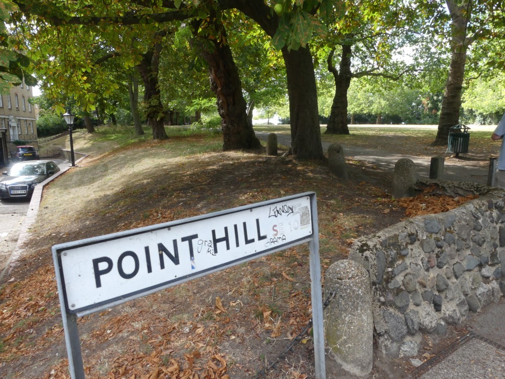
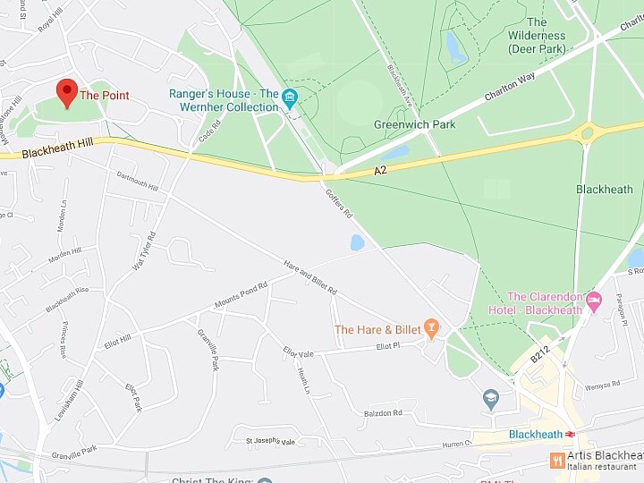
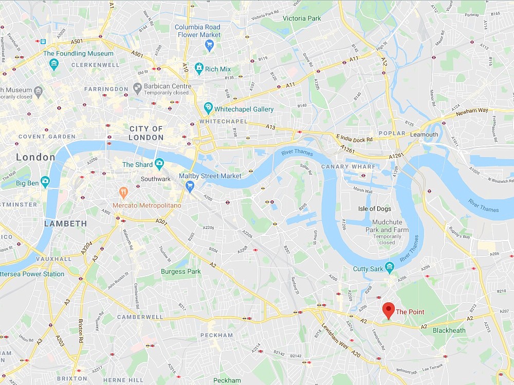
Beyond the Point Hill sign is The Point. We got to that by walking up … well, here are a couple of maps. On the left, how to get from Blackheath Station to The Point. And on the right, why you would bother, the point of The Point being what you can see from The Point:

The point of this first photo is to explain why the photos that follow are the sort that you might not consider to be that great:

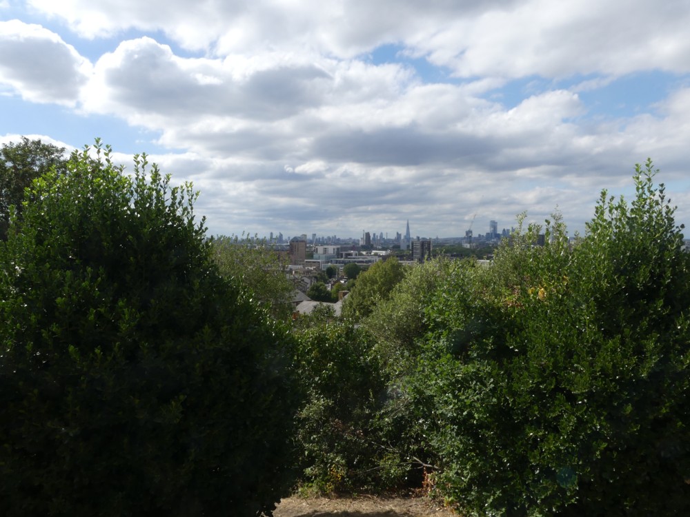
This was not the first photo I photoed from The Point, but it makes my point, which is that what you can see from The Point is most of it a really long way away. The photos that follow are all very zoomy.

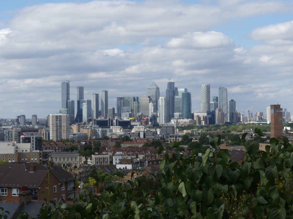
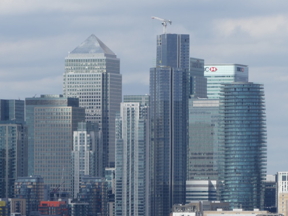
For me the most striking Things to be seen were the Docklands Towers. There are now quite a lot of them, compared to how many there were when I vaguely recall last visiting this spot.

First, two views of the entire Docklands Cluster:

And next up, a couple of close-ups of this same cluster:

The light could have been better, but it was what it was.

I really like how Docklands is turning out. One or two of the towers there have a bit of distinction about them, especially One Park Drive. But the sum is greater than the parts, I think. This is because almost all these towers go straight up. There are no Gherkins, Cheesegraters, Scalpels, Walkie-Talkies or Cans of Ham. Just gravity following towers done in the most efficient way possible. And the result is a classic spontaneous order of skyscrapers, all done in the modern vernacular. Without gravity, there’d be little logic. But with gravity, and without the starchitectural urge to defy it, it is all starting to look rather impressive. I like the City, with all its weirdness and eccentricity, but I’m glad London also has a classic skyscraper cluster in the form of Docklands. It can only grow and only get more impressive.

I like the idea of people looking at photos of it, and saying: Where’s that? “London.” London? I’d never have guessed.

Off to the right, we can see the Dome:

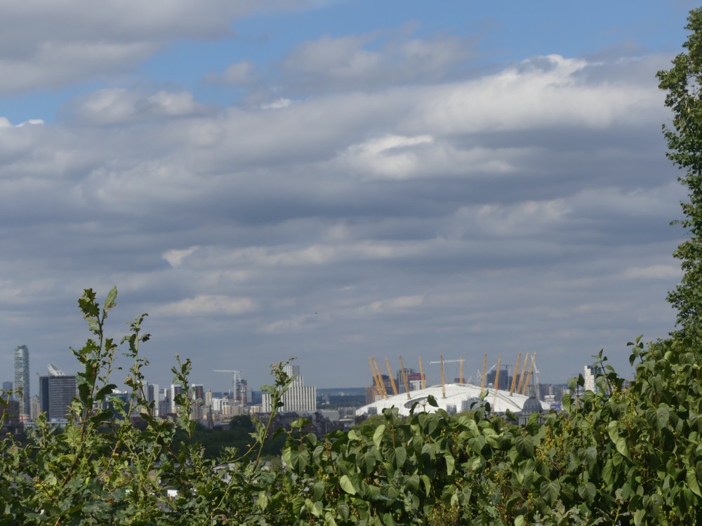
The stuff to the left of the Dome is the muddle on the other side of the River, to the east of Docklands. The sooner that muddle gets gobbled up by the Docklands Tower Cluster the better. To the right of the Dome, south of it, on the Greenwich Peninsular, there’s already more stuff rising up, with more to come.

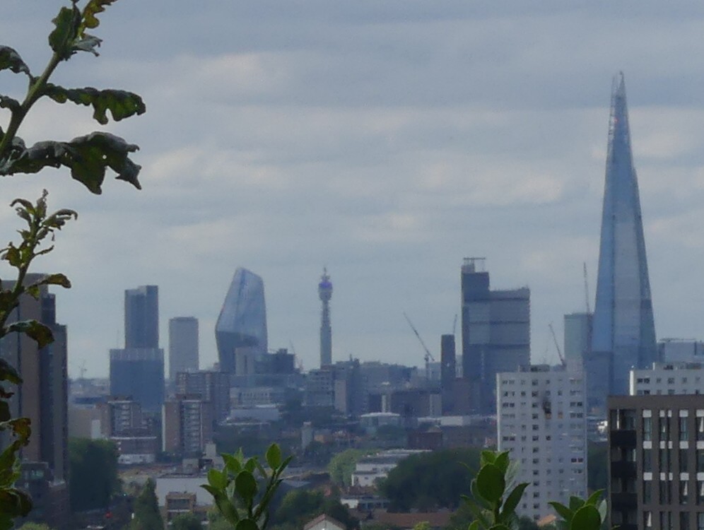
Off to the left, all the eccentricity of central London is duly on show, but even further away:

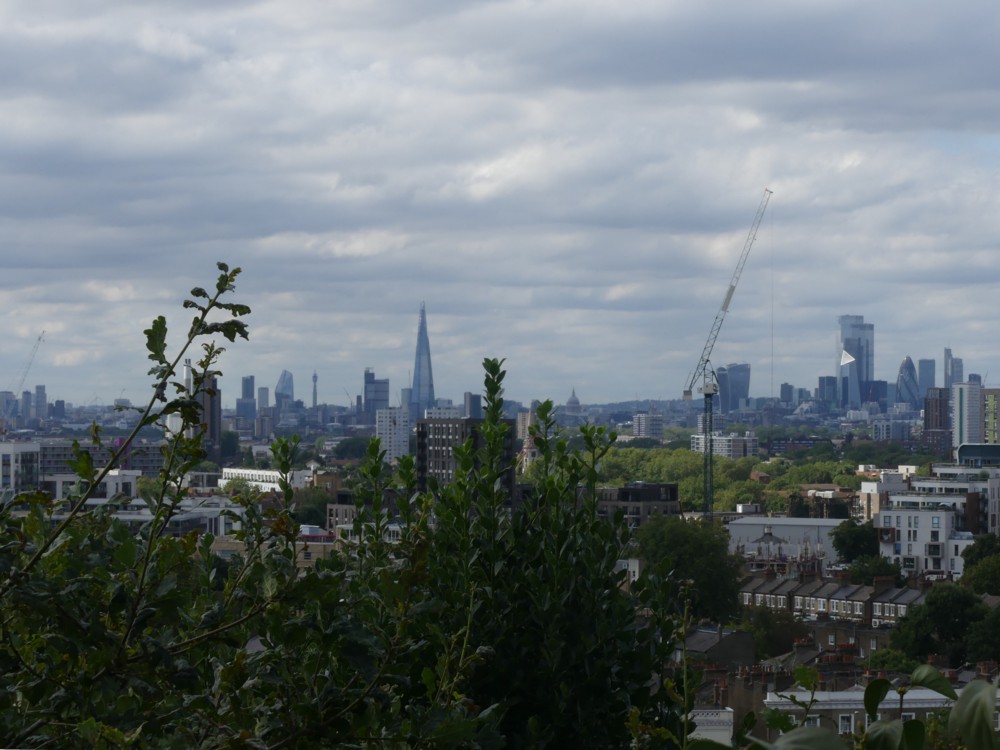
Let’s take closer-up looks at bits of that:

The photo on the right is a different photo. But the image on the left is a detail cropped out of the bigger and more panoramic shot. In that left hand shot you can clearly see the BT Tower in the distance there, as also One Blackfriars, looking very squat and far less elegant than it might have. For which, Alastair reminded me, we can thank Prince Charles.

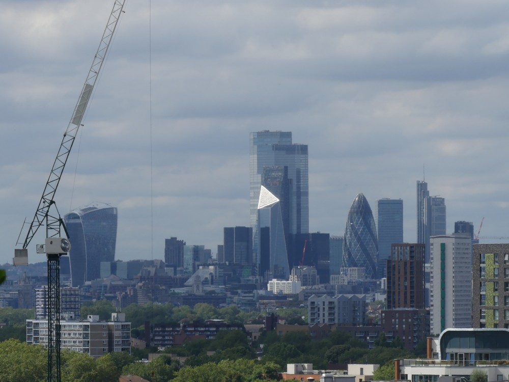
And speaking of way in the distance, Alastair also helped with this next photo. Basically, he directed it and I just pushed the button, what with his eyesight now being so much better than mine:

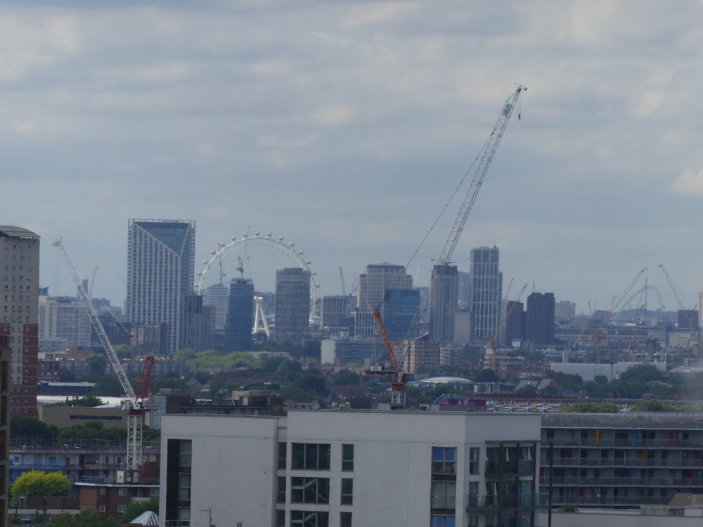
Now that I’m home and looking at a screen twenty inches or so away from me, I can clearly see both The Wheel, and … the new Wembley Arch. I could dimly perceive the Wheel on the day, but the Wembley Arch I totally took on trust. Yet, there it is, way off in the distance on the right, being hovered over, like waiters, by two cranes.

And on the right, a new central London architectural eccentricity, in the form of that strange white triangle that is often to be seen now in photos of London from the south east. It looks like something you might click on to get video to play. But that’s the Scalpel.

So, there it is. That’s how the Big Things of London are/were looking during the Lockdown of 2020. Will London continue to develope, or will it pause for a decade? Or longer? We shall see. Or I will. I hope.

Memo to self: Go back there on a sunnier day. In a few weeks time, after it’s cooled down a bit.

England v Pakistan: No spectators and all the time in the world

The first test match between England and Pakistan could be a terrible disappointment, for England fan me. But, as I write this now, it could get special. England are chasing 277, I think it is, in the fourth innings. Pakistan got a first innings lead of over a hundred, but then got bowled out for only 169, so England appear to have a chance. It’s the morning of the fourth day now, so England have two days to get those runs. Nobody is at the ground watching, other than the players not out on the pitch and the ground staff and the TV and radio commentators. But it turns out that mere spectators at the ground aren’t necessary for test cricket to be thoroughly absorbing. Test cricket can be played in front of a live studio audience. But if it isn’t, nothing important seems to change.

Basically, if England start losing wickets now, as they well might according to what I’m hearing about plays and misses, then Pakistan will surely win later today, by quite a lot. If England can somehow hang about until tomorrow, they have a chance.

Oh dear. England one down already.

LATER:

England are nevertheless now hurtling towards their target.

LATER: Three quick wickets. England now four down and sinking fast. Shame. Looks like being all over today. The next LATER in this looks being that.

LATER: Well if you follow the first link at the top of this you will now know what a win this was for England, and with the final day not needed. Following those dots above, England lost a flurry of wickets and were at one point 117-5. But Buttler and Woakes turned it around, first by counter-attacking (that being why the final day was not needed) and then by, well, just batting. Buttler got out before the end, but Woakes stayed to the end.

The weird thing is: It would be logical if both Buttler and Woakes now got dropped. Buttler kept wicket very badly, and his batting has not usually been nearly this good. Woakes might be dropped if Stokes is fit to bowl. Given that Stokes actually did some bowling, he surely will be able to bowl. More likely though is that Buttler will stay, and they’ll hope he keeps better in the future. And Anderson will get dropped. Wibble wibble wibble. What the hell do I know? What a game.

The Babylon Bee’s “Is it racist?” flowchart

One of my favourite insects just now is the Babylon Bee. I especially liked this graphic, from quite a while back now:

Most flowcharts done in this graphic manner are extremely complicated. Lots of questions. Lots of arrows. This one hits its target by being very uncomplicated.

The BB churns out lots of stuff, so there’s a good chance that (a) this amuses you, but (b) you missed it when they first unveiled it, back in June.