Sunrise on the way to Alicante (etc.)

Happy New Year to all my readers. Every time I go out to a party, I encounter people who read this thing, despite all its technical stupidities and despite the fact that the subject matter is just me musing aloud. So good morning to you all and I hope that not only I, but also you, have a good 2019. (Yes, I’m managing to keep up, approximately speaking, there also, where my musings are more structured and disciplined.)

This being Jan 1st, I offer you a sunrise:

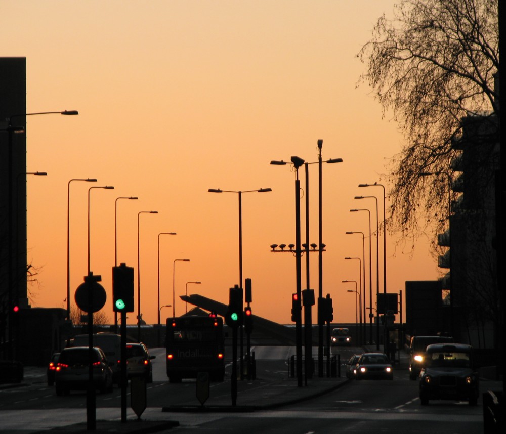
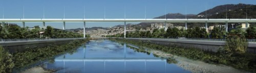
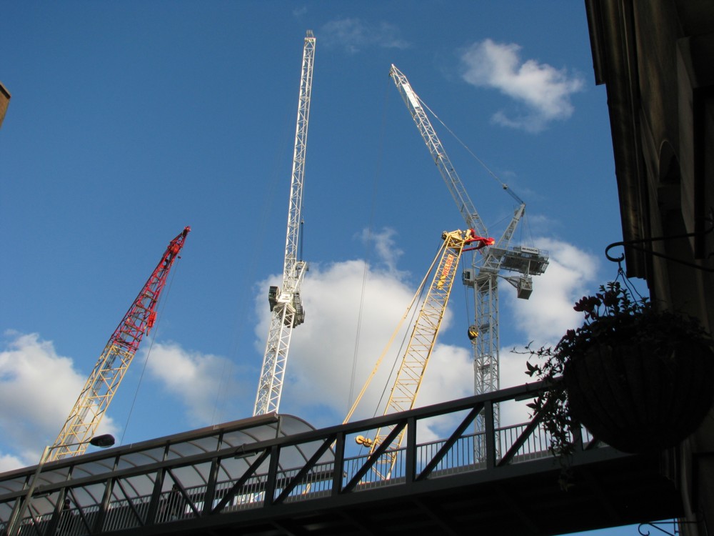
Usually when the sky is that colour in my photos, it’s a sunset. But it all came back to me when I chanced upon these photos, of an expedition to Alicante. Basically, I visit all the bits of France and Spain that my ex-Quimper friends have or have had bits of property in. And they had a place in Alicante, or they rented it, or something. Maybe they still have it. So, I went to Alicante, in January 2010. And, the above photo was taken by me at a bus stop in Vauxhall Bridge Road, looking back across Vauxhall Bridge, while waiting for a bus to take me and all my holiday clobber in the opposite direction along Vauxhall Bridge Road to Victoria Station, where I eventually caught a bus to the airport. With much confusion, as I recall it, about exactly where the damn bus departed from. Had I not happened upon another traveller who knew, I might have missed that airplane.

All of which clarifies a fact that has for me become more and more clear over the years, that although blogs are not diaries, photo-archives are. I have photoed many photos which I would not even consider sticking up here. But they have all piled up on my hard disc. I live, you might say, a double life. There’s my, you know, life. And then there’s my photoed life, which I can relive any time I want, and see all my friends and relatives and remember all the private things we said and did, the way you people very rarely get even to hear about, never mind learn the private details of.

This blog, meanwhile, is a severely edited subsection of my diary, with some added words, added in a way that I hope doesn’t make me appear too ridiculous. Very different.

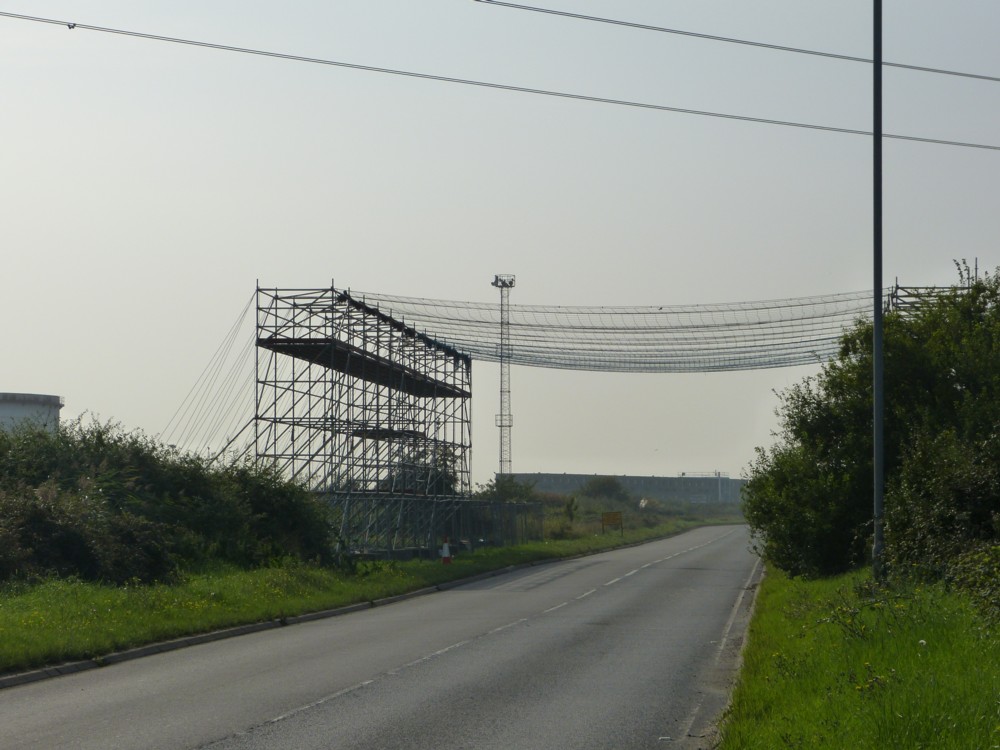
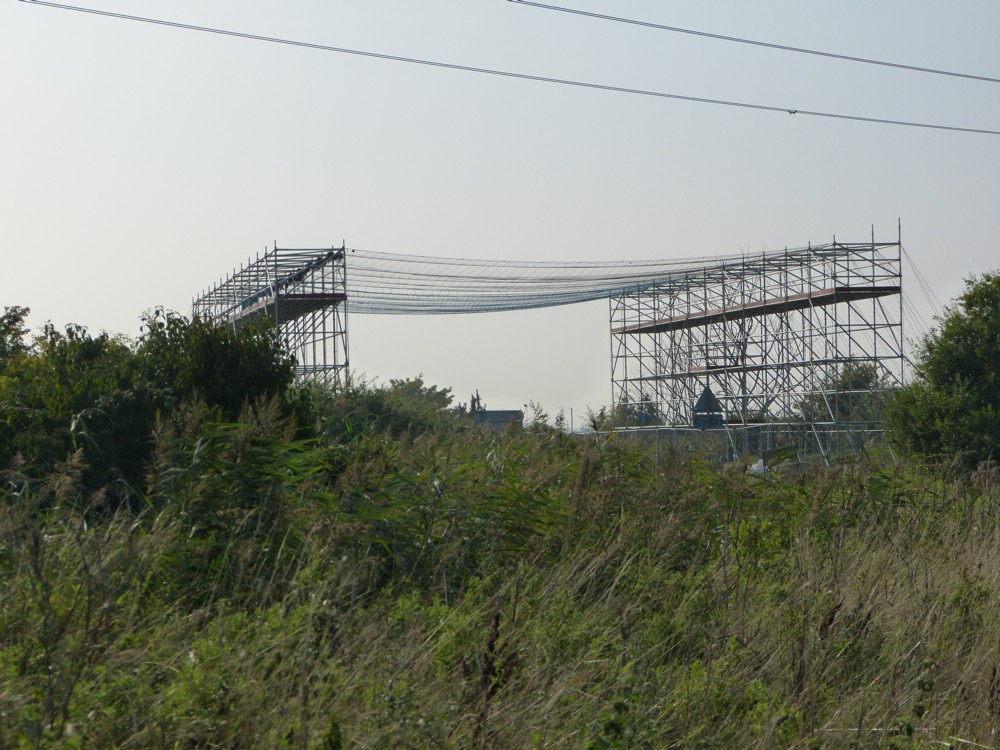
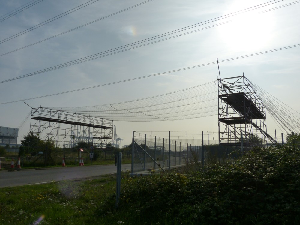
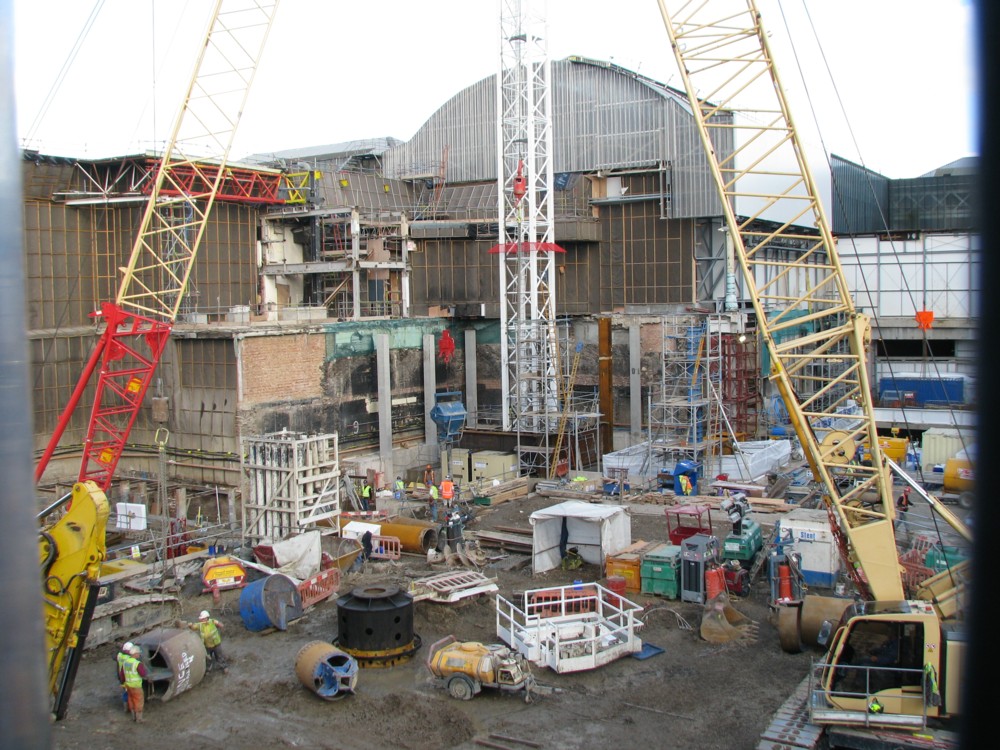
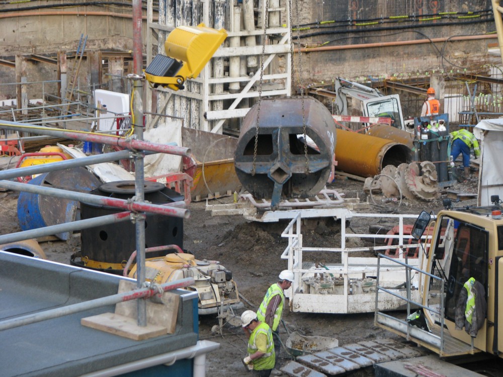
To add some words to the above photo, I realise that in addition to loving roof clutter, I am also becoming ever more fond of street clutter, which, due to the anarchic and non-mutually-communicating nature of London’s public sector, London possesses an abundance of. Much of it is, like most modern roof clutter, severely utilitarian, which I like, because nobody is trying to make it look pretty. But much ground clutter is very beautiful, especially London’s more showy street lamps.

Love the new keyboard. So solid and strong. Happiness is being able to check all the letters and symbols on your keyboard, as you type.

Originally posted at Brian Micklethwait’s Old Blog

Renzo Piano’s new Genoa Bridge

Here is Renzo Piano’s design for a new bridge in Genoa to replace the one that collapsed:

Nice, I think. Does the job, with no fuss and much elegance.

A lot of the “photos” make this look like the Millau Viaduct. However, the spikes on the top are light fittings, not structural columns. All the load bearing is done by the columns under the roadway.

Originally posted at Brian Micklethwait’s Old Blog

The secret is the back wheels

A slow motion catastrophe, all the more inevitable because this is, after all the internet. But, it doesn’t happen.

This popped up on my computer screen, courtesy of Facebook. What happened was was that I activated a video a Friend had stuck up, and this was what Facebook wanted me to see next. It looked like a nice little catastrophe to pass the time with, so I activated that as well. And although that catastrophe didn’t happen, what did happen was even better.

Do the people who arrange things like this play with toys beforehand? That would make sense.

Apparently Transport Blog may be coming back to life, any month now. But, it promises nothing.

Originally posted at Brian Micklethwait’s Old Blog

Like a bridge but not a bridge

On the same day, September 24th 2013, that I took all those artistic photos not of cranes, I also photoed something else that wasn’t a crane either. In addition to liking cranes I also like bridges, but this other something wasn’t a bridge either, despite looking a lot like one. I refer to this contrivance:

So far as I can work it out, this is a structure to protect a road against some power lines which are crossing that road. The road in question being the A1014, aka “The Manorway”, just before it runs out of puff at a roundabout.

I know. Why this one structure, there? What’s so special about these power lines? Were people about to start working on them, and were they scared that they might fall on the road and set light to a lorry laden with some highly inflammable liquid, of the sort they concern themselves with in Coryton? Could be. According to this, there used to be a refinery there (hence yesterday’s ruins). Now, there either already is or there is about to be a diesel import terminal. Yes, apparently this got going last year.

Maybe the structure I photoed is somehow a consequence of this change.

Originally posted at Brian Micklethwait’s Old Blog

Darren gets it

Incoming from Darren:

Took this photo a couple of weeks ago and couldn’t help think of you. …:

… I didn’t discover that the photoer had been caught in the picture until later. Taken from on a train while going through Blackfriars station. As you can probably tell, it was just taken using a phone.

I emailed Darren back, saying I’d feature his photo here. He then said that I shouldn’t feel in any way obligated to do this. He just thought I’d like the photo.

I thought about why I was so glad to receive this photo, and so keen to show it here, along with what he says about it. I think the reason is that Darren clearly “gets”, as they say, this blog. He gets that I am fond of the unfolding and ongoing drama of the architecture of central London. He gets that I notice how others like to photo London, too, it’s not just me. He gets that I am fond of the new Blackfriars railway station, straddling the river the way it does, and that I love the sort of views you can see and photo from it. And, Darren gets that I am deeply impressed by the photographic prowess of mobile phones.

He even refers to his photographer as a “photoer”. Until now, that was just me.

Originally posted at Brian Micklethwait’s Old Blog

Sardar Patel goes large

I do like Dezeen. Mostly it’s just Posh Modernism, but every so often it reports on something a lot more interesting.

Like: what is now the world’s tallest statue, four times the size of the Statue of Liberty, recently erected in Gujarat state, India.

This looks for all the world like it’s Photoshopped, but it truly isn’t:

Vallabhbhai Patel (31 October 1875 – 15 December 1950), popularly known as Sardar Patel, was an Indian politician who served as the first Deputy Prime Minister of India. He was an Indian barrister and statesman, a senior leader of the Indian National Congress and a founding father of the Republic of India who played a leading role in the country’s struggle for independence and guided its integration into a united, independent nation. …

Prediction: a Global Big Statue Race.

Originally posted at Brian Micklethwait’s Old Blog

More modern architectural colour

I recall speculating here (by quoting Bill Bryson) that a reason why Modernism is so monochromatic is that there was a time about a hundred years ago when the two hardest colours to get right in painted form, and hence the two most modern colours, were: black; and: white.

Early, monochrome photography was also a big reason for architectural modernity not to care about colour. The most modern buildings were the ones that looked like black and white photos.

This has been a long time changing, but changing it finally is. There was Renzo Piano, and his brightly coloured buildings near Centre Point in London. And now here comes this, by Jean Nouvel:

It’s the right hand of the two towers that I’m concerned with here, not with the other tower, or not with the crane or the bridge, bonuses though the latter two undoubtedly are.

Jean Nouvel has tricked his tower out in red, white and blue. It’s in Marseille, and is called La Marseillaise.

My immediate reaction is: a bit of a mess. Looks like he did this with three cans of spray paint, and in about twenty seconds. But, if I got to see it in the flesh, with all the complexities of the detailing, I might well like it a lot.

But my opinion about the beauty or lack of it of this building is beside my point, which is that colour is finally creeping into fashion, as part of architectural modernity.

It has taken a long time, because architectural fashion always does take a long time. This is because architects, unlike more regular artists, peak very late, a bit like classical conductors and for the same reason. Which is that architects (like conductors), in order to peak, have to be very powerful, by which I mean, liked and supported and paid for by lots of other powerful people. Powerful people tend to be old.

And sure enough, when I looked up the architect of this tricoloured tower, Jean Nouvel, I learned that his is now 73, having been born in 1945. In other words, he is now entering the architectural promised land, that land being where he can design buildings exactly as he pleases, and the clients build them and reckon themselves lucky to have got him.

I could now add other coloured modernism photos, and make further points about why this trend is now happening, and happening so powerfully. But the trick with blogging is to keep it brief, and if a subject matters to you, to come back to it again and again, while linking back to earlier pieces which make the same big point.

So, expect plenty more here about coloured architectural modernity.

Originally posted at Brian Micklethwait’s Old Blog

Apartments on a bridge in Stockholm

That’s the plan anyway. Read about it in a Dezeen posting entitled Urban Nouveau wants to save Stockholm’s Gamla Lidingöbron bridge by building homes in it:

Urban Nouveau has designed the scheme in response to Lidingö Municipality’s plans to tear down the Gamla Lidingöbron bridge, which links the Swedish capital to the island of Lidingö, and replace it with a modern structure.

I like the sound of this, and the look of it:

Oh, sorry, no, that’s the old version of London Bridge. (I recommend having a browse of that full-size. (it’s 6144 x 1024.))

The thing is, a bridge, for all the grand vistas you can often see from it, can be a rather forbidding and even boring thing to walk across. It’s like walking along a huge boulevard. Sounds good, but too little changes as you progress. To make bridges pleasurable to walk across, you need stuff on them.

Which is why I am prejudiced in favour of this Stockhom scheme, even though what I know about it is only what I have skim-read about it in this one Dezeen posting.

There’s a Petition.

Originally posted at Brian Micklethwait’s Old Blog

How the Shard was looking nine years ago

Nine years, to the day, actually. I was trying for ten years to the day, but after concocting what follows, I realised that these actually date from October 8th 2009:

The first one shows a rather strange footbridge that used to go over the site, taking pedestrians from London Bridge Station to Guy’s Hospital, and places beyond. Most of the other photos were taken from on that bridge.

What surprises me now is how chaotic it all looks, especially when I zoomed in on a particular bit of chaos.

What that lumpy cylinder that they are manhandling is, I do not know.

The website to be seen in the final photo seems to be long gone.

Originally posted at Brian Micklethwait’s Old Blog

A bridge held up by giant hands

Not really, I don’t suppose. But that’s how it looks.

I can’t recall how I came across this amazing bridge, but I think it was my Twitter feed. My first reaction was that this was some very high class Photoshopping. But no. Here’s a report from July of this year.

This Thing is for real. It is in Vietnam:

I found that photo here.

Given that the flood of big and impressive new bridges now seems to have receded (and given that big “new” bridges are now starting to collapse), the emphasis has switched to small and impressive new bridges. Of which this one is by far the most impressive, in my opinion.

These giant hands are going to trigger a flood of similarly inventive small bridges, with sculptors and engineers collaborating to outdo each other. Not all will be beautiful, but all will very recognisable and distinctive, which is the next best thing, I think.

People love bridges. It’s not just me. Look at all the people on that bridge.

Does the bridge have a giant figure beside it, who is holding the bridge, or are there just hands? If not, maybe that will happen soon. A statue holding a bridge. Why not?

How about London getting the man who did these sculptures (LINK TO THE OLD BLOG) to design a London footbridge, somewhere, in which two more such guys are holding it up? Or four? Or six? I’ll leave that to him and his engineer. But, London, do this.

All over the world, now, people – people like me – are seeing the bridge in the photo above, and are saying: Why can’t we have something like that?

And others are saying: Oh no, how ghastly. But to hell with them. Put the first such bridge in your area somewhere really ugly, where there’s nothing to spoil. That should silence the grumblers.

Originally posted at Brian Micklethwait’s Old Blog