Shelves

When it comes to Micklethwait’s Laws, the best one undoubtedly is and will always be Micklethwait’s Law of Negotiated Misery.

But there is also a Micklethwait’s Law of Shelves. On the face of it, Micklethwait’s Law of Shelves is not that fundamental, but, writing about it now, I do think it explains quite a lot about the world, and about why there is so much stuff in the world, clogging it up. It is a law that, unlike with (so far as I am aware) Micklethwait’s Law of Negotiated Misery, many others have discovered the truth of, even if I’ve not been able to find it spelt out in so many words on the www. Micklethwait’s (or Whoever’s) Law of Shelves states that …:

… there is always room for more shelves.

That’s my bedroom. Imagine what the rest of my place is like.

Originally posted at Brian Micklethwait’s Old Blog

Some photographers last November

At the end of November 2014 (on the day that I also took these photos) I made a small pilgrimage to Tower Bridge, the excuse being that I might be able to photo up someone’s skirt through the observation floor that they had recently installed at the top of that bridge, and the reason being that I simply like to go on random pilgrimages in central London, for the sake of what I might see on the way there, there, and on the way back.

As often happens with these small pilgrimages of mine, I got there not at midday, but towards the end of the day. By which I mean just before and during the ending of daylight. And the ending of daylight is a very good time for taking photos, especially with a digital camera that is good in low light conditions, and especially if you are someone who likes taking pictures of other photographers in ways that don’t show their faces but do show the screens of their cameras. At dusk, those screens tend to show up particularly well, as a number of these photographer photos illustrate:

The more I photo, the more I find myself liking to take categories of photos, photos in sets. At first, my photos of photographers were just photos of photographers. But soon I was subdividing that huge category, into photographers taking selfies, photographers looking at the photos they’d taken. Recently I have found myself making further subdivisions, often of photos I have been taking for some while but which I had not been putting into a separate category in my head, if you get my meaning. So, above, in addition to all the photos of photographer’s camera screens, we see contributions to the photographers taking selfies category (subdivision: couples taking selfies), to the photographers looking at the photos they have just taken category, but also a good addition to the bald blokes taking photos category, and two for the photographers with interesting hats category.

And of course, there is that vast category that has hove into view in the last few years, of people taking photos with their mobile phones. No less than seven of the above twelve snaps are of people doing this. This was not a decision on my part, merely a consequence of me picking out nice photos of people taking photos.

My favourite photo of these is the last one of all, bottom right. The light is nearly gone, but that means that the view of the shot he is taking (with his mobile phone) shines forth splendidly, as strongly as what he is photoing. And I love that I got what he was photoing as well as his screen picture of what he was photoing.

It was the essentialness of posting that one photo, very late but not never, that made me, while I was about it, also stick up the others, all twelve having already been subdivided into a separate little directory.

Originally posted at Brian Micklethwait’s Old Blog

How Bill Bryson on white and black paint helps to explain the Modern Movement in Architecture

I have already quoted a couple of interesting bits from Bill Bryson’s excellent book, At Home. I have now finished reading this, but just before I did, I encountered some interesting stuff about paint (pp. 453-5):

When paints became popular, people wanted them to be as vivid as they could possibly be made. The restrained colours that we associate with the Georgian period in Britain, or Colonial period in America, are a consequence of fading, not decorative restraint. In 1979, when Mount Vernon began a programme of repainting the interiors in faithful colours, ‘people came and just yelled at us’, Dennis Pogue, the curator, told me with a grin when I visited. ‘They told us we were making Mount Vernon garish. They were right – we were. But that’s just because that’s the way it was. It was hard for a lot of people to accept that what we were doing was faithful restoration.

‘Even now paint charts for Colonial-style paints virtually always show the colours from the period as muted. In fact, colours were actually nearly always quite deep and sometimes even startling. The richer a colour you could get, the more you tended to be admired. For one thing, rich colours generally denoted expense, since you needed a lot of pigment to make them. Also, you need to remember that often these colours were seen by candlelight, so they needed to be more forceful to have any kind of impact in muted light.’

The effect is now repeated at Monticello, where several of the rooms are of the most vivid yellows and greens. Suddenly George Washington and Thomas Jefferson come across as having the decorative instincts of hippies. In fact, however, compared with what followed they were exceedingly restrained.

When the first ready-mixed paints came on to the market in the second half of the nineteenth century, people slapped them on with something like wild abandon. It became fashionable not just to have powerfully bright colours in the home, but to have as many as seven or eight colours in a single room.

If we looked closely, however, we would be surprised to note that two very basic colours didn’t exist at all in Mr Marsham’s day: a good white and a good black. The brightest white available was a rather dull off-white, and although whites improved through the nineteenth century, it wasn’t until the 1940s, with the addition of titanium dioxide to paints, that really strong, lasting whites became available. The absence of a good white paint would have been doubly noticeable in early New England, for the Puritans not only had no white paint but didn’t believe in painting anyway. (They thought it was showy.) So all those gleaming white churches we associate with New England towns are in fact a comparatively recent phenomenon.

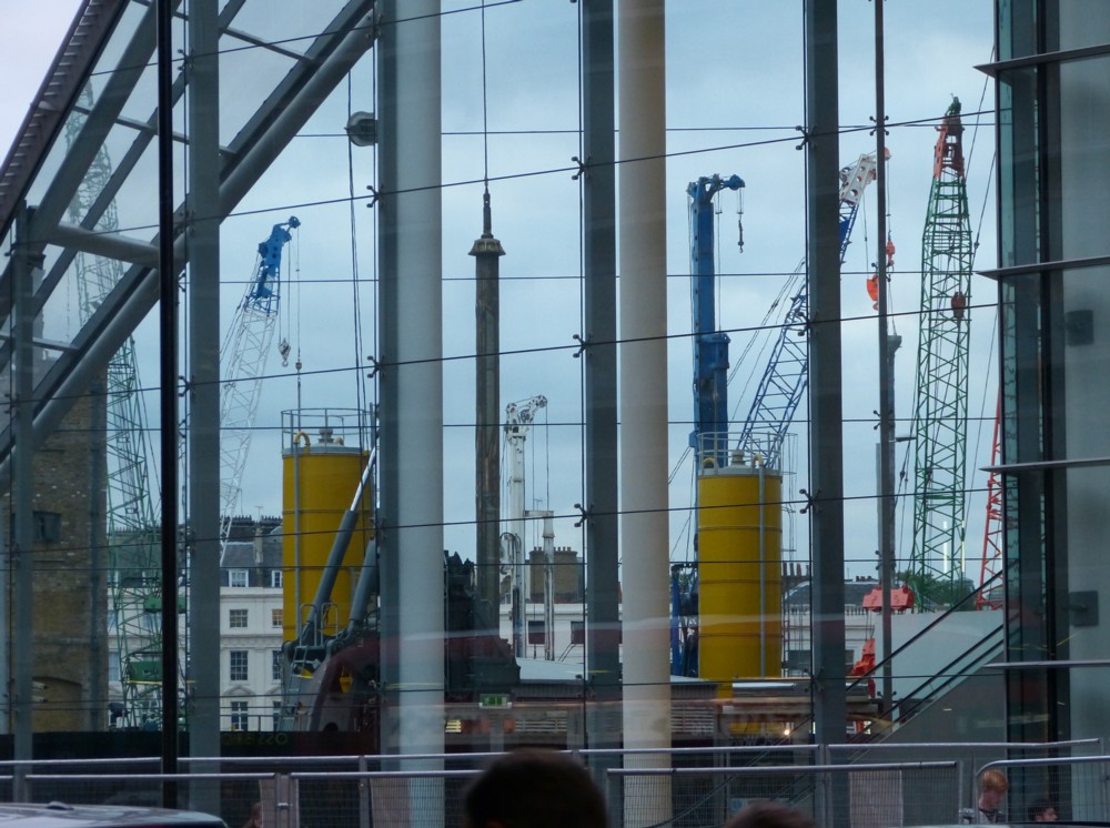
Also missing from the painter’s palette was a strong black. Permanent black paint, distilled from tar and pitch, wasn’t popularly available until the late nineteenth century. So all the glossy black front doors, railings, gates, lampposts, gutters, downpipes and other fittings that are such an elemental feature of London’s streets today are actually quite recent. If we were to be thrust back in time to Dickens’s London, one of the most startling differences to greet us would be the absence of black painted surfaces. In the time of Dickens, almost all ironwork was green, light blue or dull grey.

Famously, the rise of the Modern Movement in Architecture was triggered by, among many other things, a revulsion against the excesses of Victorian-era decoration, especially architectural decoration. Decoration became mechanised, and thus both much more common and much less meaningful. What did all this mechanised decoration prove, what did it mean, when you could thrash it out with no more difficulty than you could erect a plain wall?

What the above Bryson quote strongly suggests, at any rate to me, is that something rather similar happened with colour.

Why is the overwhelming atmosphere of Modernist architecture and architectural propaganda so very monochrome, still. Part of the answer is that it was only recently learned how to do monochrome. Monochrome looked modern, from about 1900-ish onwards, because it was modern. Monochrome was the latest thing. Colour, meanwhile, had become much cheaper and had been used with garish nouveau riche excess, and there was a reaction to that also, just as there was to excessive decoration.

Originally posted at Brian Micklethwait’s Old Blog

Alex on Quentin

Alex Singleton has sent me an advance print-out of a book he has written about how to do PR. I have reached page 59, and am so far very impressed.

When I read a book of this sort, I like to read about relevant personal experiences, as well as Big Lessons and Grand Principles. That way, you are more likely to be convinced that the Big Lessons and Grand Principles really are as good and grand as they may merely seem.

So I particularly enjoyed this bit (from page 59):

When I got my first column in 1994, in a newsstand computer magazine, I had no idea what I was doing. But it seemed like I needed to get some stories, so I wrote to all the relevant companies and invited them to send me information about what they were doing. Not all of them replied – those that failed to respond were PR idiots. Some of them wrote to me saying that they would add me to their press release distribution lists – they were amateurs.

Then some guy called Quentin got in touch. His company, Accountz, sold products by mail order and it was miniscule – just him and his wife. But he wrote me a personal two-page letter (this was before email was commonplace) explaining how he had a Big Idea to defeat the major players in his sector. Unlike some of the other companies, he had no PR agency – but he had a story. And during the 15 issues I wrote that column, I could always rely on him to take my calls and give me a good quote. When I upgraded to bigger-selling PC titles, including the market-leading ComputerActive, I kept on writing about his company. Today, his products are sold in PC World, Currys, AppleStores and Staples, and as I type this he has just made a successful exit from the company, passing it onto an investor.

What worked about that PR-journalist relationship is that Quentin – perhaps unwittingly – had good personal brand. He never tried to force a bad story on me and never wasted my time.

Alex has told me he is in the market for typos, and I think I see another blemish, to add to the two I’ve already told him about. Shouldn’t “onto” (final line of para 2 there) be “on to”? Not sure, but I think I’m right about that.

More about this book when I have finished it.

Originally posted at Brian Micklethwait’s Old Blog

Jamie Whyte on deferring gratification less as he gets older

Quote:

I used to defer gratification when I was a teenager. Now that I am middle-aged I take it when it presents itself. Not only have the opportunities become rarer and more precious, but the benefits of deferral are always in the future. And my future is getting shorter every day.

“A moment on the lips is a lifetime on the hips.” This equation advises us to forgo the pleasure of tasty but fattening food. It may be good advice when you are 20. But as you age and your hips’ lifetime shortens, the scales begin to tip in the direction of instant labial gratification. No one counts the calories of his last supper.

Those are the first two paragraphs of the first column in a collection of columns entitled Free Thoughts, by Jamie Whyte. All available on line.

I found them while looking for this (about housing subsidies being a bad idea), which is by Preston Byrne. Byrne is my next Brian’s Last Friday speaker (about housing subsidies being a bad idea), this coming Friday, as I’ve already written about on Samizdata.

Originally posted at Brian Micklethwait’s Old Blog

Cranes seen through Cardinal Place

Yes more cranes, which I spotted yesterday afternoon, at the top end of Victoria Street. So again, very near to Victoria Station.

I’m afraid that, yet again, I had to do some twisting to get that vertical and horizontal. I am cursed with the desire to photograph verticals and horizontals, but not to be able to get them looking right straight out of the camera.

Cardinal Place has a pointy end, which is basically just two huge windows, so you can see right through that. Below this paragraph, on the right, a photo from the exact same spot in the exact same direction, but with the zoom not operating, so you can see better what this is of.

Perhaps there are some readers wondering what the hell is so fascinating about cranes. Well for one thing, they’re cranes, with all that this entails, in terms of structural magnificence, aesthetic beauty, functional just-so-ness. Also, cranes mean new Things, coming soon. Not necessarily good Things, but … Things. Cranes are a vote of confidence in whatever place they are operating in. Cranes in London say: hurrah for London.

Also, cranes are, unless something has gone badly wrong, temporary. It will be great fun to stand, in two years time, in the exact same spot, and see how different things then look.

Originally posted at Brian Micklethwait’s Old Blog

Smaller is more legible – big is more fun

Sometimes mistakes caused by not holding the camera still can be interesting.

Today I took several photos (at Victoria Station, like the previous photo featured here) of the station electronic notice board saying where my train was about to go. Basically, I was taking notes to remind myself later of where I had been. But one of these photos went wrong. On the twiddly little screen on my camera it looked, on account of me having moved my camera vertically at the critical moment, approximately like as you see it, top right.

That one won’t last a second when I go through all these at home, I thought. If I was in the habit of deleting snaps on the fly, which I am not, I would have deleted that one straight away.

But now look at how it looked on my big screen, back home on my desk, this evening:

That’s the middle of the picture, to get how big it is when spread out sideways all over my big screen. Click on that bigger picture to get an even bigger version of the original.

I don’t think it’s just me. The smaller picture is much more legible. But the bigger picture is a lot more fun, on account of being less legible. It stops being annoyingly blurry writing, and instead becomes Art.

Originally posted at Brian Micklethwait’s Old Blog

Anton Howes at the Rose and Crown

Anton Howes spoke earlier this evening to Libertarian Home, about what made the Industrial Revolution get started. I took this photo of Howes, as he relaxed afterwards:

Howes really is a class act, as I already knew from when he addressed my Brian’s Last Friday, in July. What he has to say about the Industrial Revolution is already fascinating, and full of fascinating detail. When he has done all his research, then this talk will turn into something very formidable.

Meanwhile, a way to understand where Howes is coming from, and what kind of thesis he is exploring the further biographical and other detail of, is to read a book called Bourgeois Dignity, by Deirdre McCloskey. Howes recommended this book at the talk he gave in July. I bought a copy and am reading it now.

McCloskey’s basic thesis is that the thing that made the difference was ideas. The Industrial Revolution was not merely a bunch of people responding to economic incentives. It was people doing something they had come to believe in, surrounded by other people who also got the point, enough to let them get on with it. The Industrial Revolution was an ideology, brought to life by a core community of industrial inventors and creators, and sufficiently bought into by the wider society for those creators not to be suppressed.

The Industrial Revolution had plenty of chances to happen far earlier, in such places as China and Imperial Rome. That it did not happen earlier in such places is because, although the material conditions seemed to be all present and correct, they just weren’t thinking the right way to make the breakthrough. So McCloskey says, anyway.

As to what Howes said, well, the good news is that, unlike the talk he gave at my place, tonight’s talk was recorded on video by Simon Gibbs, and will accordingly materialise at Libertarian Home, by and by.

Originally posted at Brian Micklethwait’s Old Blog

Blank-faced tower – crazy hairdo

This is a shot I regularly take, because it never fails to impress me. Here is the version of it that I took yesterday:

That’s the top of Millbank Tower, viewed from the point where Horseferry Road does its sharp right turn towards Victoria Street, or its sharp left turn towards the river, depending on which way you are going. (Me, I tend to go home, straight on along Regency Street.)

I tried cropping this picture even more, so that all there was was roof clutter, but this, I think, somewhat spoiled the effect. What I so much like about the top of Millbank Tower is the contrast between all that intricate techno-anarchy, and the architect-imposed blandness – the faceless face, so to speak – of the main building. Show only the techno-clutter, and you miss that contrast. Show it, and it makes the building look like the architectural equivalent of a blank-faced young man, with a crazy punk hairdo.

There is a similar contrast to be enjoyed in the last of these pictures, again of a big lump with a crazy roof garden of gadgetry. Roof garden is right, because all this stuff combines high-techness with the picturesque appeal of nature.

This is the picture I mean.

Originally posted at Brian Micklethwait’s Old Blog

Crossrail grubbings

As soon as I had finished looking at those brightly coloured buildings designed by Renzo Piano, I also took at look at the bottom of Centre Point, where they are doing Crossrail.

“Grubbings” is a word I inherited from my late father, along with his fondness for the thing that grubbings describes. Grubbings are big building projects in their early, especially below ground level, stage, when they are … well: grubbing, rather than building upwards. My father loved grubbings, and so do I.

It’s often hard to photo grubbings, because they often put a high fence around them and there’s no convenient high-up spot nearby to look over. But at this site, you can climb up some steps (top left) to a Centre Point entrance on the first floor, and photo through the mesh that you see in most of the other pictures.

Even with the internet, it can be hard to know how these kind of things are going to end up. Okay, here are these computer fakes of how they had in mind two years ago for it to be, but who knows if that’s still what they’re thinking.

There is also the fact that there are often so many images of how, at various stages in the design, they envisaged things looking, that it’s hard for a more casual onlooker to keep up. Simpler to just wait and see.

It reminds me of how the Brits confused the Argies during that Brits versus Argies war. Instead of not telling the Argies their plan, the Brits did tell the Argies their plan, and all the other plans the Brits might just as likely be following. The British newspapers were full to the brim with every imaginable plan. And the Argies were baffled, trapped in the headlights of too much information, all of it suspect of course. That’s sometimes how I feel when trying (admittedly not very hard) to find out how some big grubbings in a big city like London are going to end up looking.

Originally posted at Brian Micklethwait’s Old Blog