To Tower Bridge: Shadow selfie – Peace memorial – Big Things old and new

Yesterday, encouraged by the weather forecast (which predicted a window of weather excellence in the midst of the otherwise dark and dreary weather that had been prevailing until yesterday and that has resumed today), I went out photo-walking. The mission was to check out that viewing platform at the top of Tower Bridge. How does that look from below? I will tell you all about that later, maybe. (I promise nothing.)

Within seconds of stepping outside my front door, I knew that this was going to be a very good day for photoing, because of the light. Photography is light. I like lots of it, but I don’t like it to be too bright, and I don’t like it all going in the same direction. Yesterday was such a day.

If you are a Real Photographer, and if the sort of light that is readily available is not what you would like it to be, then you contrive what you do like, or you fake it – with clever filters, Photoshop, blah blah – processes that you know all about. I am not a Real Photographer.

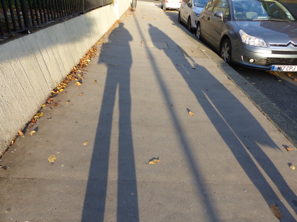
On the right there is one of the very first shots I took, a shadow selfie, which included a lady walking past me in the opposite direction. It’s not really proper to stick photos of strangers up on your blog – photos of strangers complete with their faces, photos of the strangers complete with their faces who are doing nothing to draw attention to themselves – no matter how obscure your blog may be. But, photoing their shadows and sticking that up is definitely okay.

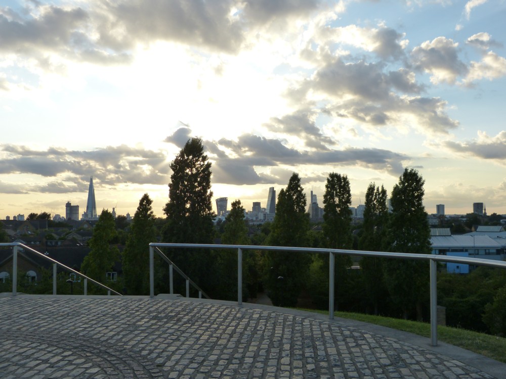
And here are two more pictures I took early on in my perambulations, just after I had emerged from Tower Hill tube station. I start with them simply because they are vertical rather than my usual horizontal, and hence it makes sense to display them next to each other:

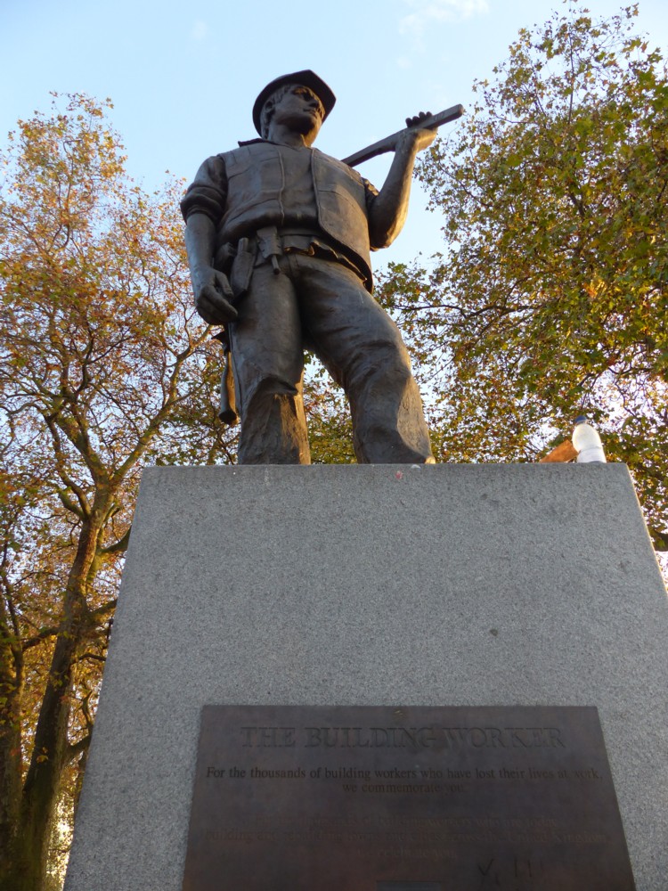
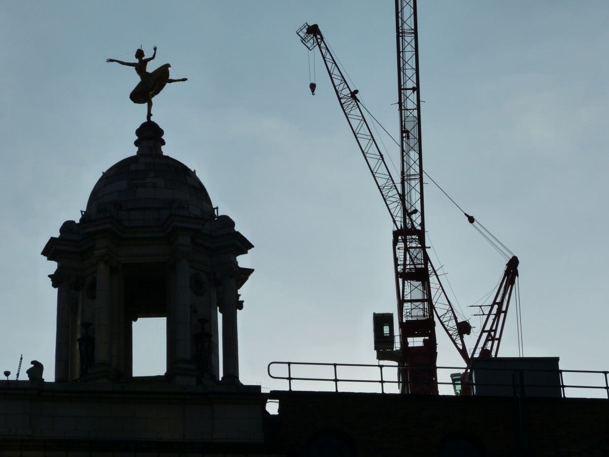
Here is a report from when that statue was unveiled, in 2006. It is not the war memorial that it resembles, more like a peace memorial, for people killed while doing building work. Good. This is the least that such unlucky persons deserve.

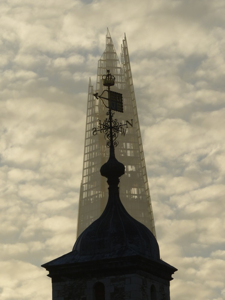
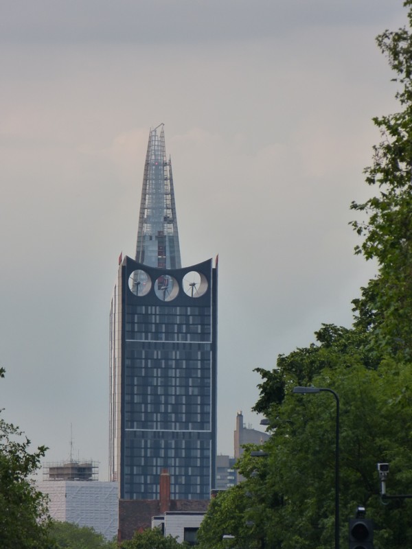
As for the Shard, it was looking particularly beautiful yesterday, like a ghost of its regular self. It was all to do with that light.

The Thing in front of the Shard is the highest of the four towers of The Tower of London. The Tower of London is an odd way to describe it, what with their being so many towers plural involved. I’m guessing they built one big Thing, called it the Tower of London, and by the time they added all those little towers, the name had stuck.

However, after reading this, which says things like this, …:

It is not clear exactly when work started on the Conqueror’s White Tower or precisely when it was finished but the first phase of building work was certainly underway in the 1070s.

Nothing quite like it had ever been seen in England before. The building was immense, at 36m x 32.5m (118 x 106ft) across, and on the south side where the ground is lowest, 27.5m (90ft) tall. The Tower dominated the skyline for miles around.

… I would like to revise my guess. It would seem that the four little towers on the top were there from the start, and that to start with it wasn’t the Tower of London at all. So, what I want to guess instead is that now that the Tower of London is surrounded by London as we now know it, what we tend mostly to see of it is the four towers at the top. But, for many centuries, the Tower of London was indeed seen by all those within sight of it as the one Big Thing (which merely happened to have a few spikes on the top), London’s first Big Thing, and for many decades, its only Big Thing.

Originally posted at Brian Micklethwait’s Old Blog

How Bill Bryson on white and black paint helps to explain the Modern Movement in Architecture

I have already quoted a couple of interesting bits from Bill Bryson’s excellent book, At Home. I have now finished reading this, but just before I did, I encountered some interesting stuff about paint (pp. 453-5):

When paints became popular, people wanted them to be as vivid as they could possibly be made. The restrained colours that we associate with the Georgian period in Britain, or Colonial period in America, are a consequence of fading, not decorative restraint. In 1979, when Mount Vernon began a programme of repainting the interiors in faithful colours, ‘people came and just yelled at us’, Dennis Pogue, the curator, told me with a grin when I visited. ‘They told us we were making Mount Vernon garish. They were right – we were. But that’s just because that’s the way it was. It was hard for a lot of people to accept that what we were doing was faithful restoration.

‘Even now paint charts for Colonial-style paints virtually always show the colours from the period as muted. In fact, colours were actually nearly always quite deep and sometimes even startling. The richer a colour you could get, the more you tended to be admired. For one thing, rich colours generally denoted expense, since you needed a lot of pigment to make them. Also, you need to remember that often these colours were seen by candlelight, so they needed to be more forceful to have any kind of impact in muted light.’

The effect is now repeated at Monticello, where several of the rooms are of the most vivid yellows and greens. Suddenly George Washington and Thomas Jefferson come across as having the decorative instincts of hippies. In fact, however, compared with what followed they were exceedingly restrained.

When the first ready-mixed paints came on to the market in the second half of the nineteenth century, people slapped them on with something like wild abandon. It became fashionable not just to have powerfully bright colours in the home, but to have as many as seven or eight colours in a single room.

If we looked closely, however, we would be surprised to note that two very basic colours didn’t exist at all in Mr Marsham’s day: a good white and a good black. The brightest white available was a rather dull off-white, and although whites improved through the nineteenth century, it wasn’t until the 1940s, with the addition of titanium dioxide to paints, that really strong, lasting whites became available. The absence of a good white paint would have been doubly noticeable in early New England, for the Puritans not only had no white paint but didn’t believe in painting anyway. (They thought it was showy.) So all those gleaming white churches we associate with New England towns are in fact a comparatively recent phenomenon.

Also missing from the painter’s palette was a strong black. Permanent black paint, distilled from tar and pitch, wasn’t popularly available until the late nineteenth century. So all the glossy black front doors, railings, gates, lampposts, gutters, downpipes and other fittings that are such an elemental feature of London’s streets today are actually quite recent. If we were to be thrust back in time to Dickens’s London, one of the most startling differences to greet us would be the absence of black painted surfaces. In the time of Dickens, almost all ironwork was green, light blue or dull grey.

Famously, the rise of the Modern Movement in Architecture was triggered by, among many other things, a revulsion against the excesses of Victorian-era decoration, especially architectural decoration. Decoration became mechanised, and thus both much more common and much less meaningful. What did all this mechanised decoration prove, what did it mean, when you could thrash it out with no more difficulty than you could erect a plain wall?

What the above Bryson quote strongly suggests, at any rate to me, is that something rather similar happened with colour.

Why is the overwhelming atmosphere of Modernist architecture and architectural propaganda so very monochrome, still. Part of the answer is that it was only recently learned how to do monochrome. Monochrome looked modern, from about 1900-ish onwards, because it was modern. Monochrome was the latest thing. Colour, meanwhile, had become much cheaper and had been used with garish nouveau riche excess, and there was a reaction to that also, just as there was to excessive decoration.

Originally posted at Brian Micklethwait’s Old Blog

Chippendale without Rannie

Chippendale most of us have heard of. But Rannie? Who is, or was, Rannie? Exactly.

Seven years ago now, I wrote a Samizdata piece about two-man teams. It still, I think, reads well, and it contained the following assertions:

Even when a single creative genius seems to stand in isolated splendour, more often than not it turns out that there was or is a backroom toiler seeing to the money, minding the shop, cleaning up the mess, lining up the required resources, publishing and/or editing what the Great Man has merely written, quietly eliminating the blunders of, or, not infrequently, actually doing the work only fantasised and announced by, the Great Man. Time and again, the famous period of apparently individual creativity coincides precisely with the time when that anonymous partner was also but less obtrusively beavering away, contributing crucially to the outcome, and often crucially saying boo to the goose when the goose laid a duff egg. If deprived, for some reason, of his back-up man, the Lone Genius falls silent, or mysteriously fails at everything else he attempts. …

Now read this, from At Home, the Bill Bryson book I am currently reading. On pages 234-5, concerning Thomas Chippendale, the noted furniture maker, Bryson writes:

He was an outstanding furniture maker but hopeless at running a business, a deficiency that became acutely evident upon the death of his business partner, James Rannie, in 1766. Rannie was the brains of the operation and without him Chippendale lurched from crisis to crisis for the rest of his life. All this was painfully ironic, for as he struggled to pay his men and keep himself out of a debtor’s cell, Chippendale was producing items of the highest quality for some of England’s richest households, and working closely with the leading architects and designers – Robert Adam, James Wyatt, Sir William Chambers and others. Yet his personal trajectory was relentlessly downwards.

It was not an easy age in which to do business. Customers were routinely slow in paying. Chippendale had to threaten David Garrick, the actor and impresario, with legal action for chronic unpaid bills, and stopped work at Nostell Priory, a stately home in Yorkshire, when the debt there reached £6,838 – a whopping liability. ‘I have not a single guinea to pay my men with tomorrow: he wrote in despair at one point. It is clear that Chippendale spent much of his life in a froth of anxiety, scarcely for a moment enjoying any sense of security at all. At his death in 1779, his personal worth had sunk to just £28 2s 9d – not enough to buy a modest piece of ormolu from his own showrooms. …

Rannie did not make the actual furniture, but he was essential to Chippendale in exactly the sort of way I describe.

It feels good to be so right.

Originally posted at Brian Micklethwait’s Old Blog

Keeping up appearances

Photoed by me in Oxford Street late this afternoon:

What this tells you is that architectural modernism has utterly conquered indoors, but that out of doors, modernism is only popular because its totalitarian impulses have been held at bay, by what you might call ancientism.

The Modern Movement founders would have been disgusted by the process portrayed in this picture.

Originally posted at Brian Micklethwait’s Old Blog

Parisian roof clutter gets the Real Photographer treatment

I loved them when I photoed them last January. Now the chimney pots and rooftops of Paris get serious Real Photographer attention, from Michael Wolf:

One of David Thompson’s latest clutch of ephemera.

Originally posted at Brian Micklethwait’s Old Blog

The view from Stave Hill

I’ll let this guy explain it:

The areas around Rotherhithe and Surrey Quays was once a series of docks that were slowly filled in and lost in the 1970s and early 1980s.

As befits an area that was originally a marsh, and then an industrial hub, it was entirely flat, so it may surprise people to learn that there is a decent sized hill lurking right in the middle of these former docks.

Stave Hill is however a very modern edifice, being made up largely from rubble left over from the clearance of the docks and then shaped into a sharply defined flat-topped cone.  It is also only just about as high as most of the houses that surround it, so while you get a view from the top that is almost entirely free of blockages, the hill itself is hidden from people looking the other way.

The reason I’ve no time to describe it is I’ve just got back from taking photos from the top of it myself. I took a million zoom shots of individual Big Things, on their own and in clumps, but here is a panoramic shot that gives you a sense of what the place is like:

I forced myself to pick just the one shot from the twenty seven million I took. Well, 463 to be more exact. Often, after one of these photo-expeditions, I pick out about twenty of the best shots, and and then never get around to showing them here at all, because it becomes too complicated, and there is too much to be said about them all. This time I’ve kept it simple, and stolen stuff from elsewhere, and that way, I got it done.

I will say this, though. The sheer number of Big Things you can see from this spot is truly amazing. Some of my favourites are Big Things that you can just see the very top of, like Big Ben and the tower of Westminster Cathedral. And I think I also spotted the tops of two of the chimneys of Battersea Power Station, but that needs to be checked. Definites include; the Gherkin, the Shard, the Cheesegrater, the Walkie Talkie, the Strata, the Spraycan, the Wheel, Tower Bridge, the Dome of St Paul’s Cathedral, the Monument, and, away on the other side, the Docklands Towers. The tricky bit is getting as many Big Things as possible into the one shot, which is quite hard. For instance, you can’t see the Gherkin in the picture above. Those trees do not help. For this reason, it might be fun to go back in the winter, when the damn leaves have gone away.

Originally posted at Brian Micklethwait’s Old Blog

Man 3D-prints Thing in his back garden

I get google emails whenever “3D printing” is mentioned at all prominently on the www, and the latest one definitely got my attention. It linked to a story about a guy who has been 3D printing in his garden.

A building contractor living in Minnesota has developed his own 3D printer which can print concrete directly from CAD design software, and he has used it to 3D-print a castle in his back garden.

Here is how that looks:

Calling that a “castle”, as this story does, is a bit of a stretch. At the moment, if this is anything to go by, open-air and architectural 3D printing seems to have all the deft elegance and aesthetic flexibility of a dot matrix printer. But the equivalents of laser printers, and then (what we have now) cheap laser printers, and cheap colour printers, will surely soon be with us. And in due course the building trade will become something completely different, and hence buildings will too.

Yet another reason why I would love to remain alive for another century, just to see how this kind of stuff develops.

In England, this guy would either have failed to get planning permission for this erection, or else he would now be being told to take it down, for having failed to get planning permission.

Originally posted at Brian Micklethwait’s Old Blog

Tower Bridge before it got covered in stone

If you’ve not been there before, I recommend visiting Handpicked London. I’ve just been browsing through it, and found my way from it to Photographs of Tower Bridge being constructed are found in a skip, from December 2011, which I do not remember noticing at the time. (The first two of those are Facebook links, and maybe they don’t last. You have to register, is what the second one just said.)

These photographs of Tower Bridge being constructed have been unveiled after a stash of hundred-year-old photos were found in a skip. The 50 sepia pictures, the most recent of which date back to 1892, reveal in incredible detail the ingenuity behind one of the capital’s most popular tourist destinations.

One of the photos:

Hybrid modernism. Modern in its manner of creation. Ancient in appearance. An architectural style with a lot of mileage in it.

LATER: More stuff from me about towers here.

Originally posted at Brian Micklethwait’s Old Blog

Pavlova with cranes

I am very fond of the ballerina statue at the top of the Victoria Palace Theatre. I recently photoed it with a red crane behind it, that being one of my favourite recent snaps.

This afternoon, I photoed it again, again with craneness:

What I had not realised until today is that this is a statue of Anna Pavlova. Says the Victoria Palace Theatre:

From 1911, the year after its rebuilding to its present design by Frank Matcham, the Victoria Palace had a gilded statue of prima ballerina Anna Pavlova poised above it. This was owner Alfred Butt’s homage to the dancer he had spectacularly introduced to London.

The tribute was not appreciated by the superstitious ballerina, who would never look at her image as she passed the theatre, drawing the blinds in her car. The original statue was taken down for safety reasons in 1939 before the blitz and has completely disappeared. It is not known whether it is in someone’s garden or was turned to wartime military use, such as bullets.

The Victoria Palace moved into the new millennium with an adventurous building programme; enlarging the Foyer, WC facilities and increasing the dressing room space, whilst maintaining all the feel and character of a historic building.

In 2006, a replica of the original statue of Pavlova was reinstated to its original place above the cupola of the Victoria Palace and her gold-leafed figure once again gleams above us.

Blog and learn.

Originally posted at Brian Micklethwait’s Old Blog

Lining up the Strata with the Shard

This is one of my favourite Big Thing Alignment shots, to be observed by emerging from Oval tube and walking north east along the A3. Do that, and you soon see Strata in the distance, and directly behind it, the Shard, thus:

These shots are two of many such that I took on June 25th 2012.

On the left: the heart of the matter. On the right: the context. Often, when you have a zoom lens, you show the zoomed shot, and neglect how it actually looked, along with all the other stuff you could see. When I say “you” I of course mean “I”.

I worked out that this shot might be there for the taking by looking at the map. Strata is at the Elephant and Castle, which is the big yellow roundabout in the middle of this map:

And the Shard is at London Bridge railway station, top right.

What this shows, I think, is another contribution made by technically rather poor photographers like me. We may not take our pictures that well, from the point of view of using the right cameras, lenses, f numbers, and general technical jiggery pokery. But we often take great shots, as in, we often take great shots rather badly. A technically better photographer might see this posting, and say to him or herself: Hey I like that shot. I’m going to go out there and do it again, properly, while crediting the person who first did the shot and thus showed me that the shot was gettable.

(Are Real Photographers reluctant to do this kind of copying-stroke-improving of amateur shots, for intellectual property (and hence money) reasons? Is there a sense in which, photographically speaking, I now “own” this view?)

A similar point could have been made in the course of this posting, which also included a map showing how that shot happened, and where to go to get it. That too was a great shot, done just about well enough to show what a great shot it might have been, but only just.

Originally posted at Brian Micklethwait’s Old Blog