 More housekeeping, this time to sort out how to have a picture on the right, and text next to it on the left.
First I will just have a picture which isn’t clickable, but if I can, I’ll make it so you can click and get the original and wider version.
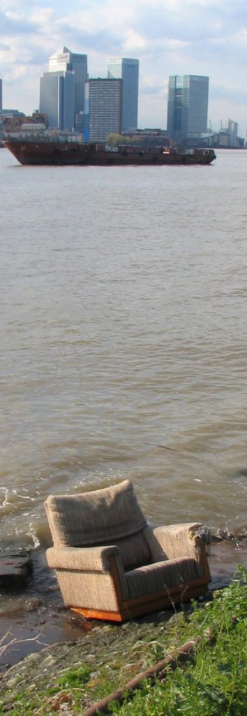
For those not familiar with London, and I have to face the fact that I do share a planet with millions of such people, the towers in the distance are the towers of Docklands, and the chair in the foreground is a chair in the foreground.
That part of London is one of my favourite places in the world. The magic of it for me is in the constant contrasts you get between the mundane foreground – industrial estates, chain link fencing, weeds, parked cars, security guard signs, joggers, families on bicycles, pubs, giant rusting machinery like in the last scene of Get Carter (by the sea), and new apartment blocks beyond counting – and the vastness of the distant towers or the distant Dome, which is a wonderful structure even if they have yet to think of anything meaningful to put in it. Because both the towers and the Dome were put there by politicians, rather than being straight commercial bets, there is this constant mismatch between the relatively low key foreground, and the high tech background. These are not objects that thrust up from the seething surface of a city – a city with nowhere else to go except up. They are more like parked spacecraft.
Is that going to be enough chitchat, I wonder? I don’t like it when the picture goes further down than the text.
Well, that is enough text but the problem remains of the gap between the text and the photo. I hoped it would be 10 pixels minimum, but that doesn’t seem to be registering. Until that is sorted, forget about clicking for a bigger picture. A call has gone to my technical staff to get them to put their heads together and sort this out.
Plus, re my liking for that bit of London, I realise I ought to prefer the atmosphere of libertarian type edifices to that of mixed economy edifices like these ones. What next? Preferring Brazilia to Rio de Janeiro? But there you go, that’s how I feel it. At least these towers are a capitalist muddle rather than an identical national socialist matching set, like in Brazilia.
More on the margin thing. In case anyone suggests this as an alternative, I don’t want to stick a margin all around the picture, first because I just don’t, but second, because I also want to be able to put a photo on the left and have text next to it on the right, with the left hand edge of the photo aligning vertically with the main text. I knew you’d be excited.
DONE! It turned out that the answer was to replace “10” with “10px”. As simple as that. As I always say, everything involving computers is easy when you know, and f***ing impossible and f***ing infuriating when you don’t.
By the way, my team of web developers and software engineers have said that they would like to be thanked in person, as well as being paid all the fees I am paying them. They are: Patrick Crozier.
