EXCLUSIVE IT LIAN LOUNGE, DIN G & BEDROOM FUR ITURE

It’s been a while since there’s been any horizontality here. (That isn’t the most recent piece of horizontality here, just one that I happen especially to like.) So, allow me now to correct this, thus:

Click to get the bigger original.

It’s a shop just off Lea Bridge Road, opposite the station. Photoed by me almost exactly one year ago.

Originally posted at Brian Micklethwait’s Old Blog

A recognisable Lancaster and a recognisable Vulcan

When it comes to showing off my photos, I am currently in full-on retro mode, and my latest little retrospective is of a few more photos I took when I was At the 2010 Farnborough Air Show, those being a rather greater number of photos which I posted from that show at the time, at Samizdata.

All four of these photos here feature the Avro Lancaster, and the final one also features a Lancaster and also the mighty Avro successor to the Lancaster, the Vulcan:

It was a great day. And it got me thinking quite a bit more about the Avro Lancaster, and in particular about its highly distinctive and recognisable shape.

Originally posted at Brian Micklethwait’s Old Blog

Mugabe knows best

I was once briefly acquainted with a quite close relative of Robert Mugabe, and that person was truly remarkable in being utterly incapable of understanding how anyone could possibly disagree with the truth that he saw so very clearly. This person also looked exactly – spookily – like Robert Mugabe. (It was asking about this resemblance that got me the information that he was a close relative of Mugabe.) I have never known a more deeply stubborn person, ever. But it was not a stubbornness made merely of the desire or the determination not to change his mind. No. He was simply unable to change his mind. The idea of him ever having been wrong, about anything, was simply impossible for him to grasp.

If Robert Mugabe is anything like this relative of his, and everything I know about Robert Mugabe tells me that Mugabe is, in this respect, exactly like him, Mugabe may find himself sacked, imprisoned, or even executed, but he will never resign, or ever change his mind about the wisdom of anything he ever said or did. That he has not yet resigned has, according to the Guardian headline linked to there, has “stunned” Zimbabwe. I was not stunned.

They’ll have to force him out, like King Richard II was forced out by King Henry IV. But if Mugabe is forced out, there will be no scenes like the closing scenes of Shakespeare’s version of Richard II, where the deposed Richard comes to see the world and its ways differently, and to understand things more deeply. Simply, Mugabe is right, has always been right and will always be right, and if everyone else disagrees with him, it can only be that everyone else is, was, and will be, hopelesslyl wrong. Mugabe is literally incapable of understanding matters in any other way.

Mugabe is indeed now a rather confused old man. But his confusion concerns only how it is possible for so many people to be so completely mistaken.

Originally posted at Brian Micklethwait’s Old Blog

Cranes and horses

Indeed:

Tilbury, September 2013. That’s what a BMdotcom wildlife photo should be. Creatures, yes, but also cranes.

At around that time, I made a series of trips out to London Gateway, London’s new container port, which is just downstream from Tilbury. Here‘s a recent report of how London Gateway is doing, which also has further news about animals in the area:

The £1.5bn construction saw a staggering 350,000 animals moved off site into new habitats. At one stage DP World’s office building on the site homed tanks of great crested newts before they were moved into newly created ponds.

However, the horses in the above photo were not disturbed, because they were just outside Tilbury. London Gateway is further down river. It was only several hours later that day that I set eyes on those cranes, from a great distance. Despite the gloomy weather, it was a great day. The photos bring it all back.

Originally posted at Brian Micklethwait’s Old Blog

Better batteries in the pipeline

Although “pipeline” is wrong, because these are solid-state batteries, to replace liquid batteries.

Instapundit says it’s “YUGE IF TRUE”, that Fisker has filed patents for solid-state batteries:

The reason all these companies are working on developing solid-state batteries is because they present a whole host of advantages over what you’ll find in today’s phones, computers and cars. The two big ones are greater energy density and rapid charging times. Fisker claims the batteries it’s developing have an energy density 2.5 times that of current batteries, and they should be capable of providing a 500-mile driving range. The company also says the batteries could be recharged in as little as a minute.

Companies don’t usually straight-out lie about things like this, but they do often get carried away. In particular, they gloss over what may prove to be big obstacles. But the obstacles get overcome, eventually. They say they’re going to have this tech rolling in the early twenties. Make that the thirties. But, my guess: it will soon, historically speaking, happen. They’re going to be very expensive, at first. But that always happens. Got to pay for all that inventing.

A key item of evidence for my optimism is that the report states that other companies are working on the same stuff, besides the one in the headline. This suggests one of those inventions that is ready to be made, that Matt Ridley goes on about. For decades this or that gizmo is promised, but: nothing. Then suddenly: four companies all arrive at it, “independently”. In other words, all the necessary inventions, that needed to be made before this one could be made, had finally been made. At which point the gizmo goes from impossible, to inevitable.

Can these batteries be made really small, small enough for all those phones and computers? If so, it really will be a new era.

As I keep saying, the one big aspect of our civilisation that is still working really well is … stuff like this.

Originally posted at Brian Micklethwait’s Old Blog

“A large and reversible display unlike anything we’ve seen before …”

A lot of the stuff at Digital Photography Review these days is about money-no-object high-end DSLR cameras, and about the many different money-no-object lenses you can shove on the front of DSLRs. When DPRev descends from this Olympus (or this Canon or this Nikon) they usually then prattle on about the cameras on smartphones.

But this report, even though it says it’s about DSLRs, I did find interesting. Canon have filed a patent for a new sort of bigger flip out screen, in other words a bigger version of the sort of screen that I for one could not now do without:

While a hinged DSLR rear display is nothing new, Canon’s patent shows a design that would allow for a large and reversible display unlike anything we’ve seen before. In fact, the LCD shown in the patent’s illustrations covers the entire back of the camera, making it necessary to tuck the rear dial and several buttons behind it, though several others are exposed on either side of the viewfinder.

I can remember when flip out screens were held in contempt by the DSLR fraternity. But many of us digital snappers took to them with eagerness, having worked out that there are many photos that are pretty much unphotoable without such screens. The one where you hold your camera as high as you can above your head, for instance, yet still manage to compose your photo accurately as you point your camera slightly downwards to capture a scene that you can’t yourself see directly because you are stuck in a crowd, but which you can see on your twiddly screen.

To be fair to Canon, after an initial period of head-in-the-sand stupidity, they have for quite a while now lead the way with adding flip out screens to DSLRs, and all the other big manufacturers have followed along. There are still plenty of cameras available without flip out screens, for idiot Not-As-Real-As-They-Think Photographers who take positive pride in not liking these screens, and maybe for some truly Real Photographers who truly do not need them.

As the report goes on to acknowledge, filing a patent and actually making and selling the thing patented are two different things. But Canon’s new and much bigger variation on the flip out screen theme suggests that the huge added value of these screens is now widely understood by camera makers.

Originally posted at Brian Micklethwait’s Old Blog

Fewer Big Things then

Busy day. Busy evening. So just a couple of quota photos, both taken a little under ten years ago, just before Christmas 2007.

First, Guys Hospital, looking as good as it ever could:

At first, all I was thinking was: artistic impression. But it also has interesting info in it. No Shard. Which got me noticing another, at the time very commonplace photo, of the Gherkin. Also interesting info in it. No nearby Big Things. There it stands, in splendid isolation.

I also photoed lots of photoers that day, and have so far showed you only some of them (LINK TO THE OLD BLOG). There are several more good photoer photos deserving of resuscitation, all with impeccably concealed faces, but these will have to wait.

Originally posted at Brian Micklethwait’s Old Blog

Brushing up my Shakespeare

A few weeks ago, I watched and recorded a Shakespeare documentary series, in one episode of which Jeremy Irons talked about, and talked with others about, the two Henry IV plays. And that got me watching two recorded DVDs that I had already made of these plays, the BBC “Hollow Crown” versions, with Irons as King Henry and Tom Hiddleston as the King’s son, Prince Hal. While watching these, I realised how little I really knew these wonderful plays, and how much I was enjoying correcting that a little.

More recently, partly spurred on by what Trevor Nunn in that same documentary series had to say about it, I have been doing the same with The Tempest, this time making use of a DVD that I long ago purchased for next to nothing in a charity shop but had failed ever to watch.

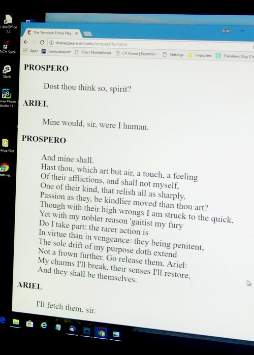
By accident, when this DVD of The Tempest began, there were subtitles to be seen, and I realised that these written lines, far from getting in the way, only added to my enjoyment, so I left them on. And, if subtitles were helping, why not the entire text? Maybe I possess a copy of The Tempest, but if so I could not find it, so instead, I tried the internet, which quickly obliged. My eyesight not being the best, I beefed up the magnification of the text until it was nearly as big as those subtitles. So, I watched, I read subtitles, and I was able to see who was saying what, and what they were about to say. And very gratifying it all was:

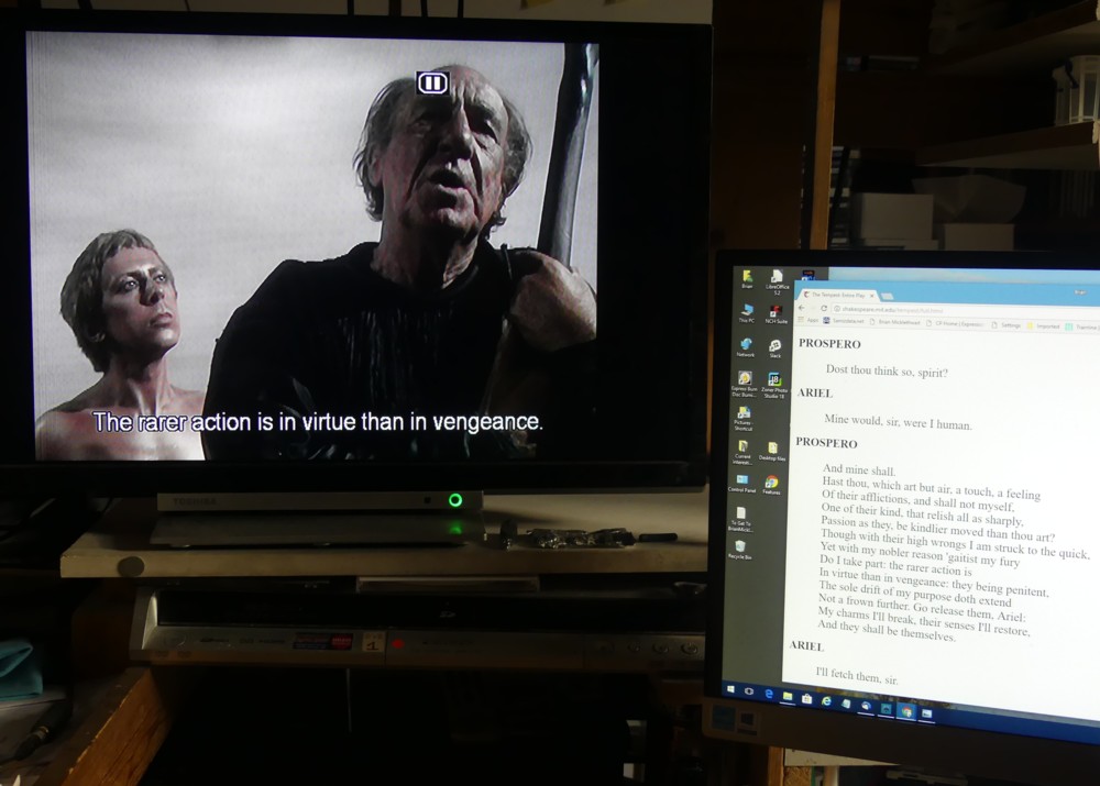
On the telly, on the left, David Dixon as Ariel and, on the right, Michael Hordern as Prospero, both very impressive.

And here, should you be curious, is the text they were enacting at that particular moment, as shown on the right of the above photo, but now blown up and photoshop-cloned into greater legibility:

I think the reason I found this redundancy-packed way of watching The Tempest so very satisfying is that with Shakespeare, the mere matter of what is going on is secondary to the far more significant matter of exactly what is being said, this latter often consisting of phrases and sentences which have bounced about in our culture for several centuries. As ever more people have felt the need to recycle these snatches or chunks of verbiage, for their own sake, and because they illuminate so much else that has happened and is happening in the world, so these words have gathered ever more force and charismatic power. As the apocryphal old lady said when leaving a performance of Hamlet: “Lovely. So full of quotations.”

The thing is, Shakespeare’s characters don’t just do the things that they do, and say only what needs to be said to keep the plot rolling along. They seek to find the universal meaning of their experiences, and being theatrical characters, they are able, having found the right words to describe these experiences, to pass on this knowledge to their audiences. This is especially true of Hamlet, because central to Hamlet’s character is that he is constantly trying to pin down the meaning of life, in a series of what we would now call tweets, and consequently to be remembered after his death.

Prospero in The Tempest is not quite so desperate to be remembered, any more, we are told, than Shakespeare himself was. In Prospero, as Trevor Nunn explained in his documentary about The Tempest, many hear Shakespeare saying goodbye to his career as a theatrical magician and returning to his provincial life of Middle English normality. But Shakespeare was Shakespeare. He couldn’t help creating these supremely eloquent central characters. Even when all they are doing is ordering room service, or in the case of Prospero doing something like passing on his latest instructions to Ariel, they all end up speaking Shakespeare, with words and phrases that beg to be remembered for ever. These famous Shakespeare bits are rather like those favourite bits that we classical music fans all hear in the great works of the Western musical cannon.

So, a way of watching these plays that enables these great word-clusters to hang around for a while is just what you want. (Especially if, like Prospero, you are getting old, and your short-term memory is not what it was.) It also helps being able to press the pause button from time to time, to enable you to savour these moments, to absorb their context, better than you could if just watching the one unpausable performance in front of you. Although I agree, having a pause symbol on the furrowed brow of Prospero, as in my telly-photo above, is not ideal.

I am now browsing through my Shakespeare DVD collection, wondering which one to wallow in next.

Originally posted at Brian Micklethwait’s Old Blog

A different sort of Remembrance photo

I took this photo out in the Epping region, while walking about there with a friend, in the autumn of 2015. And I believe that even when I took it, it seemed like a modern take on Remembrance Sunday and all that. Death in a major war, although itself no doubt often a very solitary experience, is experienced by the rest of us, especially as events like World War One recede into history, as a vast collective, shared, catastrophe. It’s the scale of the death, the sheer numbers, that hits home. And much poppy imagery reflects this, for instance in the form of all those poppies that were recently planted around the Tower of London.

So this poppy photo perhaps suggests the individuality and isolation of military death, when fighting on behalf of a country like ours, now. Your son dies. But nobody else for miles around is suffering in the same way. You’re on your own.

The yellow of the surrounding flowers suggests cowardice, which I dare say is how some bereaved people feel about their loss: that everyone else is scared to get stuck in. But there the metaphor probably breaks down. I certainly think that the people of Britain would be more than ready in the future to fight another big war, if they thought it made sense.

But it was a striking sight, nevertheless.

Originally posted at Brian Micklethwait’s Old Blog

The face of a seagull

I’m not much of a wildlife photoer, if only because others are so very enthusiastic about it. Nature beautiful. (Hu)Man-made world ugly. Those are the cliches, and bollocks to them. I prefer to celebrate, with my photoing, the human-made world, often by noticing how “natural” (that is non-centrally-dictated) that human-made world so often is, especially in a complicated place like London.

But I do keep trying to photo non-human creatures in case I get lucky, and about once every other blue moon, I do get a non-human photo that strikes me as worth showing here.

So, for instance, earlier this year I was photoing Big Things with a seagull in front of them, mostly to illustrate how recognisable these Big Things are, despite being out of focus. Recognisable to me anyway. Thus:

On the left, a seagull lined up with the Spraycan. On the right, the same seagull lined up with the Millbank Tower. But then, when I lined the seagull up in front of Big Ben, I got this, which strikes me as, you know, quite good:

Click on that to get my original photo, with blurry Big Ben behind being clearly recognisable. But here is a case where the photo I photoed of the actual creature seemed more interesting than the Big Thing. Because this seagull happened to be pointing its face straight at me, I got a view of a seagull face that I for one don’t regularly see. The beak, because pointing straight at me, is taken out of the picture, and the head that remains looks more like that of some kind of fluffy baby seal or some such thing. But with bird legs. Scroll up so that you only see the head, and it hardly looks seagullish at all.

I was going to add a photo of a squirrel to this posting. I even checked that I was spelling squirrel right. But this squirrel photo, which I took about two minutes before taking the above seagull photos, although quite nice, had no architecture in the background. It was just a squirrel, in a tree.

Originally posted at Brian Micklethwait’s Old Blog