
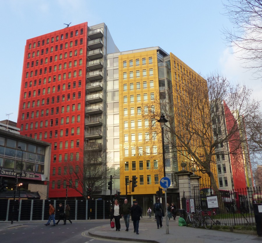
Here is a piece I did here about how Modernism got associated with whiteness. And for most would-be Modernists, Modernism still is white. But, here is another piece I did about coloured Modernism, in the form of Renzo Piano’s very colourful buildings near Centre Point. (Renzo Piano also designed the Shard.)
Here is another photo I took of these, I think, delightful edifices:
And here is a faked-up picture I came across not long ago, which suggests that Piano’s colourfulness may have struck a chord with other architects:
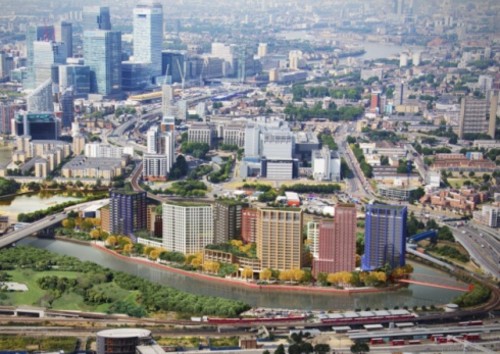
That picture adorns a report about the footbridge that you can see on the right of the picture, the very same one that I saw being installed last August. But I think you will agree that the towers on the Island there are a definite echo of that Pianistic colour.
The great thing about coloured architecture is that you can build the most severely functional lumps, and only worry about brightening them up afterwards. Form can colour function, and then colour can cover up the form and make it fun.
But it need not stop at just having one plain colour. Soon the artists will join in, and there will be giant murals.
If I had to place a bet about how different London will look from now in thirty year’s time, this would be the change I would bet on. Both new buildings and dull old ones will be much more brightly coloured.
I’m guessing that outdoor paint is a technology that has had a lot of work done on it in recent years, and that such work continues.
I will be interested to see if those Piano office blocks become faded, or if the colour stays bright for a decent time.
Interestingly Le Corbusier was a great one for colour being slapped on Modern buildings, but the notion never really caught on. Or rather, it is only now catching on.
As is illustrated in this posting at Material Girls. Where the point is also made that another huge influence on the monochrome association with Modernism was early and black-and-white photography. Even colourfully painted buildings didn’t look coloured in the photos. (One might add that newspapers and magazines only burst into colour after WW2, in the case of newspapers only in the 1960s. Until then, all newspaper and magazine photos were printed in black and white. So even if Modernism was done in colour, its influence spread in black and white.)
Now, colourful buildings tend to look colourful, both for real, and in the photos.