Just learned about the existence of …

DRACULA PARROTS. Me to. But how did he learn this? Doesn’t say. Hate that. Scroll down, scroll down. Here we go:

Despite it’s name and vulture-like visage, the Dracula Parrot is actually not bloodthirsty at all. It feeds almost exclusively on just a few species of figs, …

Could’ve googled this but I thought he made up the name “Dracula Parrot” himself and that I’d only get back to the original tweet.

Now, if you are looking to see a bird that is truly vampiric, look no further than the vampire finch, …

Pass. Had enough vampire birds for now.

Martin Cook photographs creatures

I follow Martin Cook on Twitter. His day job is medical, which must be interesting just now. But he’s also a Real Photographer. Here we see him lining up a swan with Salisbury Cathedral:

Also, that tree on the left looks like it’s had a big old dose of pollarding done to it, a process that has long intrigued me.

See also: a deer; a rabbit; another deer; a monochrome deer; the same deer (?) in colour; a bee; … You get the pictures.

BabelColour

Simon Evans, whom I follow, did a tweet asking what is the greatest photo ever. Many excellent photos followed.

The Chosen One joined in the discussion:

May I humbly suggest @StuartHumphryes for your delectation? An amazing collection of superb photos

It certainly is. Cue more excellent photos, and excellent photographic restorations and history lessons. This is Twitter being brilliant. Twitter can be horrible. So, ignore the horrible and go with the brilliant.

Simon Evans was already a fan of Humphryes, who calls his Twitter feed “BabelColour” (see above). But I’d never encountered the discoveries and recreations of Humphryes until now.

Following.

The shininess of architectural modernity

One of the biggest architectural trends of the last half century has been the relentless replacement of rough and unreflective surfaces with smooth and shiny surfaces, concrete by glass, old school stones and bricks by glass or shiny bricks held up by regular bricks. Glass is now omnipresent, even as much of it is deliberately arranged not to be seen through. Glass has got a lot smarter, meaning better at making light do exactly what it wants light to do, and a lot stronger and less accident-prone.

As a result, reflections now abound in cities, including reflections in see-through glass, because you actually don’t want see-through glass being perfectly see-through, because then people would keep walking into it and breaking their noses or skulls. So, the surface of see-through glass has mostly been kept deliberately shiny.

If you think about it, the difference between rural picturesque and urban is the difference between rough and smooth, between not-shiny and shiny. Shininess in hitherto impeccably rural settings can be particularly grating. It’s not necessarily the shape of architectural modernity that causes the most offence, in architecturally ancient or Ancientist settings. It is often its typical surface. Its shiny surface.

And it’s not just glass. Even the most mundane of building materials have tended to get shinier. The latest stronger-than-before materials tend to have smoother and shinier surfaces. Modern materials just seem to turn out like that. But also, smooth and shiny surfaces are so much easier to clean. Dirty stones or bricks have to be cleaned with industrial scale toothbrushes and savagely powerful hoses, which tend to rip off the old surfaces of the stones or bricks and make them even rougher and more likely to get even dirtier, later, again. Rinse and repeat until there is either a cripplingly expensive restoration job to be done, or else hardly anything left. A shinily modern surface can just be hosed down more gently, from a distance, with no lasting damage being done to it.

So, lots of reflections. Lots of images bouncing around off urban surfaces, and mingling with the images already on or made by those surfaces. If you are a Real Photographer, being paid to photo some very particular Thing, with no distractions please, this must often be maddening, the ultimate humiliation being when you yourself and your camera end up in the damn photo. But for the likes of me, urban shininess arrived just in time for us to be able to run about photoing it, with joy.

This aesthetic sermon began life as the mere intro to a clutch of shiny photos, but the rule with blogging, often broken here I’m afraid but at least sometimes not, is: keep it simple and keep it brief. Let one link suffice (note in particular the second photo in the Maier set there), by way of (prophetic) illustration. Here endeth the lesson.

Cat kindergarten

Why was I not informed about this remarkable building, erected in 2002 in Karlsruhe, Germany, until now?:

I am interested in unusual buildings. On Fridays, I like to do creature-related postings here, which are not just regular cats-or-dogs-doing-endearing-things postings, or at least not always. And, for a while, just after this building was built, I was an education blogger. So, The Internet really should have told me about the Kindergarten Wolfartsweier a decade and a half ago, rather than only yesterday.

The above photo is one of these, of Buildings That Look Like Animals. (Again, this list was published nearly two years ago, and only now am I being told about it. Come on Internet, you can do better than this.)

The Internet only got around to mentioning this building to me because Owen Hopkins has written a book about Postmodern Architecture (subtltled “Less is a Bore”), and The Internet finally deigned to send me an email, linking to an article about this book, at a website called “Luxury London”.

This article is quite informative, but the subheadings that sell it are a bit silly. As usual, the stupidest stuff in media is perpetrated by headline and subheading writers. For insteance, this:

London has become the global epicentre for postmodern architecture …

Which merely means that London, being quite big and quite rich, has quite a bit of postmodern architecture.

And this, which is silly, given what the article is about:

… narcissistic steel-and-glass megaliths of the City …

London is about to start seriously pining for more new narcissistic steel-and-glass megaliths, now that it has stopped building them, for the time being anyway.

What the world now needs is a narcissistic steel-and-glass megalith, shaped like a cat.

Love the NHS or die!

And speaking of photos by other people, as I just was, what of Michael Jennings? I linked to a photo of his not long ago, and do so quite often.

Well, on the first day of this month, Mchael was, he said on Facebook, in the Old Kent Road, and he photoed this:

The worship of the NHS is now so over the top that soon mainstream columnists are going to start trashing it, just to be different. Perhaps they already have and I just didn’t notice.

That’s a Soviet T-34, by the way.

Fifteen dancing ladies in 1923

I have now well and truly caught the Shorpy habit (from Mick Hartley mostly). Usually the photos at Shorpy are of Americans, but these ladies dancing (or just posing?) on a beach are British, although the beach is American:

Shorpy calls these ladies a “millipede”, but there are only fifteen of them. Most of them are holding the lady behind’s leg up, but the one at the front has to keep her leg up unaided, and the one at the back is doing no lifting. Just thought I’d mention it.

More seriously, changing fashions in figures is a fascinating subject. These ladies look to me a wee bit more plump than their equivalents now.

I remember noticing when Indian movie stars stopped being fat, and thinking: those Indians are finally eating properly. Good news. High status Indians no longer needed to prove they could afford to eat. They needed to prove that they could resist the desire to eat too much. I’m guessing that 1923 in Britain was still a time when food was somewhat scarce, albeit not as scarce as when these paintings were done.

I spend a lot more effort and time photoing and presenting my own photos than I do searching for good photos by other people. Basically, I let people like Mick Hartley do it for me. And Shorpy. Also this guy (I love that one). Any other photography suggestions would be most welcome.

The Merlin and the man who made it fly

Sadly, Patrick and I were unable to record our intended WW2 bombing conversation this afternoon. Patrick has done his bit, but it turns out that my mere phone won’t suffice and I need to get Skype working at my end too, which is the sort of thing I am not good at and which will take me time.

But, the delay does mean I can do a bit more homework. Homework like pondering this question: What was the most impressive air war machine of WW2? The Spitfire, maybe? The Avro Lancaster? How about the de Havilland Mosquito? The North American P-51 Mustang, mentioned in yesterday’s posting?

Well, maybe none of the above. But, how about the aero-engine, also mentioned in passing yesterday, which powered all of the above? (Also the Halifax and the Hurricane.) Wikipedia has this resplendent photo, “Taken by JAW 19th November 2005 Pearce Air Force Base Western Australia”, of the engine in question:

Yes, it’s the Rolls-Royce Merlin. I doubt many of them looked like that, when they were fighting WW2. The one in this photo looks more like something we’d now see in Tate Modern. Well, we wouldn’t. But we should.

The Merlin was named, not after the noted wizard, but, like all the Rolls-Royce engines of the WW2 era, after a bird of prey.

I have long possessed and am now reading a book about the man (his name was Hives) who, more than anyone else, ensured the Merlin’s development and mass production in sufficiently war-winning numbers. The number in question being, according to Wikipedia: 149,659.

The Wikipedia entry on Hives is also worth a read, especially the bit about how Hives met, and won over, the “highly irascible but utterly pivotal” Admiral Hyman G. Rickover, the USA’s nuclear submarine boss during the Cold War, and got him to cooperate with the British nuclear submarine programme.

And we could also use more Ancientism

Yesterday I said Modernism isn’t going anywhere. Today I say that this doesn’t mean we can’t also have more Ancientism. Like this:

That’s Photo thirty-five in the top fifty architectural photos that were competing for this prize. It’s Eltz Castle and it’s actually not a nineteenth century rehash, done by that bloke who paid Wagner’s bills, however much it may look like that. (Blog and learn.)

Whatever. We need more of the spirit of King Ludwig II of Bavaria. Why can’t there be more edifices of this sort built, now? Why can’t most of us get at least some of the architecture we like, now? What’s the big problem?

Maybe these guys could do it. They seem perfectly willing to do either Ancientism or Modernism, depending only on who the customer is. Now there’s an idea.

The winning photo out of those fifty was a photo of a bridge I have already written about here, making points not dissimilar to those I make in this posting.

Colourful Modernism

Google sends me emails about “new london architecture”. As you can imagine, there’s not a lot of news of this sort just now. But today, I received a link to a report about this, or maybe that’s these:

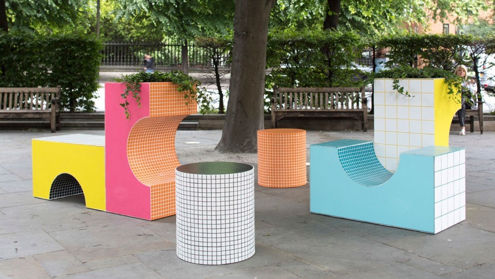
I smelled a young designer trying to get noticed, and I was not wrong. The thing is, the email said something about “colourful city benches”, and that intrigued me in all sorts of ways. I like public sculpture, especially if you can sit on it. I am interested in how designers are doing a lot of colour these days. And before the link even materialised, I placed a mental bet along the lines described in the first sentence of this paragraph.

Sure enough, Irene Astrain is indeed young. Well, thirties, which is young by architect standards. She only got started with her own enterprise in 2016.

(Starchitects often have to be seventy before they get to be starchitects. (Which was why Zaha Hadid’s recent death in her mere sixties was such a shock. (She should have had another thirty years of shape shifting ahead of her.)))

But back to these benches. What they say to me is that here’s a young architect, doing the old attract-maximum-attention-with-whatever-piddling-little-job-they’ll-let-me-do trick, and making two very strong statements. One: Modernism ain’t going anywhere. Two: but it is going to get much more colourful.

Time was when black and white, and what you get when you mix black and white (grey), were the most modern colours there were (I strongly recommend that link), and photography could also only do black-and-white. And for that mid-twentieth century generation of architects, colour was vulgar and trashy, even Victorian, the Victorian era having been, architecturally speaking, a very colourful and garish time. So, for the Modernists, coloured architecture was the superimposition of mere surface effect. Colour did not ooze out of the inner essence of whatever it was, the way Modernist shapes did, or were claimed to. So, black-and-white architecture was de rigueur and colour was an abomination.

(Interestingly, Le Corbusier deviated from this norm. More recently, Renzo Piano is now very old, but has still done some very colourful buildings, right here in London.)

And now, black-and-white-only is itself what a bygone era looked like. Colour is now done a lot better, in cities that are getting a lot less polluted than they used to be. Colour photography is something everyone can now do and now wants to do.

There’s more blog postings to be done about why Modernism ain’t going anywhere, and it damn well ain’t whatever you maybe might wish. But those will have to wait. Meanwhile, I promise nothing.

There are also lots of blog postings to be done, or discovered having been done by others, about how modernism is caused by, among other things, the fondness that adults have for the kind of things they played with when very young, and when very small compared to these things.