Singapore architecture

Recently I have become included in the Libertarian Boys Curry Night gang. I know them all. I just hadn’t been having curries (or in my case biryanis) with them every now and again, until rather recently.

During the latest such Curry Night (at an Indian Diner near to me (which turned out to be a good choice (I had a biryani))), one of the Boys showed me some photos of Singapore he’d taken with his mobile, of that huge thing that looks like a set of cricket stumps, for a game of cricket played in hell and painted by Bruegel.

I said, send me one of those, and he did, twice:

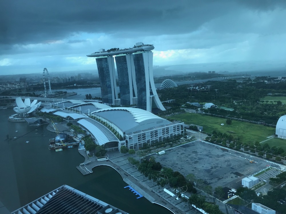
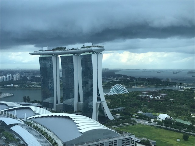
I show these photos here, because whatever you think of this Thing, it is certainly of architectural interest, in a misshapen and off-putting sort of way (or so I think).

But more, I show these photos because they actually are rather informative, especially the one on the left. That one especially shows context, in the form of nearby places and other nearby buildings. In general, you get a feel for what sort of place Singapore is.

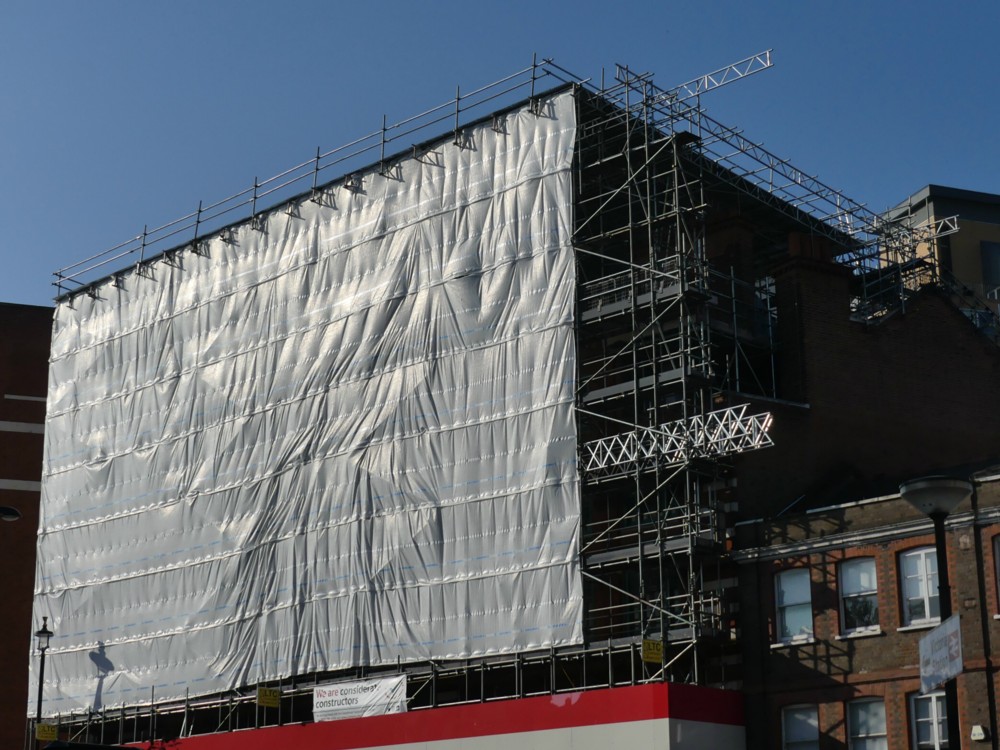
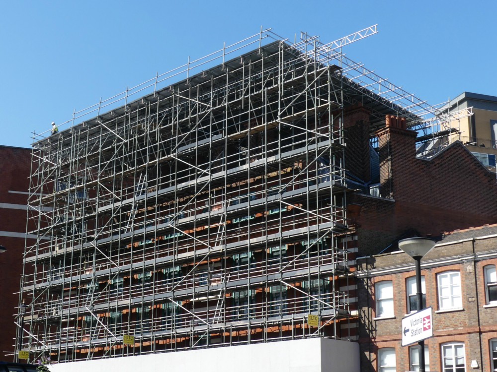
In Real Photographer photos, you get buildings like this looking super-cool and super-glamorous, in other words not how they actually look like when you get there.

I’ve said it before and will say it again now. Real Photographers photo photos that are super-nice. Amateur photoers often photo photos which tell you more about what a place is actually like. So it is, I think, with these photos that my mate Tom took.

My low opinion of this Cricket Stumps Thing is perhaps shared by whoever compiled this list of 10 Super Cool Buildings in Singapore You Might Not Have Noticed Before, because The Stumps are not included. That’s because you’ve probably already noticed them, rather than because it’s ugly. But the implied point of the list is: we have other and cooler buildings, besides and unlike The Stumps.

One of the Cool Buildings in this list is something called the “Interlace” Apartments, which is that pile of blocks of flats, all rectangular and each very boring, but piled up like a child’s set of big wooden bricks, all at angles to each other. There’s a photo of this Pile of Bricks in the list, of course. But I prefer this aerial photo of it, that I found elsewhere, and which I’d not seen before:

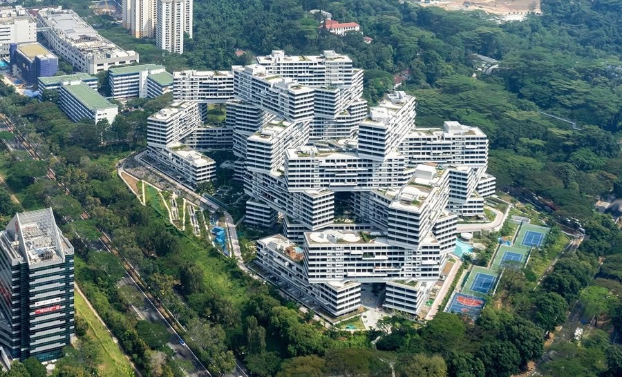
Once again, you get context. So I’m guessing: photoed from an airplane by an amateur photoer.

Tom’s photos of The Stumps were not photoed from an airplane, but rather from a nearby building. You can tell this because both were photoed from the exact same spot, but the clouds are different. Ergo, he was still when he photoed them.

Wheel lit – Wheel not so lit

Indeed:

March 2012, from Primrose Hill.

I love things that are the same, but not the same. E.g., the exact same size but a different colour. The exact same sort of taxis but each with a different advert. Or, as here, the same exact thing, but differently lit.

I’ve always liked these.

A big painting in a small puddle

I have a busy day ahead of me, or at least I want to. So I am doing today’s quota photo now, to get it out of the way.

And of all my recent photos I find that the one I want to put here is this:

What I think I enjoy there is the contrast between the smallness and shallowness of the puddle and the extremity of the visual effects it is creating. One silly little bit of water, surrounded only by grubby road and pavement detail, creates all that light and depth, to say nothing of the Photoshop effect it does on the building, turning a mere photo into an impressionist painting.

It helps that the building tells me that I am very near to my home, about twenty seconds from my front door. Nearly there. That always lightens the mood.

If you are not impressed …? As I have definitely said before, the good thing about quota photos you don’t care for is that they waste very little of your time.

More art beside the river

After I photoed those metal men beside the river; outside the old Woolwich Arsenal, I then walked up river towards the Dome, photoing photos like this:

However, just before photoing that photo; I photoed this next photo, of a painter, hard at work:

And here is the photo I photoed of how he was making this scene look:

The painting above had yet to say this, but that is the Tate & Lyle factory just south of London City Airport.

I asked this artist’s permission to photo his painting, which he graciously gave, but I did not ask him who he was. The polite way of asking that would have been to say: Do you have a website? But, alas, I forgot to ask this: So, no link to any website, Apologies to him if he does have a website, and apologies to you.

Originally posted at Brian Micklethwait’s Old Blog

Red chameleon in Stoke Newington

One of the things explained in the article linked to in the previous posting is that product placement often happens in a quite subtle way, without the brand being spelt out clearly, for everyone to see. Street art adverts can be part of a campaign, and the street art bit only makes sense if you also notice the rest of that campaign.

So, for instance, is this, also spied in Bermondsey by me the day before yesterday, also some kind of advert?:

Maybe.

I googled “red chameleon” and found two books both called that, but no other products. No beer. No deodorant. No dating site for psycho-communists.

So, maybe it’s just a painting, of a red chameleon.

LATER: And it would appear that these are just flamingos:

I also saw them on my Stoke Newingtonian travels.

Both the flamingos and the red chameleon are, it would seem, the work of Frankie Strand. That she signed the chameleon was a clue. And a little googling got me to her particular fondness also for flamingos.

Originally posted at Brian Micklethwait’s Old Blog

Street Art sells beer instead of political ruination – pro-political-ruination writer not happy

Christine Macdonald complains, in an article recently linked to by Arts and Letters Daily that:

Street Art Used To Be the Voice of the People. Now It’s the Voice of Advertisers.

Given what Ms MacDonald means by “the People” (the people who ruin all the places they get control of), this development is to be welcomed. Compared to ruination by a diverse array of people, all with the same ruinous opinions, advertisers trying only to sell you stuff are a breath of fresh air.

Here is an example of this process at work, spotted by me in Stoke Newington, the day before yesterday:

And here is another van from the same stable, which I spotted and photoed on the same day that I spotted and photoed these other exercises in profit seeking and actual people helping, nearer to the middle of London, while out and about a while back:

Vans like this are different, and thus attract attention. They certainly got mine. Many beer drinkers will surely have been persuaded to wonder what this particular beer tastes like. If it tastes like crap, advertising won’t save your product. But if the product is good but is being ignored, advertising is just what you want.

But, all you graffitists who have sold out or who would like to, be warned. Soon, this style will look rather ordinary, once lots of others have started doing it. At which point people like me won’t photo it any more, and commerce that is trying to attract attention will be on to the next aesthetic fad.

Originally posted at Brian Micklethwait’s Old Blog

Modern Art

I don’t hate paintings that look like this, as so many paintings of a certain vintage do. Hatred is for things you can’t avoid and mere paintings can usually be avoided with ease. But I don’t respect paintings that look like this:

But that isn’t a painting. It looks like a painting. But, it’s a photo. And I really like it.

It was photoed by Real Photographer Charlie Waite. Read his tweet about it here.

Originally posted at Brian Micklethwait’s Old Blog

Hell or Habito

I continue to photo taxi adverts, whenever I get the chance. Last Sunday, I photoed this one:

There wasn’t space for to get the whole taxi, and there wasn’t time for me to go the other side of the road and get the whole taxi, because I was in a hurry to be somewhere else. But I hope you agree that that photo suffices.

This being the century of the internet, I have since found this, and this, and this.

I bet Jimbo Phillips never thought he’d be selling mortgages.

Originally posted at Brian Micklethwait’s Old Blog

How photo-collating reminded me of some (other) good modified cliché photos

More and more of my photo-time is spent collating the photos I have already taken. Last night, for instance, I went looking for (more) photos of London taxis with adverts on them. There is something especially appealing, to me anyway, about a large number of objects all exactly the same shape, but each decorated differently. (Some time, I must go searching for my photos of elephants.)

Equally appealing, to me, were those Gormley Men (LINK TO THE OLD BLOG). In that case, each Man was the same, and undecorated in the more usual and rather bland sculpture way. But, each one was in a different place and a different sort of setting. My Gormley Men photos did not need collating, because Gormley had already collated them, by putting all his Men in the same part of London at the same time. Therefore my photos of the Gormley Men mostly collated themselves.

Not so the elephants, or taxis. When looking for taxis, I am looking for taxis photoed in the course of all manner of different photo-expeditions each with their own directories.

But my point is that in the course of all this taxi-collating, I was clicking through literally thousands of non-taxi photos, and I kept coming across non-taxi photos that I particularly liked. Like (like as in “such as” – this is not a command) this one, for instance, taken last June:

I like doing modified cliches in writing, and I also like them photographically. A view, for instance, of some London Thing that has been photoed to death, but put beside or in front of or behind something that is not so usual. Most photoers would regard the above scaffolding as a problem rather than any sort of solution, to the Eros-has-been-photoed-to-death problem.

The scaffolding’s wrapping has the effect of clearing away all the usual clutter from Piccadilly Circus and replacing it with something a lot like sky on a dull day. It puts Eros in an empty field in the countryside, you might say. And yes I know, I like clutter. But not always.

Here is another modified cliché photo:

The Wheel has been photoed to death, and that’s a view I regularly see – and regularly photo – of it, from the point where Strutton Ground meets Victoria Street, looking down Victoria Street towards Parliament Square and beyond. But that sky behind The Wheel made The Wheel look amazing, on that particular day in January of this year.

Finally, one of many photos I took this year of Battersea Power Station:

The Power Station and (if you are a craniac like me) its crane cluster are the clichés. And if you want to take the sting out of a cliché, one way is to reflect it in something. At that point its extreme recognisability becomes more a virtue and less of a bore. Its very clichéness becomes helpful to the photo.

This photo was taken from the upstream side of the Power Station, where there is already a big chunk of new flats up and running, with accompanying tasteless sculpture, coffee serving places and the like. All sparked, I believe, by the new USA Embassy.

This photo of mine turns Battersea Power Station upside down. I’ve always thought that an upside down Battersea Power Station would make a rather good table. But, until now I never thought to go looking for such a table on the www. Here we go. That took about three seconds, so I bet there are plenty more that are cheaper. This guy had the same idea, but those two links were all I could quickly find concerning this notion.

Here is another modified cliché photo of Battersea Power Station, the modification this time being smoke.

Come to think of it, all those London taxi photos I’ve been digging up are also modified cliché photos, aren’t they? London taxi = cliché, adverts = modification.

Originally posted at Brian Micklethwait’s Old Blog

The last really fine day of 2018 (2): Scaffolding wrapped and unwrapped – and the Reichstag wrapped

I’ve asked it before and I’ll ask it again. Why do I regard most of Modern Art as silly, yet relish real world objects which resemble Modern Art? Objects like this:

The above photo was taken on The last really fine day of 2018, just minutes after I had taken the one in that earlier posting.

You don’t need to go to an exhibition of sloppily painted abstract art, when the regular world contains wondrous looking objects like that. And what is more, they are wondrous looking objects which have worthwhile purposes. This wondrous object is for supporting and protecting workers as they work on a building.

Here is how that same scaffolding looked, unwrapped, about a month earlier:

I particular enjoy how the sky changes colour, in my camera, when a big white Thing is inserted into the picture. (This afternoon, I encountered this, by Real Photographer Charlie Waite. Same effect.)

Thank you to the (to me) invaluable PhotoCat, for enabling me to crop both of the above photos in a way that makes them more alike in their scope and which thereby points up the differences. I’m talking about the invaluable Crop But Keep Proportions function that PhotoCat has, but which PhotoStudio (my regular Photoshop(clone)) 5.5 seems not to offer. (I would love to be contradicted on that subject.)

Despite all my grumblings about how silly most Modern Art is, I do nevertheless greatly like the way that this Big Thing (the Reichstag) looks in the pride-of-place photo featured in this BBC report, an effect which presumably makes use of the same sort of technology as we see in my photo, but on a vastly grander scale:

I have to admit that this is several orders of magnitude more impressive than my scaffolding. (Maybe that was the last really fine day of 1994.) My scaffolding looks lots better than some badly painted little abstract rectangle in an Art gallery, but it’s not nearly as effective as the Reichstag, as wrapped by Christo and Partner.

Because this Big Wrapped Thing was so very big, and because it is such a very interesting shape, it really does look like it added greatly to Berlin, in that summer of 1994. I entirely understand why all those people assembled to gaze at it. Had I been anywhere in the vicinity, I would have too. And had there been digital cameras then, I would have taken numerous photos, as would thousands of others. Thus giving permanence to this vast piece of temporariness.

Because, what I also like about this Reichstag wrapping is that, just like my scaffolding, and just like all the other wrapping done by Wrapper Christo and his Lady Sidekick, it is temporary. That BBC report calls it Pop-Up Art, and it is of the essence of its non-annoyingness that any particular piece of Pop-Up Art by Christo will soon be popping down again.

This Reichstag wrapping happened in 1994, but is now long gone. Did you disapprove of what Christo and his lady did to the Reichstag? You just had to wait it out. Soon, it would be be gone.

Do you think scaffolding, especially when wrapped, is ugly? Ditto.

Originally posted at Brian Micklethwait’s Old Blog