On how all new building on a large scale tends to start out looking meaningless

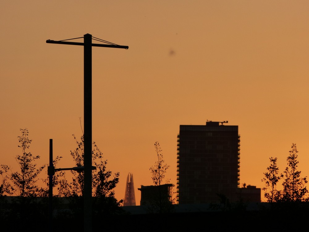
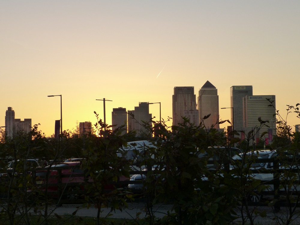
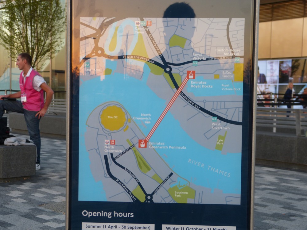
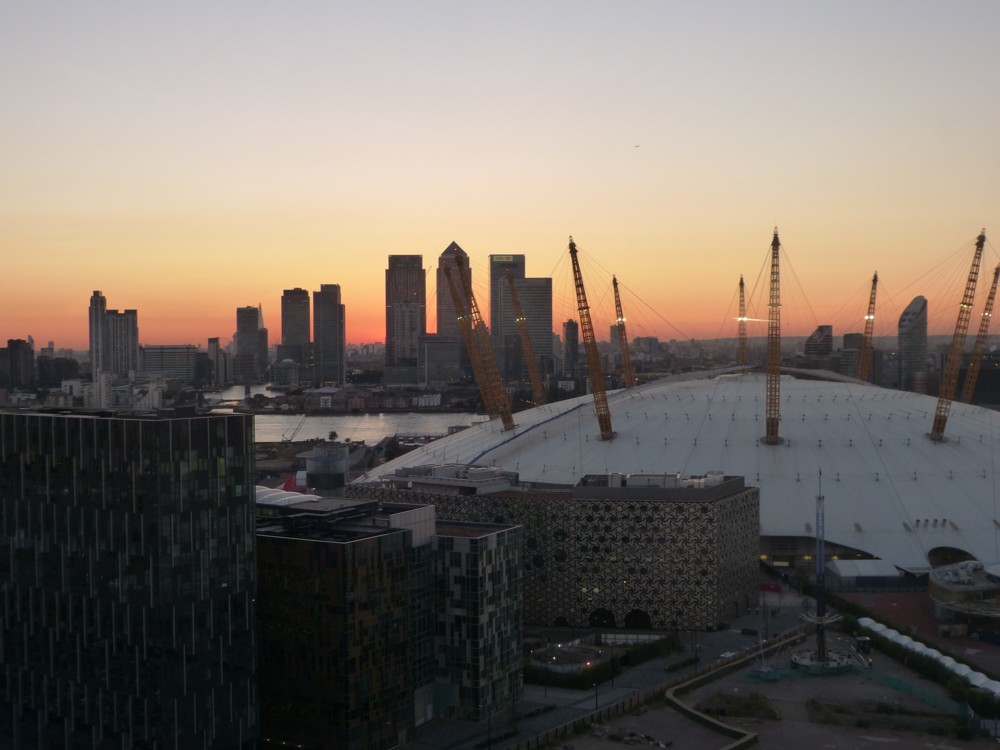
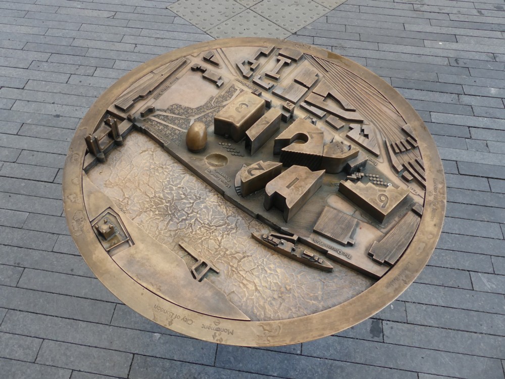
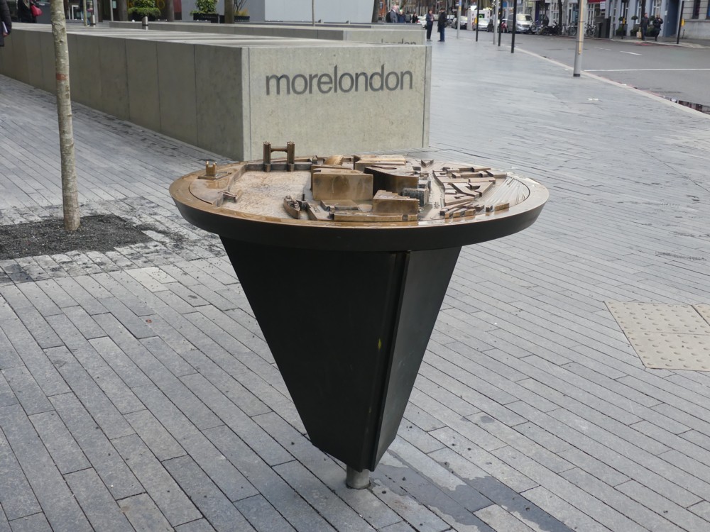
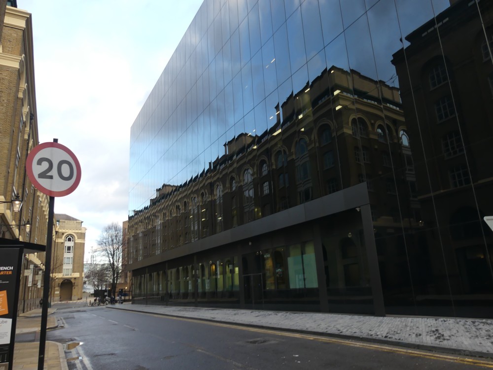
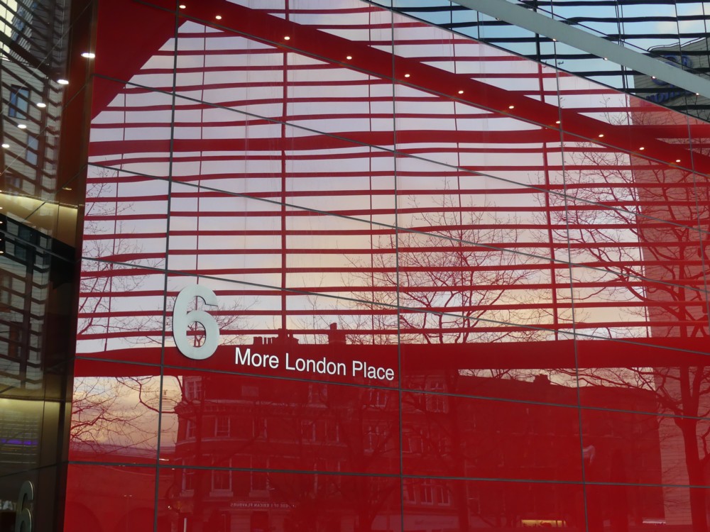
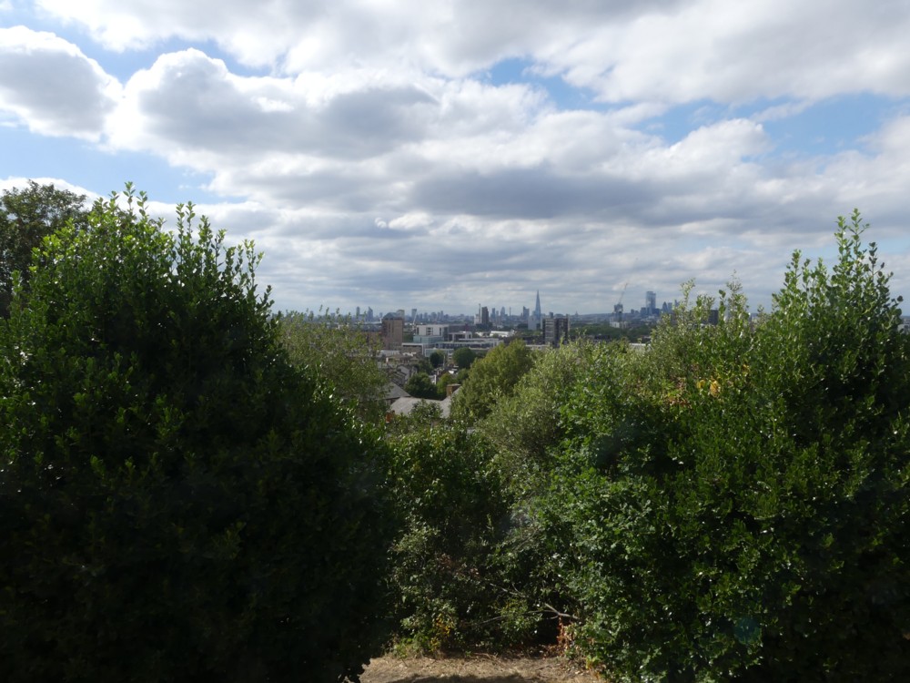
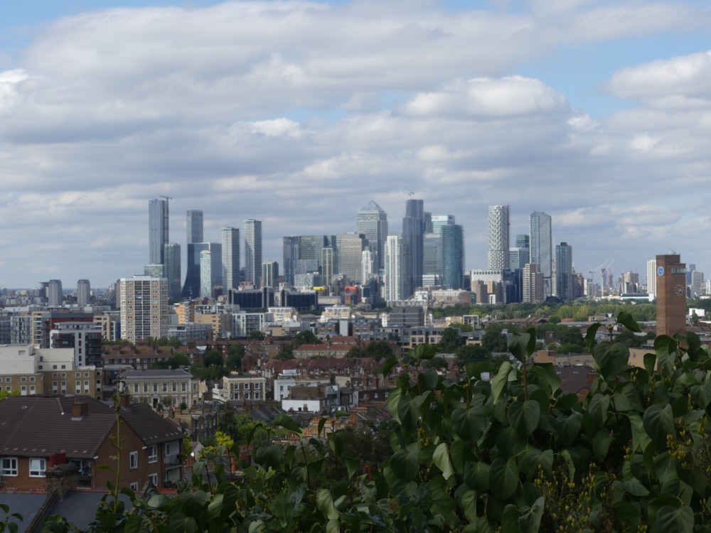
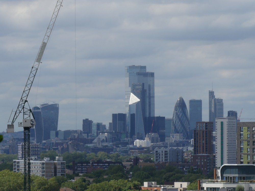
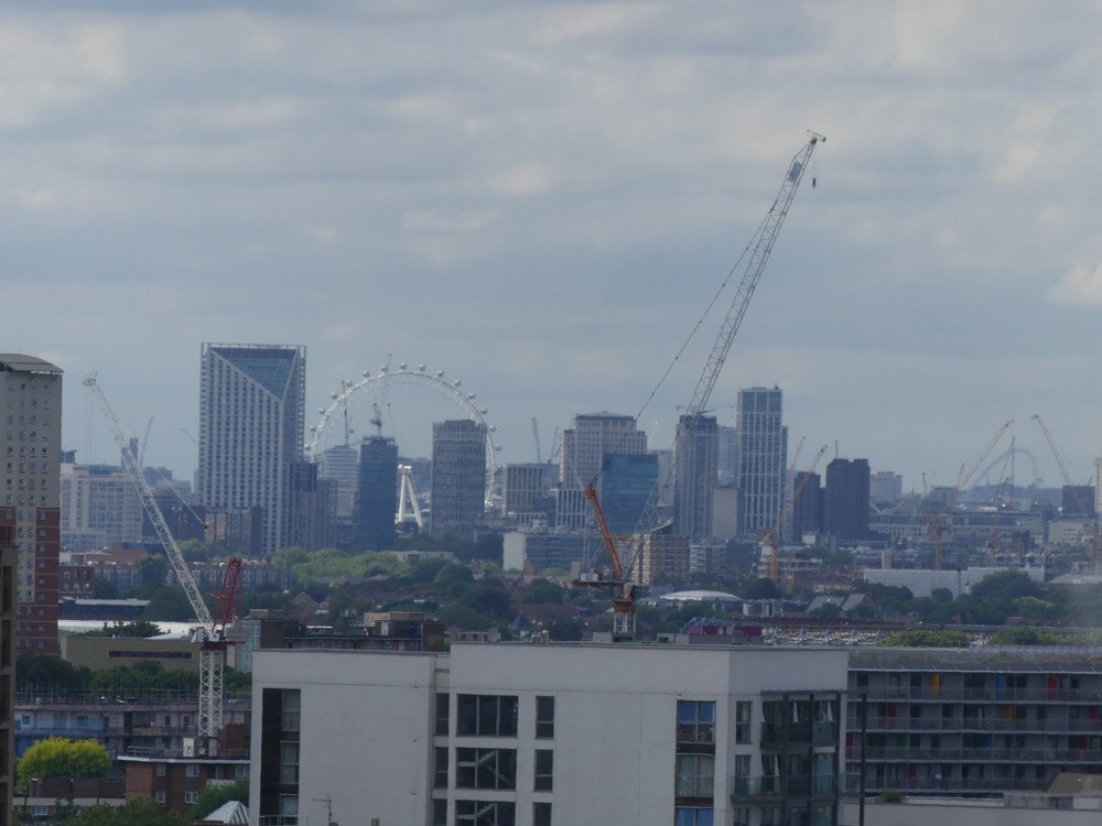
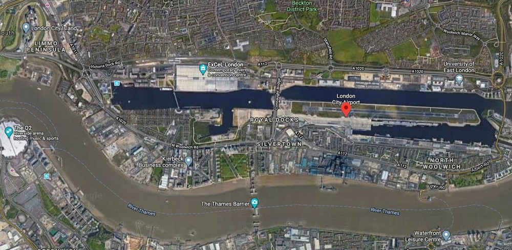
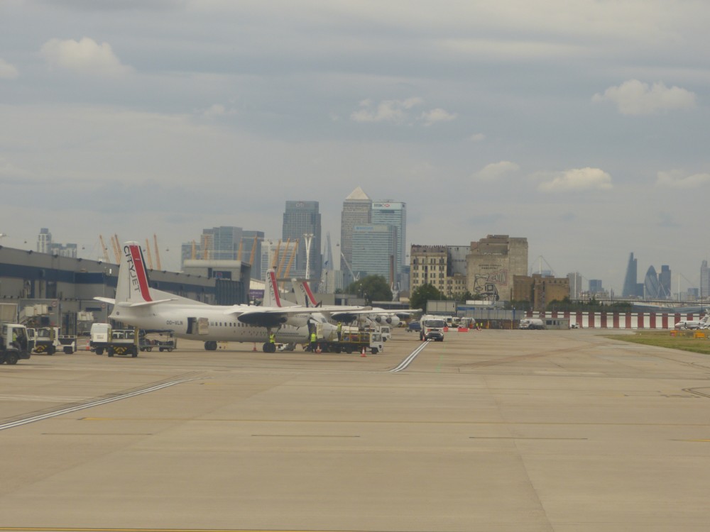
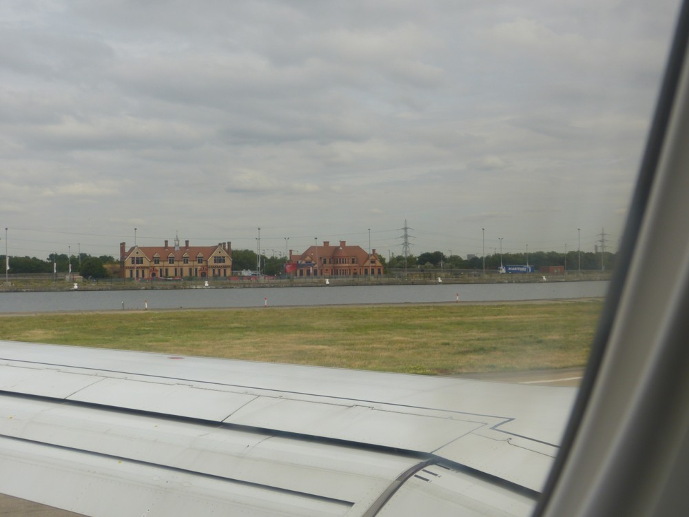
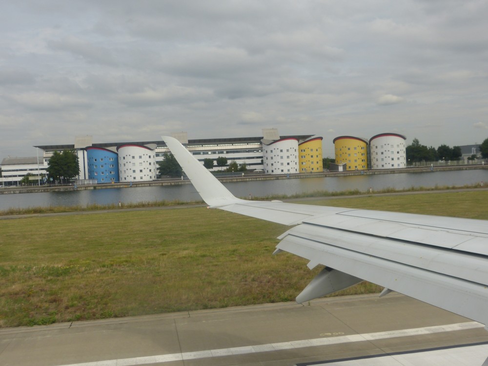
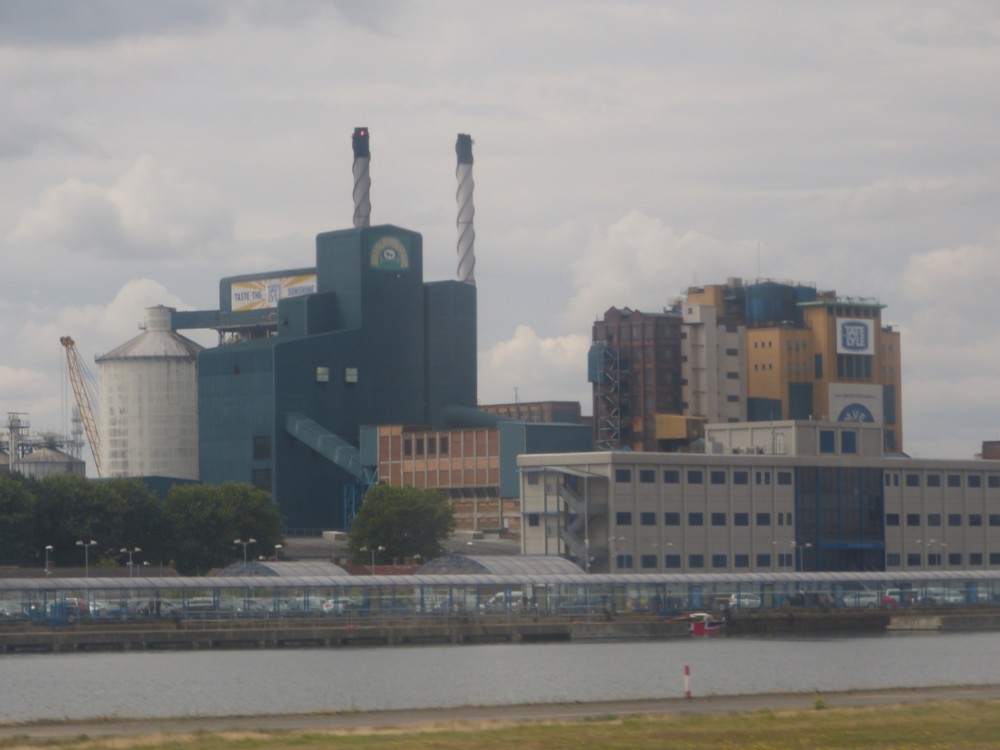
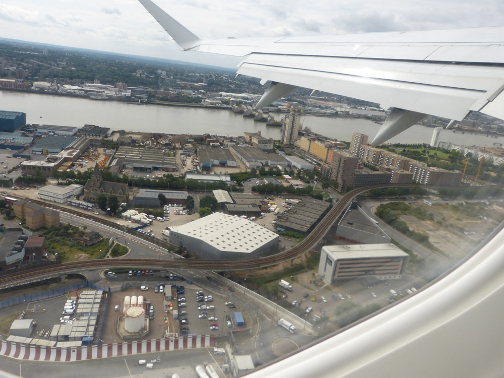
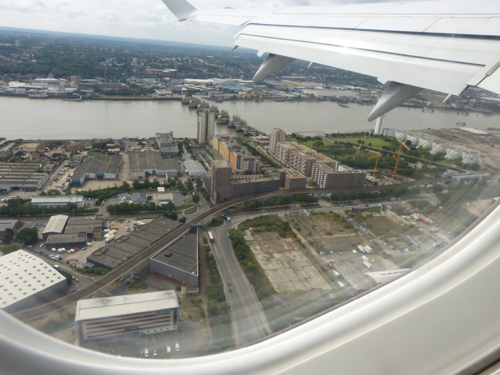
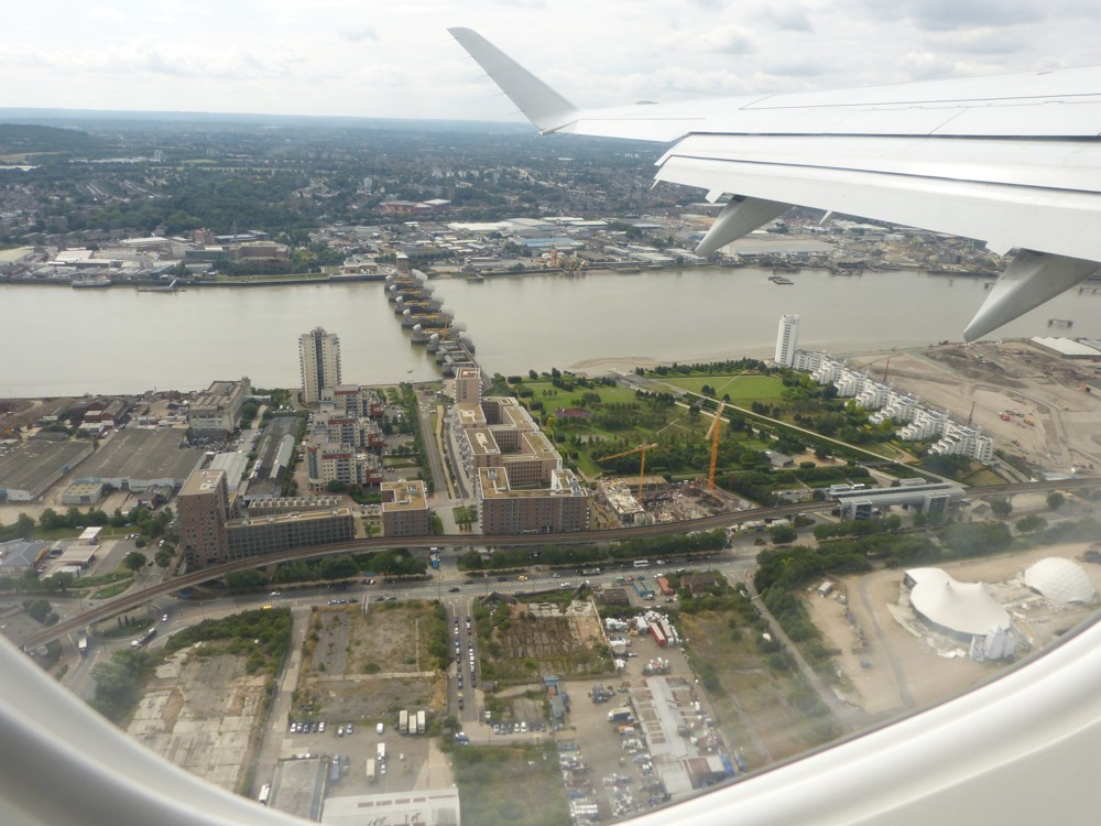
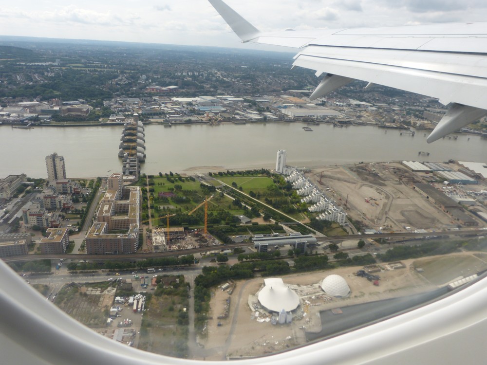
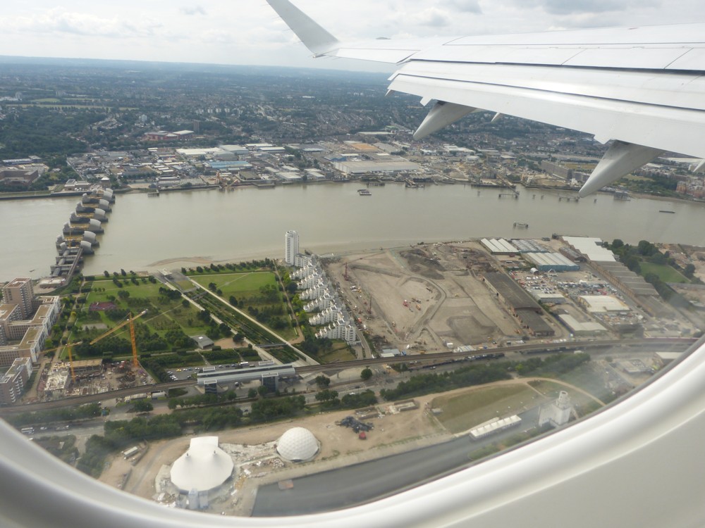
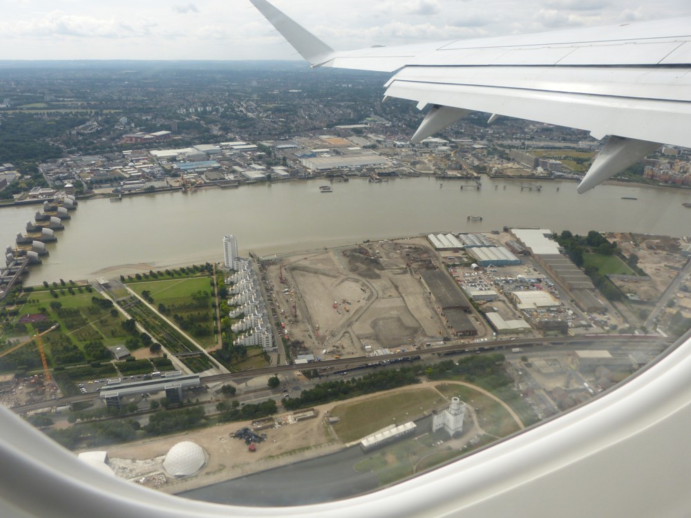
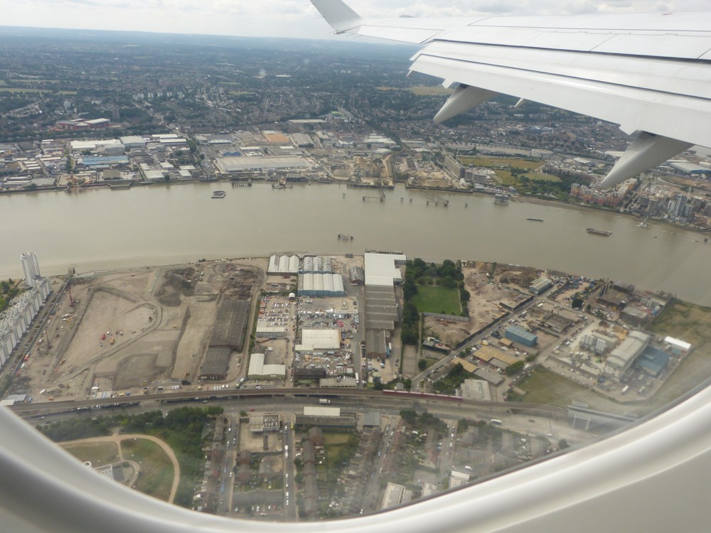
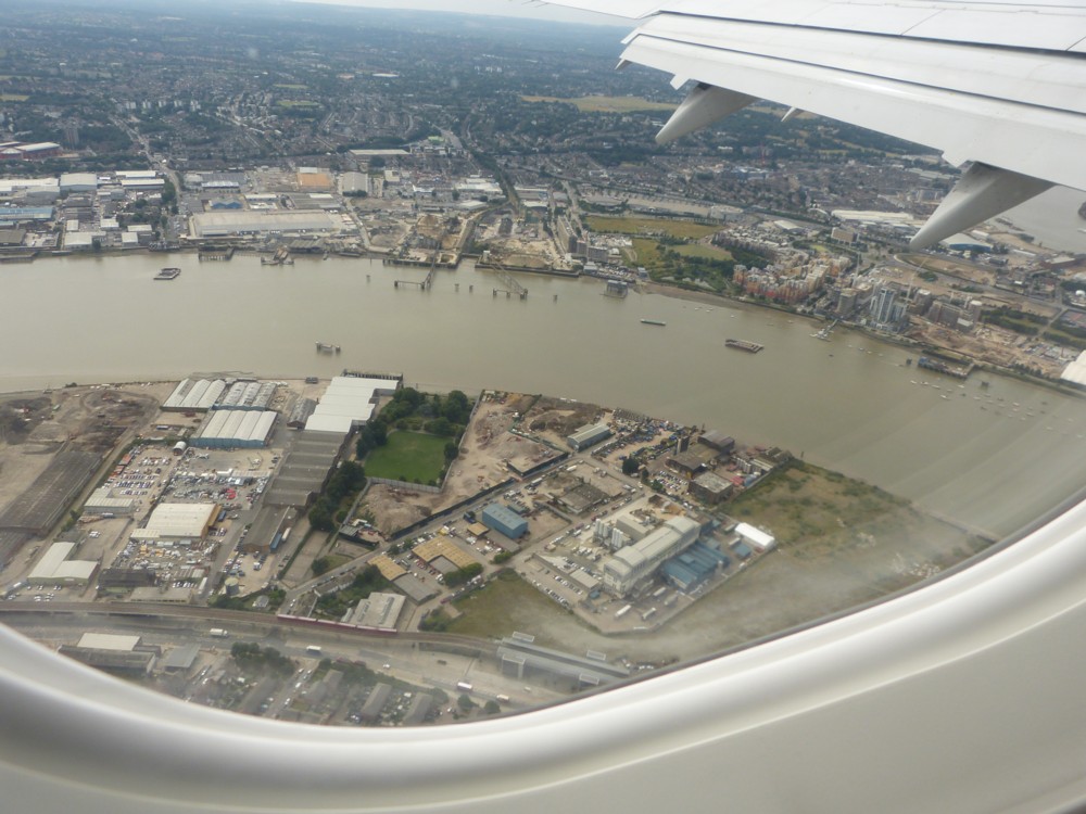
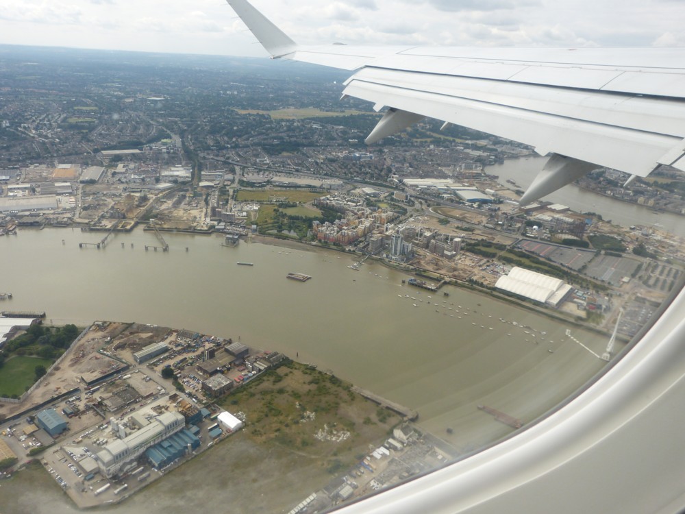
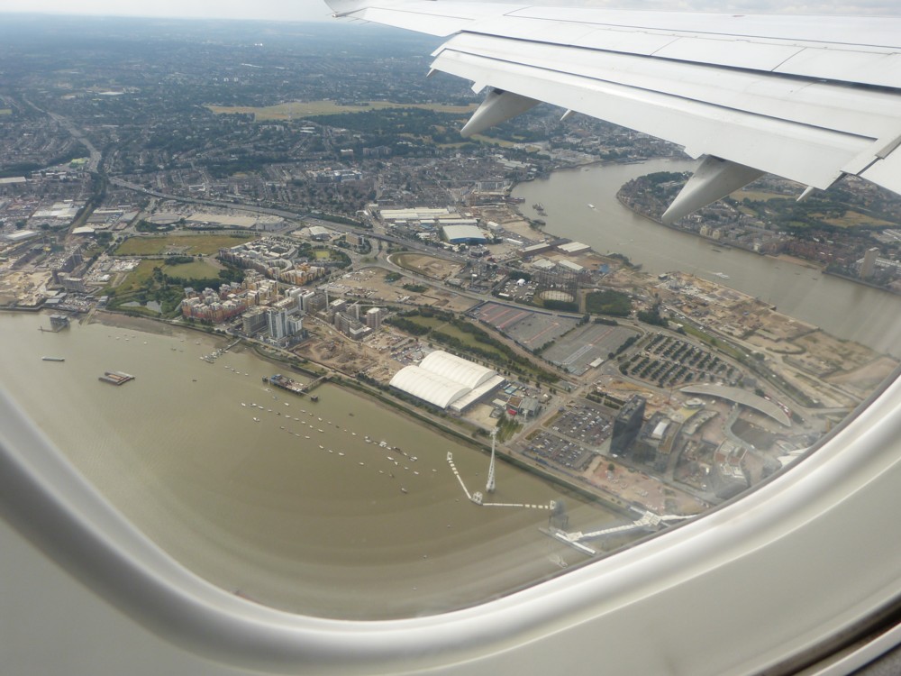
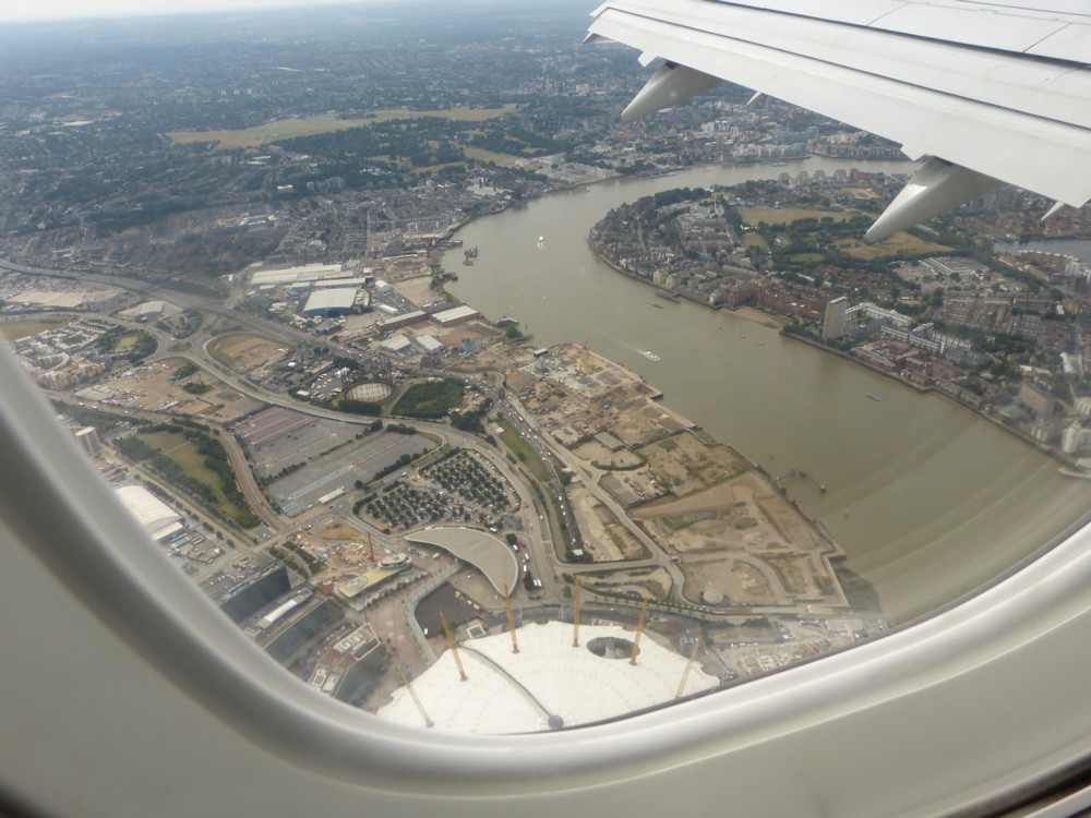
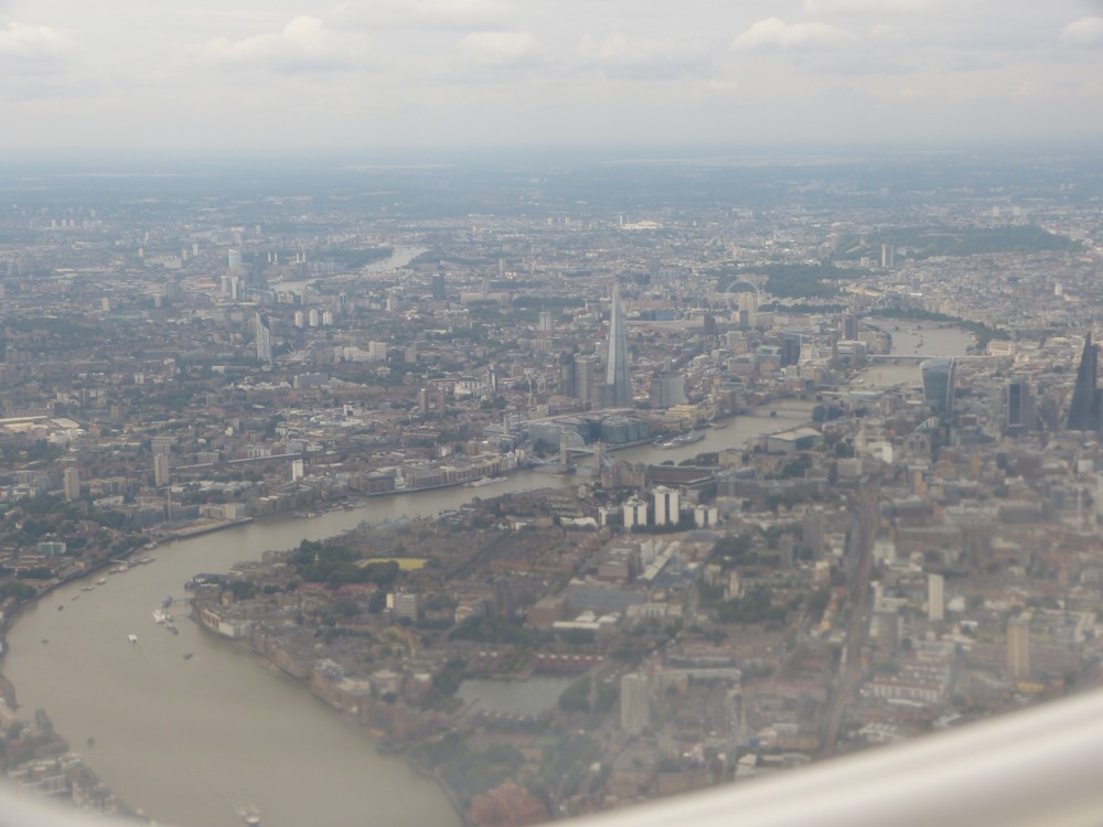
Here are some photos I took in and around City Island in 2017, while it was in the process of being constructed:

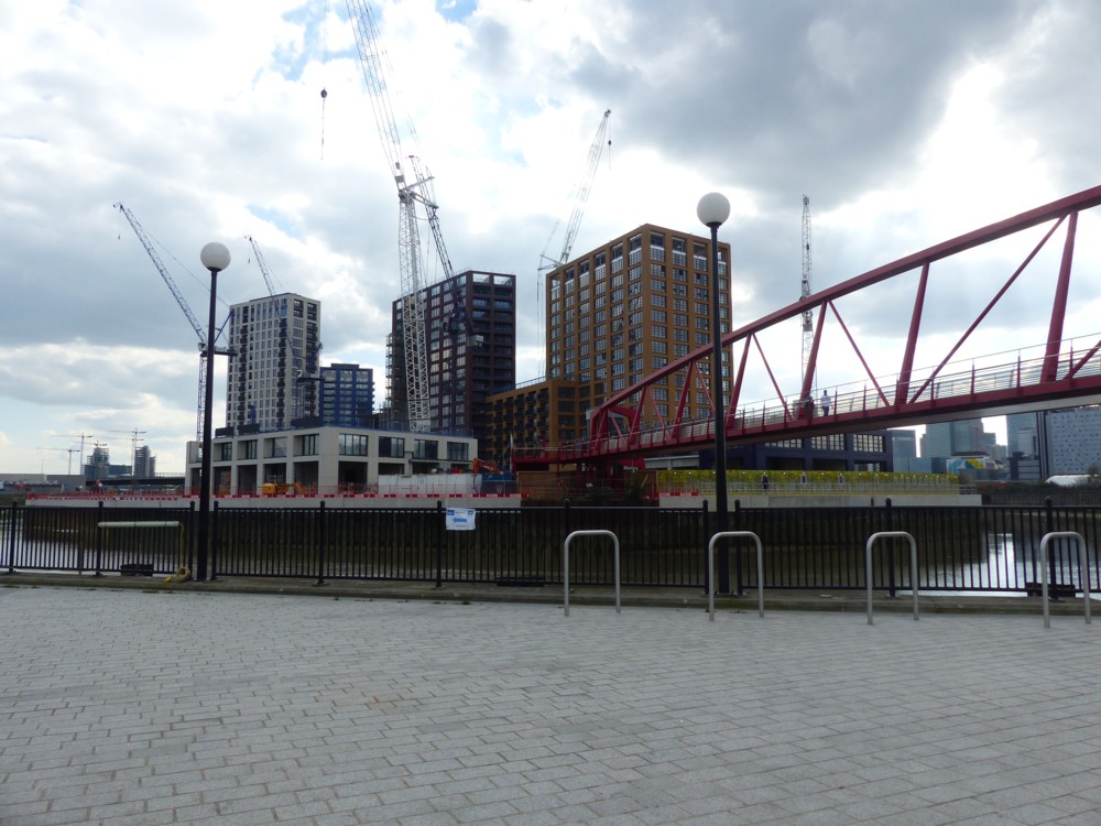
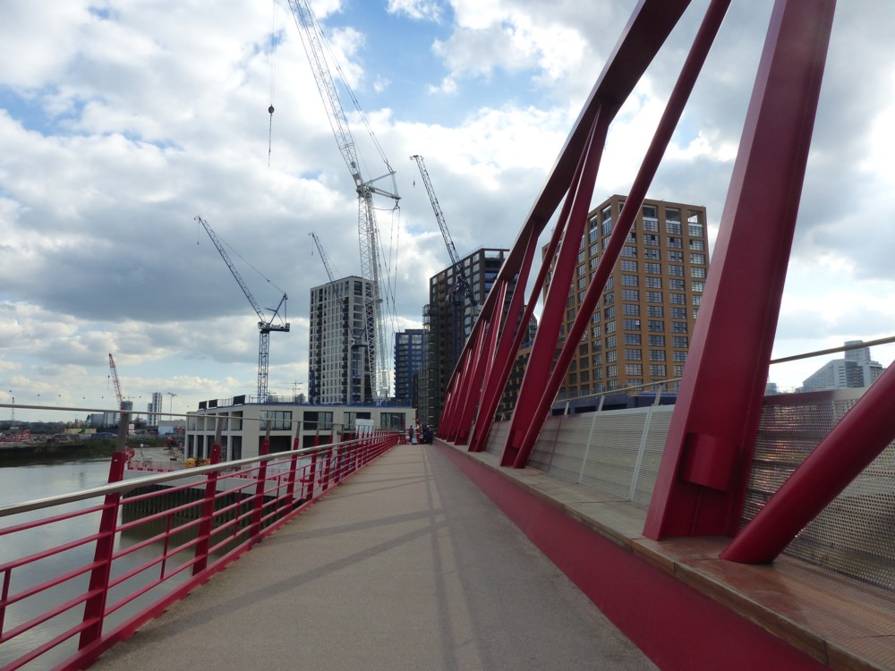
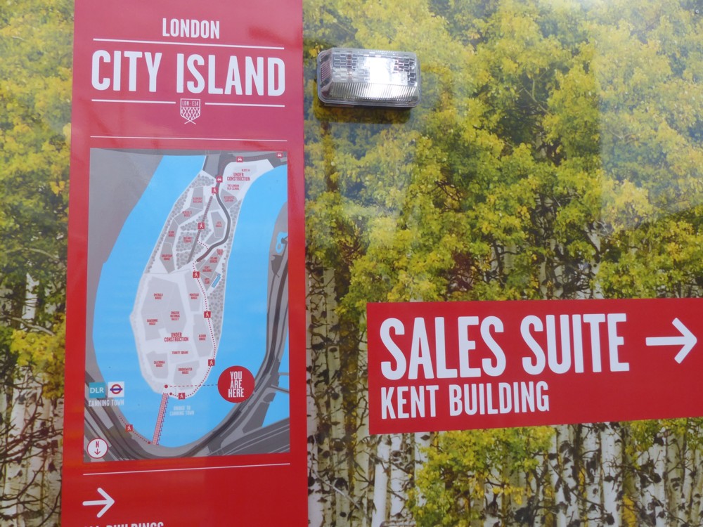
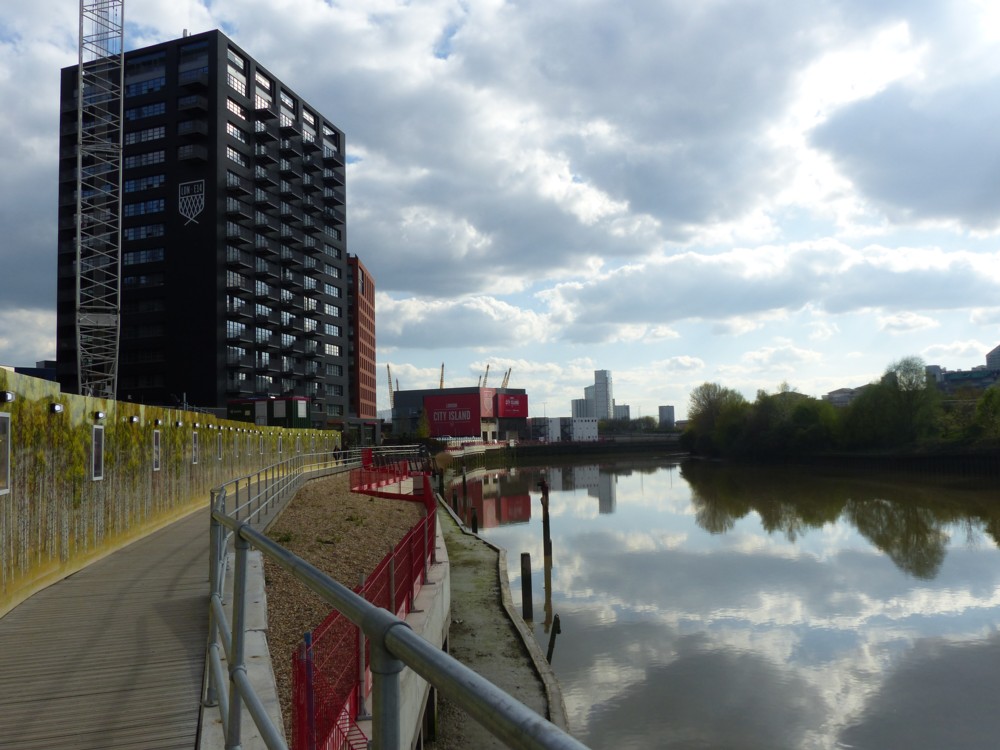
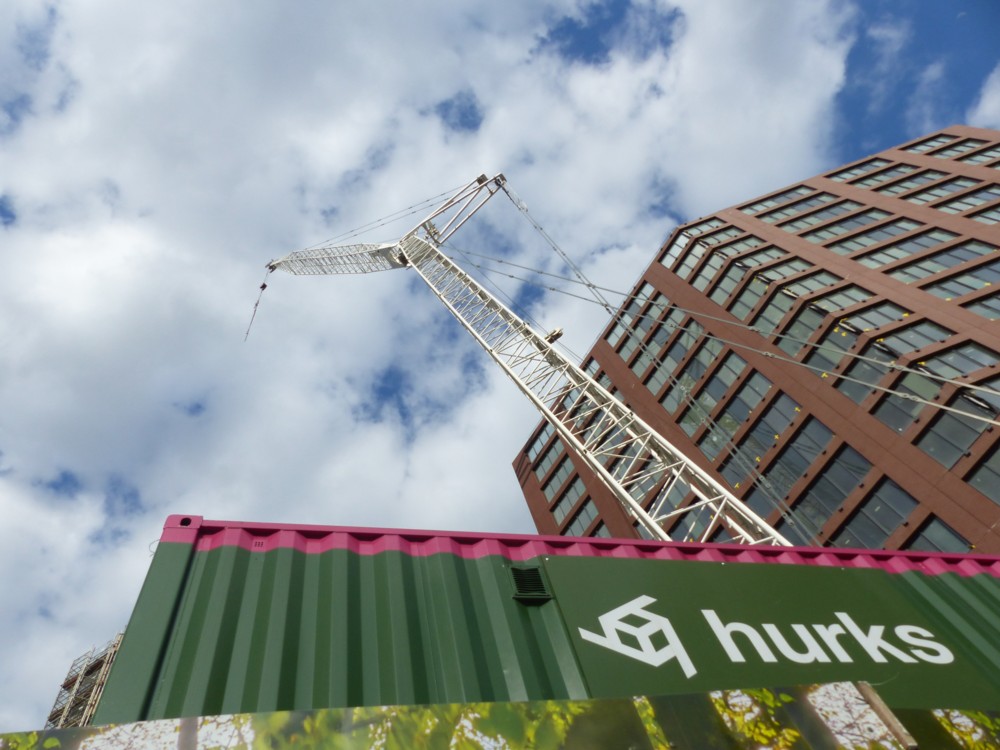
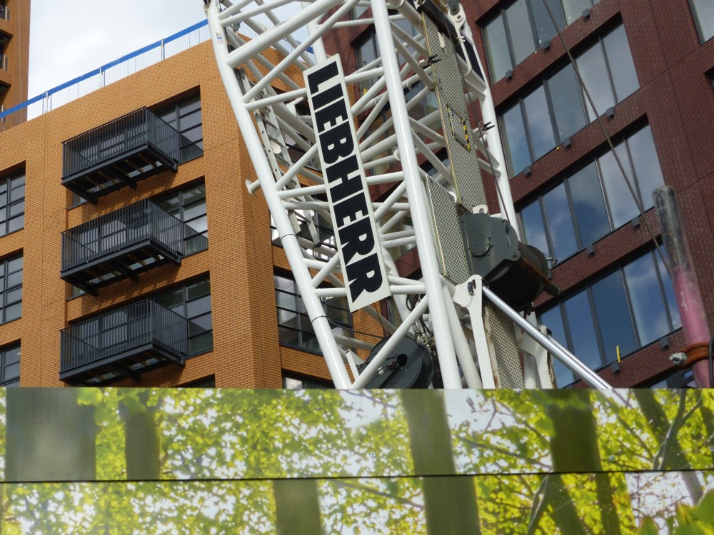
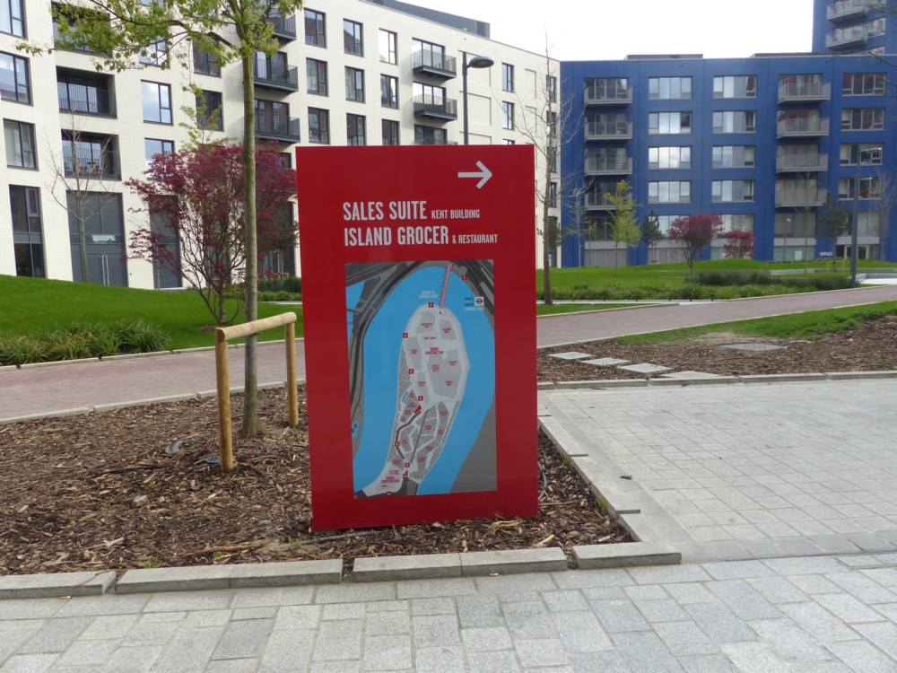
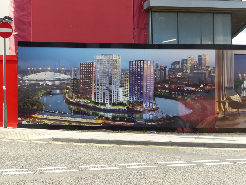
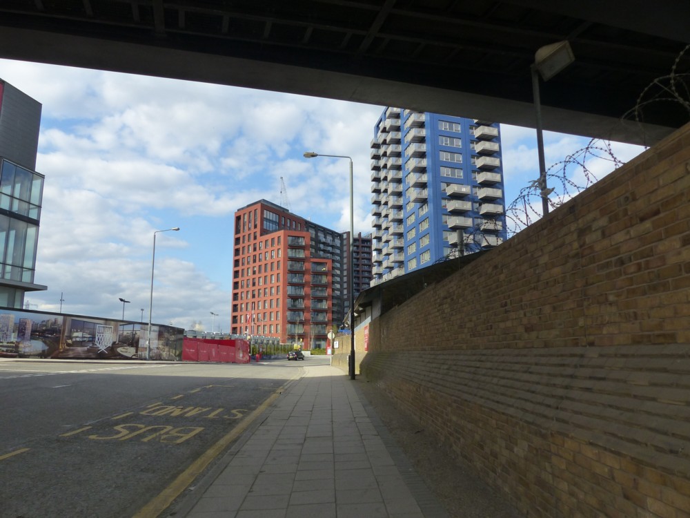
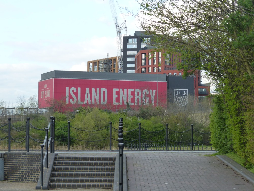
As you can see, there are maps and images as well as photos of the finished objects, to tell you what this place was going to be like. And cranes.

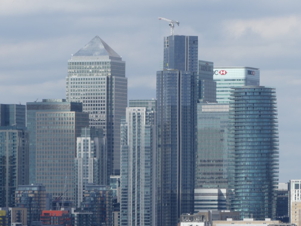
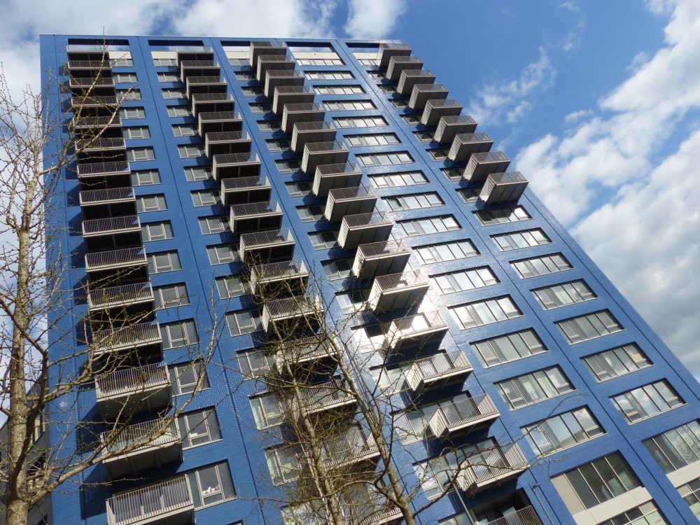
City Island is a particularly perfect illustration of what Modernist Architecture has now become, and as I have said here before, I quite like it. I especially like how City Island has what amounts to a moat around it, which gives it the appearance of a micro-Manhattan.

I entirely understand why Ancientists think that Ancientist architecture should also be allowed, and I’d also quite like to see more of that. But I suspect that if there were more of that, even the protagonists of such buildings would find themselves being somewhat disappointed, both in how others react and in how they find themselves feeling about what they were in theory so keen on seeing.

The basic aesthetic problem that new building of the sort we see on City Island is the sheer amount of it that is liable to be happening at any given moment. If lots of buildings are required, all for some similar purpose, then whatever gets built is liable to start out looking and feeling rather meaningless. And that emphatically will apply, I believe, if a mass of fake-Ancient buildings is what happens. That is awfully liable, at least to begin with, to look all fake and no Ancient. To look, in short, meaningless. So, why fight it? Why not build what makes economic sense, in a style that is rather bland, but efficient and reasonably smart looking, and be done with it?

What gives meaning to buildings is not just the way they look when they first appear; it is the life and the work that subsequently get lived and done in them. Because of those things, buildings acquire a particular character, and people start to have positive feelings about those buildings, provided of course the life and work they associate with the buildings is something they also have a positive feeling about.

If people hate what happens in new buildings, they’ll hate the buildings and yearn to see them destroyed, no matter what style they were built in.

Wooden maps of the world’s cities

So I did a rootle through the latest stuff at This Is Why I’m Broke, and came upon these rather classy looking carved wooden maps of cities:

The one on the left is London, and sadly, nobody told them that London has been doing a lot of expanding lately, in general, and in particular out eastwards. I’d have preferred wider coverage, including such things as the Thames Barrier. Not that it matters to me, because CDs and books mean I have no wall space at all for such things.

The one on the right is Brisbane. I include this map because the river that runs through Brisbane and which presumably provoked that city’s creation, is positively Parisian in its convolutedness. Apparently, this Brisbane river is called the Brisbane River. I did not know any of this.

The top bit of Alderney looks like a conductor

Yes. Did you know, that the top bit of Alderney, the northern most Channel Island, looks like a conductor. With a baton.

Photo on the right there, photoed by me from the plane back to London from Brittany, in July 2007. Now suitably rotated and cropped.

It would seem that a lot of people don’t know that. I can find no other references to this on the Internet, but cannot believe that I am the only one to have noticed this important musico-geographical fact.

Did you also know that the French for a conductor’s baton is “baguette”? That may be quite wrong, but I do recall hearing this somewhere, from someone. And it would seem that there may be some truth in this notion.

Police horses

Friday is my day of the week for creatures of all sorts, and today BMNB has already featured a butterfly and a bee. But now, four horses, spied and photoed by me, near my home, on my way home from shopping, this very afternoon:

The first two. brown and black, were past me before I could get my camera out from under my shopping, so I only got them from behind. But the second two, black and white, I saw coming from a distance, so I got a better photo of them. But then, another photo of the rear end of the white horse seemed in order, because the colouring of this horse was so pleasing. I seem to recall, as a kid, being told that white horses are called “grays”. This photo perhaps explains why that might be. White horses of a particular sort have a natural tendency to turn gray, in parts. Is that it? Could well be.

These were Police horses, of course, them being the only sorts of horses to be seen around London SW1. Police horses need to live near where these demos are liable to happen, but in between demos they need exercise. They can’t just be stored in a shed, like guns or truncheons or complicated cars. And, around where I live is the perfect spot for this exercise. It’s an area bounded by busy roads with names you’ve heard of, like Victoria Street, Horseferry Road, and by the River Thames. But in between these roads, nobody goes, because this place is not on the way to anywhere else. So, perfect for SW1 Police horses to stroll through without any nasty surprises or causing any traffic complications with their slow pace of movement and their preference for walking next to each other.

West Taiwan

Of this, which seems to be an adaptation of this …:

Glenn Reynolds says:

I almost wish Trump would tweet this out …

For me, there’s no “almost” about it.

Map of walking spots in London

Came across this today:

It’s a map of all the nice places you can walk through or along in London. I do lots of walking. This map has lots of words, which are searchable, so I may find this quite useful, to create Official Designated Destinations (these being the things that get me out of the house (actually my block of flats)).

If your eyesight is anything like mine, you’ll need to open that image in a new window

I found it at Londonist, but the map they showed had such low resolution that I couldn’t read it. What was it? One of my photos? No, but it might have been. I found a better version. Again with the words. Once you have the words, you can find anything.

London has a lot of parks, doesn’t it?

Urban picturesque with Shard

Same formula as the previous post. Ooh that’s nice:

But puzzle. What is it? We see the Shard there, but where are we? What direction are we looking at the Shard from?

Context:

We are at the Dome end of the Dangleway, looking across the Greenwich Peninsular towards the towers of Docklands, with central London beyond. The City cluster is not visible, but the Shard is.

I still don’t know what that blob in the middle of the sky is. Mercifully, it isn’t to be seen on any of the other photos I photoed at this time.

The tall pole with sticking out bits in the original photos is for hanging banners, saying things like: “London Olympics 2012”, 2012 being when all these photos were photoed. Now, there are Machines-For-Living-In Things in the foreground, next to and just south of the Dome, and a great many more bigger Things in the Docklands Tower Cluster.

The photo on the right, featuriing the Dome, was photoed as I began a Dangleway journey across the River to Victoria Dock.

I love that part of London. An essential part of that being because it keeps on changing.

More London

Back in March 2019, on the same day and just before I photoed these photos, I photoed this photo:

What I like about that is what I also find weird about it, which is the way that this metal circle of 3D map information kind of hovers weightlessly over the pavement.

Luckily I soon found another photo which explained this weird effect with logic:

But now, there was another mystery. What is “morelondon”? Turns out it’s More London, which was the place where I was.

Here are some more photos I photoed at the same time as the two above:

The reason I made them look so small in this posting is in the hope that you will be deceived about what is going on, in photos 1 and 4 there, 1 especially, 4 in a general way, but 1 in a very particular way. Click and you’ll surely see what I mean.

The strange coloured-in statues are, I now learn, by Stephan Balkenhol. More about him here. At the time I recall wondering if they were Art, or just advertising of some kind. Art, it would seem.

The view from The Point

I’ve already done several photo-postings about that walk Alastair and I did, from Blackheath to the Dome. There was that posting that rhymed. There was a cat. There was that amazing photo of the River that Alastair did. There was Lord Nelson. Well, time for some photos taken at our Official Designated Destination. Our actual first thing we decided to visit which would supply me with plenty of photo-opportunities, after we had met up at Blackheath Station, was this:

Beyond the Point Hill sign is The Point. We got to that by walking up … well, here are a couple of maps. On the left, how to get from Blackheath Station to The Point. And on the right, why you would bother, the point of The Point being what you can see from The Point:

The point of this first photo is to explain why the photos that follow are the sort that you might not consider to be that great:

This was not the first photo I photoed from The Point, but it makes my point, which is that what you can see from The Point is most of it a really long way away. The photos that follow are all very zoomy.

For me the most striking Things to be seen were the Docklands Towers. There are now quite a lot of them, compared to how many there were when I vaguely recall last visiting this spot.

First, two views of the entire Docklands Cluster:

And next up, a couple of close-ups of this same cluster:

The light could have been better, but it was what it was.

I really like how Docklands is turning out. One or two of the towers there have a bit of distinction about them, especially One Park Drive. But the sum is greater than the parts, I think. This is because almost all these towers go straight up. There are no Gherkins, Cheesegraters, Scalpels, Walkie-Talkies or Cans of Ham. Just gravity following towers done in the most efficient way possible. And the result is a classic spontaneous order of skyscrapers, all done in the modern vernacular. Without gravity, there’d be little logic. But with gravity, and without the starchitectural urge to defy it, it is all starting to look rather impressive. I like the City, with all its weirdness and eccentricity, but I’m glad London also has a classic skyscraper cluster in the form of Docklands. It can only grow and only get more impressive.

I like the idea of people looking at photos of it, and saying: Where’s that? “London.” London? I’d never have guessed.

Off to the right, we can see the Dome:

The stuff to the left of the Dome is the muddle on the other side of the River, to the east of Docklands. The sooner that muddle gets gobbled up by the Docklands Tower Cluster the better. To the right of the Dome, south of it, on the Greenwich Peninsular, there’s already more stuff rising up, with more to come.

Off to the left, all the eccentricity of central London is duly on show, but even further away:

Let’s take closer-up looks at bits of that:

The photo on the right is a different photo. But the image on the left is a detail cropped out of the bigger and more panoramic shot. In that left hand shot you can clearly see the BT Tower in the distance there, as also One Blackfriars, looking very squat and far less elegant than it might have. For which, Alastair reminded me, we can thank Prince Charles.

And speaking of way in the distance, Alastair also helped with this next photo. Basically, he directed it and I just pushed the button, what with his eyesight now being so much better than mine:

Now that I’m home and looking at a screen twenty inches or so away from me, I can clearly see both The Wheel, and … the new Wembley Arch. I could dimly perceive the Wheel on the day, but the Wembley Arch I totally took on trust. Yet, there it is, way off in the distance on the right, being hovered over, like waiters, by two cranes.

And on the right, a new central London architectural eccentricity, in the form of that strange white triangle that is often to be seen now in photos of London from the south east. It looks like something you might click on to get video to play. But that’s the Scalpel.

So, there it is. That’s how the Big Things of London are/were looking during the Lockdown of 2020. Will London continue to develope, or will it pause for a decade? Or longer? We shall see. Or I will. I hope.

Memo to self: Go back there on a sunnier day. In a few weeks time, after it’s cooled down a bit.

Taking off from London City Airport in 2014

There’s no way I’d be inflicted the job of sticking up these thirty photos upon myself, let along the actual photos on any of you, were it not for the magic of WordPress Gallery, which enables me to shove them all up in one big lump, and you to click through them with just twenty nice clicks. Or not. As you please.

As if often the case, I display them in spite of their photographical quality, but because what they show is so interesting. My plane that day took off right over my favourite clutch of places in the whole world.

Here’s where the plane took off from, flying from right to left:

And here is what I photoed from it, presumably in defiance of the instructions of the people bossing the plane, from just before take-off until we arrived, I’m pretty sure, at the English Channel. I was on the left of plane, pointing my camera south towards the River, at any rate at first:

I particularly like the early ones there, of the territory between the western bit of the Victoria Dock and the River. We clearly see the Thames Barrier, and the Dome of course, but I love all that ever-changing muddle in between. I may well, although of course I promise nothing, be using some of those photos again, one at a time, when discussing the details of how this part of London has changed, is changing and will change. No way does it look the same now.

Later you can see, I think, the Walthamstow reservoirs (which call themselves the Walthamstow “Wetlands”), a golf course (which one, I have no idea), a very particular road intersection (ditto), and an aerial view of The Scream, that painting of a woman screaming, with a friend. Then, would that be the Isle of Wight? Don’t know. Commenters who like this kind of thing can, if they wish, elucidate.

If that’s right we did a 270 degree turn, first going north and then going south, on our way to Brittany. Presumably this was to make sure we kept well clear of anything to do with Heathrow.