David Bowie dead – 2005 Ashes winners alive

Wandering along the Strand towards Embankment Tube, after Turandot had finished, I spied this sign on the inside of a shop window:

I had not realised that there are now David Bowie stamps. Apparently so. Ten in all. The ones above, and six more featuring LP covers.

You know what they mean, but the phrase “DAVID BOWIE LIVE” seems rather … jarring. What got Bowie onto these stamps now rather than any sooner, was that instead of being live, he is now dead (LINK TO THE OLD BLOG). Only dead people, or royals, can be on stamps, right?

Not quite. If you were an England cricketer playing in the 2005 Ashes that England won, you might also have become an honorary royal:

Scroll down here, for that picture, together with some rather sneering and very Australian references to Britain’s alleged lack of sporting prowess, which (says the Australian sneerer) explains why so many went crazy (LINK TO THE OLD BLOG) when those Ashes were won. And why the Post Office also went crazy and broke its own rule of us only being allowed, on stamps, to see dead people.

IKEA furniture – Lego furniture?

So I had a look around Dezeen to see what’s there that’s interesting, and their most popular posting right now is about IKEA. All I saw, for several days, was: IKEA. So I ignored it. But on close inspection, the posting is actually rather interesting. Its title is: IKEA switches to furniture that snaps together in minutes without requiring tools.

Quote:

The fiddly ritual of assembling IKEA furniture is set to become a thing of the past as the furniture giant introduces products that snap together “like a jigsaw puzzle”.

The brand has developed a new type of joint, called a wedge dowel, that makes it much quicker and simpler to assemble wooden products. This does away with the need for screws, bolts, screwdrivers and allen keys.

My chosen destinations for furniture are charity shops, mostly. That or basic second hand places. Partly that’s an aesthetic preference. I take pride in the cheapness of my living arrangements, that being my preferred look. But part of that is because I have always assumed that flatpack furniture is indeed too fiddly and complicated to be relying on. Also, frankly, I basically just don’t like IKEA’s furniture.

But for those who do like IKEA furniture, it looks like it is about to get a bit simpler to assemble.

Thought. Does Lego make furniture? I just googled that question, and google answer number one was this:

A company is making furniture that is like giant Lego for your home:

This furniture is designed to be taken apart over and over again.

It is called Mojuhler and is flatpack, modular furniture that can be changed from a chair to a table in minutes.

You can fund the project on Kickstarter from about £80.

Nice basic idea, but scroll down and you get to pictures of brackets and screws! Screw all that, and not with a screwdriver. It looks more like Meccano than Lego, I’d say. It says on the right at that place that it failed to get its funding. If that’s right, I’m not surprised.

This is more what I was thinking.

One of the basic drivers of design is the desire to own bigger versions of the stuff you played with as a little kid. A lot of Art is like this, I believe. So, why not furniture too?

Originally posted at Brian Micklethwait’s Old Blog

The outdoor map next to the Twelvetrees Crescent Bridge over the River Lea

I like London’s (England’s?) long, thin, very vertical, outdoor maps. Whenever I am out and about photoing, I photo them:

There’s nothing like a photo of a map with “You are here” on it, to tell you exactly where you were. That’s where I was, early on, on the day I later took these pictures.

Seriously, it is often quite difficult to work out exactly where I was when I look through the products of one of my photographic perambulations. This kind of snap turns it from difficult to obvious.

Especially if you can actually see the bit where it says “You are here”, like this:

I’ve recently been on several expeditions to this intriguing part of London, with its convoluted waterways. Maps are nice, but there’s no substitute for actually being there. With a camera.

Originally posted at Brian Micklethwait’s Old Blog

Guess what this is

I’ve been meaning to post this image here for some time:

Guess what it is. If in doubt, look at the categories list below. Then go here, to confirm what you must surely have worked out.

Many have described the event at which this happened as historic, but not because of this. But I reckon what you see in the above picture is what historians will end up being most impressed by, about this event, because it was a very public manifestation of a very impressive sort of technology, which is going to have a very big future.

Originally posted at Brian Micklethwait’s Old Blog

Are London’s cranes about to depart for a few years?

Usually, I do quota postings in the small hours of the morning. Today, I am doing my quota posting in the big hours of the morning, to get it out of the way before a rather busy day, at the end of which I do not want to be fretting about doing a quota posting. Although, actually, this posting has now turned into something a bit more substantial than that, and I changed the title to something more meaningful. So anyway, yes, cranes:

Ah, cranes! Those structurally perfect votes of confidence in the sky. Those cranes were snapped from the south bank of the river, looking across at The City, on the same day earlier this month that I snapped yesterday’s quota photo. What that new Moderately Big Thing is, that some of the cranes there are ministering to, I do not know, but I like how it looks, in its incomplete state.

With Brexit, will the cranes vanish for a few years, until London sorts itself out and finds itself some new business to be doing? Crexit? (You can always tell when a word has well and truly caught on, because people immediately start trying to apply the same verbal formula to other things. Brexit, verbally speaking, is the new Watergate. Frexit, Swexit, Thisgate, Thatgate, etc. etc.) I thought that the cranes were going to depart after 2008 and all that, but the money people managed to keep the plates spinning on their sticks, and London’s cranes carried on. How will it be this time?

Here is a very pessimistic piece about Britain’s prospects, for the immediately foreseeable future. Does this mean that my crane photo-archive will, in hindsight, be the capturing of a moment of the economic history of London that will now pass? If the cranes do go, how will they look when they return? When the new cranes move in, in ten years time or whenever, will cranes like those above look strangely retro, like digital cameras circa 2005?

Or, will the cranes never return, but instead be replaced by magic electric guns which fill the air with muck and sculpt a building out of the muck, 3D printing style, all in the space of an afternoon?

Originally posted at Brian Micklethwait’s Old Blog

Seven London bridges (again)

I was very proud of this photo of seven London bridges …:

… when I first posted it here.

Today I took another photo of these same seven bridges:

I said I’d check this model of the City of London out, and today I did.

I wish this model included Westminster as well as the City, but it’s a model of the City.

Originally posted at Brian Micklethwait’s Old Blog

Another walk along the river

And I was deliberately retracing steps I used to do a lot of around eight or ten years ago, to see what had changed and what had not. A lot had changed, in the form of a few big new buildings. The rest had not changed.

Did I say that that sunset I recently posted photos of was last Saturday? Yes. Actually it was the Friday. Get ill and you lose track of time. That evening I also took a lot of other photos, on and from the south bank of the river, between Blackfriars road bridge and Tower Bridge, and here are some of the ones I particularly liked:

That array of small photos (click on any you like to the look of to get it a decent size) really should not now be misbehaving, on any platform. If it is, please get in touch, by comment or by email.

As to the pictures themselves:

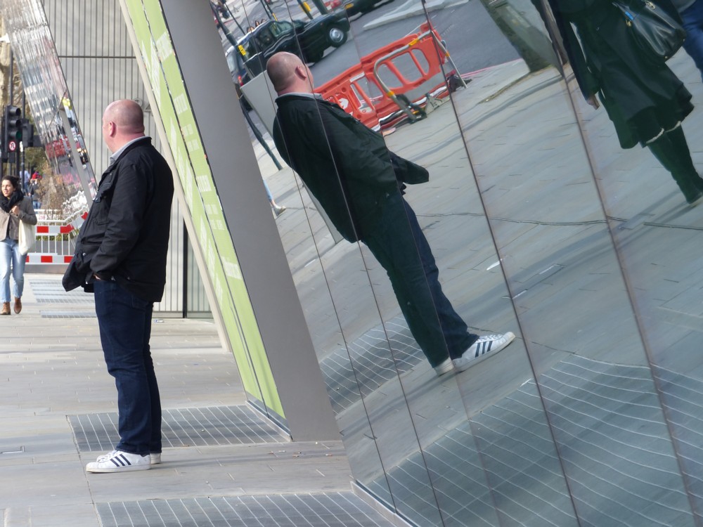
1.1 A Deliberately Bald Bloke standing at the bottom of 240 Blackfriars. (You can see the top of 240 Blackfriars in 3.1 here.) That Deliberately Bald look is, I think, fair game photo-blogging-wise. The guy is choosing to look this way. It’s a fashion statement, not an affliction. Blog-mocking the involuntarily bald is not right, but blog-celebrating those who embrace their baldness is fine. Especially if the guy obligingly turns his face away.

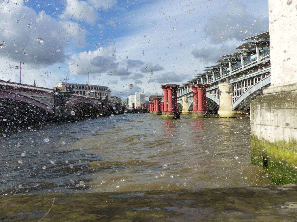
1.2 is one of my favourite weird London sites, namely the topless columns of the Blackfriars Bridge that isn’t, in between the two Blackfriars Bridges that are, the one on the right now sporting a new station on it. The twist is that this was high tide, and waves were rhythmically breaking against a corner in the river wall and filling the air between my camera and the bridges with bits of water.

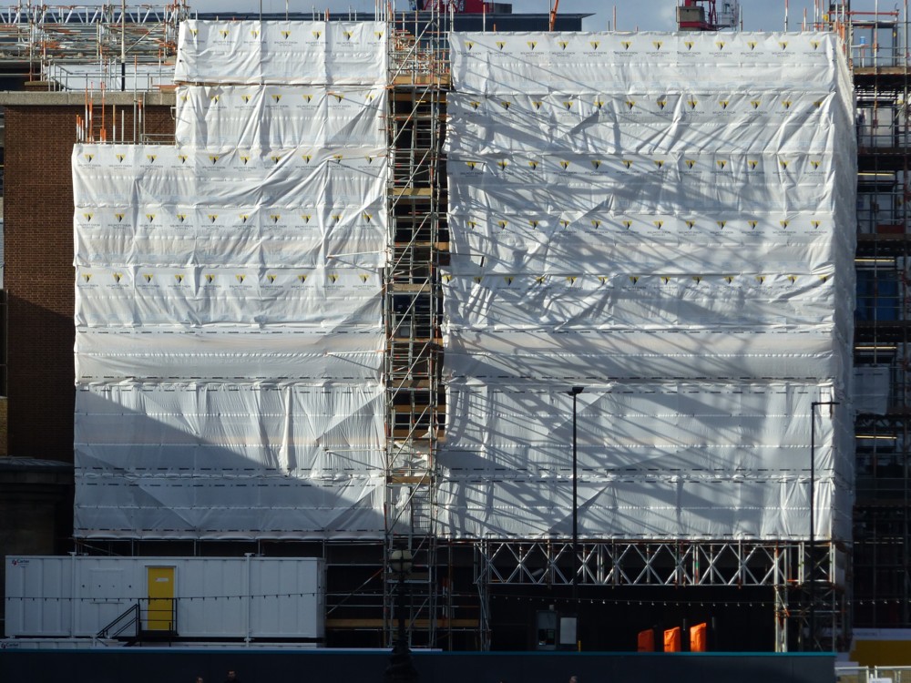
1.3 is a building on the other side of the river. Just beyond the Blackfriars Station bridge. I do love what light and scaffolding and scaffolding covers sometimes do.

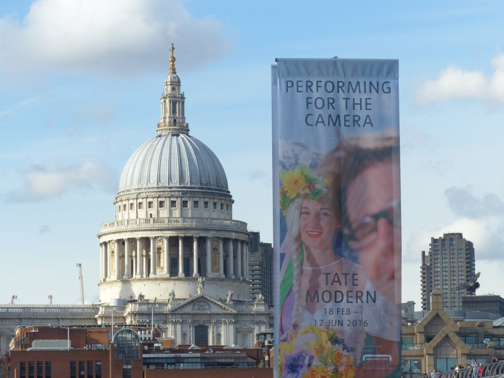
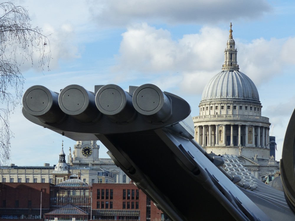
1.4 and 2.1 illustrate the universal photography rule to the effect that if you want to photo something very familiar, like St Paul’s Cathedral, you’d better include something else not so familiar, such as some propaganda for a current Tate Modern show that I will perhaps investigate soon, or maybe four big circles that you can see at the Tate Modern end of the Millennium Bridge.

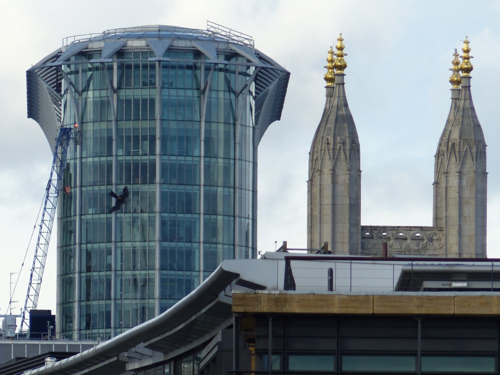
2.2 is an ancient and modern snap, both elements of which I keep meaning to investigate. Those two buildings, the office block and the church, are like two people I frequently meet, but don’t know the names of. Luckily, with buildings, it’s not embarrassing to ask, far too late.

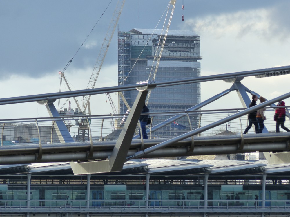
I know what that Big Thing behind the Millennium Bridge in 2.3 is, under wraps, being reconditioned, improved, made worse, whatever, we’ll have to see. That’s Centre Point. It even says most of that on it. I have always been fond of Centre Point, one of London’s early Big New Things.

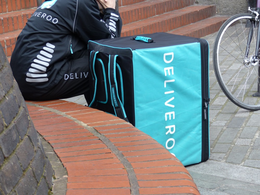
2.4 features something I have tried and failed to photo several times previously, a Deliveroo Man. Deliveroo Men are usually in a great hurry and are gone before I can catch them, but this one was taking a breather. Deliveroo Men carry their plasticated corrugated boxes on their backs like rucksacks, which I presume saves valuable seconds.

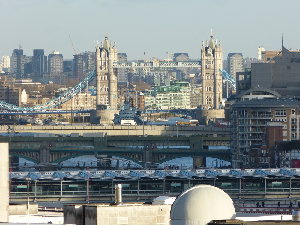
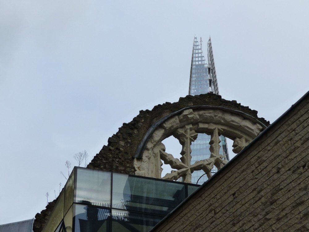
3.1: Another ancient/modern snap. The very recognisable top of the Shard, and another piece of ancientness that I am familiar with but have yet to get around to identifying, see above. I really should have photoed a sign about it. I bet there is one.

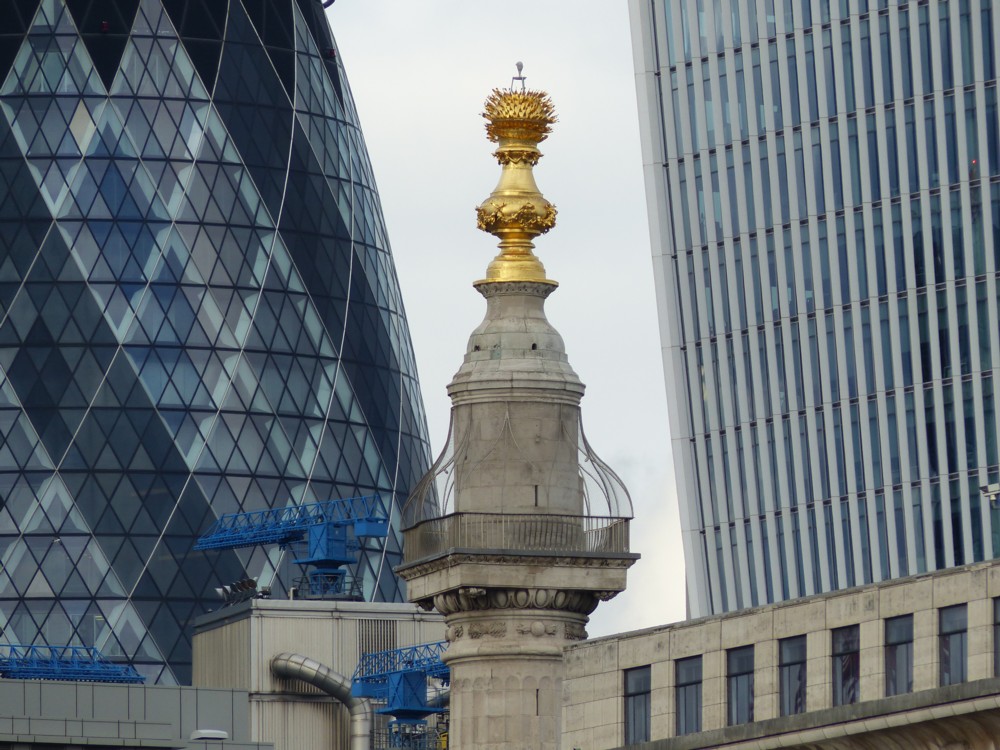
3.2: The golden top of the Monument, now dwarfed by the Gherkin and by the Walkie Talkie.

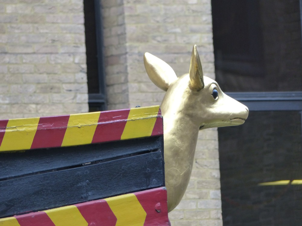
3.3: A golden hinde, which is to be found at the front of the Golden Hinde. I’ve seen that beast before, but never really noticed it.

3.4: Another ancient/modern snap, this time with Southwark Cathedral dominating the foreground. The combined effect yet again vindicates Renzo Piano’s belief that the Shard would blend into London rather than just crow all over it. Those broken fragments at the top echo the four spikes on the nearby Cathedral. It looks that way to me, anyway.

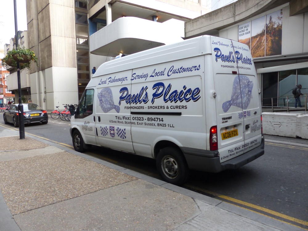
4.1: Another delivery snap, this time of the old school sort. A White Van. But with lots of propaganda all over it, notably the back door, in the new school style.

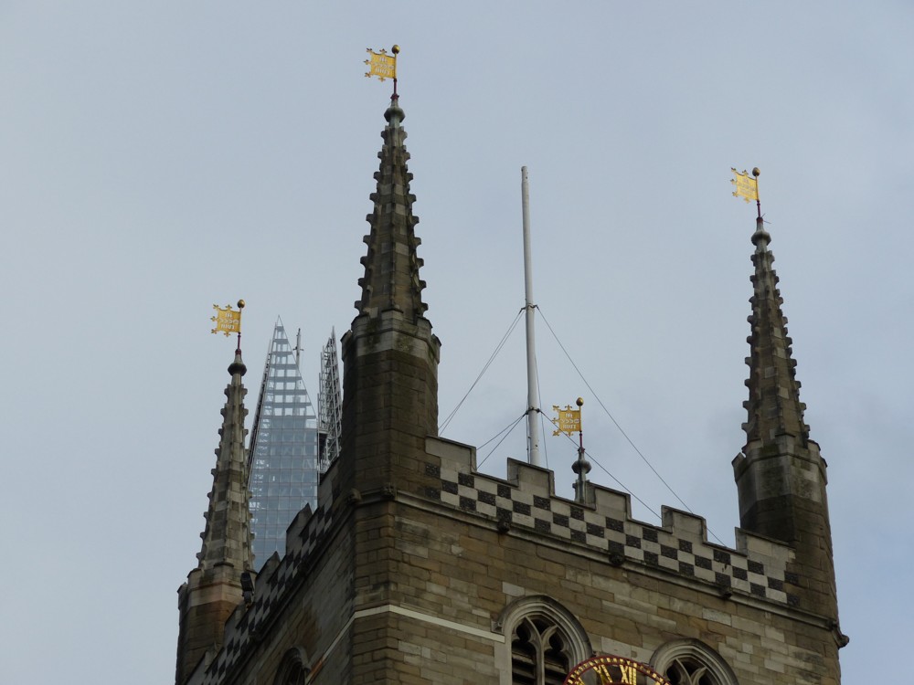
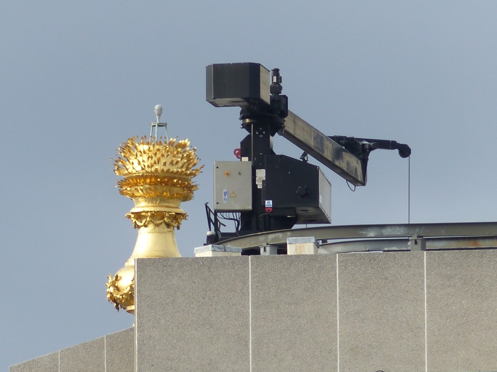
4.2: Yet another ancient modern contrast, this time the Monument, again, with a machine for window cleaning. Note that small tripoddy object on the top of the Monument. I suspect that this is to give advance warning if the Monument starts to wobble.

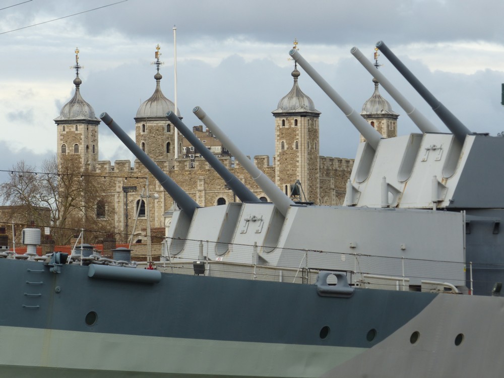
4.3: Two exercises in power projection, now both lapsed into tourist traps. Behind, the Tower of London. In front, HMS Belfast.

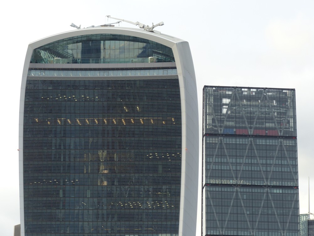
4.4: Finally! Modern/modern! The Walkie Talkie and the Cheesegrater, and probably my favourite snap of all these. Not a view you often see in other photos, but there it was. Should the bottom be cropped away, to simplify it even more. I prefer to leave photos as taken.

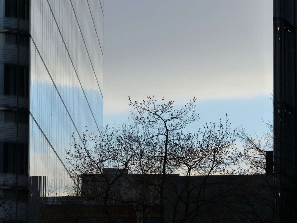
5.1 shows that thing when reflected light is the exact same colour when reflected as originally. Photography is light, so photography sees this. But eyes always try to create a 3D model of what is going on, rather than just a 2D picture. Eyes deliberately don’t see this.

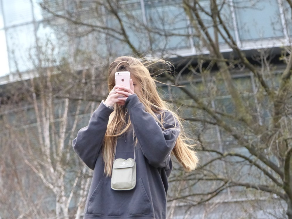
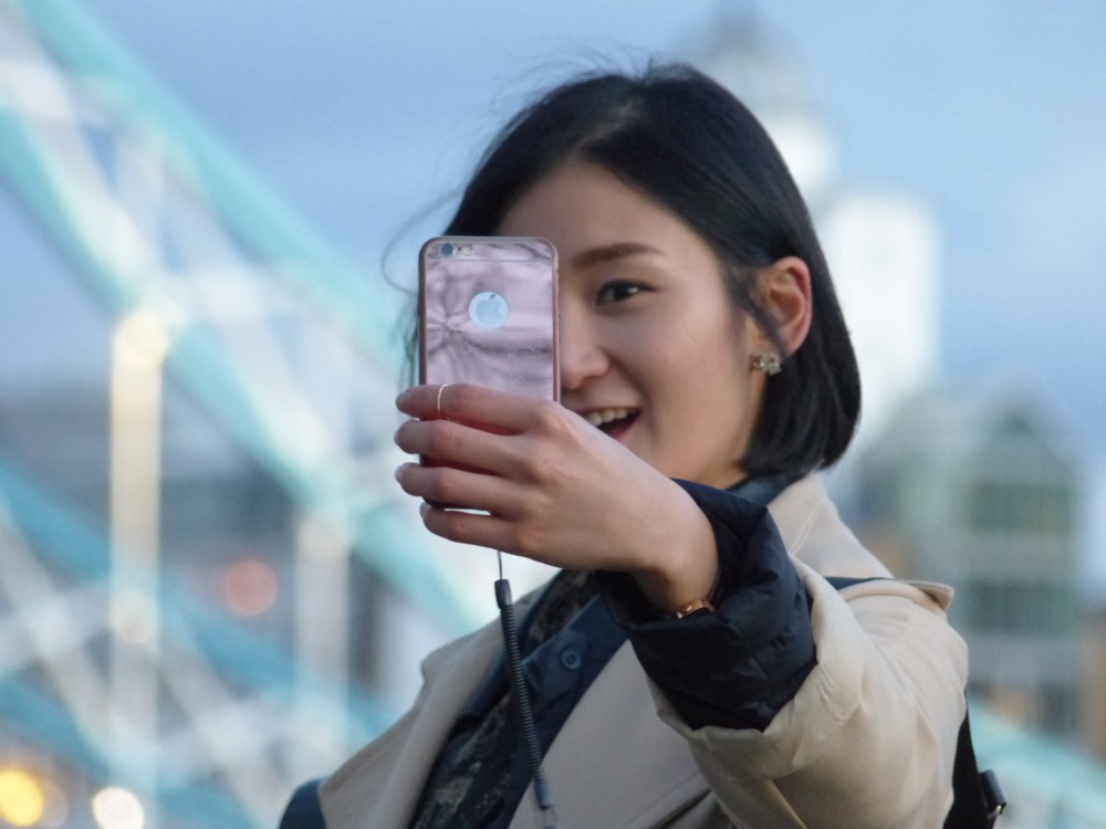
5.2 and 5.4 take me back to my beautiful-women-taking-photos phase, which was big last decade. These two were too good to ignore. They were just so happy! But, mobile phones, which is very this decade. Just like my cameras, the cameras in these just get better and better.

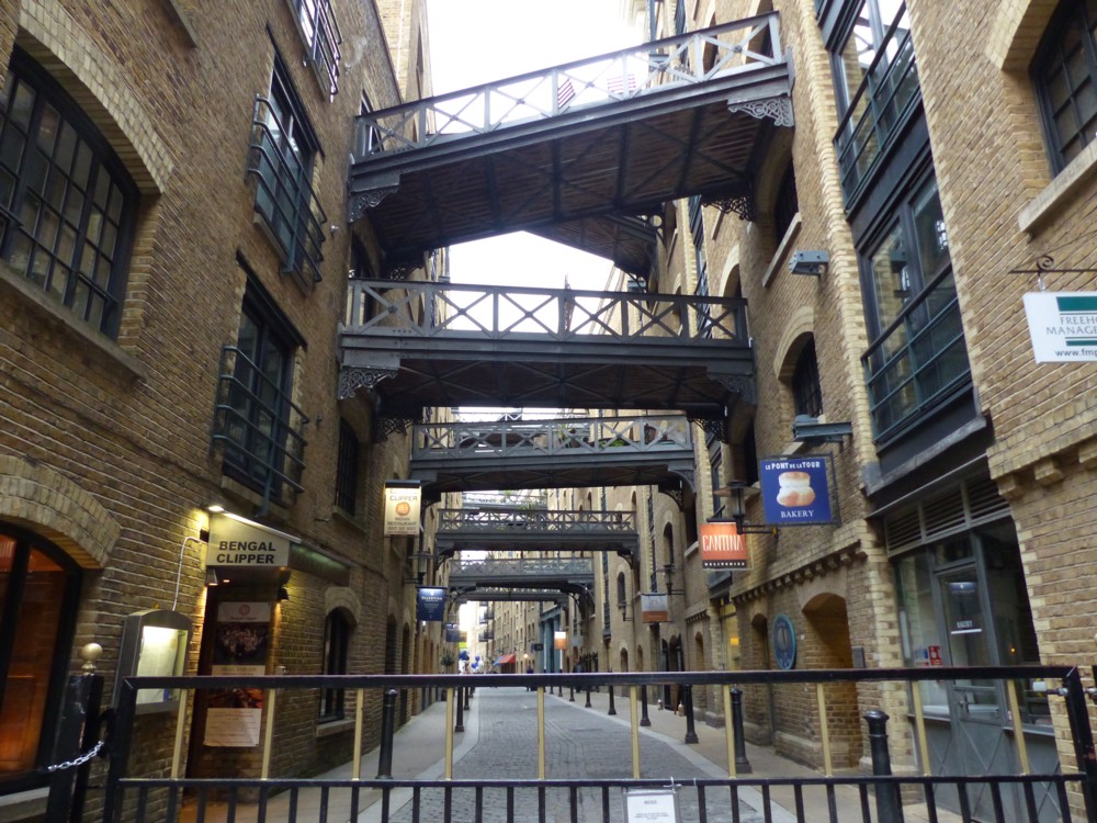
5.3 is another view of that amazing cluster of footbridges.

Originally posted at Brian Micklethwait’s Old Blog

Magnificent The Wires! sculpture gets noticed because of a concrete temple next to it

Yes, a truly wonderful The Wires! sculpture gets long overdue recognition from Dezeen, on account of a lump of religious concrete being put next to it, by an architect.

The photographer clearly loves The Wires!:

But Dezeen’s writers are under strict orders.

It doesn’t matter how beautiful and intricate The Wires! are:

The rule is set in concrete.

Don’t mention The Wires!

Originally posted at Brian Micklethwait’s Old Blog

More Big Olympic Thing photos

Yesterday morning from first thing to about midday, I had a nosebleed, caused by my lurgy, a lurgy which is lasting for ever. During this lurgy, I have had several nosebleeds (having never had a nosebleed in my life before), yesterday’s being by far the worst, and it cannot be coincidence.

Since then, I have been recovering my wits, such as they are, and am accordingly now in quota photo mode. And here are today’s quota photos, all of them of the Big Olympic Thing, designed by the man who also did the Chicago Bean, Anish Kapoor:

The photo on the left was taken in March 2012, from the Victoria Docks area, looking north, and the one of the right was taken looking south from Walthamstow. The one on the right (with all its excellent roof clutter in the foreground) being an example of a common thing at this blog, namely a good photograph, taken badly. (The one on the left, though I say it myself, is a really quite good photograph, taken really quite well.)

Trouble is, whenever I do one of these postings about some Thing, which I have a nice photo of to show you, I then go trawling through the archives looking for more photos of the same Thing. Here are two more pictures of this Big Olympic Thing, this time with foliage in the foreground:

The one on the left of those two, behind the trees was taken from Stave Hill, looking east (guess). And the one on the right was taken from the big road just this side of the Victoria Docks. These two photos were (left) taken in August of last year, and (right) in 2012 (about week after the sunset photo above).

The most recent of these four photos, the only one taken with my latest and undoubtedly my best camera, is by far the worst, technically. This is because, for that photo to work, the light had to be very good, but it was not. A less good camera with perfect light trumps a better camera with poor light, for me, usually, given the sort of outdoorsy, long-distancey photos that I generally like to take. I’m hoping my lurgy goes away soon enough for me to take advantage of this summer, and all its light.

As you can surely tell, I consider the Big Olympic Thing to be a fine contribution to London. It is not beautiful, exactly, but it is extremely recognisable. Every time I happen to see it in the distance, I immediately know what it is, and it lifts my spirits.

Originally posted at Brian Micklethwait’s Old Blog

London is getting more colourful

Here is a piece I did here about how Modernism got associated with whiteness. And for most would-be Modernists, Modernism still is white. But, here is another piece I did about coloured Modernism, in the form of Renzo Piano’s very colourful buildings near Centre Point. (Renzo Piano also designed the Shard.)

Here is another photo I took of these, I think, delightful edifices:

And here is a faked-up picture I came across not long ago, which suggests that Piano’s colourfulness may have struck a chord with other architects:

That picture adorns a report about the footbridge that you can see on the right of the picture, the very same one that I saw being installed last August. But I think you will agree that the towers on the Island there are a definite echo of that Pianistic colour.

The great thing about coloured architecture is that you can build the most severely functional lumps, and only worry about brightening them up afterwards. Form can colour function, and then colour can cover up the form and make it fun.

But it need not stop at just having one plain colour. Soon the artists will join in, and there will be giant murals.

If I had to place a bet about how different London will look from now in thirty year’s time, this would be the change I would bet on. Both new buildings and dull old ones will be much more brightly coloured.

I’m guessing that outdoor paint is a technology that has had a lot of work done on it in recent years, and that such work continues.

I will be interested to see if those Piano office blocks become faded, or if the colour stays bright for a decent time.

Interestingly Le Corbusier was a great one for colour being slapped on Modern buildings, but the notion never really caught on. Or rather, it is only now catching on.

As is illustrated in this posting at Material Girls. Where the point is also made that another huge influence on the monochrome association with Modernism was early and black-and-white photography. Even colourfully painted buildings didn’t look coloured in the photos. (One might add that newspapers and magazines only burst into colour after WW2, in the case of newspapers only in the 1960s. Until then, all newspaper and magazine photos were printed in black and white. So even if Modernism was done in colour, its influence spread in black and white.)

Now, colourful buildings tend to look colourful, both for real, and in the photos.

Originally posted at Brian Micklethwait’s Old Blog