Poetic perfection in a reopening pub

Rebecca Day tweets:

I’ve spoken to regulars Chris and Jimmy. Jimmy hasn’t gone to bed after his night shift tarmacking the roads. He had a shower and came straight here. He described the taste of his first Carling as being like an ‘angel pissing on the tip of my tongue’.

In her original tweet, Rebecca Day put “p***ing” and “his” tongue, so I’ve restored what Jimmy said to its original state of perfection. You’re welcome.

One of the services this blog supplies to its regular readers is to pluck occasional pearls of perfection like that (or that (or that)) from the torrent of swine shit that is Twitter, or at any rate what Twitter seems to turn into for many people.

John Duffin painting on Blackfriars Bridge ten years ago

Ten years plus a few days ago, I was checking out the work that was beginning to be done making the new BlackFriars Bridge railway station. And today, I checked out the resulting photos, Here are six of them:

Photo 2: Sampson House and Ludgate House, again. Photo 4: The Shard, just getting started. Soon after those photos, I photoed that black bus.

It was a somewhat gloomy day, and my camera wasn’t as good as what I have now, so I was glad to come across a couple of photos of a painting. And because I took such a good note of the painting, in the form of a photo of the painting and of its title and creator – memo to self: always do this – I was able quickly to track down a better digital version of the painting:

Reminds me of this photo of mine, but it’s far less of a muddle.

John Duffin, it would appear, sees London in the same way I do and, I’m guessing, the way lots of others do. He pays attention to landmark buildings, and all those bridges of course, and kind of recedes everything else more into the background. Cameras don’t discriminate. You have to point them at particular things if you want them to emphasise those things. Otherwise, to emphasise this or that, you have to do bullshit graphics manipulation. Or if you can’t or won’t do that (that would be me), write an essay.

I thought: does John Duffin have a website? Of course he does.

Here are a couple more Duffins:

On the left, many more London bridges, from the Albert (I think) Bridge in the foreground, all the way to Tower Bridge. And on the right, oh look, that’s Lord’s cricket ground. Nice player shadows.

I love how, with a camera, and provided you photoed notes as well as photos, you can pick up where you left off a decade ago.

Now thrive the scaffolders and the craners

Quota photos, yes, but I trust amusing ones:

That’s the Tate Modern extension nearing completion, photoed by me five years and one day ago. So not really now. But the scaffolders and the craners do now still thrive.

Quota photos because I spent the morning failing to finish another piece of writing which just grew and grew. And now, I have to go out and Do Things, which always tires me out these days, so I wanted to have something here before I went out. More later. Maybe.

I hate not being able to go up that Thing and photo London and photo others photoing London. Can wait until it opens. And will. But would prefer not to be having to.

A garden centre in Vauxhall

Just after checking out that China Works Tower, on May 25th, I walked along Black Prince Road, under the big railway that goes into Waterloo, and turned left into Newport Street. There I came across this place:

This is, Google Maps tells me, Spring Gardens Nursery, that being their Facebook page. There you will see photos that emphasise the plants they sell rather than the wire fence at the edge. But when I went there, Lockdown was in full lockdown mode, so I had to make do with photoing through that wire.

It all looks rather temporary, an impression strengthened by a sign (see photo 2 above) with the words PLANNING NOTICE at the top. All the more reason to enjoy it while it lasts, if it doesn’t. Or, if you can’t visit or don’t reckon it to be worth all the bother, you can click on my photos.

Did I say temporary? If you go here, scroll down a bit and watch the video there about the “Relocation” of whatever exactly this is, you learn about how … whatever it is … “moves from Tate Britain to Vauxhall, for permanent installation”. Permanent.

But only originally. It would seem that this Thing began as an outdoor Art Gallery, and ended up as a Garden Centre for selling plants. The shop, in other words, took over the entire place. Guess: Getting people to just stare at Art Stuff became a problem, because it wasn’t lucrative enough? Guess: Their grant got cut? So, they expanded the shop bit and the Art retreated. Now it’s just a shop. A very nice shop, I think, and out-of-doors. But, a shop. At which point, the place having degenerated into mere capitalism, it becomes vulnerable to bigger and richer capitalists who want to buy it and put Machines For Living on top of it, instead of merely one little layer of plants.

All this is taking place in something calling itself Vauxhall One, hence the big coloured letters in my photos, beyond all the plants. I can see from this website what “Vauxhall One” says it does, but I am not yet clear what Vauxhall One is. I think it may be the name of a Creative District, or some such thing. Anyone?

All of which is only me guessing. This place is only a longish walk away from where I live, which is how I came to be photoing it during Lockdown in the first place, strictly for the exercise you understand. So, memo to self: Go back there in a while and check out what happens. Maybe: nothing. Maybe just, more plants.

By the way, “Beaconsfield” (see the last two photos above) is an actual art gallery, still, it would appear. Shut now, of course. Memo to self: Check that out too.

China Monty

Last night, as already mentioned earlier today, I went to Sainsburys in Wilton Road. On my way there, I passed the Royal Trinity Hospice charity shop, also in Wilton Road, where I photoed thus, through the its annoyingly shiny shop window:

On the left, a very reflection-ridden photo of a generic beefeater jug, and a Field Marshal Bernard Law Montgomery jug. On the right, a better close-up of the Monty jug. Well, I think they’re jugs. I couldn’t see if there were handles on the back. But they sure look like they’re one of these and one of these.

And if that’s right, then they are both products of that exact same pottery enterprise, Royal Doulton, that used to be at that China Works place I’ve just recently been out photoing.

When I photoed these jugs last night, I did not know this.

Somewhat more seriously, I think it worth asking why public statues are not more realistic, in this exact sort of highly colourful way. Why, to put it another way, were these guys (on of them being Monty again) were not done in a similar way to the way that the above items of pottery were done?

Is it that statues please people by being very obviously statues, and not actual people? Too realistic, and statues would freak people out. I’m more sure that this is an interesting question than I am about the answer. Maybe it’s just that people have got used to statues being monochrome, and they expect them to go on being that way. Maybe they tried doing them in colour, but people complained that they looked too much like china jugs, rather than like proper statues.

But as the technology of this kind of thing gets better, and as colourful architecture becomes more of a regular thing, will public statues suddenly become colourful also, again?

WHAM!

While searching the photo-archives for something else completely, I came across THIS!:

I photoed the above in the summer of 2016, in the Tate Modern gift shop.

Art galleries fascinate me, even though I often don’t like the Art that’s on show in them. And I am in particular fascinated by the gift shops that are now always attached to Art galleries. These places are often more crowded than where the Art is being shown. The above is only one of many, many photos, of Art stuff, that I have photoed in Art gallery gift shops.

In the case of this Roy Lichtenstein stuff, you can make a pretty good case for saying that those cushions, for instance, are as “authentic” Roy Lichtensteins as the “original” painting that the cushions were copied from. After all, the “original” painting was itself a copy, of something a lot like the cushions. And the original comic that Lichtenstein copied his painting from was mass produced, just like the cushions. Only the fetishism of the authentic unique object, by an officially recognised Artist, is holding back the dam of absurdity here.

I’m guessing that the business that Art galleries do in their gift shops, and in their equally vital coffee shops, is the difference between economic famine and something more like feast.

I also think that Art galleries are popular places to spend time in, again not because of the Art, but because of the quiet. Art galleries do not, on the whole, play annoying music, and talking in loud voices is considered boorish. The result is something a lot like a church.

Adam Nathaniel Furman – Colourful Modernist

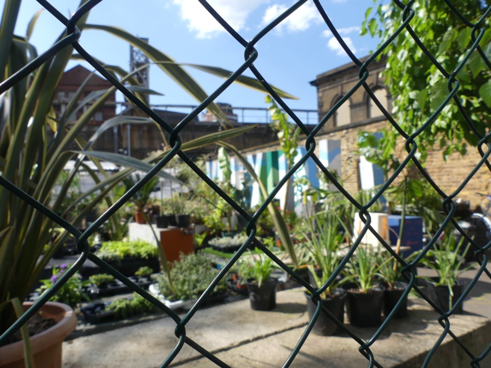
Here we go. Colourful Modernism is on the up-and-up:

Design education “brainwashes” students into rejecting colour, pattern and ornament, according to Adam Nathaniel Furman, who said a group of London designers is finally overcoming bias against their use.

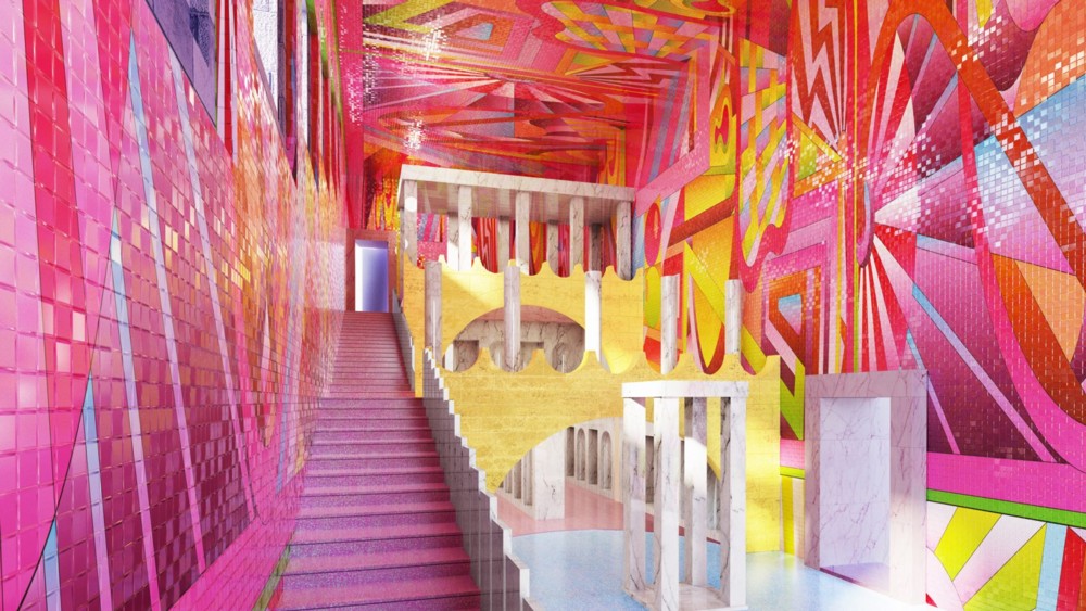
Furman named the movement “New London Fabulous” and described it as “design and architecture as a visual and cultural pursuit, which is highly aesthetic, sensual and celebratory of mixed cultures”.

The thing you have to understand about “architecture” (as opposed to just shoving up machines for living and/or working in) is that famous architects do most of it, and you have to work long and hard to become one of these people. What designers and architects aged around 35-40 are fantasising is not what gets done, except on a very small scale.

Architecture is not like Art. Art, you can actually do, now, whoever you are. You don’t need a room full of old people to all agree to spend a huge amount of money on it. (It helps that in addition to costing nothing, Art doesn’t have to “work”, as in: not collapse and not leak, and so forth.) But “architecture” needs just this sort of tedious functionality. So, you need to have spent a life-time impressing the clusters of old people who matter, persuading them that you are a safe enough pair of hands as well as a genius, blah blah. Your contemporaries with proper jobs, basically. So, you spend your life doing architectural propaganda and publicity. You do manifestos, books, essays, and little design jobs that attract disproportionate attention, given their often humiliating size (i.e. lack of it). Like Adam Nathaniel Furman is doing. Then, when you’re about sixty, the old men may pick you from the ranks of all the propagandists and visionaries, and let you build a bank headquarters building or an apartment tower or a museum, and that’s your chance. If that stays up, doesn’t leak, and attracts tourists and sells in miniature form in tourist shops and on postcards – if it is declared to be “iconic”, you then have the rest of your life to go on doing “architecture”. You become, as we now say, a Starchitect. Main rule to follow then: stay alive as long as you can.

Notice how Furman is both turning his back on “Modernism” and yet not doing this. His stuff, if and when he ever builds much of it, will still look “modern”. It is merely that he is utterly rejecting one of the founding principles of Modernism. He embraces colour, and also “pattern and ornament”. As he points out, “Modernism” as originally proclaimed, was often quite colourful. But the colours were just painted on. Colour was not stuck on, in an obviously colourful way. “Applied ornament” was an object of hatred and contempt for the original Modernists, and in practise, as we know, they and their followers mostly shunned bright colours also. Furman intends to apply ornament with colourful abandon.

But, not the old sort of ornament that the Victorians liked to do, and against whom the original Modernists reacted with such disgust. Furman is proposing enough of a change to enable architecture fans like me to see something big happening. What he is not saying, merely because Ancientists also like “pattern and ornament”, is that he actually wants to be an Ancientist himself. Perish the thought. He wants to “celebrate all cultures”, rather than just ours as it used to be.

Personally, I find Furman’s “fabulous” designs more than somewhat garish and over-the-top. But then, I almost always dislike strikingly new architecture, until I see it and get used to it. And whether I personally end up liking whatever Furman builds or not, in London it will fit right in. Why shouldn’t it? Everything else does.

Millais statue close up

Yesterday, I had another go, since I was passing that way, at photoing the Millais statue behind Tate Ancient, following an earlier effort last week (number 2 of these).

The light was the same as then, unhelpfully perfect. But this time I knew to try photoing the great man in close up, as well as from a distance with the whole statue visible. The distance ones were pretty much silhouettes, but one of the close-ups was quite good:

I tried to find a picture (for instance by googling Millais self portrait, or for that matter a photo, of Sir John, to put next to the photo above, to see how much they agreed. But nobody does regular pictures from the angle I photoed that statue photo from, so there didn’t seem any point.

I intend to go back there when the weather’s less good. The great thing about statues, from the photographic point of view, is that, like buildings, they don’t change from one day to the next and they stay where they are.

Another perceptual flip to add to the collection – and why I find such things to be interesting

Yes, I do like these optical tricks that computer graphics makes it so easy for computer graphicists to play on the world.

Says Steve Stewart-Williams of his latest discovery in this genre:

If you cover the bottom of the ring, the top is closest to you; if you cover the top, it flips around.

Indeed. I clocked what was going on simply by scrolling, which I did because I wanted to see the whole thing, not because I had read what SS-W had said about it yet. But instead of seeing it all, I stopped seeing only the top and started seeing only the bottom, and … what he said.

A big part of the core curriculum of this blog, and of its predecessor, was and is something like: “How I see things and how other people seem to see things”. What do I particularly notice? What do you notice? Do you ignore what I notice?

Sculpture draws elaborate attention to itself. So does advertising. I notice both. Roof clutter and cranes don’t care how I or anyone thinks they look. They are just getting on with their jobs. Millions do not notice roof clutter and cranes, but I do, partly because of their unselfconsciously sculptural qualities. Do you ignore or notice some or all of such things? Chances are you do notice and enjoy noticing several if not all of these things, or you’d not be bothering with this blog. But if you ignore, I’m not complaining, just noticing. People vary, a lot.

See also, which is a generalised version of the above paragraph: Art.

But optical illusions are interesting, because, aside from being interesting for the usual fun reasons that people like them, we most of us tend to experience them in the exact same way. It would, for instance, be bizarre if you looked at the above-linked snatch of video and then wondered what the hell SS-W and I were both talking about. Sharing the same sorts of brains, I see most optical illusions in just the same way you see them. Assuming you share my interest in them at all and you see them at all.

Optical illusions thus celebrate what we all have in common. (Except those of us who don’t. Guess: Optical illusions, in addition to being fun, are also a tool to identify people with brain oddities or brain damage. ?)

Here is the previous one of these things that SS-W pointed me to.

Fifteen dancing ladies in 1923

I have now well and truly caught the Shorpy habit (from Mick Hartley mostly). Usually the photos at Shorpy are of Americans, but these ladies dancing (or just posing?) on a beach are British, although the beach is American:

Shorpy calls these ladies a “millipede”, but there are only fifteen of them. Most of them are holding the lady behind’s leg up, but the one at the front has to keep her leg up unaided, and the one at the back is doing no lifting. Just thought I’d mention it.

More seriously, changing fashions in figures is a fascinating subject. These ladies look to me a wee bit more plump than their equivalents now.

I remember noticing when Indian movie stars stopped being fat, and thinking: those Indians are finally eating properly. Good news. High status Indians no longer needed to prove they could afford to eat. They needed to prove that they could resist the desire to eat too much. I’m guessing that 1923 in Britain was still a time when food was somewhat scarce, albeit not as scarce as when these paintings were done.

I spend a lot more effort and time photoing and presenting my own photos than I do searching for good photos by other people. Basically, I let people like Mick Hartley do it for me. And Shorpy. Also this guy (I love that one). Any other photography suggestions would be most welcome.