Brexit taxis

Whenever I see a taxi with an interesting advert on it, I try to photo it. To recycle what I said in this, there is something especially appealing about a large number of objects, all exactly the same shape, usually all decked out in the same bland colour, but each one instead decorated differently and very colourfully.

It would appear that I’m not the only one. Further evidence that taxi adverts count for more, per square inch, than other adverts do, comes in the form of the meme war that this taxi and its advert is now provoking:

The CEO of a plumbing firm has announced that his company will be paying a delivery driver to ride around London in a taxi emblazoned with the slogan ‘Bollocks to Brexit’.

Social media gobbled this up, of course, and the responses were not long in coming. There was this:

And then this:

And there will surely be many more. I hope I chance upon the original, and get a go at photoing it myself.

More taxis with regular adverts will definitely follow here, as soon as I get around to it.

LATER: And, as I should have mentioned sooner, my friend from way back, financial journo Tom Burroughes, is giving a talk this Friday, tomorrow evening, at my place, about Brexit and all that. I anticipate a more subtle and more elevated discussion than the one on these taxis.

Originally posted at Brian Micklethwait’s Old Blog

How photo-collating reminded me of some (other) good modified cliché photos

More and more of my photo-time is spent collating the photos I have already taken. Last night, for instance, I went looking for (more) photos of London taxis with adverts on them. There is something especially appealing, to me anyway, about a large number of objects all exactly the same shape, but each decorated differently. (Some time, I must go searching for my photos of elephants.)

Equally appealing, to me, were those Gormley Men (LINK TO THE OLD BLOG). In that case, each Man was the same, and undecorated in the more usual and rather bland sculpture way. But, each one was in a different place and a different sort of setting. My Gormley Men photos did not need collating, because Gormley had already collated them, by putting all his Men in the same part of London at the same time. Therefore my photos of the Gormley Men mostly collated themselves.

Not so the elephants, or taxis. When looking for taxis, I am looking for taxis photoed in the course of all manner of different photo-expeditions each with their own directories.

But my point is that in the course of all this taxi-collating, I was clicking through literally thousands of non-taxi photos, and I kept coming across non-taxi photos that I particularly liked. Like (like as in “such as” – this is not a command) this one, for instance, taken last June:

I like doing modified cliches in writing, and I also like them photographically. A view, for instance, of some London Thing that has been photoed to death, but put beside or in front of or behind something that is not so usual. Most photoers would regard the above scaffolding as a problem rather than any sort of solution, to the Eros-has-been-photoed-to-death problem.

The scaffolding’s wrapping has the effect of clearing away all the usual clutter from Piccadilly Circus and replacing it with something a lot like sky on a dull day. It puts Eros in an empty field in the countryside, you might say. And yes I know, I like clutter. But not always.

Here is another modified cliché photo:

The Wheel has been photoed to death, and that’s a view I regularly see – and regularly photo – of it, from the point where Strutton Ground meets Victoria Street, looking down Victoria Street towards Parliament Square and beyond. But that sky behind The Wheel made The Wheel look amazing, on that particular day in January of this year.

Finally, one of many photos I took this year of Battersea Power Station:

The Power Station and (if you are a craniac like me) its crane cluster are the clichés. And if you want to take the sting out of a cliché, one way is to reflect it in something. At that point its extreme recognisability becomes more a virtue and less of a bore. Its very clichéness becomes helpful to the photo.

This photo was taken from the upstream side of the Power Station, where there is already a big chunk of new flats up and running, with accompanying tasteless sculpture, coffee serving places and the like. All sparked, I believe, by the new USA Embassy.

This photo of mine turns Battersea Power Station upside down. I’ve always thought that an upside down Battersea Power Station would make a rather good table. But, until now I never thought to go looking for such a table on the www. Here we go. That took about three seconds, so I bet there are plenty more that are cheaper. This guy had the same idea, but those two links were all I could quickly find concerning this notion.

Here is another modified cliché photo of Battersea Power Station, the modification this time being smoke.

Come to think of it, all those London taxi photos I’ve been digging up are also modified cliché photos, aren’t they? London taxi = cliché, adverts = modification.

Originally posted at Brian Micklethwait’s Old Blog

Flexible electronic paper could be available in colour …

Yesterday I was writing here about how temporariness is a great softener of visual blows. If you don’t like it, wait until it goes away.

Well, here is news of progress in the technology of making how something looks something that can keep on changing:

Flexible electronic paper could be available in colour as early as next year, allowing designers to create clothing, accessories and other products that double as display screens.

Commonly used on devices such as Kindle e-readers, e-paper has until now only been available in monochrome, restricting its appeal.

But advances in flexible e-paper technology mean that products such as shoes, watches and garments could soon feature full-colour text, patters and images that can constantly change.

It won’t just be how people dress.

However, this will be a different kind of temporariness, because the changing, at least potentially, will never stop. There will be no normal that gets interrupted, which you can wait for things to get back to, the way you can with scaffolding.

But, “could be available …” means that all this will be taking a while.

Originally posted at Brian Micklethwait’s Old Blog

150 great things about the Underground: Number 122

This:

Photoed by me last night. And explained here. The Metropolitan Line came up with this logo just after the regular London Underground logo was devised. Now this version of it survives, but only on platforms at Moorgate that are no longer used.

Weird.

In the twentieth century, weird is all it would have been. Then forgotten. Just another of life’s little mysteries. But, in the age of the internet, there are no little mysteries.

Originally posted at Brian Micklethwait’s Old Blog

La Taupe

To me, nothing says Abroad quite like a poster, somewhere in Abroad, advertising an English speaking movie, whose English title I already know, with a foreign title that is different, but with all the same star names:

La Taupe means The Mole. I preferred the TV series, but I love this poster. Photoed by me in Paris in February 2012.

As was this, on the same expedition:

In the same directory, I encountered other photos of posters advertising the following movies: Drive (Ryan Gosling), Ghost Rider (Nicolas Cage), Underworld (Kate Beckinsale), and Star Wars Episode 1 (whoever). But in those posters, the titles stayed in their original English. Why?

Originally posted at Brian Micklethwait’s Old Blog

This actually did get my attention

Photoed by me, this afternoon, just outside Acton Central London Overground station:

Time was when I would have completely trusted a blog posting like this one, which says good things about this enterprise. Now I merely trust this blog posting enough to link to it, and enough to hope that what it says is true. I’ve no reason to think that it isn’t, apart from the fact it’s on the internet.

I know what you’re thinking. How can you be sure that I am for real? I am, but I would say that, wouldn’t I?

Originally posted at Brian Micklethwait’s Old Blog

“Attention” that isn’t

This morning, I was half attending to the Test Match. And I was switching back and forth between the Cricinfo page that showed the latest few deliveries with written ball-by-ball commentary (“live”), and the version that showed the complete England scorecard (“scorecard”). I was doing this because I was trying to track how the England stand in progress, being accomplished by Jos Buttler and Stuart Broad, compared to other stands in the innings, and also how Buttler’s personal score compared to other personal scores in the England innings. In the end, the Buttler/Broad stand was the biggest in the England innings, and Buttler was the top individual England scorer. Following a terrible evening yesterday, England had a very good morning this morning.

But this is not a posting only about cricket, it is mostly a posting about internet advertising, and about what I suspect is deliberate deception in the matter of how effective internet advertising actually is.

I know, I know, if I’m not paying, I’m not watching the product; I am the product. But I suspect that I, the product, am being lied about.

Every time I performed one of the above switches, from the “live” version of the Cricinfo test match page to the “scorecard” version, a noisy video advert cranked itself up at my new destination. Silencing such video adverts can be difficult. You tell them to shut up but they just ignore you and carry on shouting, like they own the site, which they sort of do. However, I have discovered a way to silence these adverts. Click on them, and immediately close the window that this click opens. The advert feels that its job is done, and it stops shouting. Its job is to get “clicks” to whatever the hell it was advertising.

But what were my clicks? Were they attempts to learn more about the product in question. No. They were simply me getting the advert to shut the hell up. I paid no attention to the adverts.

How many others have discovered this trick? I can’t be the only one. So, you stick your annoying advert on a popular website. People click on the advert, close the window as soon as it opens, but the people who placed this advert assure the purveyor of the product that the advert got “attention”, from me and all the others who clicked purely to shut the advert up. Because, look how many people clicked on the noisy bloody advert! I did it half a dozen times for several different adverts, every time I switched from one version of that Cricinfo page to the other, which I did a lot. That’s a lot of attention!

No it isn’t. It is a small amount of contempt, for bad-mannered tradesmen shouting at me in my kitchen.

What’s that you say? I’m a libertarian? Yes I am. So, why am I complaining about capitalism?

Try reading my piece for Samizdata entitled “The overheating Samsung S24F356 – and thoughts about why there are so many complaints about capitalism“.

That link there hasn’t been shouting at you all the time you’ve been reading this posting. This is a link with manners. You can follow this link, in silence. Or you can ignore it, in silence. You are welcome.

Originally posted at Brian Micklethwait’s Old Blog

Adams versus Kaepernick

I enjoyed this Twitterxchange, here.

Colin Kaepernick:

Believe in something. Even if it means sacrificing everything.

Scott Adams:

I’m pro-Kaepernick (for his effective protest on a real issue) but this is the worst life advice you will ever see. Develop a talent stack instead.

One of the classic career counselling clashes, the one between meaning and process. There is a distinct whiff of Jordan Peterson in what Kaepernick says, or is said by Nike to be saying.

I’m sort of in between on this one. I’d say: believe in something and develop a talent stack that achieves it, or failing that, something else worth achieving. And I’d add that we all end up sacrificing everything in the end, or at least losing it. We all must die of something. Let it be of something meaningful or at least having attempted something meaningful.

I’m now catching up with Scott Adams, and in particular, am viewing this. I like how Adams’s videos to camera begin with a piece of “simultaneous sip” nonsense, because this means that you don’t have to go back to the beginning when you crank one of them up.

Originally posted at Brian Micklethwait’s Old Blog

More Surrey cricket photos

I did a posting about a Big Thing Alignment that I saw when I went with Darren to that cricket match at the oval, and I did a posting about how the last ball of that game looked, two days later, on video.

Now for some more photos I took on the day Darren and I went to day 2 of that game between Surrey and Lancashire.

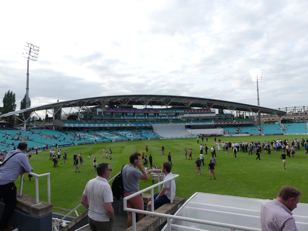
The very first photo I took that day was this:

I love how, in the middle of that big photo, we see one of those excellent You Are Here signs that you see all over London, and in many other spots, I don’t doubt, in not-London. I really like these signs, and constantly photo them, if only to remind me for later of exactly where Here was at that particular moment.

Of this OCS stand, SteelConstruction.org has this to say:

This is a most appropriate use of steel, in a geometrically complex arrangement, which adds drama and visual excitement to a famous venue.

I was hoping that this OCS Stand, would be as open for people to sit in as it was in the above photo photo, because I have yet to experience the views from the top of that stand, surely as dramatic in their own ways as the stand itself. But on the evening when Darren and I were there, the OCS Stand was shut. Shame. Memo to self: I will photo these views. If I have to make a special trip to the Oval just to ask about that, fine, I’ll do it, and keep on doing it, until they let me up there, preferably on a nice day.

Here is that OCS Stand, as it was looking at the second interval of the day, which happened not long after we got there:

That photo makes the ground look pretty dark, even though the floodlights were on. And it does not deceive. The ground did indeed look dark, to the human eye.

Here is the Pavilion that faces the OCS Stand, which is where we soon moved to:

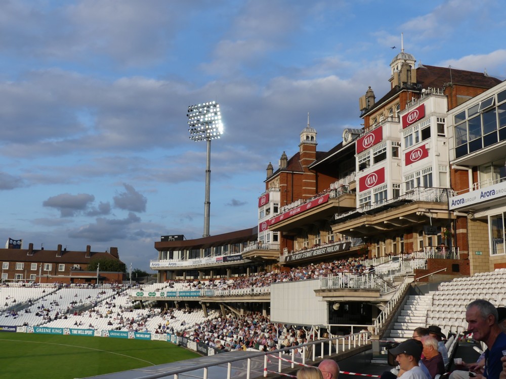
Some like ancient, and dislike modern. Others dislike ancient, and like modern. Me? I like both, and particularly like it when they are near each other, or (as in this case) facing each other, and I can relish the contrast.

One of the particular charms of cricket grounds – this being especially true of the two big London grounds, the Oval and Lord’s – is that they feature both (fairly (at least in style)) ancient, and (very) modern architecture. In comparison, I find big stadiums built all in one go very dull. I went to a football game at Wembley, and if it hadn’t been for the big arch on the top of it, it would have been totally anonymous. It’s not just the architectural uniformity. It’s also that in a place like Wembley there are no gaps, and you can’t see anything except the stadium. You could be anywhere.

Darren and I, what with Darren being a Surrey Member, sat in those seats at the top, in the middle, and when you look out from there, across at the OCS Stand and to the left and the right of it, you couldn’t be anywhere but London. Here is another view looking to the right, which includes that earlier Big Thing Alignment and several other random Big Things besides:

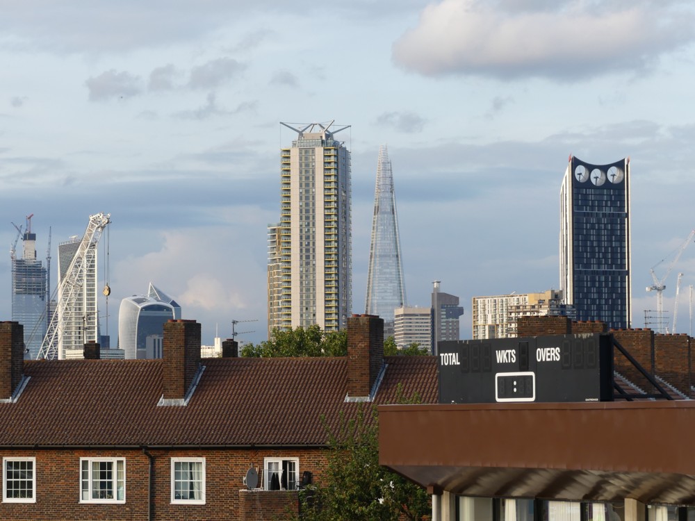
And here is the view to the left, towards Battersea, where the new US Embassy, just up river from MI6, has detonated a building boom:

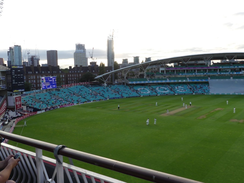
But forget the US Embassy. The reason I am showing you the above photo is to tell you how very dark the ground had become. Forget playing cricket. How on earth can you even see anything on that cricket pitch?

But seeing things on that pitch soon became very easy. Quite soon afterwards, observe how very light the ground had become:

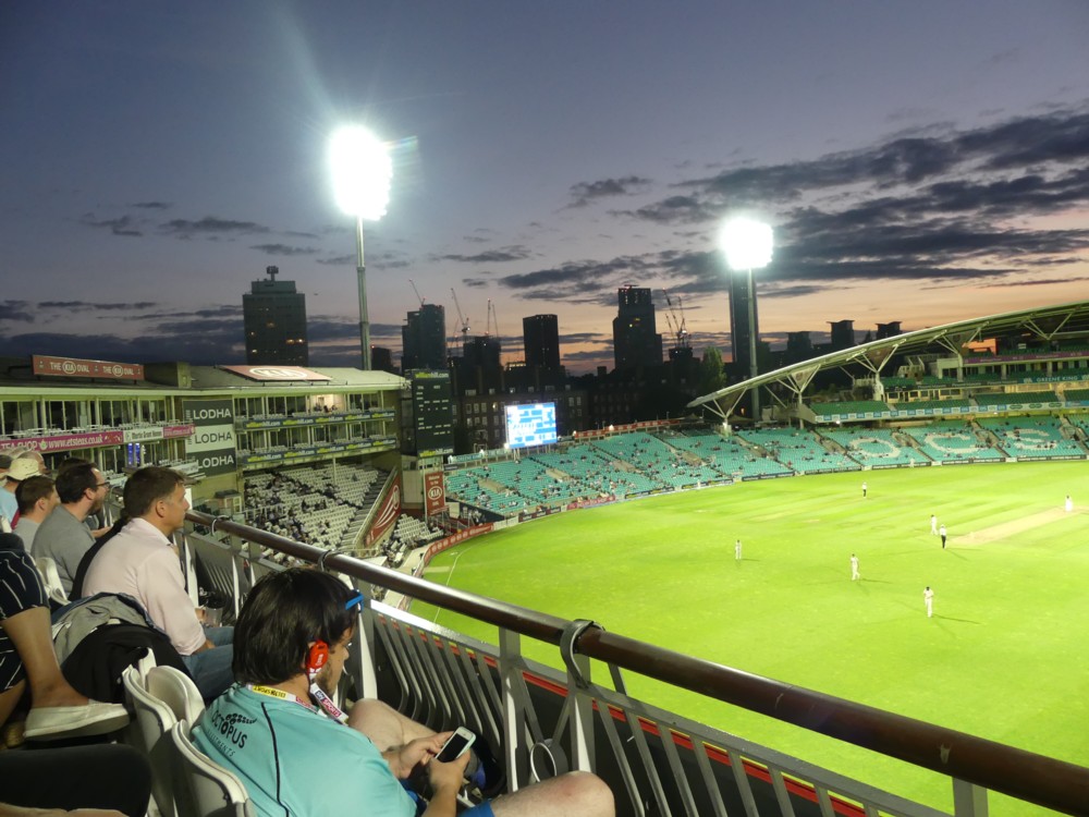
The floodlights were blasting away in both of those photos, not just in the second one. Yet, in the first, they were being totally outshone by the paltry remnants of daylight. Only when daylight had seriously dimmed did the floodlights suddenly start to make their presence felt. And even then the sky is still quite light, especially down near the horizon.

I have been to the Oval quite a few times, but don’t recall witnessing the extremity of this contrast ever before. I think it helped that we were looking down on the ground from quite a height, onto the brightness of the ground. But basically, I’ve never been there when it was properly dark before.

The reason the above photo, especially of the people near me to the left, looks like it was taken with flash is because there is another big clutch of floodlights coming crashing into us from off to the right, very nearby.

Finally, here are a couple of photos I took just after arriving at the ground, through the Hobbs Gate, which is behind the Pavilion, on the far side of the Oval from the river, and from me:

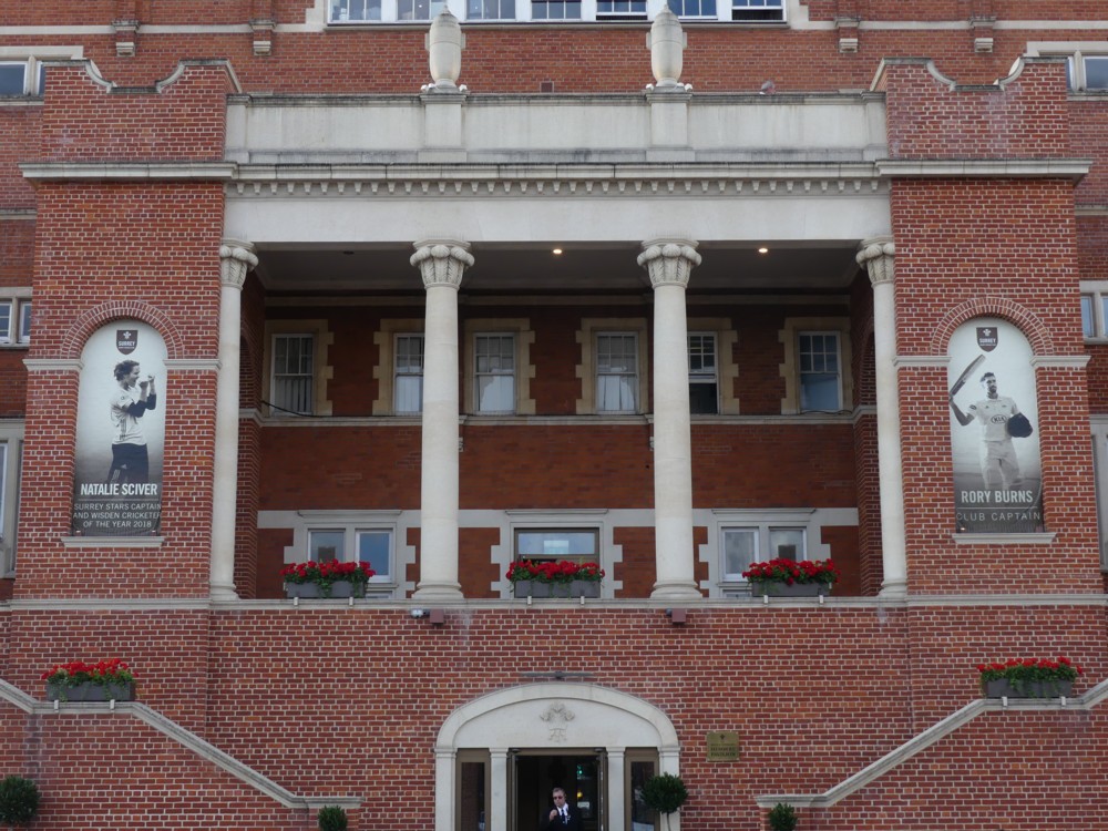
One of the more agreeable features of London’s big two cricket grounds – Lord’s especially – is the number of giant photos there are on show, of cricketing heroes present and past. It was the same when I visited White Hart Lane a while back.

Here is a closer-up snap of the Surrey ladies captain, Natalie Sciver:

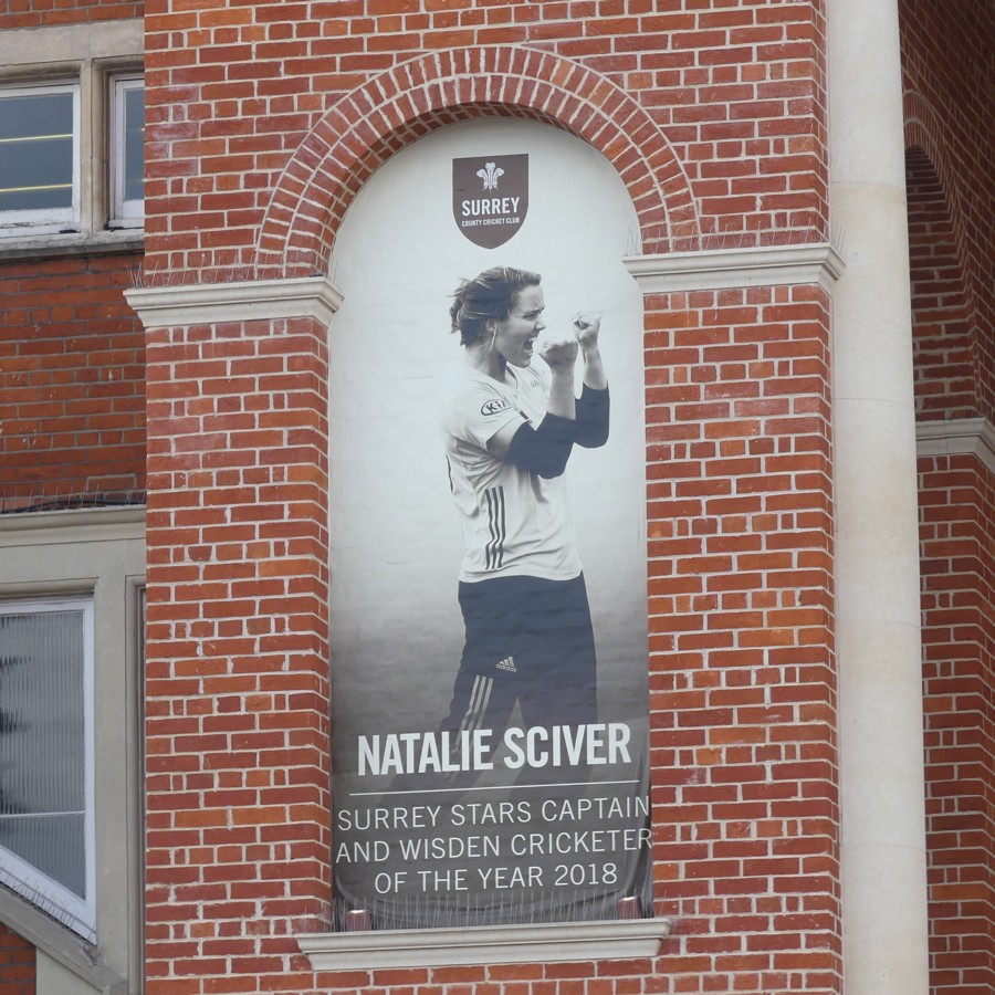
Sciver lead her team to victory on Bank Holiday Monday in the ladies T20 national tournament. Her Surrey “Stars” beat “Western Storm” in the one semi-final, and then won the final against Loughborough “Lightning”. Lizelle Lee got a century for Surrey in the final, but she got good support from Sciver, and Sciver excelled with both bat and ball in the semi-final, which was a lot closer.

I am fond of emphasising how sport has replaced war in the world’s luckier and richer countries. Long may that trend continue. What these giant pictures emphasise, or so it feels to me, is the local significance of big sports clubs, and the way that, in terms of how these places feel close up, sport is also busy replacing religion. This is especially true now that the other great modern challenger of religion in this kind of way, the cinema, is fading back into a merely domestic past-time. The elaborate imagery. The regular attendance at an architecturally impressive locale. The shared agonies and ecstasies of the assembled congregations. The way that the calendar is carved up into a distinct pattern. To me, it all feels very religious, and I am certainly not the only one to have noticed this. (That link took only seconds to find.)

The Church of Cricket is, I quite realise, but a small sect, these days, at any rate in England, compared to the Universal Church of Football. But the point about sport replacing religion in modern life still stands.

Originally posted at Brian Micklethwait’s Old Blog

A view from the Shard

Earlier this evening I did some laundretting, and while I was there, this showed up outside:

I still photo taxis with adverts on them, and I especially liked this one, advertising this.

It made me think of the last time I went up to the top of the Shard, just over a year ago.

So I took a browse through the photos I took that day, and this time around, this one particularly struck me:

That was cropped to confine itself to the one building, and photoshop(clone)ed to resist the dullness of the day and general fogginess of the original.

Part of me wants to say that this is a classic case of the behind-the-scenes bit of a building, a chunk of it that you are not supposed to look at and get all aesthetic about. It is what it is.

But I actually think that this is the facade of the building that the architects of it were most proud. There is an exuberance about this roof, done in the equipment-as-decoration style, that is utterly lacking in the rest of the building. The “official” bits of which are about as dull as dullness can get. They didn’t have the budget to go full Lloyds Building, all over. But they were able to go crazy on the roof, because the politicians whose job it was to tell them to redo the design more boringly didn’t give the roof any attention. They thought they were building a machine for studying in, but only on the roof were they able to go mad with “expressing” that machineness.

I reckon they were delighted that the Shard was later put right next to this block of boredom with a great roof, enabling thousands of folks to gaze down on their favourite bit.. Gotcha, boredom police!

Okay, just a thought, and a thought that could well be wrong. Maybe they really didn’t care how the roof looked. But take a look through these photos of this mostly very dull slab, mostly taken from street level, of course, and see if you don’t share my suspicions.

Originally posted at Brian Micklethwait’s Old Blog